Slice Rebranding Project
Vishnu Roy

Slice
Slice is a Bengaluru-based fintech company reimagining how young Indians experience credit and payments. With a focus on simplicity, speed, and rewards, Slice offers UPI, card-based payments, and a user-first interface that blends financial utility with a lifestyle brand feel.
Overview
Slice was a rebrand for a fintech startup that wanted to break out of the traditional banking look. The goal was to make it feel bold, clean, and youth-focused without falling into startup clichés. It had to look trustworthy, but also fast, fun, and unapologetically digital.
I designed a custom logotype, developed a color system around vibrant purples and supporting neutrals, and built out visuals for cards, app screens, social media, and marketing. Everything needed to work together and feel native to the product experience.
The outcome was a brand that feels fresh and confident; something that connects with a younger audience but still carries enough polish to hold space in the finance world.
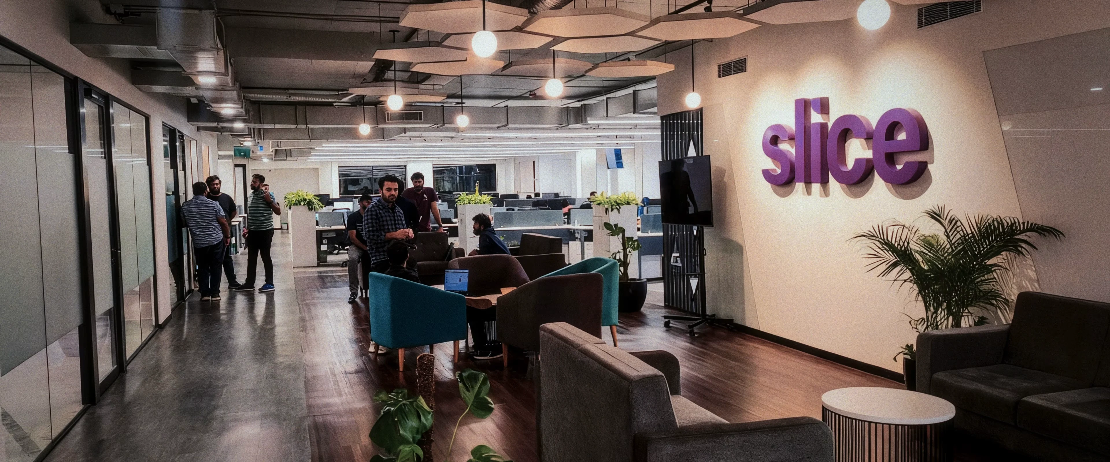
Slice Office in Bengaluru, India
Step 1: Discover
Slice, a rising fintech startup, positioned itself as a modern alternative to traditional banking. But its visual identity wasn’t doing it justice. The brand was struggling with:
An outdated logo that lacked resonance
Low market differentiation
Weak alignment between brand values and visual identity
Inconsistent voice and tone across touchpoints
There was a clear need for a cohesive, contemporary brand system that could speak directly to a younger, digital-first Indian audience.

Previous state of Slice, formerly known as SlicePay
Step 2: Define
To bring clarity and character to Slice's identity, the rebranding effort was grounded in strong design principles derived from the brand’s core values:
Premium - Communicating confidence and luxury through visual restraint.
Young - Appealing to a Gen Z and millennial audience with boldness and energy.
Joyful - Making credit feel empowering, not intimidating.
Step 3: Develop
With a clear strategy in place, the next step was to bring Slice’s brand identity to life across visual and functional layers. Every design choice was intentional, crafted to create a seamless, modern, and confident experience that customers could instantly connect with.

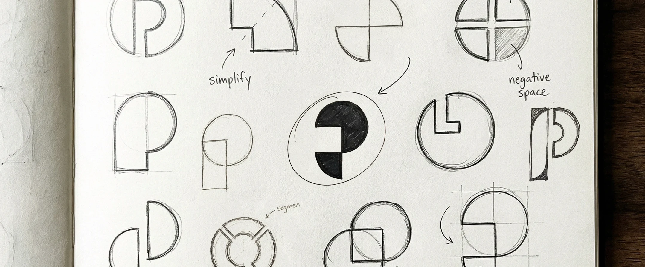
Logo Design
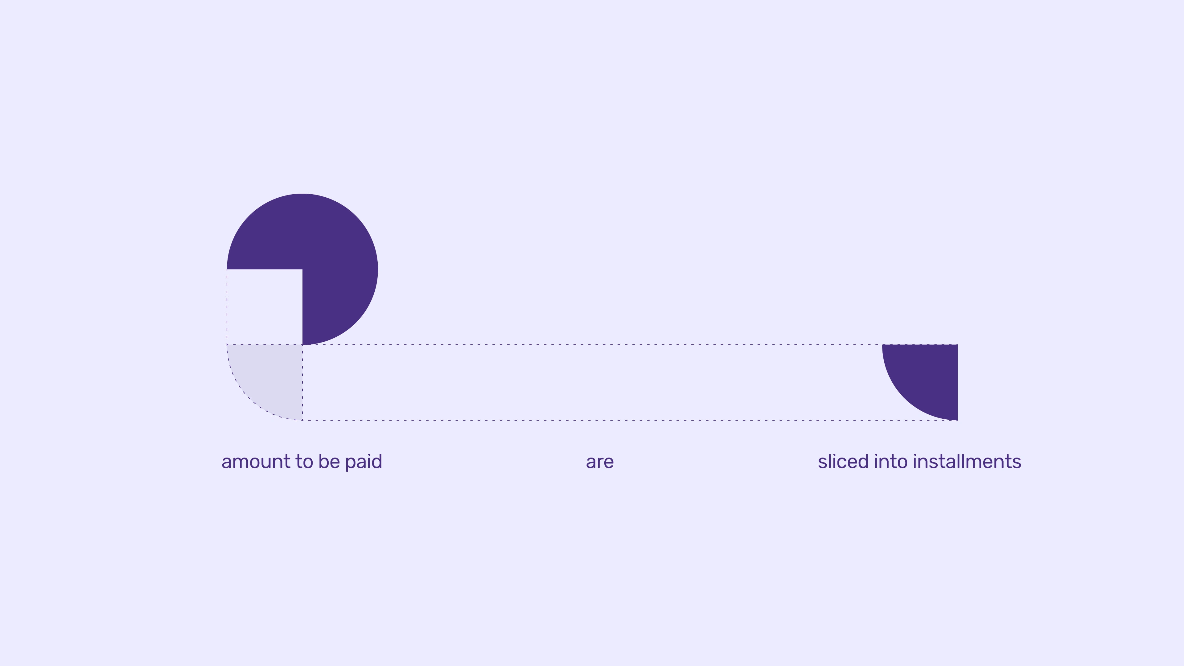
The logo represents a circle which is sliced into a quadrant and arranged in a fashion to form the letter ‘P’ - short for ‘Payment’. The circle here indicates all of user’s expenses and the quadrant subtly hints that the amount can be sliced and paid in parts.
‘Your expenses can be sliced’ is the core idea of the logo.

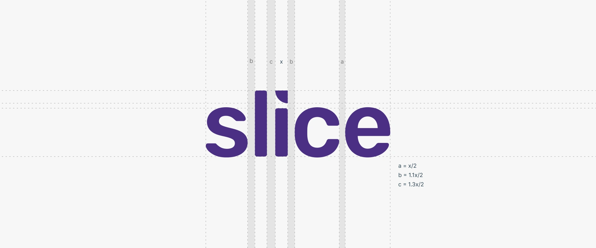
Typography
A customized version of Rubik was chosen for its balance of luxury and fun. A unique sliced “i” and a custom rupee symbol were added to enhance both branding consistency and contextual relevance for Indian users.
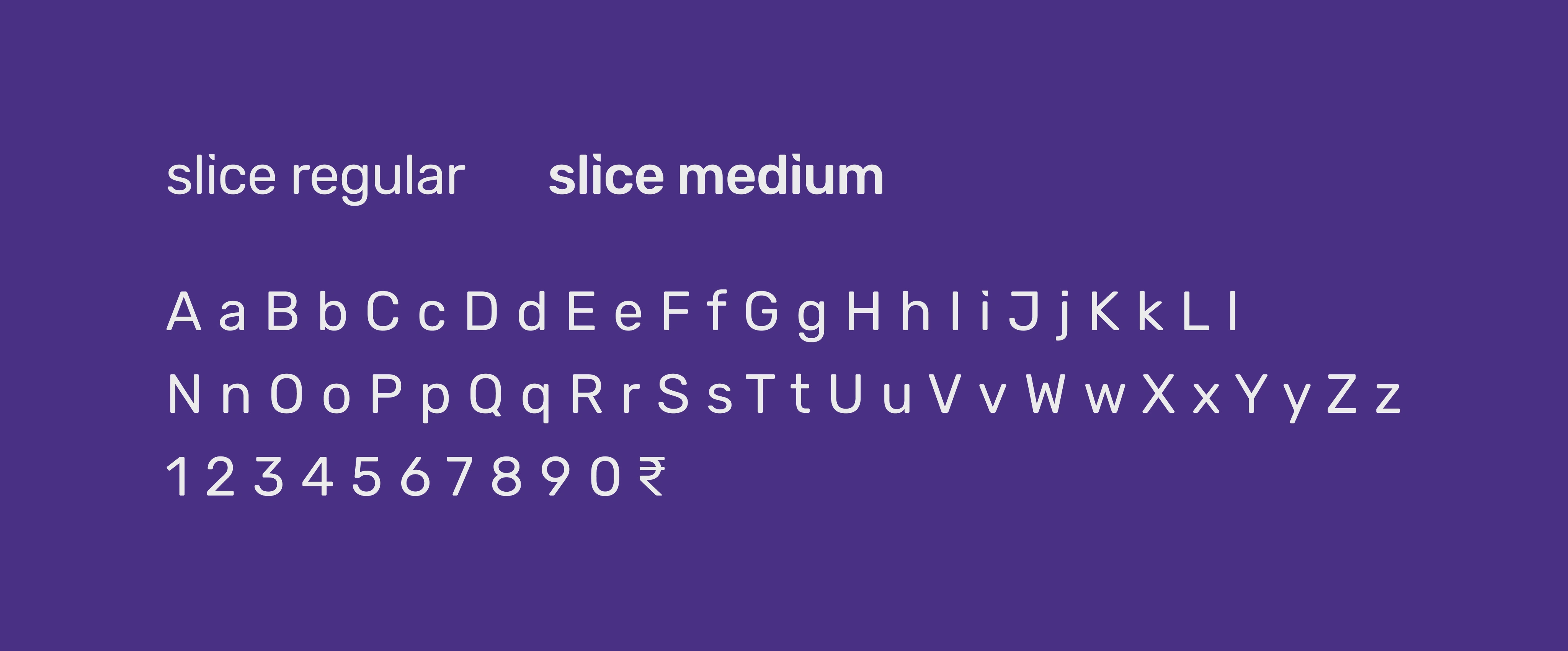

The letter ‘i’ replaces its dot with a signature slice from the logo + a custom-designed ₹ was introduced.

Colors
Purple dominates the interface, lending the brand a sense of luxury and depth. Orange acts as a vibrant accent to bring youthful energy and draw attention. This purple-orange duo is rooted in complementary color theory and resonates with Slice’s target demographic (age 20–30), according to color preference studies.
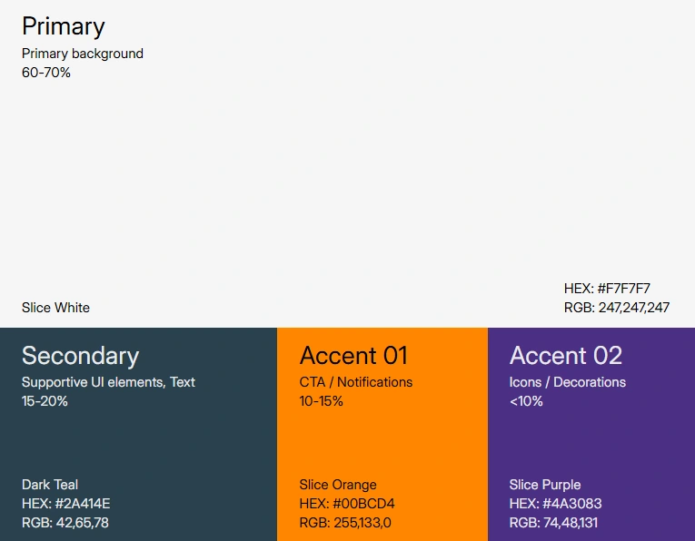
Color Guideline

Step 4: Deliver
The Slice rebrand was not just a visual overhaul. It was a collaborative shift rolled out in deliberate phases.
Each team, from product and marketing to engineering and design, played a critical role in ensuring consistency and coherence across every touchpoint. I served as the connecting link throughout this journey, aligning efforts, facilitating feedback loops, and helping turn a shared vision into a tangible, unified brand experience.

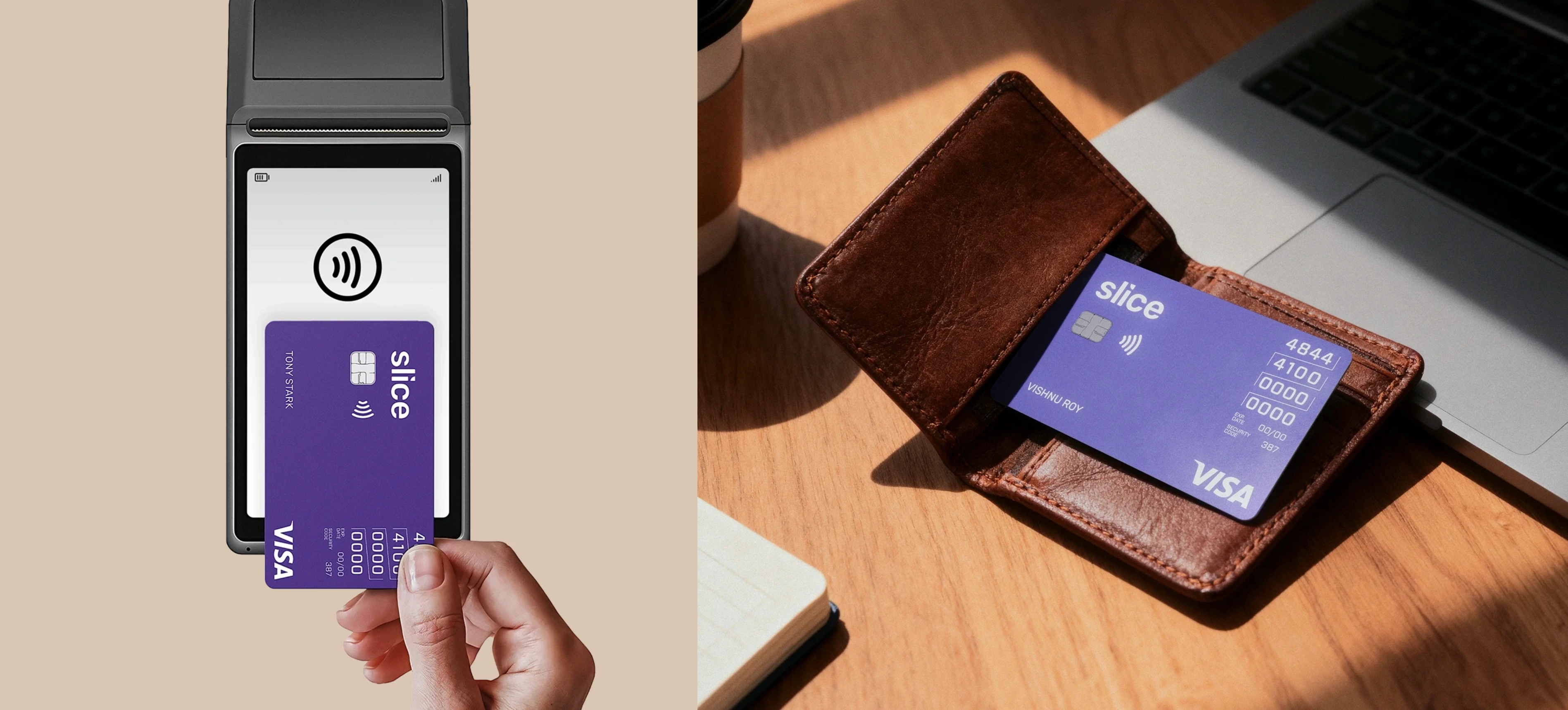
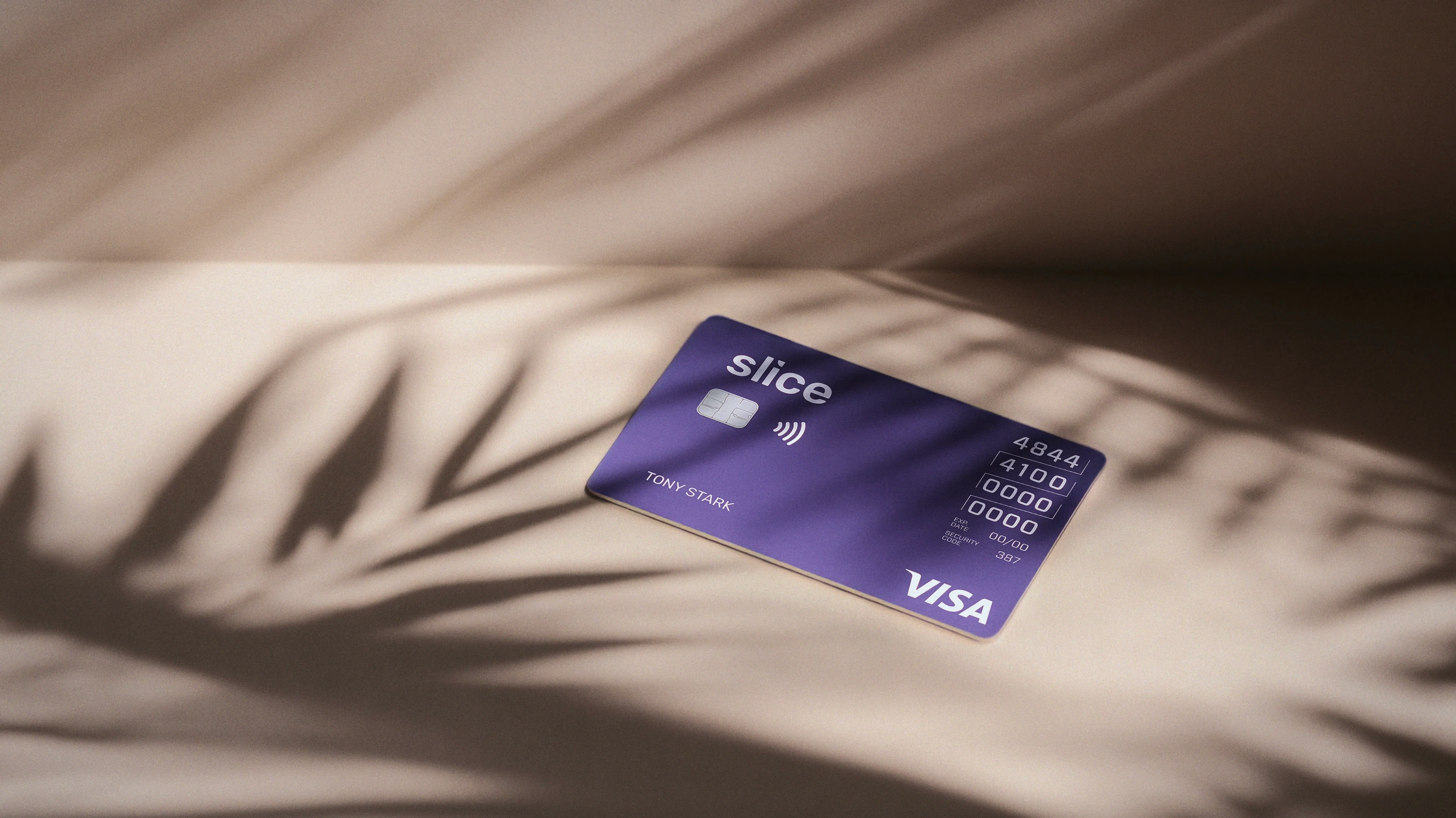
Slice Card
The Slice card was designed to break away from traditional credit card aesthetics while still meeting strict banking and network regulations. From exploring textures and layouts in its first version to the refined “stardust” look and engraved details in Slice Card 3.0, the focus has been on creating a premium, distinctive identity that balances creativity with compliance. Read more.
Conclusion
The rebrand didn’t just improve aesthetics, it transformed perception. With the new design system in place:
Slice's app installs jumped from 2L to over 1M+.
The credit card, once purely functional, became a status symbol among many young users.
The product’s identity now felt consistent, meaningful, and culturally resonant; aligning perfectly with Slice’s vision of making credit cool and accessible.
Like this project
Posted Nov 28, 2025
A full-scale rebrand for a modern Indian fintech. From logo to UI system, the identity is rebuilt for clarity, trust, and youthful energy.
Likes
0
Views
4
Clients
Slice