Car Logos
Bohdan Harbaruk
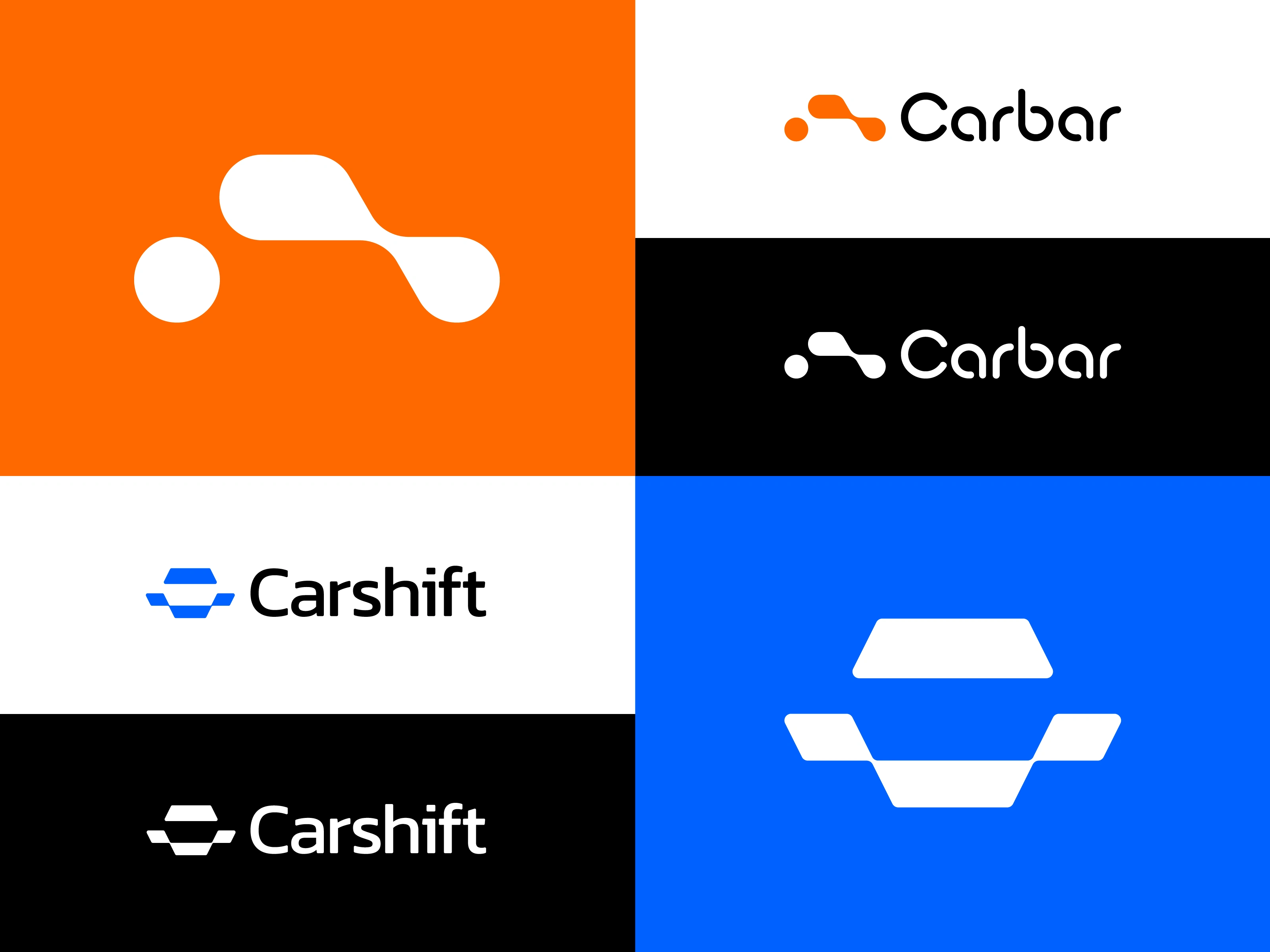
A collection post pairing two car logos created as part of the same 2020 brand project — Carbar and Carshift — built around the question: how many different ways can a car be drawn as a logomark?
The challenge: design two automotive logos for adjacent product positioning, each mark feeling completely distinct from the other while sharing the same craft DNA. Two cars, two brands, one project.
Carbar — an organic, biomorphic car silhouette built from rounded, fluid forms. Warm orange palette. Reads as friendly, retail-facing, approachable. Built for a turnkey vehicle import service from the USA to Ukraine
Carshift — a geometric two-trapezoid construction that doubles as a stylized car-from-the-front and a visual "shift" between two positions. Electric-blue palette. Reads as engineered, marketplace, tech-forward. The mark was sold as a concept
Both are still among my favorites — two answers to the same question, neither of them wrong.
Available for logo & brand identity projects.
brandforma.com
Designed by Bohdan Harbaruk | Brandforma Studio™
All rights reserved © 2024
Like this project
Posted Jul 28, 2025
Hi everyone, I'm revisiting two of my old logos from 2020, which feature abstract images of cars. These two are still among my favorites.