Branding Updated [2026]: Pixelblue

Joyjit Sett


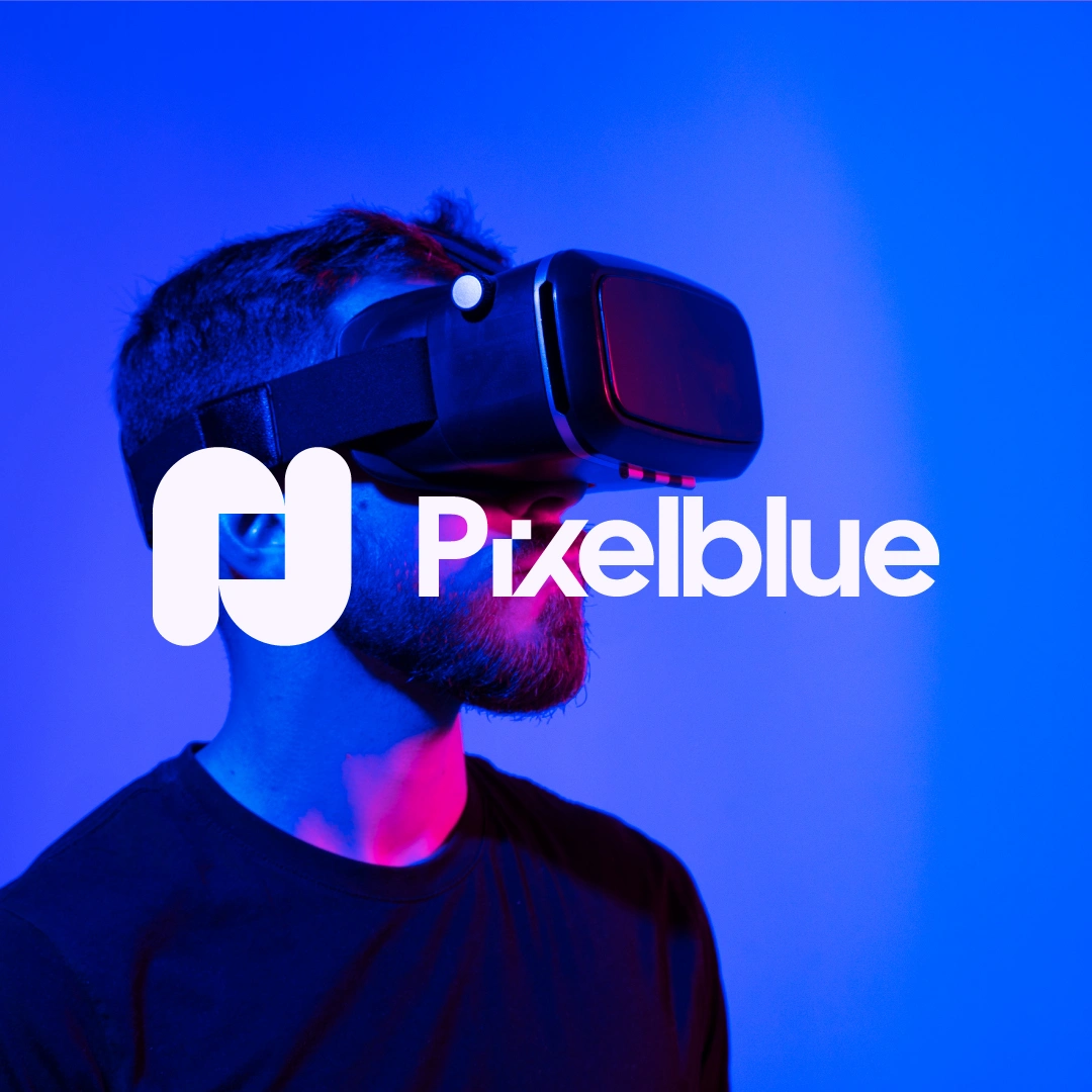
Case Study: Pixelblue Brand Identity Refresh
A studio built on 9+ years of motion craft, evolving its identity to match how far the work has come.
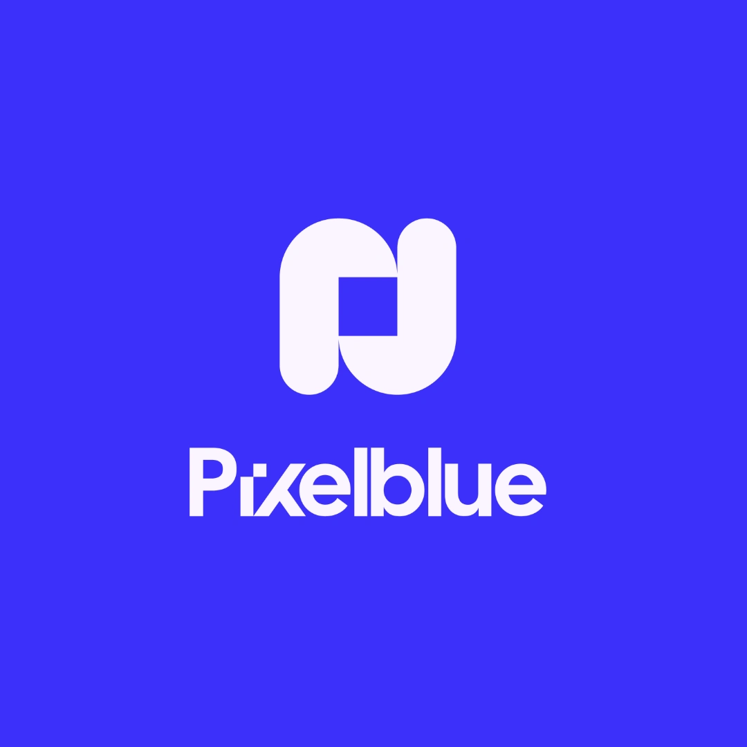
New Logo
Problem:
After nearly a decade collaborating with 100+ event agencies, SaaS companies, and marketing teams, Pixelblue had outgrown its original visual identity. The work - cinematic explainer videos, product launches, event openers, UI animation - had matured into something premium, precise, and intentional. The brand presenting it hadn't kept pace.
The old identity didn't communicate the studio's actual positioning: high-impact, minimal, cinematic. Clients judging the studio on first impression (website, proposal deck, portfolio intro) were seeing a visual language that undersold the quality of work behind it. For a motion studio specifically, that mismatch matters more than most - the brand is a portfolio piece before a single project is ever shown.
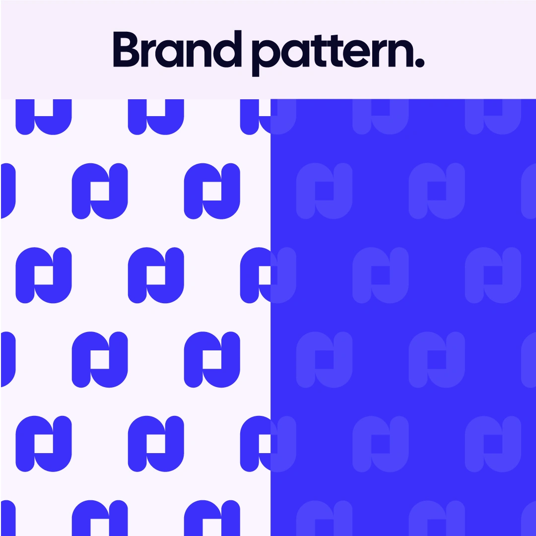
Brand pattern
Insight:
A rebrand isn't a redesign exercise - it's a repositioning exercise. The real question wasn't "what should the new logo look like," but "what does the identity need to signal before a client even watches a reel?"
For Pixelblue, that meant the new identity had to do three things simultaneously:
Feel premium without feeling corporate or cold
Read as motion-native - not just a static mark, but a system built to move
Stay flexible enough to work across wildly different contexts: a SaaS explainer pitch, a conference stage opener, a social reel thumbnail
The insight that shaped everything: the brand needed to behave like the work -clean, cinematic, and built with intention at every frame, not just look good as a flat logo.
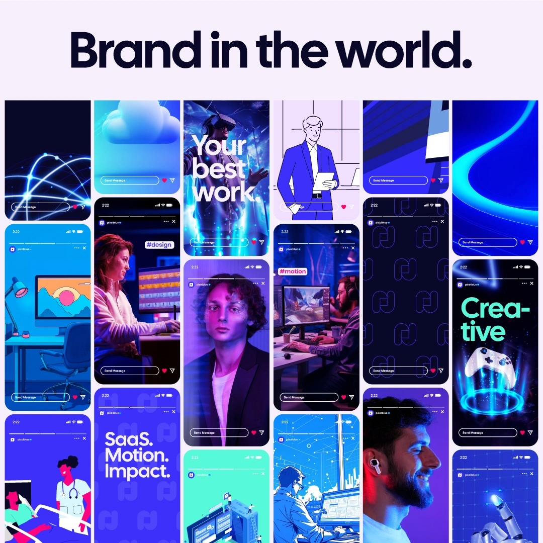
How the brand looks in the social media world
Solution:
The new identity centers on a geometric wordmark and icon system built specifically with motion in mind - clean negative space, a mark that can animate on its own (opening sting, loop, reveal), and a bold indigo-blue palette that reads premium across both light and dark contexts.
Rollout was sequenced deliberately rather than dumped all at once:
Foundation first - locked color codes, typography, animated logo behavior, and motion-specific brand rules (easing, transition style, signature sting) before touching anything client-facing.
Tier 1 rollout - website, portfolio intro, email signature, LinkedIn, Upwork - the highest-visibility touchpoints updated first.
Narrative alignment -outreach templates, taglines, and case study copy rewritten to match the new tone: direct, confident, zero filler.
The reveal itself was treated as a small case study in the studio's own craft - an announcement built with the same cinematic framing language (corner marks, minimal typography, deliberate pacing) used in client deliverables, rather than a generic "we rebranded!" graphic.
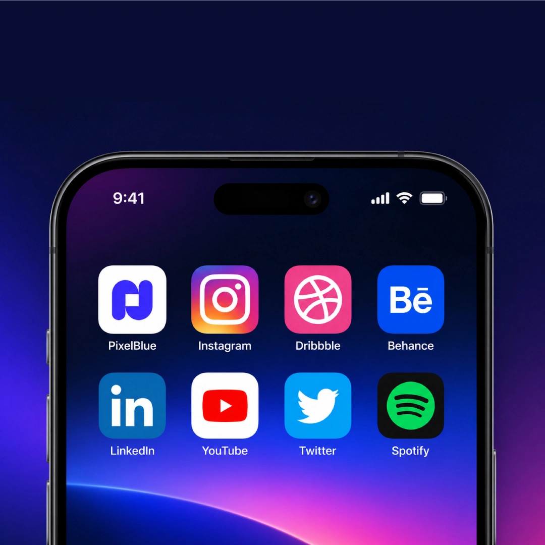
If Pixelblue has an app icon
Impact:
The refresh does three things for Pixelblue going forward:
Closes the gap between how the studio looks on first contact and the quality of the actual work - proposals, portfolio, and outreach now match the caliber of the reel.
Creates a reusable system, not a one-time asset - every new project can pull from the same animated brand kit, keeping delivery fast without sacrificing consistency
Sharpens positioning for the studio's target clients — SaaS, tech, and event producers evaluating a premium motion partner now see that signal before the first call.
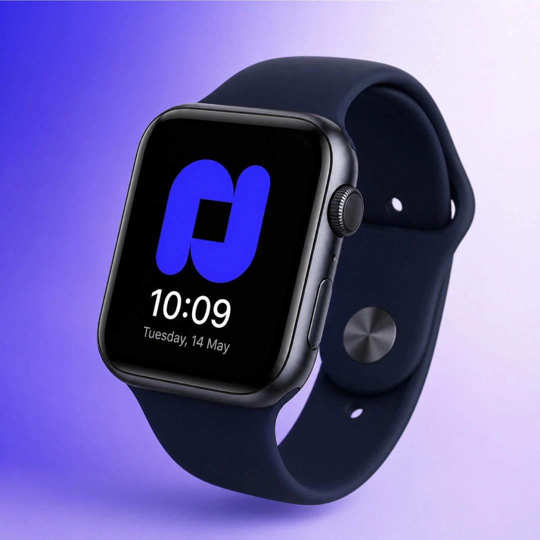
As in a watch face
Like this project
Posted Aug 19, 2026
New identity, same obsession with craft. Introducing the refreshed Pixelblue: new logo, new colors, same cinematic motion design.