Brand Redesign
Krafttrans Brand Redesign
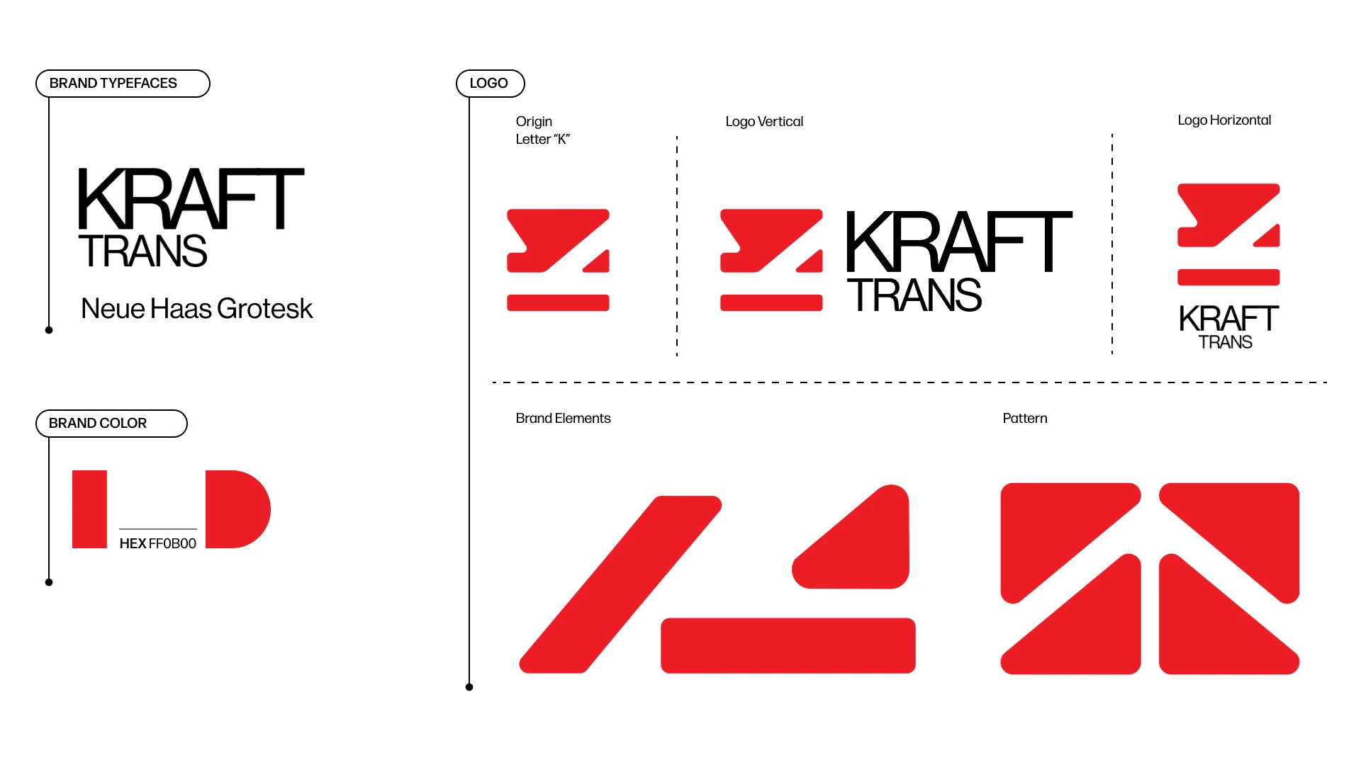
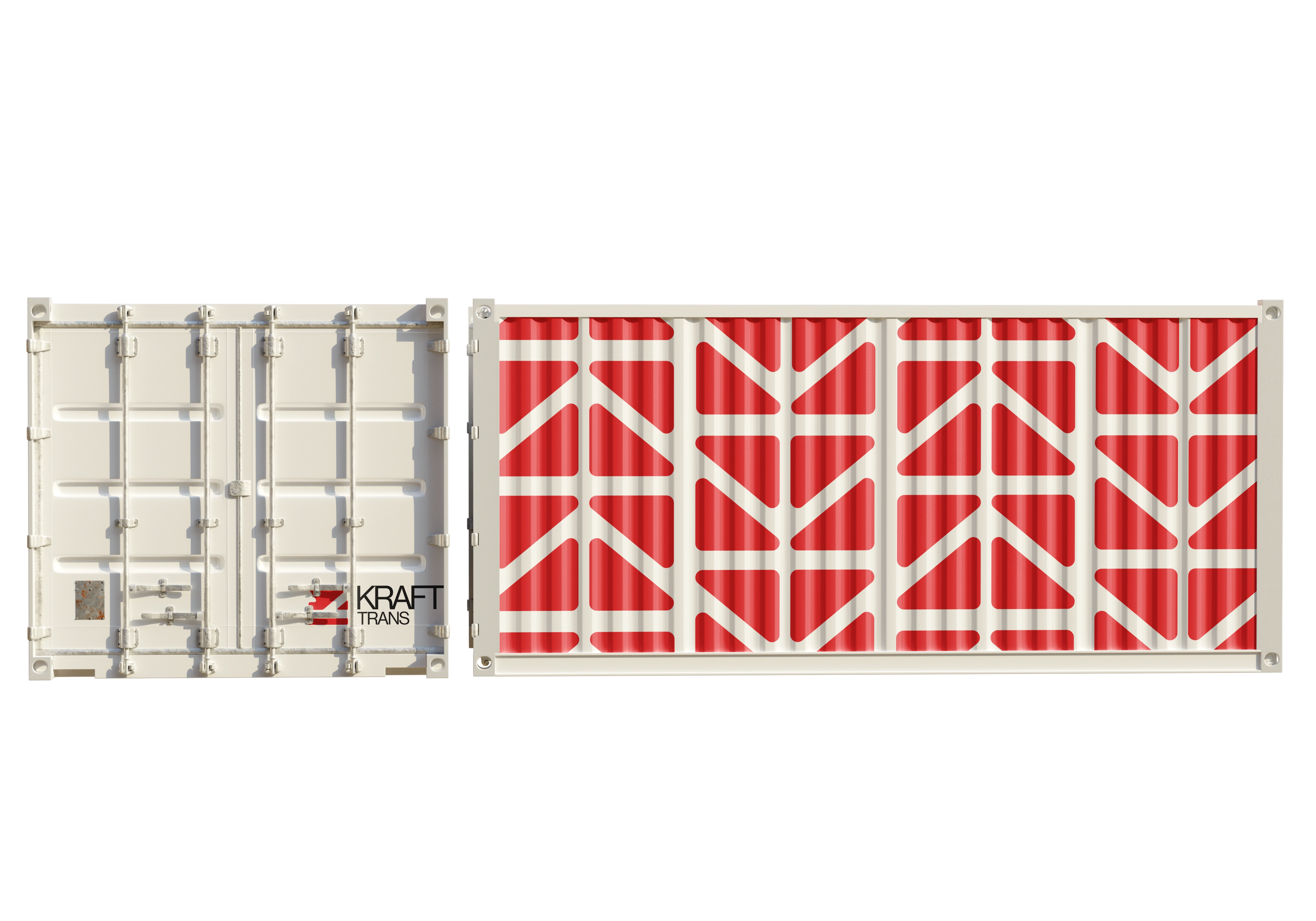
In this project, I crafted a new brand identity for Krafttrans logistics by drawing upon their rich history and original logo mark. In an effort to pay homage to the company's legacy, I utilized the same typeface and color scheme as the original logo. Additionally, I extracted the key element of the logo - a letter "K" - and simplified it while playing with negative space. The result is a modern and clean design that still pays tribute to Krafttrans' roots.

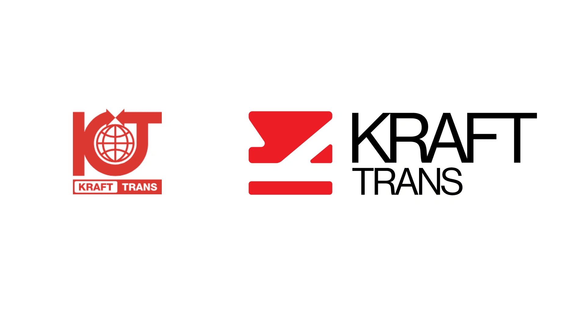
(old one on the left, new one on the right)
Like this project
Posted Sep 6, 2023
In this project, I crafted a new brand identity for Krafttrans logistics by drawing upon their rich history and original logo mark.

