Ayana | Reflective Brand Identity
Social Sherpa
Description
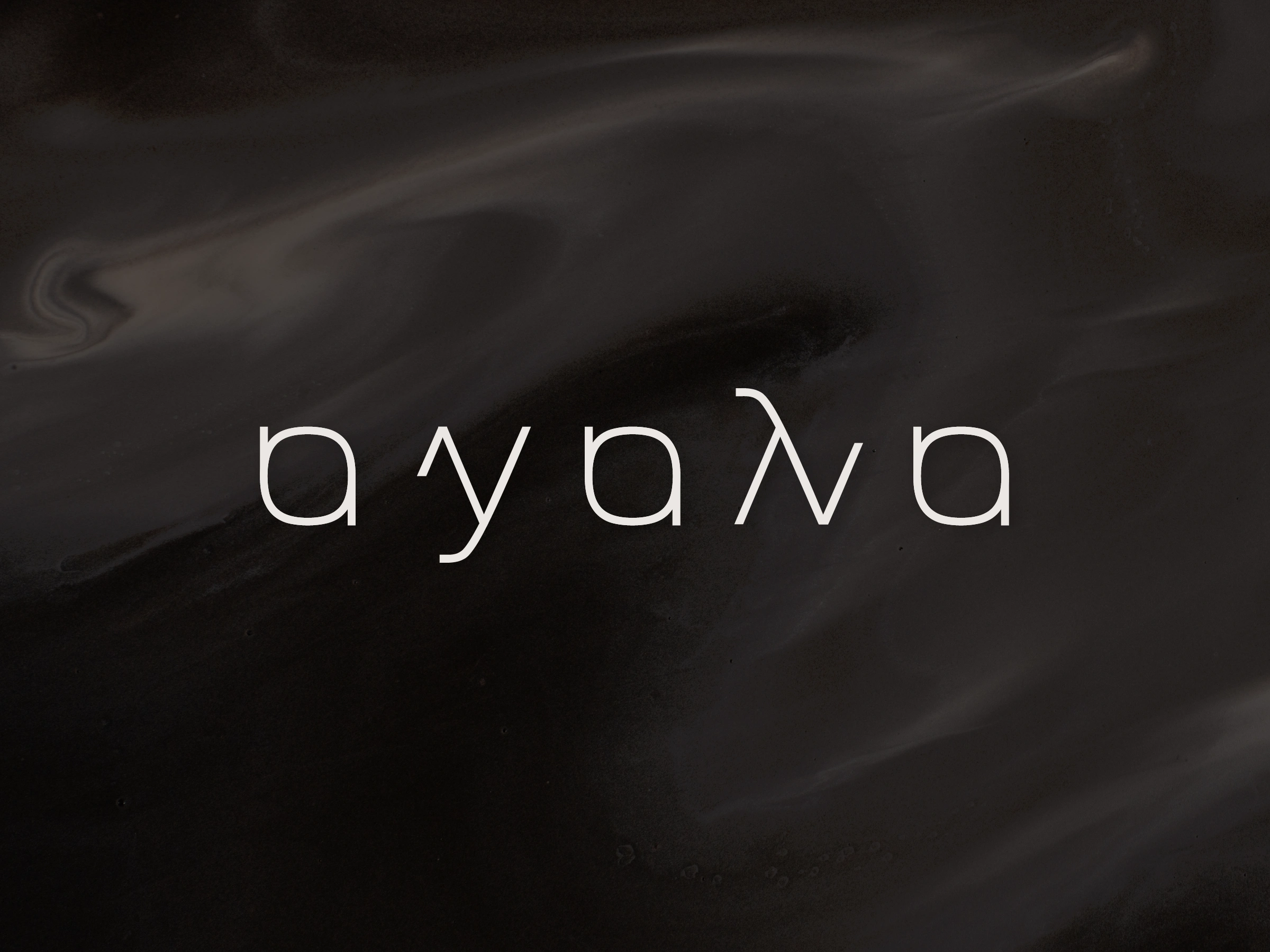
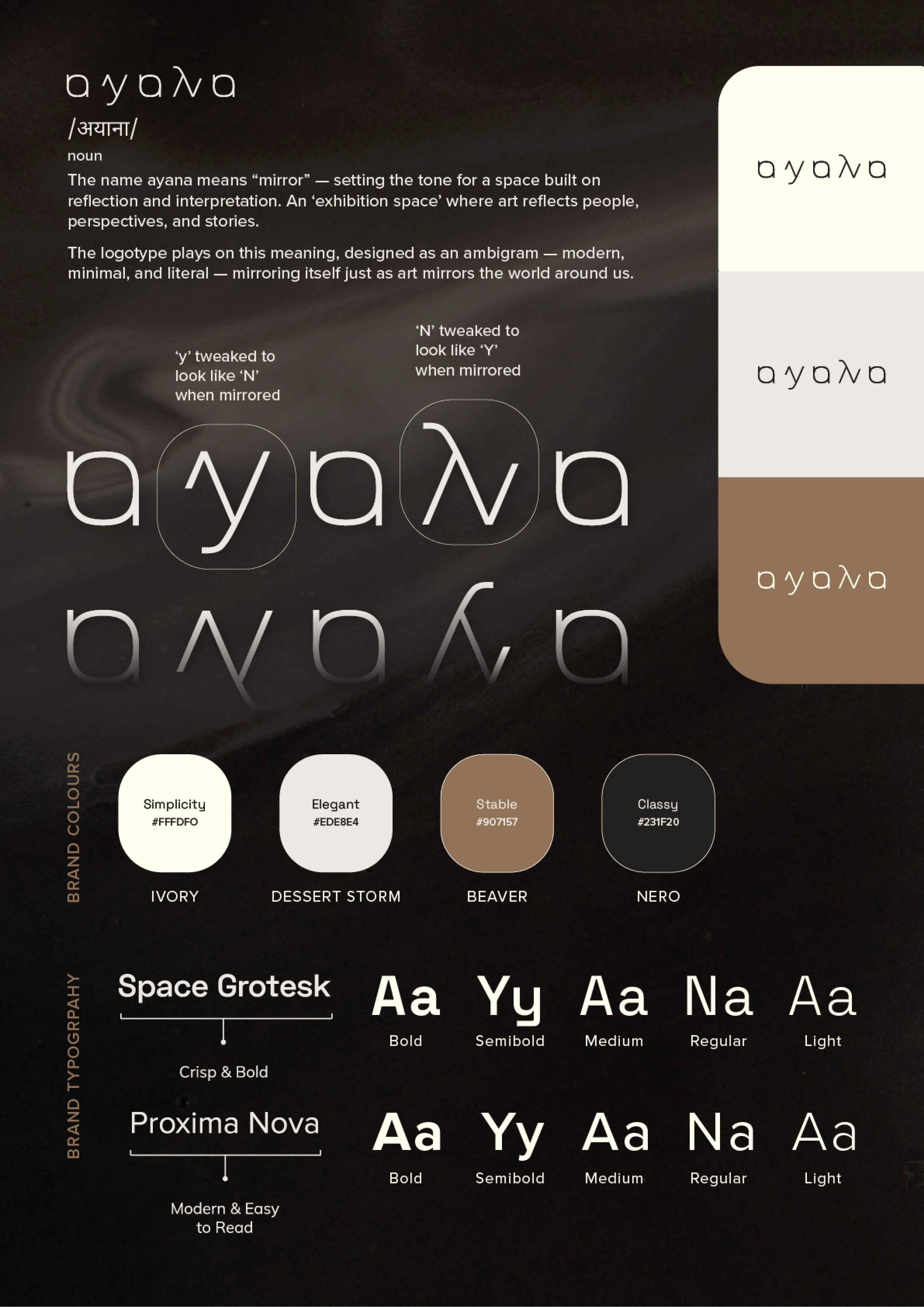
Ayana means “mirror,” setting the foundation for an exhibition space built on reflection, interpretation, and dialogue. It is a place where art becomes a response shaped by people, perspectives, and the stories they bring into the room.
Our Approach
We translated the idea of mirroring into the identity itself. The logotype was designed as an ambigram—minimal and intentional—where letterforms reflect one another. Subtle tweaks allow the ‘Y’ and ‘N’ to transform when mirrored, making the concept literal yet refined.
The Results
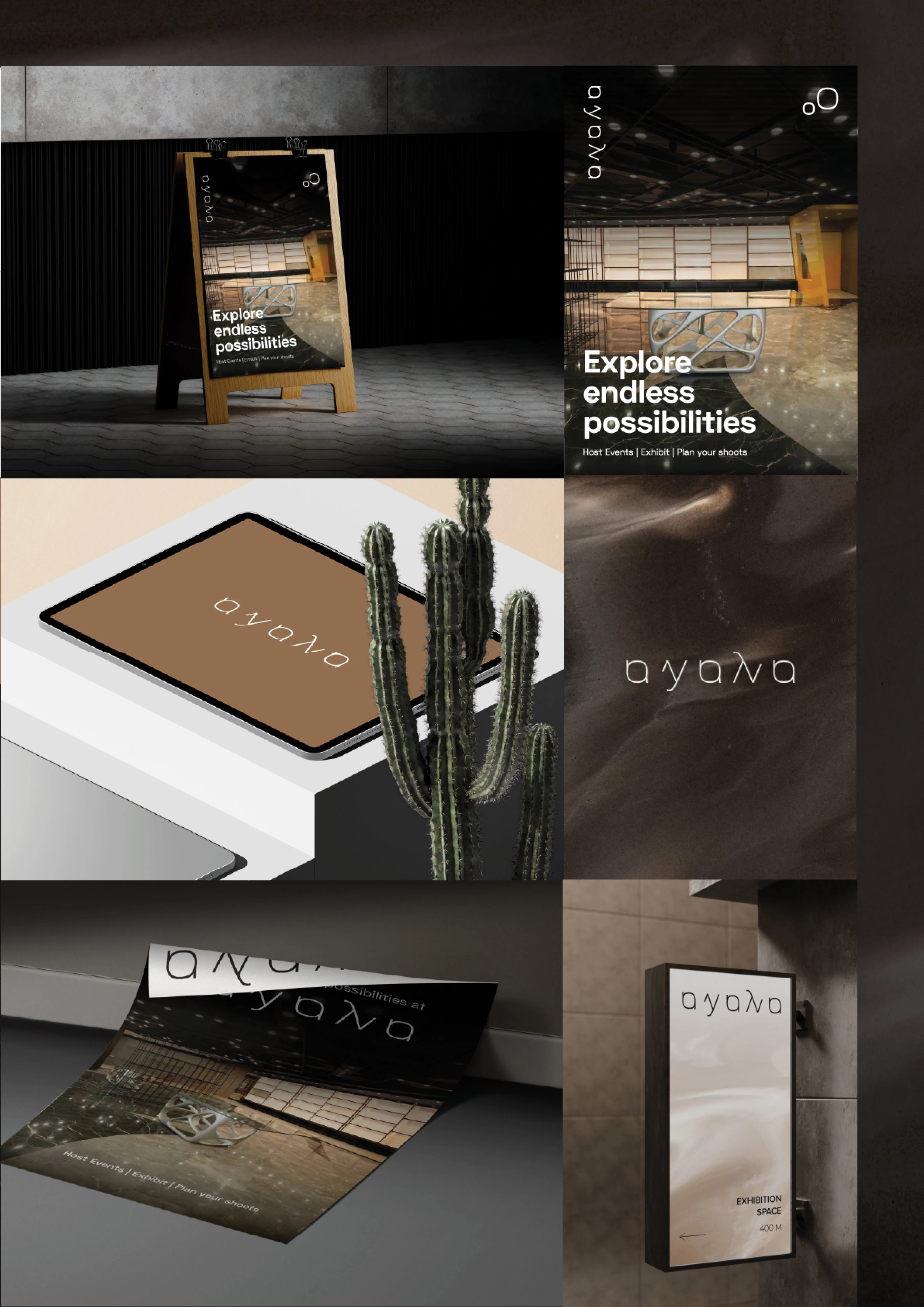
The brand language feels quiet but thoughtful, allowing the work inside the space to lead. Ayana now presents itself as a considered platform for art and ideas—one that invites reflection without overpowering the experience.
Like this project
Posted Feb 9, 2026
Developed a reflective brand identity for Ayana, centered around a mirrored logotype that conveys balance, depth, and modern elegance.
Likes
2
Views
2
Clients
Ayana