
Overview
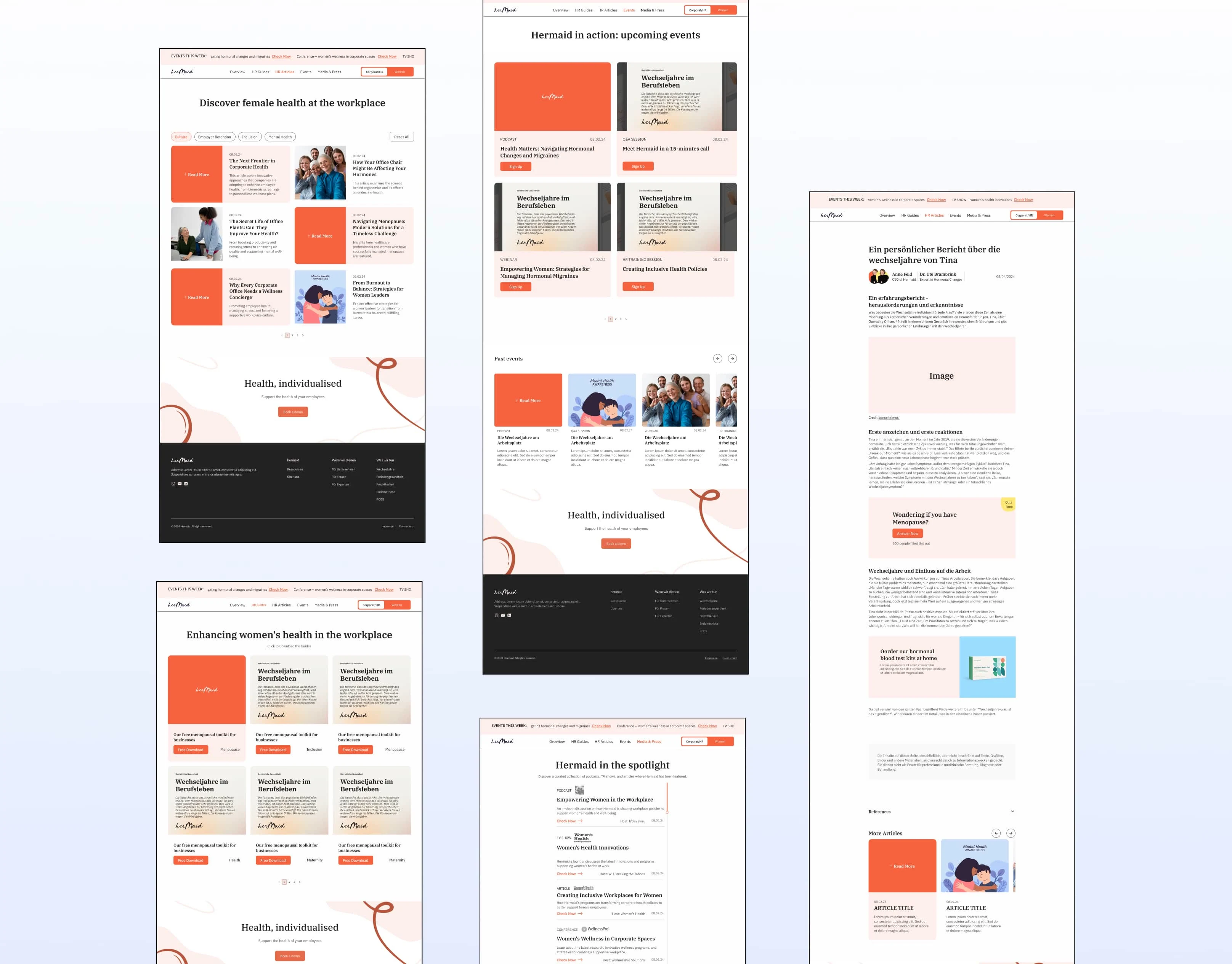
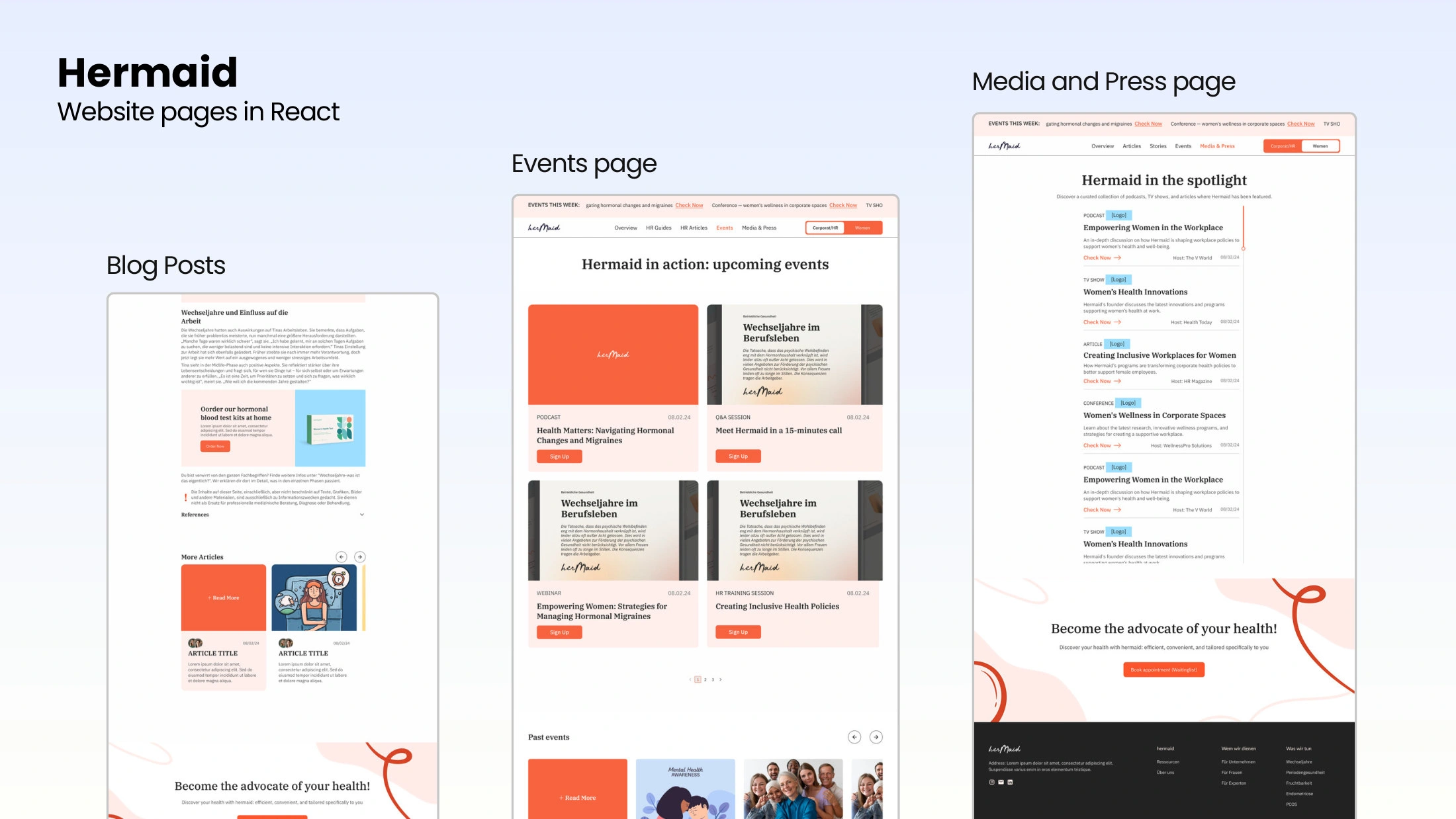
Hermaid is a FemTech startup supporting women through menopause, for both employers (HR teams) and individuals. As UI/UX designer, I redesigned its Resources page and refreshed the brand, then followed the IT team's build in React, with Ghost for articles.
The challenge
The Resources page had no clear structure, limited accessibility and no filtering, so neither HR teams nor patients could find what they needed. The brand felt busy, with too many competing colors.
Resources page
A toggle that splits content for HR/corporate users and for patients
Article filtering by symptoms for personalized guidance
An Overview page with key HR guides, articles, events and press
Accessibility guidelines for users with visual impairments
12 desktop and 12 mobile screens, plus prototypes in Figma and XD
Brand refresh
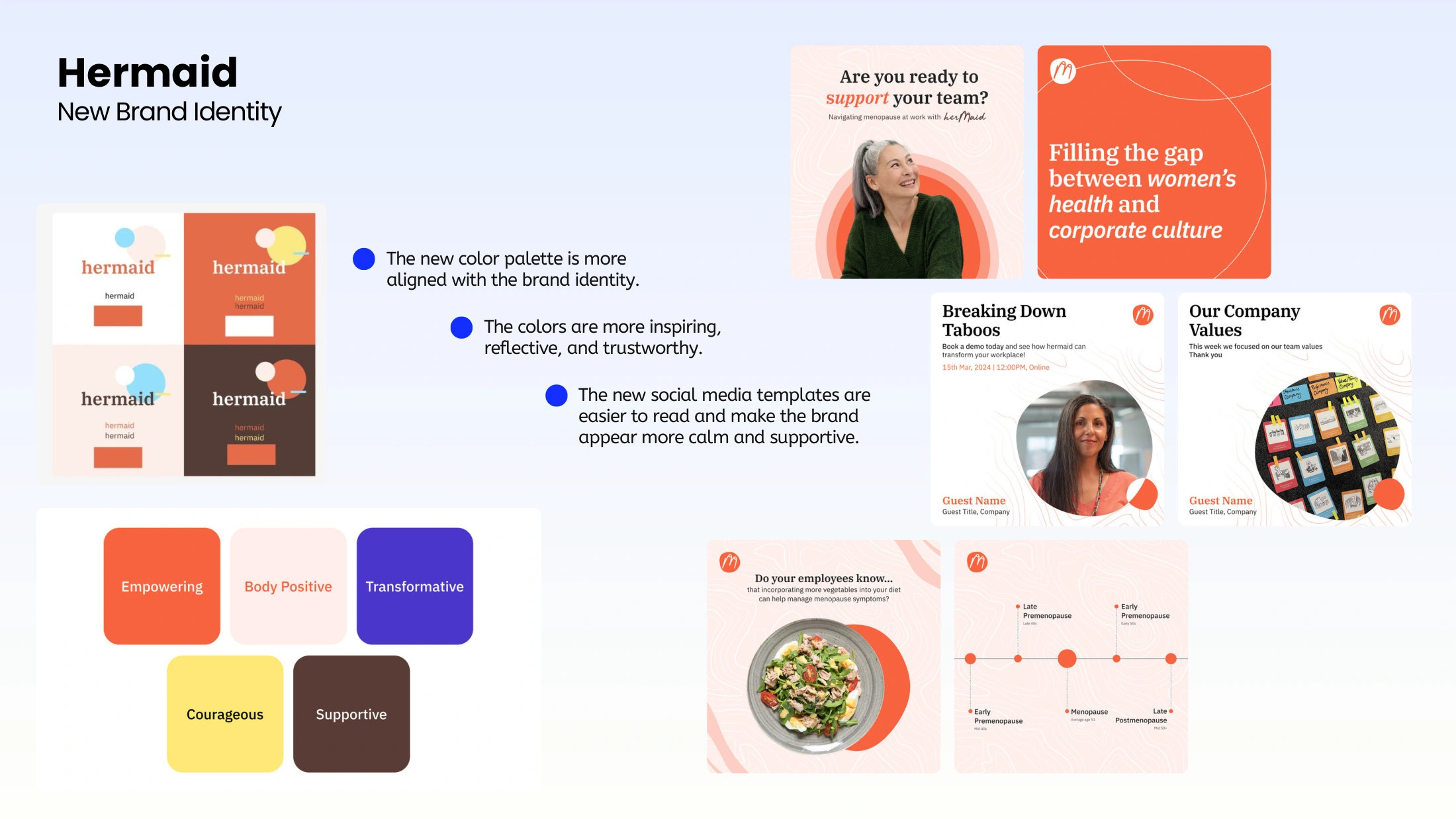
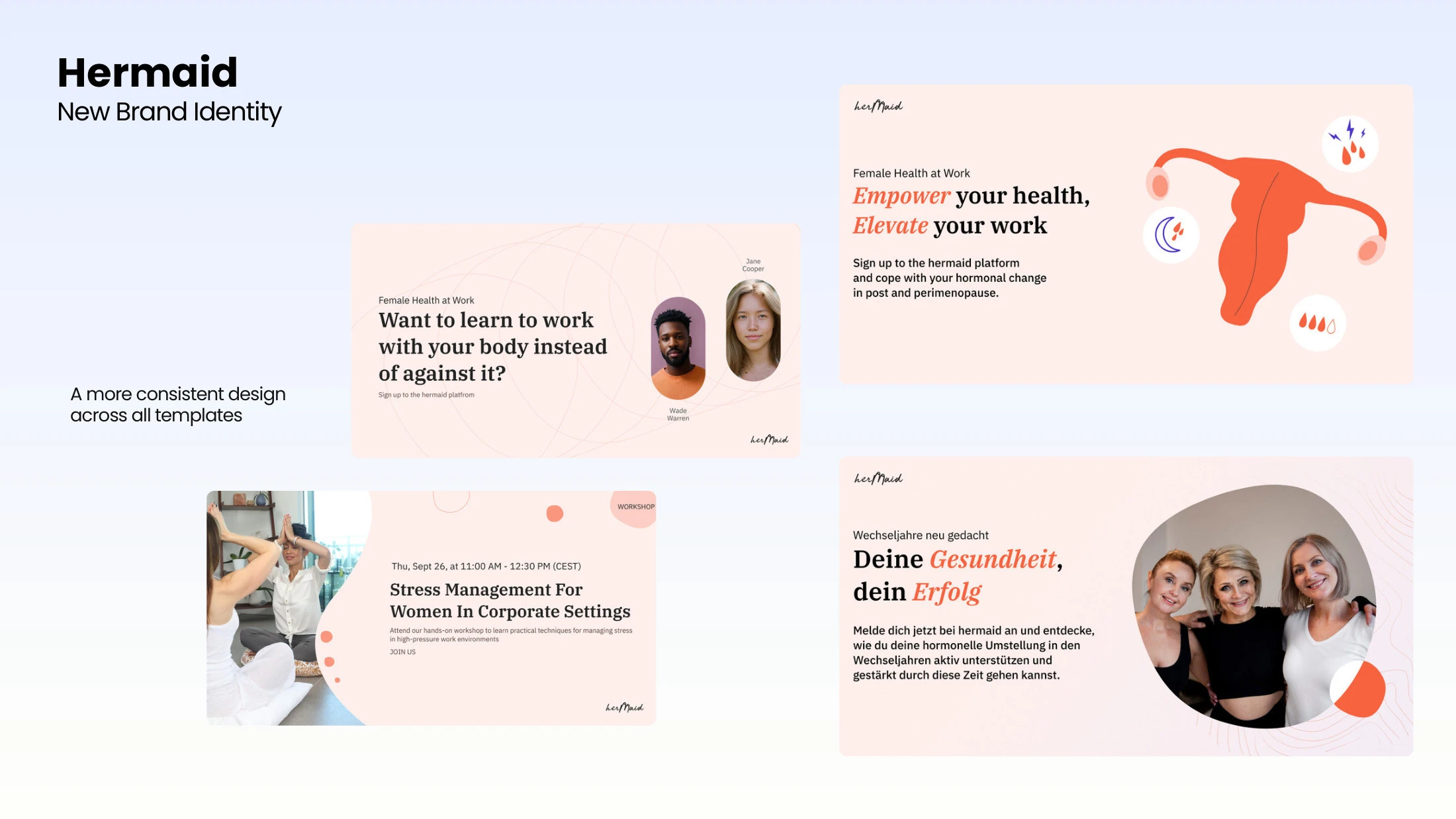
I simplified the palette into calmer, more trustworthy colors and built consistent social media templates, so the brand feels supportive instead of overwhelming.
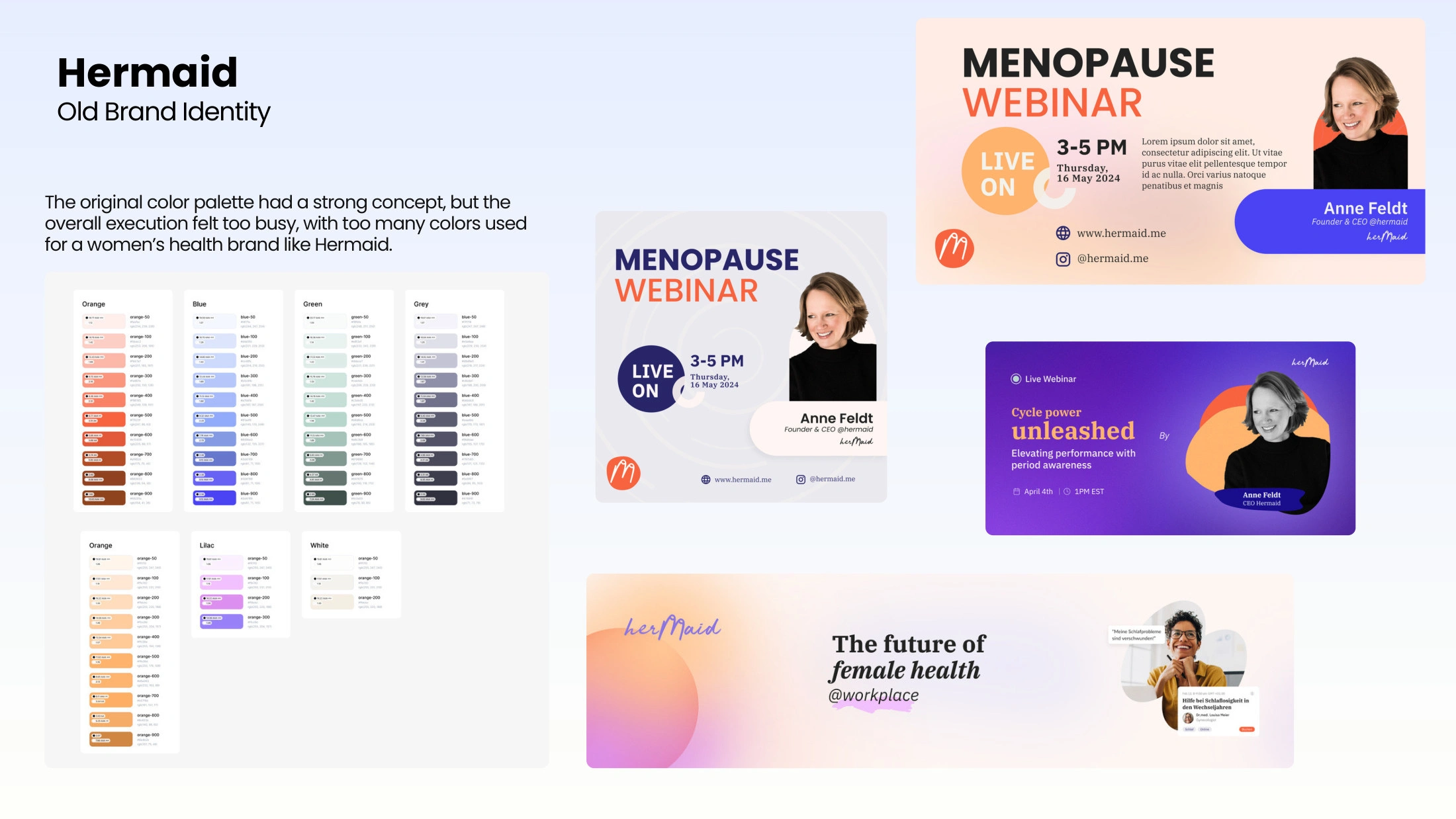
Where it started
The original palette had a strong concept, but too many colors for a women's health brand.

The redesigned version of Hermaid's Resources Page. Section: Overview
What happened next
I handed off the designs and followed the IT team while they built the page in React, with Ghost for articles. The build is on a staging link, and the launch is on hold until the Head of IT finishes changes and adds the remaining pages.
Outcome
A Resources page design that clearly segments content by audience and makes it easy to filter
A calmer, more consistent brand across web and social templates
Tools: Figma, Adobe XD. Built by the IT team in React and Ghost.
0 likes · 7 views · Jan 30, 2025
Redesigned a menopause platform's Resources page with HR and patient views, symptom filters and accessibility, plus a calmer brand palette.

