High Spiritz Brand and Package Design
Enrique Duarte Urrutia
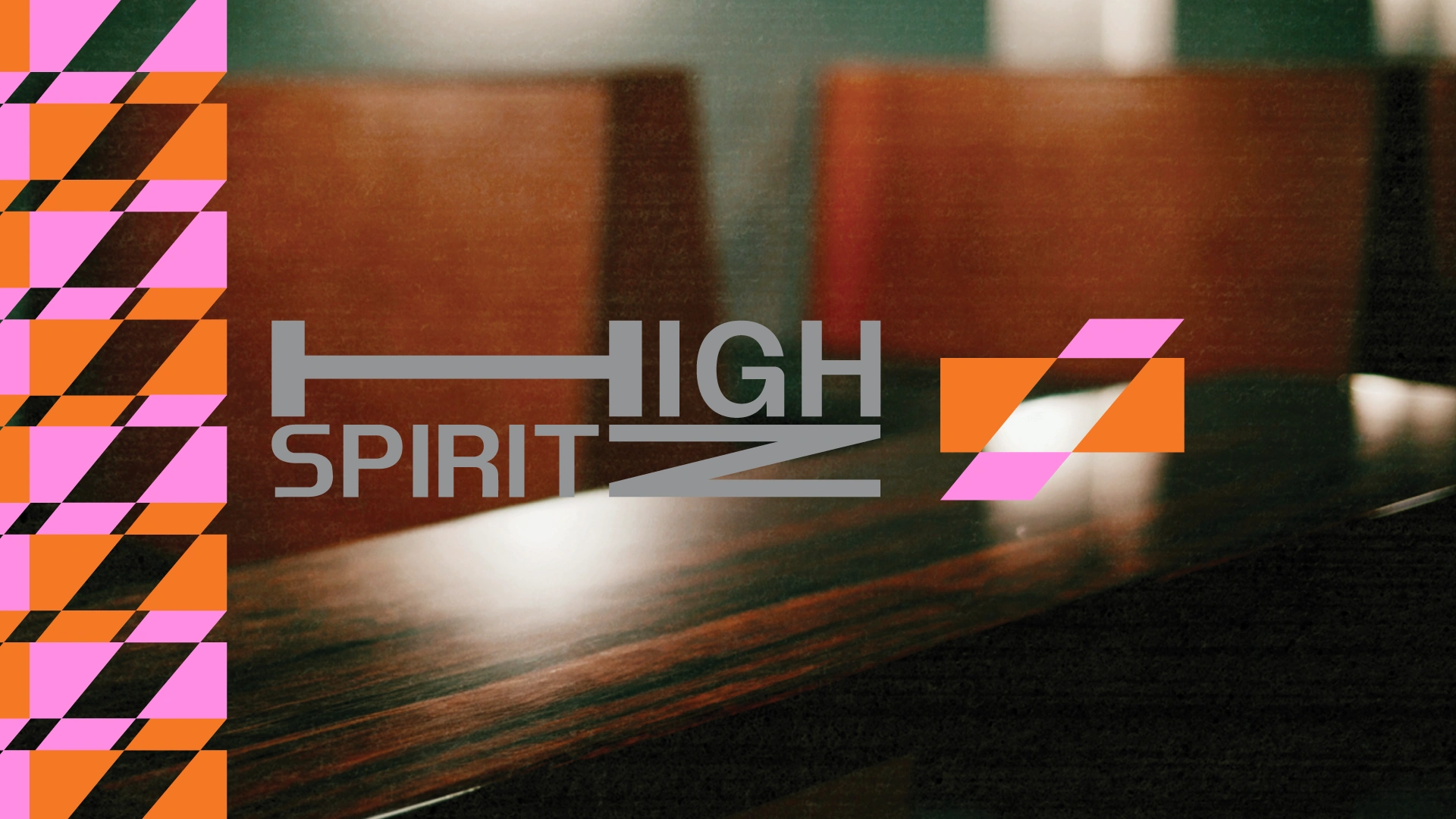
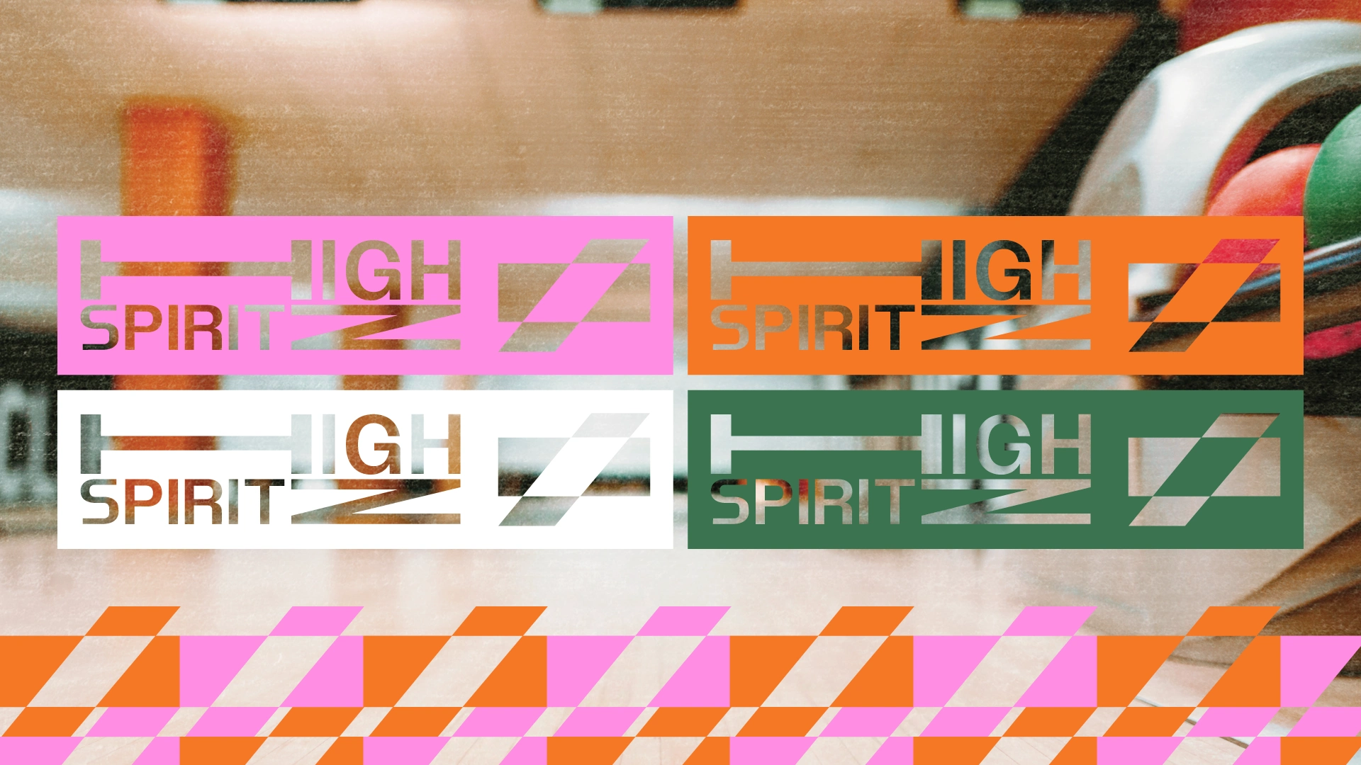
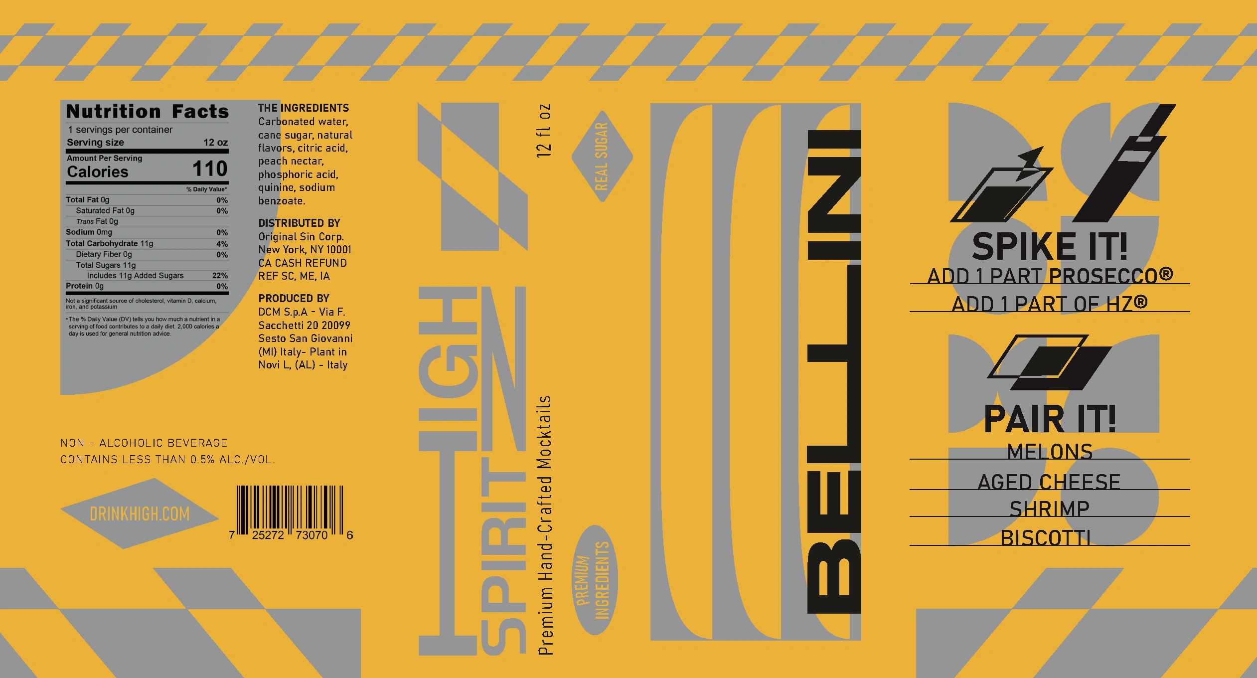
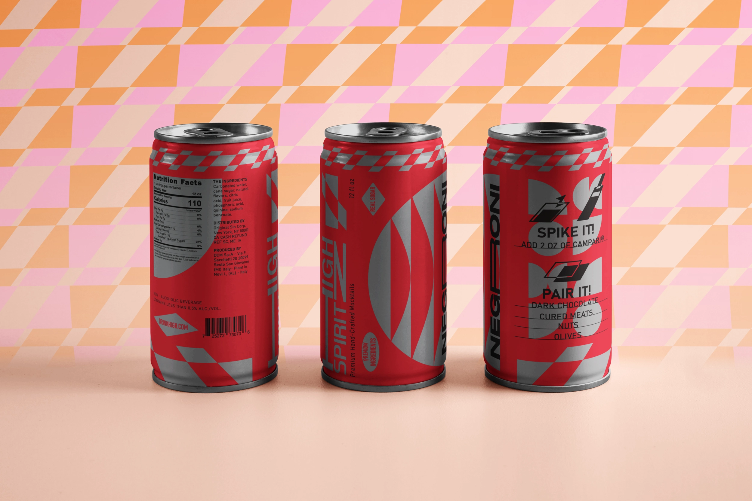
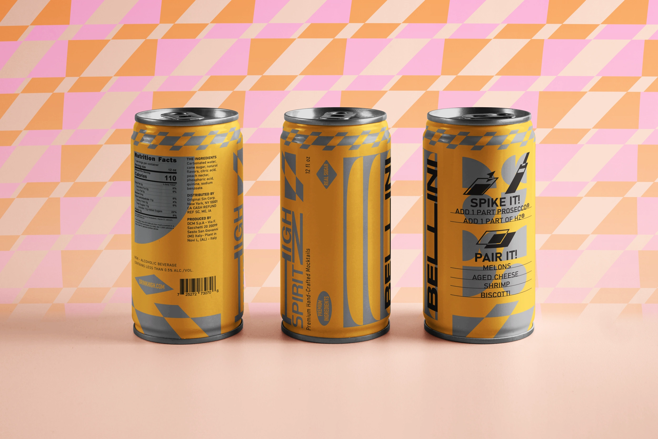
Branding for a high-end mocktail brand aimed at the recently retired, blending Italian vintage charm, Mid-Century Modern design, and Bauhaus simplicity. The wordmark plays with stretched typography, using sharp angles and negative space between the H and Z to create a distinctive mark. Each flavor is color-coded and represented by its own shape, nodding to classic cocktails. The cans include easy “spike it” instructions, making it perfect for anytime, anywhere.
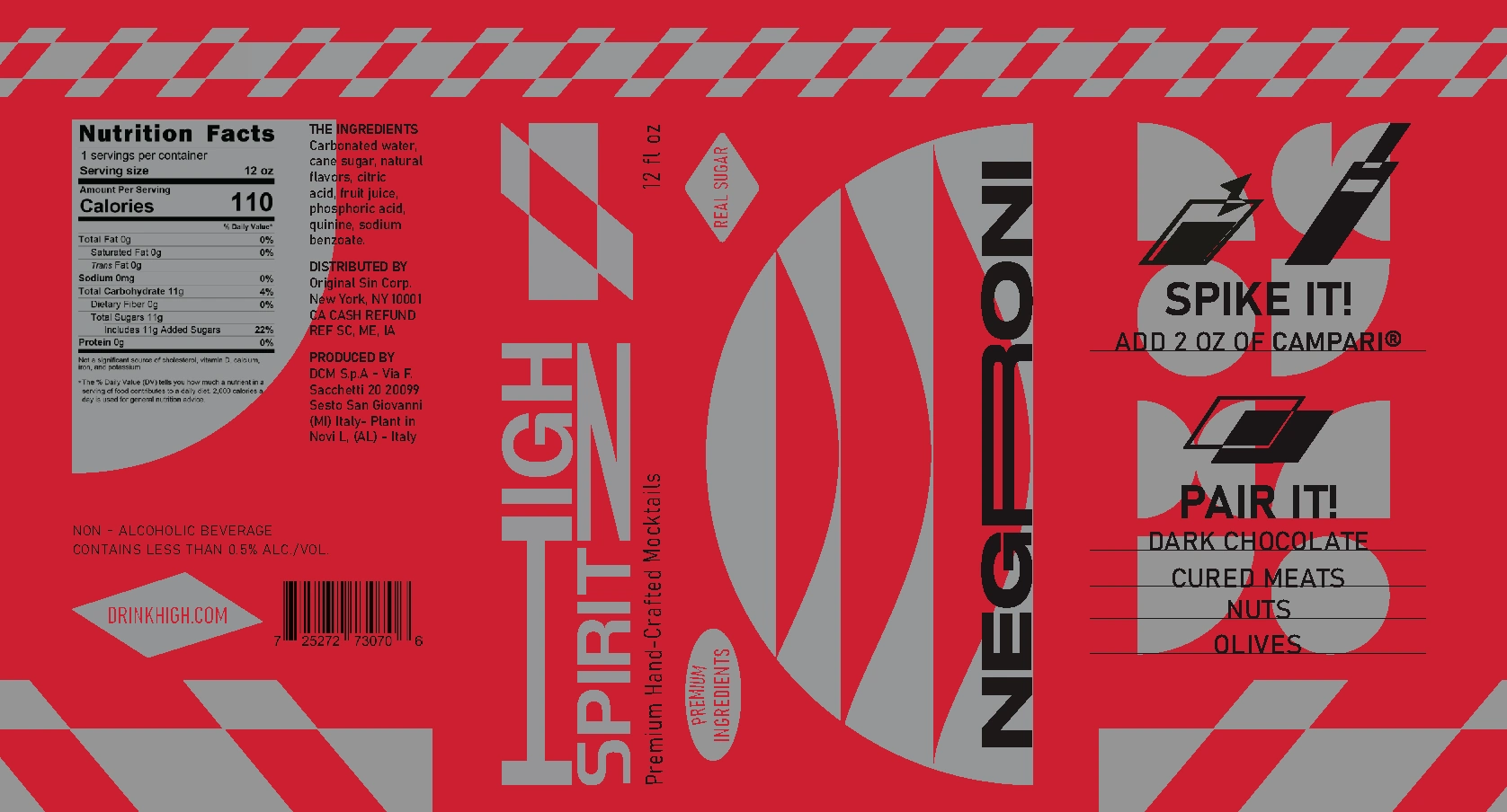
The design of the canned beverage uses shapes from the brand’s inspiration. Creating badges and patterns that matched the logo and branding. Use of the angle of the mark helped create vector objects to be added for the can design. Included pairings for the two flavors I designed to give it a more personable feeling.
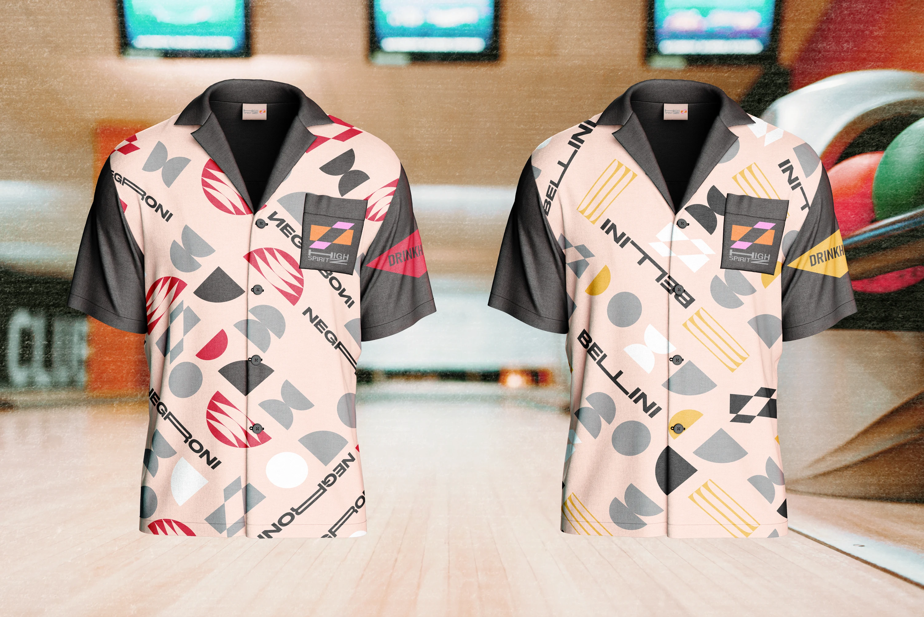
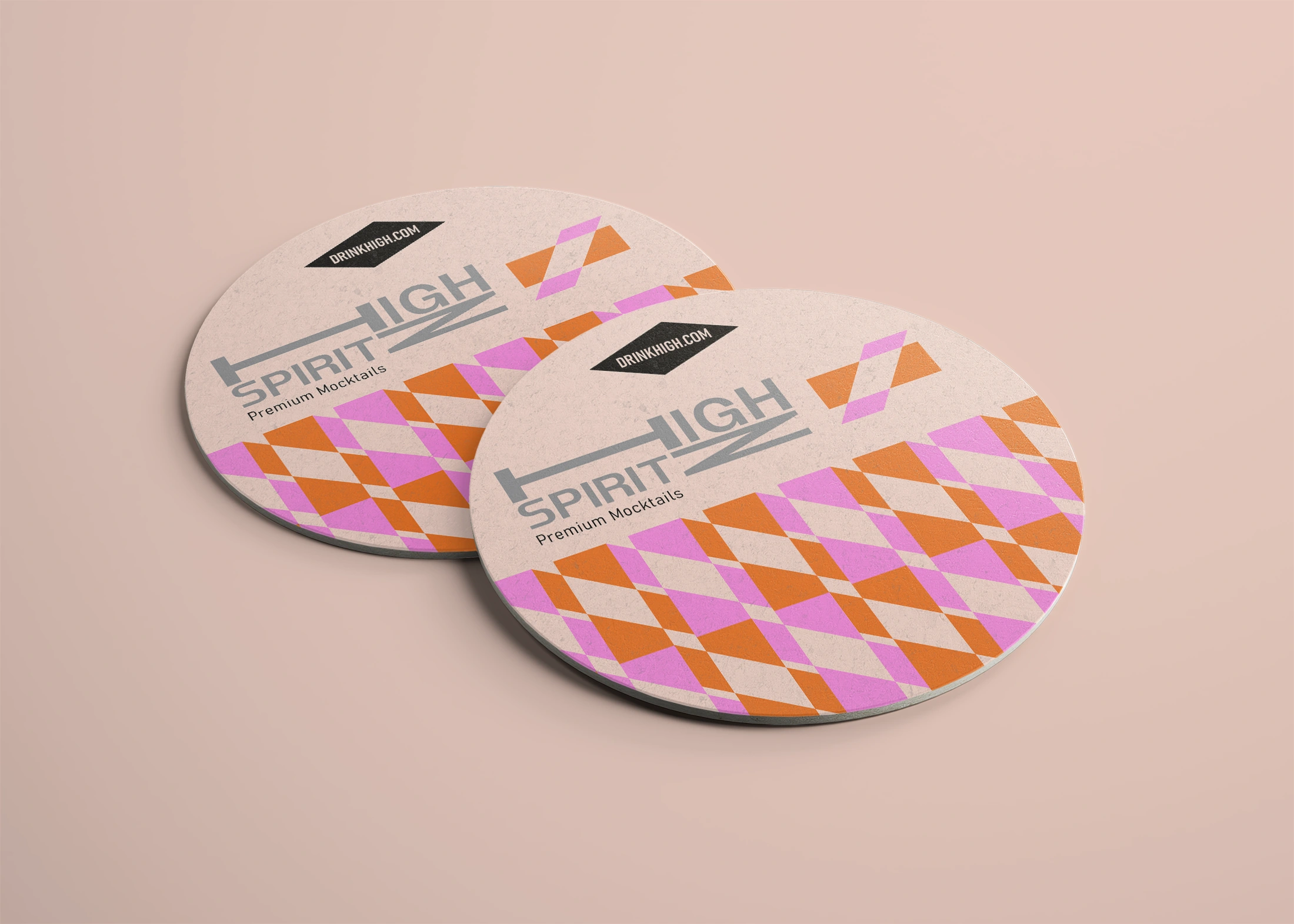
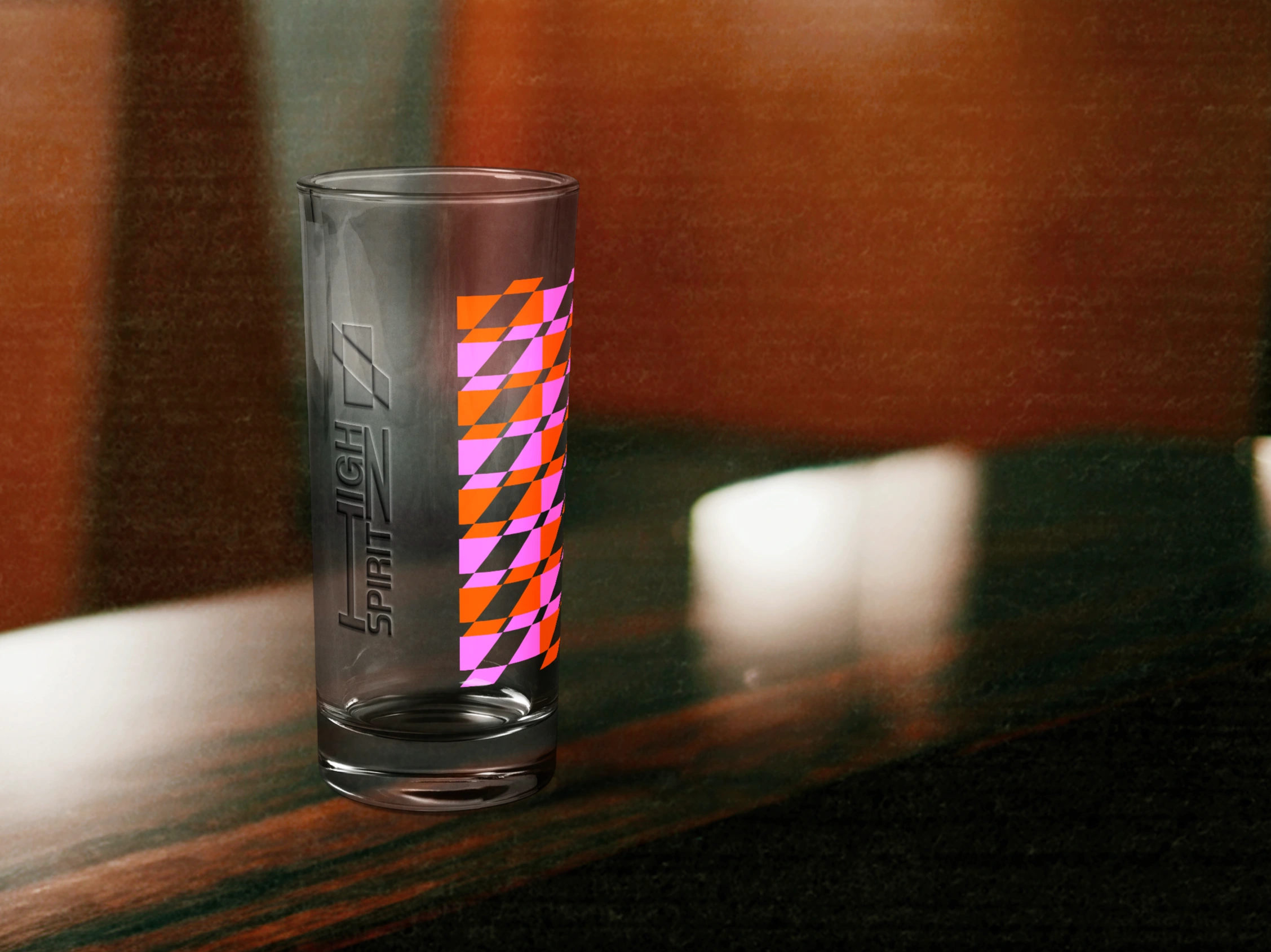
Merchandise was designed based on the user. Creating bowling shirts that match each can design since bowling is popular among the retired community. I also developed glassware and coasters that fit the lifestyle and pair well with the mocktails.
Motion graphics were created for social media use. Used the same design techniques as the can design by using the angle of the mark to create vector objects. Tried to cater towards the audience with the use of pool and card games the same way I did with the bowling shirts.
Like this project
Posted Jun 2, 2025
A premium mocktail branding that involves with the retired audience that want a drink that caters to any event. Having an option to involve alcohol.