Corporate Branding for Retropack - Zoeke
Salomi Mouton
Retropack’s Fresh Identity
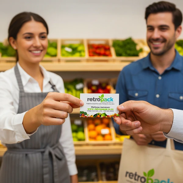
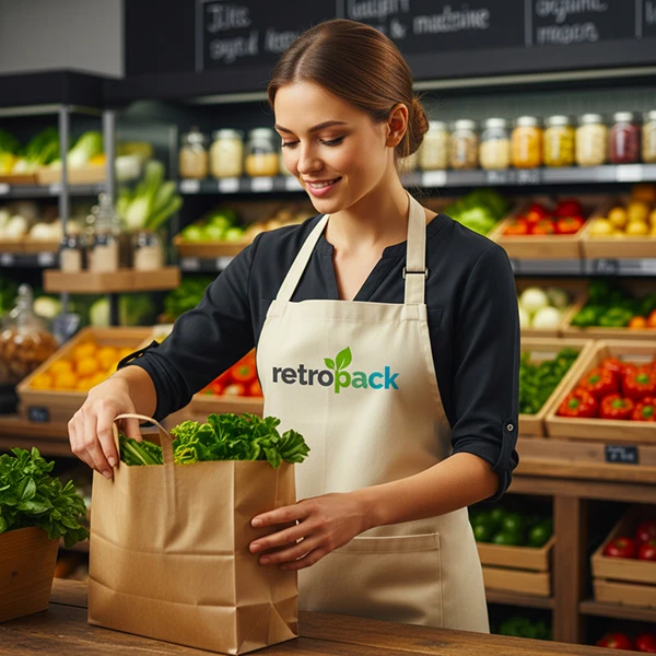
Retropack set out to bring fresh fruit and vegetables directly to people’s doors, but they wanted their brand to reflect more than just delivery, they wanted it to embody freshness, sustainability, and trust.

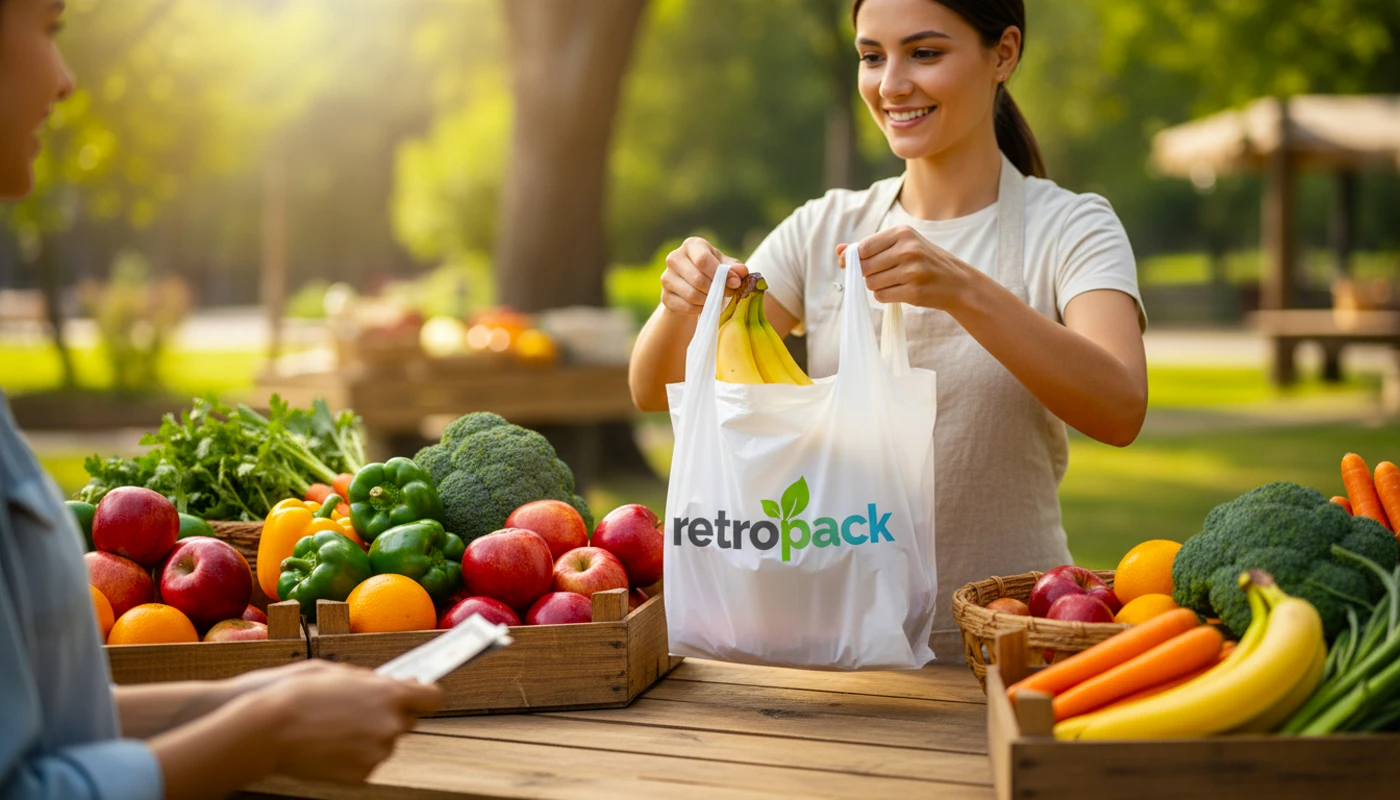
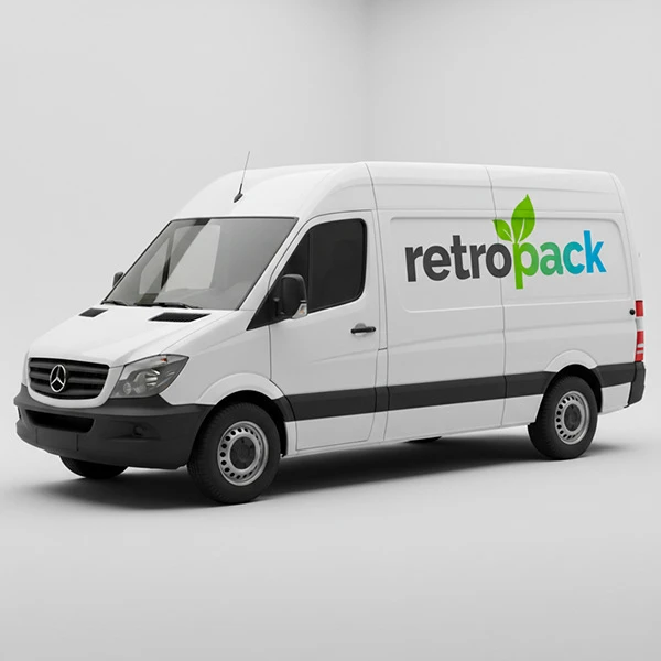
Branding: Their identity was built around the leafy “p” in the logo, symbolizing growth and vitality. A palette of greens and blues reinforced the natural, wholesome feel, while clean typography gave the brand a modern edge. Together, these elements told the story of produce that is both fresh and responsibly sourced.
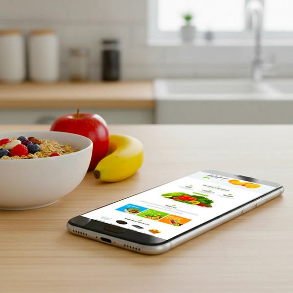
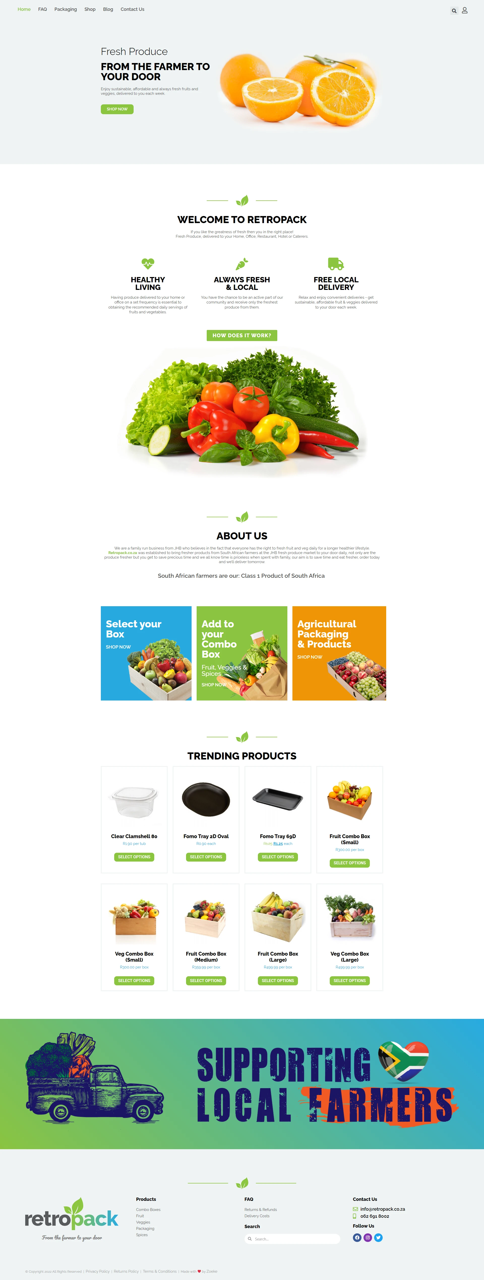
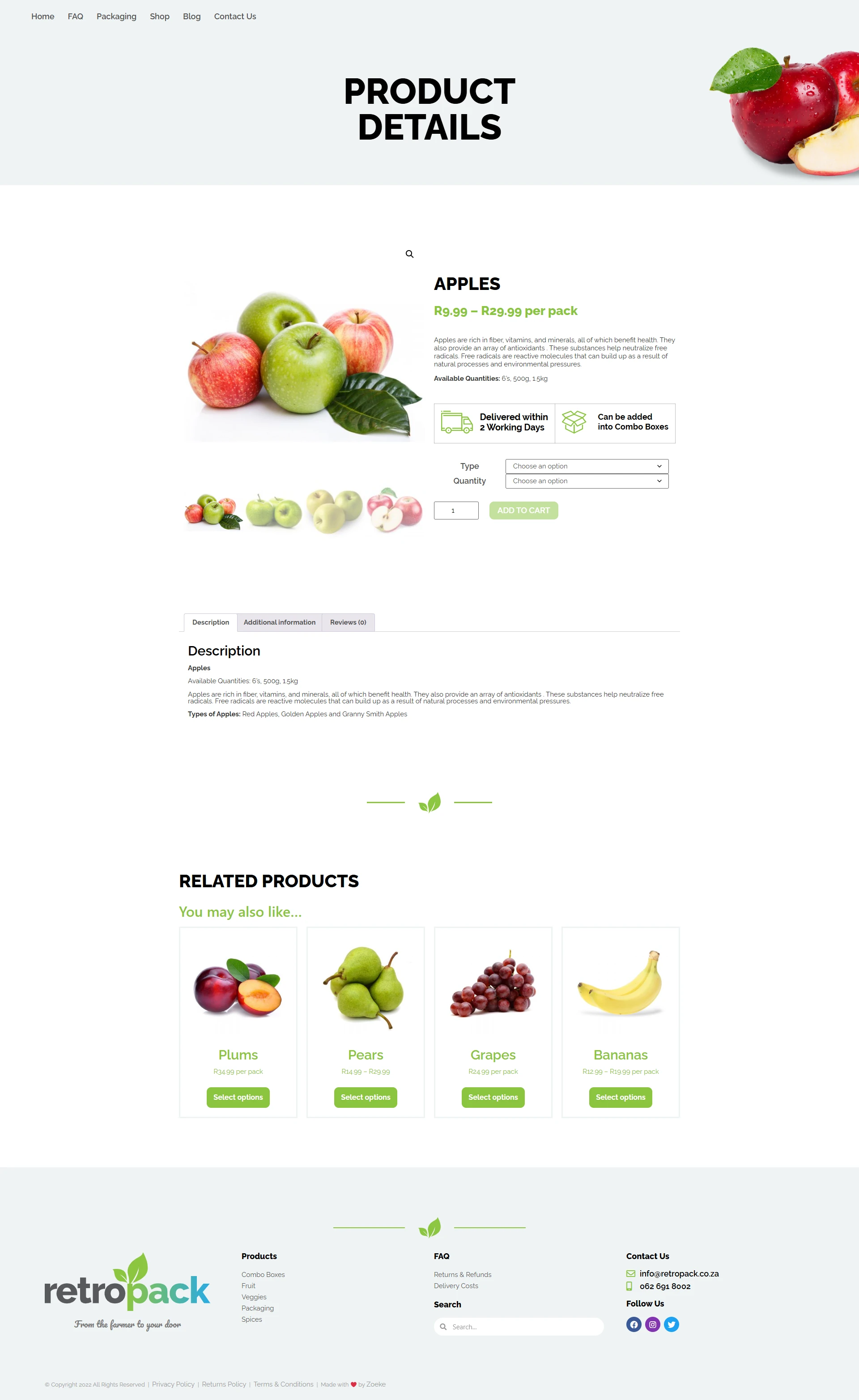
Website: Their online presence was designed to be simple, inviting, and informative. The homepage featured subtle animations of leaves unfurling, while product pages showcased seasonal produce with clear, friendly descriptions. The site emphasized convenience and transparency, helping customers feel confident about the freshness and quality of what they were ordering.
Like this project
Posted Mar 31, 2026
Corporate Branding for Retropack - Zoeke
Likes
0
Views
2