OREYN | Luxury Skincare Brand Identity & Packaging

Zarbaz Khan


OREYN — Luxury botanical skincare brand identity & packaging
Brand identity · Logo design · Cosmetic packaging · Brand guidelines
OREYN is a botanical skincare brand concept inspired by the little rituals that make everyday self-care feel more considered. The visual identity brings together refined typography, botanical details, and rich natural tones across the packaging range.
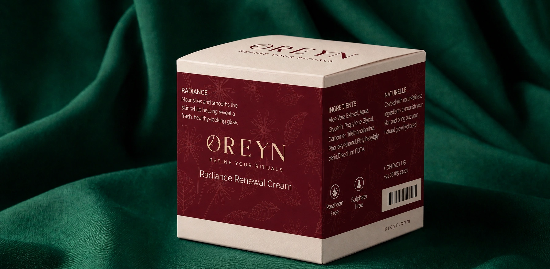
OREYN skincare cream jar packaging
The challenge
Skincare packaging has to communicate a lot in a small space: what the product is, what kind of brand it belongs to, and why someone might pick it up. With OREYN, the aim was to create a premium feel without losing the warmth of a nature-inspired brand. The identity also needed to carry across jars, tubes, labels, and boxes without looking repetitive.
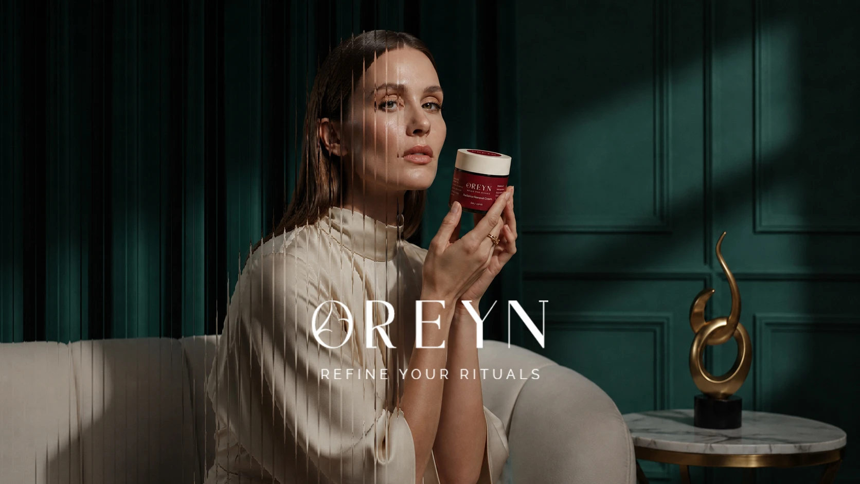
OREYN brand identity presentation
The idea — Refine Your Ritual
The direction started with a simple thought: skincare can feel like a small daily ritual. “Refine Your Ritual” became a thread connecting the visuals. The result is understated rather than clinical, with an editorial feel that gives the products room to stand out.
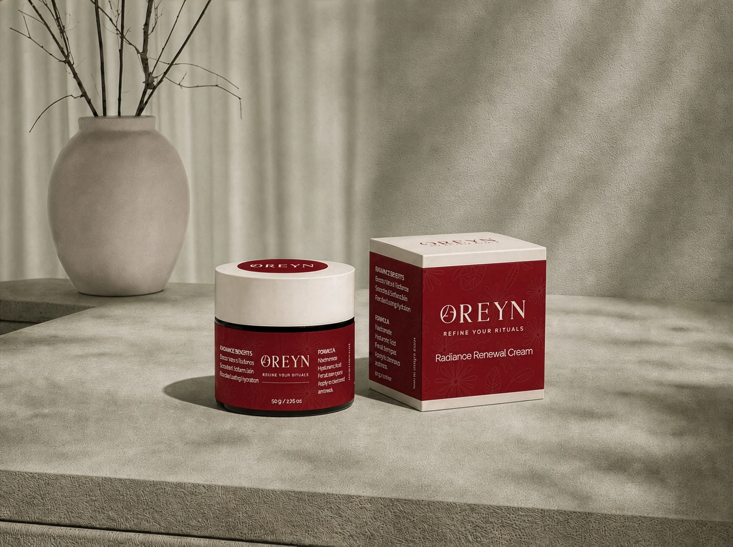
OREYN jar and box packaging
Logo & visual identity
The OREYN wordmark uses an elegant typographic style, with careful spacing and proportions. Supporting logo variations give it flexibility across different placements, from product labels to larger brand applications.
Burgundy brings a distinctive, confident note; ivory keeps the layouts light; and natural green connects the system to its botanical inspiration. Delicate leaf and stem illustrations add texture without competing with the product information.
Packaging design
The identity was developed for multiple cosmetic formats, including cream jars, tubes, serum labels, and product boxes. Across each application, the same typographic hierarchy, palette, and botanical elements help the range feel related, while leaving space for individual product details.
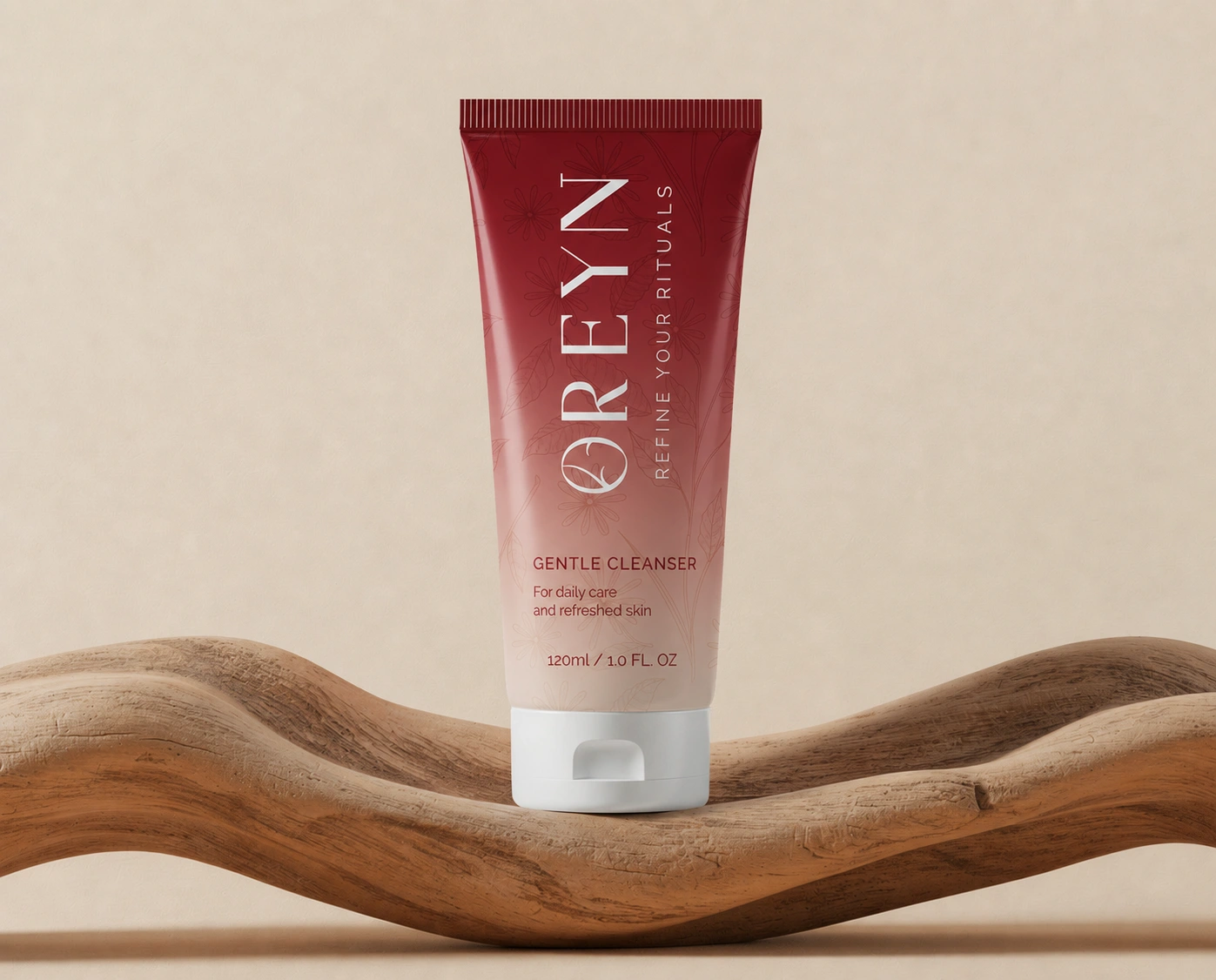
OREYN skincare tube packaging
Brand guidelines & applications
A visual guideline system brings the logo, colors, typography, patterns, and illustrations together. It gives the brand a practical foundation for future packaging, campaign graphics, and digital touchpoints.
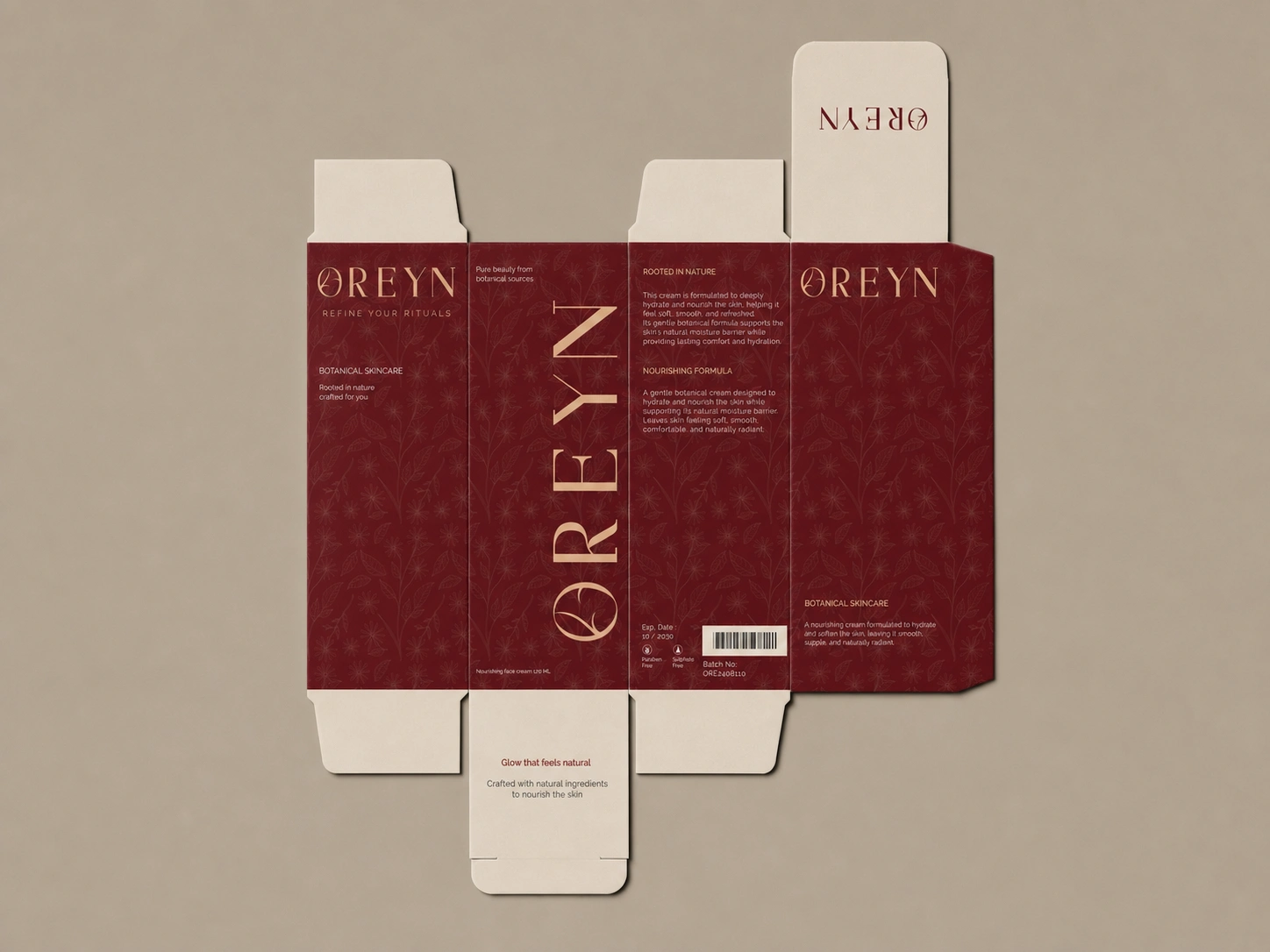
OREYN brand guidelines and visual identity sheet
The result
OREYN brings its botanical inspiration into a cohesive luxury skincare identity, from the wordmark and supporting graphics to the finished packaging presentations. The project shows how a consistent design language can make a product family feel recognizable across formats.
Building a skincare, beauty, wellness, or DTC brand? I work on brand identities, packaging, and visual systems. Feel free to get in touch about your project.
Like this project
Posted Sep 29, 2026
Luxury skincare brand identity and cosmetic packaging for OREYN, featuring a custom logo system, brand guidelines, botanical illustrations, jar and tube labels, and premium product mockups for a cohesive DTC beauty brand.