US Flight Analysis and Visualization with Tableau
Flight cancellations can easily become a traveler's nightmare, often inciting frustrations and unwarranted inconveniences.
In the United States, the Department of Transportation's (DOT) Bureau of Transportation Statistics tracks the on-time performance of domestic flights operated by large air carriers.
In this project, I developed an interactive dashboard with Tableau built on the DOT 2015 dataset of flight delays and cancellations.
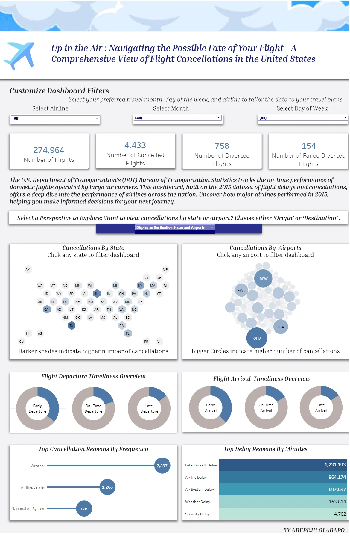
What was my analysis focused on?
While the obvious answer lies in examining flight cancellations, I delved deeper, considering various angles to visualize the data.
A significant aspect of my analysis aimed to spotlight the performance of different airlines across states. Converting raw numbers into compelling visuals was paramount.
Why did I choose to showcase this?
Despite the 2015 dataset serving as historical data, it holds relevance for travelers seeking insights into potential flight disruptions. Empowering flyers with this knowledge was a key motivator. Thus, I ensured the dashboard offered flexibility, enabling users to fine-tune their selections, down to specific details like the day of the week they plan to travel.
Additionally, I aimed to provide users with seamless navigation, enabling them to switch perspectives effortlessly within the dashboard, and eliminating the need to navigate through multiple pages.
Like this project
Posted Mar 19, 2024
Flight disruptions analyzed from DOT 2015 dataset. Visualizing airline performance for empowered travel decisions. Flexible, seamless Tableau dashboard.
Likes
0
Views
77

