
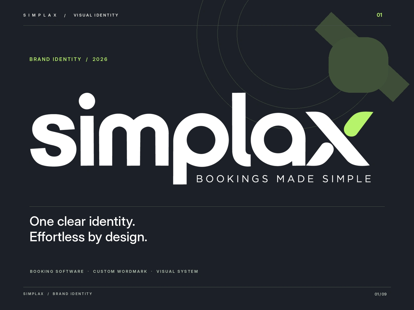
Overview
Simplax is an online booking and scheduling platform for service businesses such as salons, barbers, cleaners, personal trainers and groomers, from independent professionals to small teams. It brings a booking page, a shared calendar and a team rota into one simple app.
The identity needed to carry the same promise: clear, calm and reliable from the first glance.
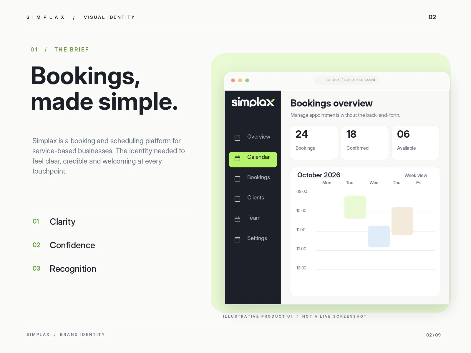
The brief and the three principles that shaped the identity.
The challenge
Booking software tends to look alike. Calendar grids, checkmarks and clock faces are everywhere, which makes it hard for any one product to be remembered.
Simplax needed to step away from those clichés without losing trust: a mark simple enough to read at favicon size, distinctive enough to own, and professional enough for a business to put its own name beside. The direction was guided by three principles from the brief: clarity, confidence and recognition.
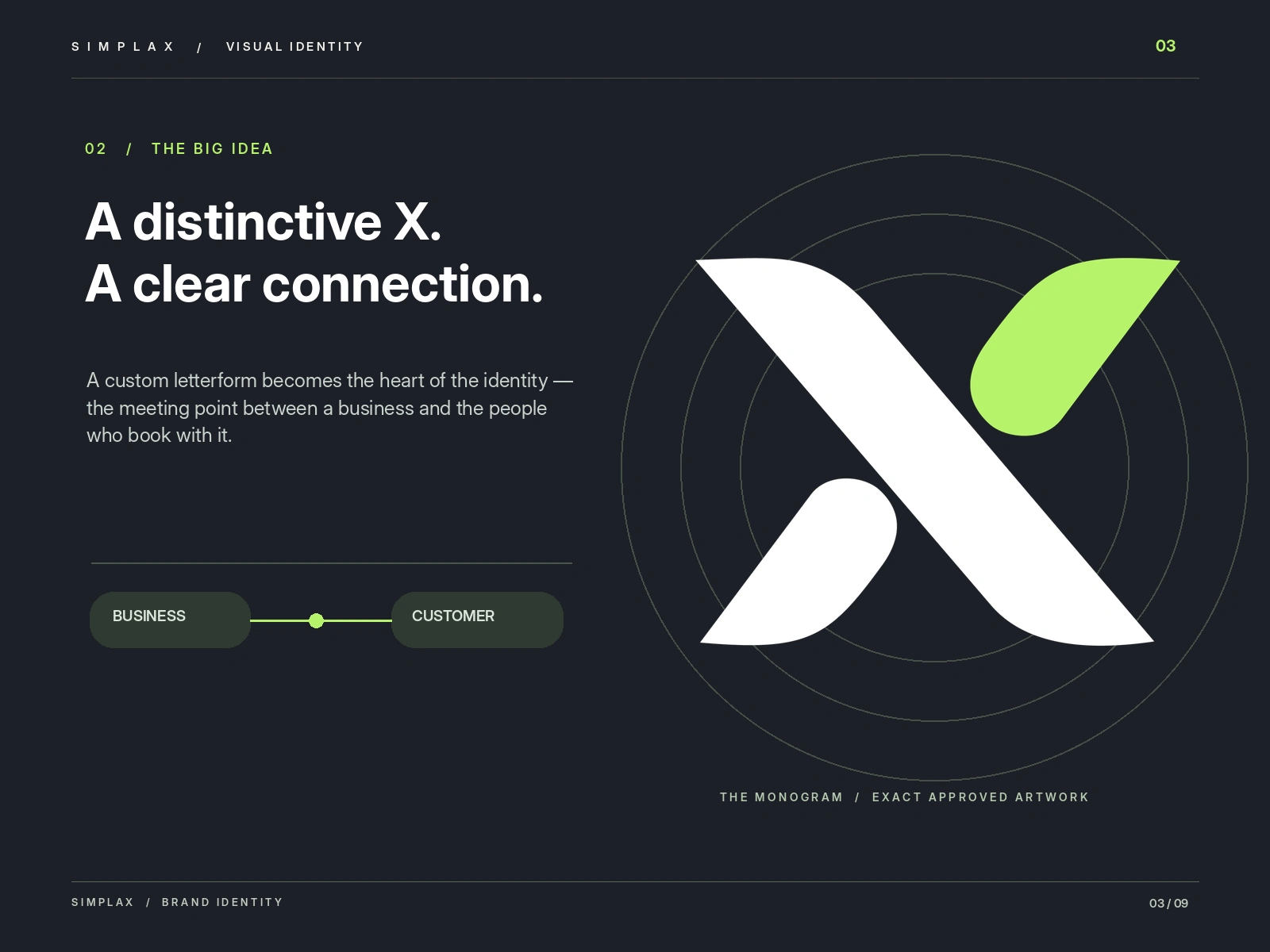
Concept 03, Smart Wordmark: the custom X at the heart of the identity.
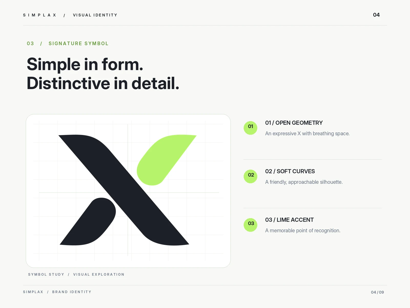
Symbol study showing the geometry behind the X.
The concept: a smart wordmark
The chosen direction is a lowercase wordmark with one custom-drawn letter. The X brings two sides together, the business and the customer, and the point where they meet stands for the moment availability becomes a confirmed appointment.
Building the logo
Lowercase letterforms keep the tone approachable and easy to read. The X is built from open, geometric strokes with soft curves and a single lime accent, balanced against the weight and rhythm of the other letters so the name reads as one confident unit. Because the X carries the idea, it also works on its own as a recognisable symbol.
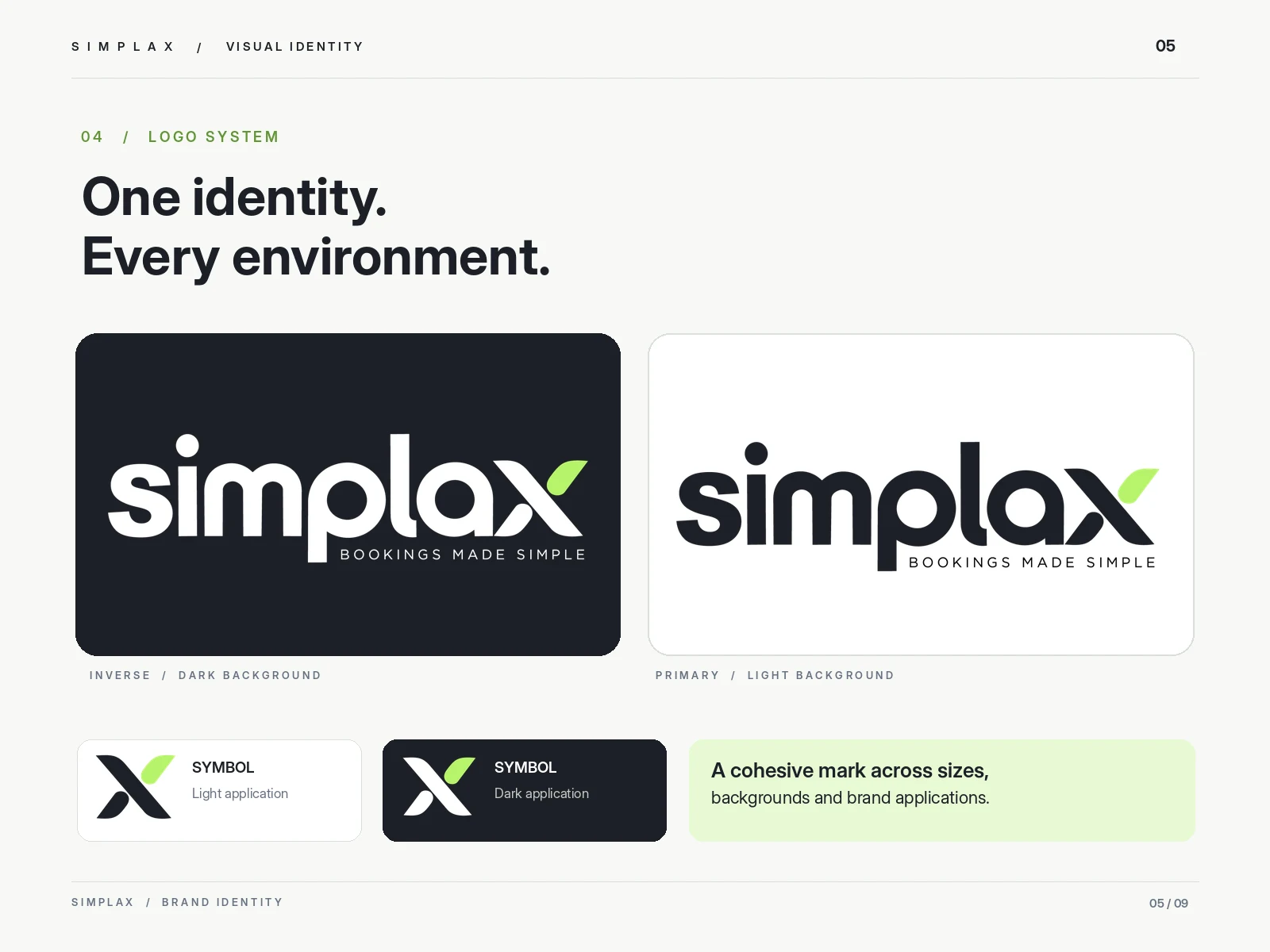
Primary and inverse wordmarks, with the standalone symbol for light and dark backgrounds.
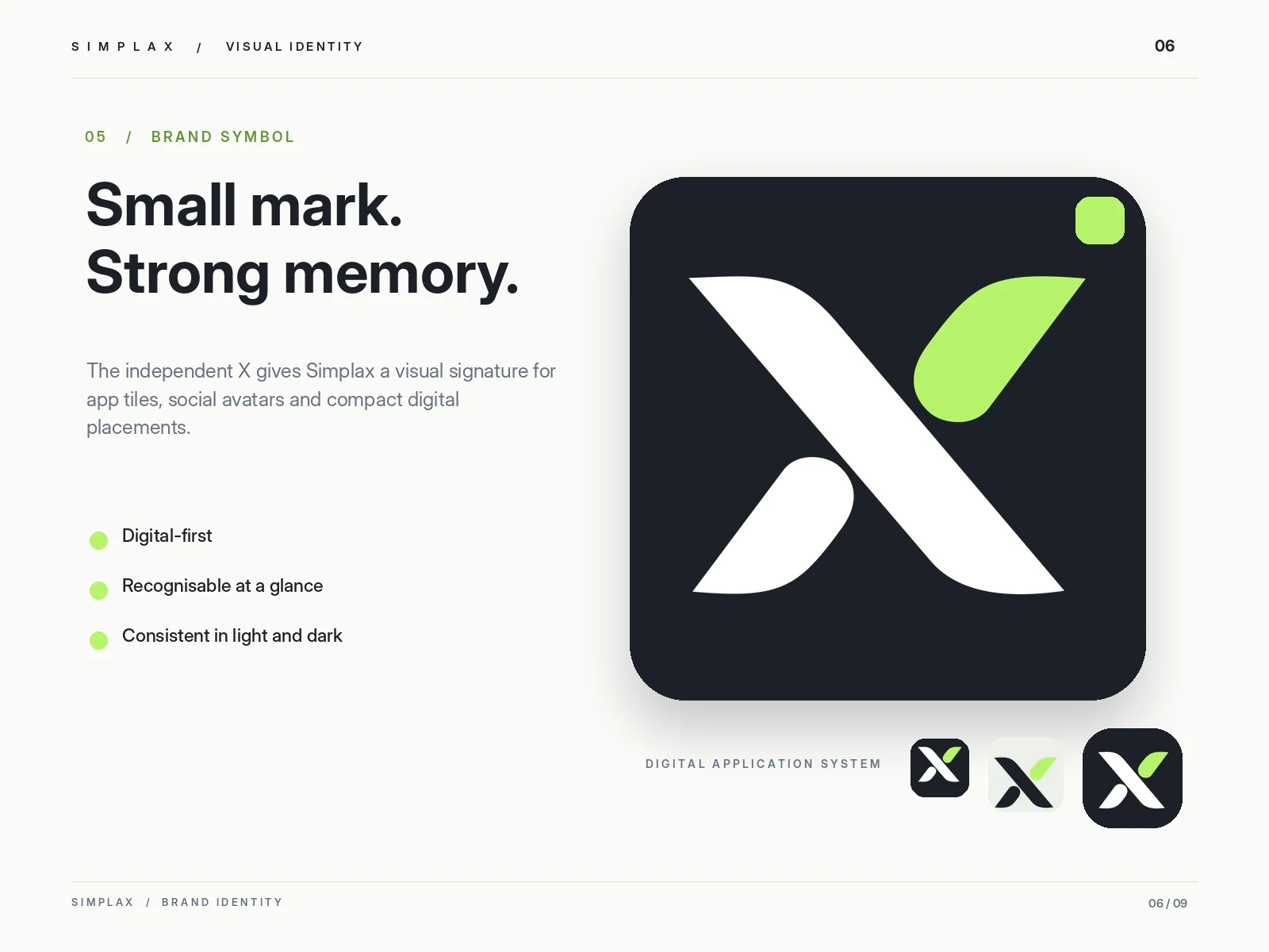
The independent X for app tiles, favicons and social avatars.
Colour and type
Deep Ink #1C1F26 gives the brand a confident, professional base. Fresh Lime #B7F36B is the accent: used sparingly, it adds energy and becomes the most recognisable detail of the identity. White keeps every screen clean, with Soft Paper #F7F8F5 and Slate #667080 as supporting tones. Inter Display is proposed as the supporting UI typeface.
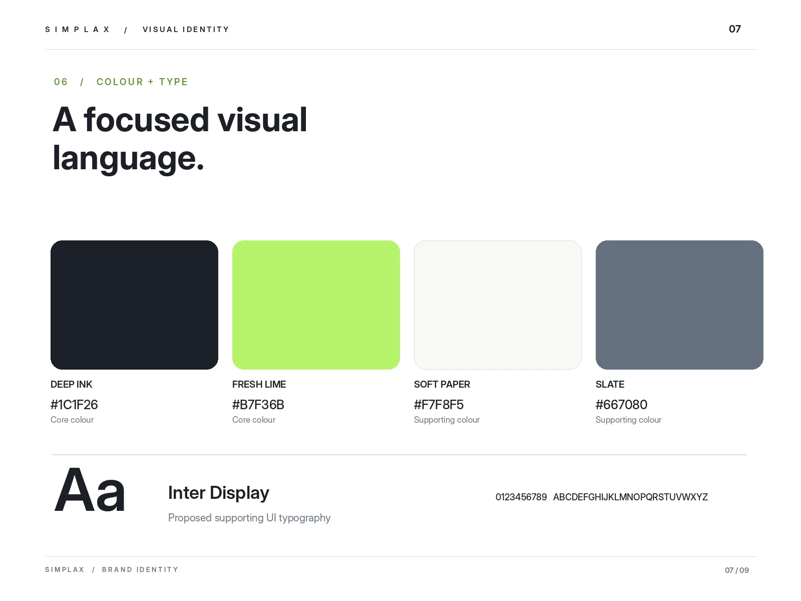
Two core colours, two supporting tones and a proposed UI typeface.
In context
To test the system, the identity was applied to concept screens for a booking dashboard and a mobile booking flow. They are illustrative mockups, not live product screenshots, showing how the brand holds up across real digital touchpoints. The wordmark is also in use on the live Simplax website.
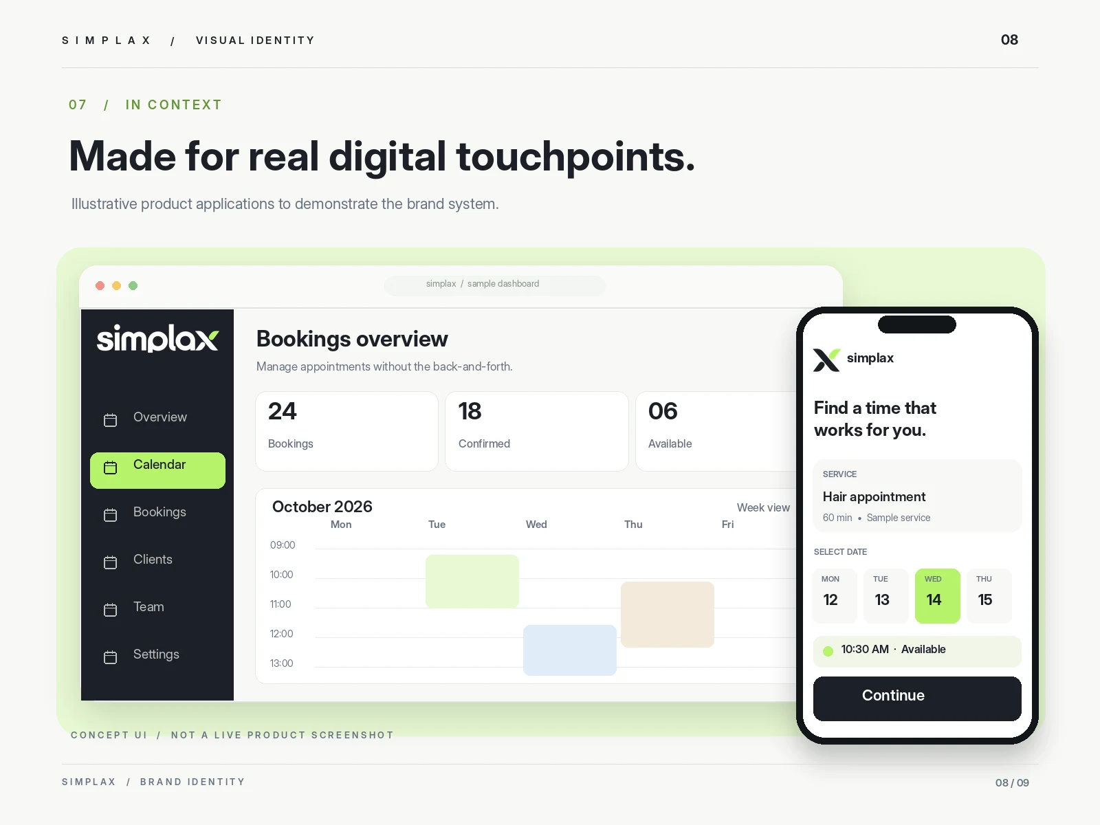
Concept UI for a booking dashboard and mobile booking flow. Not a live product screenshot.
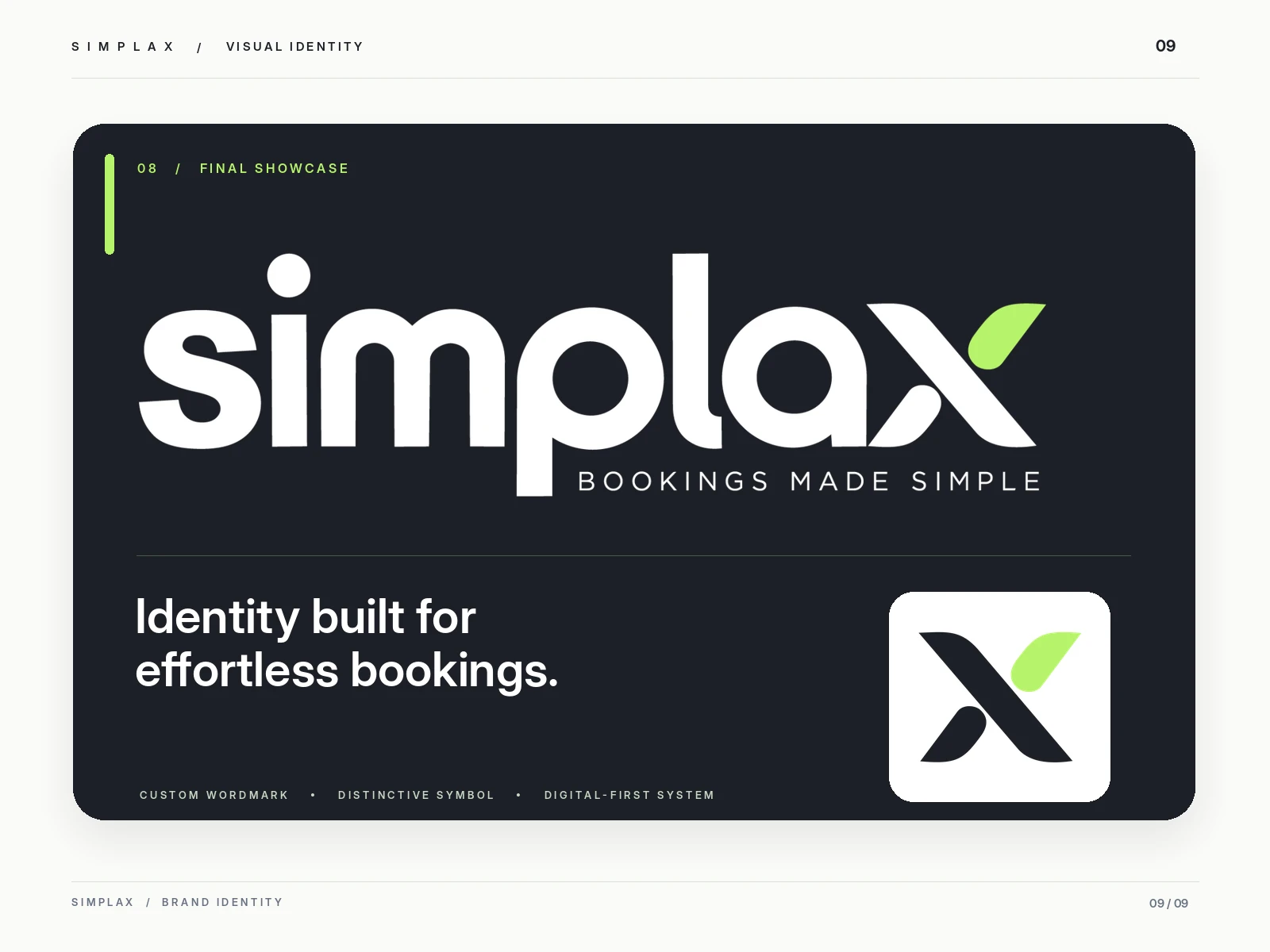
Final showcase: wordmark, tagline and symbol together.
Outcome
A complete, digital-ready identity for Simplax, built around one idea that lives inside the name.
Custom lowercase wordmark and tagline lockup
Standalone X symbol
Core and supporting colour palette
Logo variations for light and dark backgrounds
App icon and compact digital marks
Digital application concepts
Brand presentation assets
0 likes · 1 view · Oct 10, 2026
A distinctive brand identity for a modern booking platform, built around simplicity, seamless connections, and effortless appointment scheduling.


