Brand Refresh
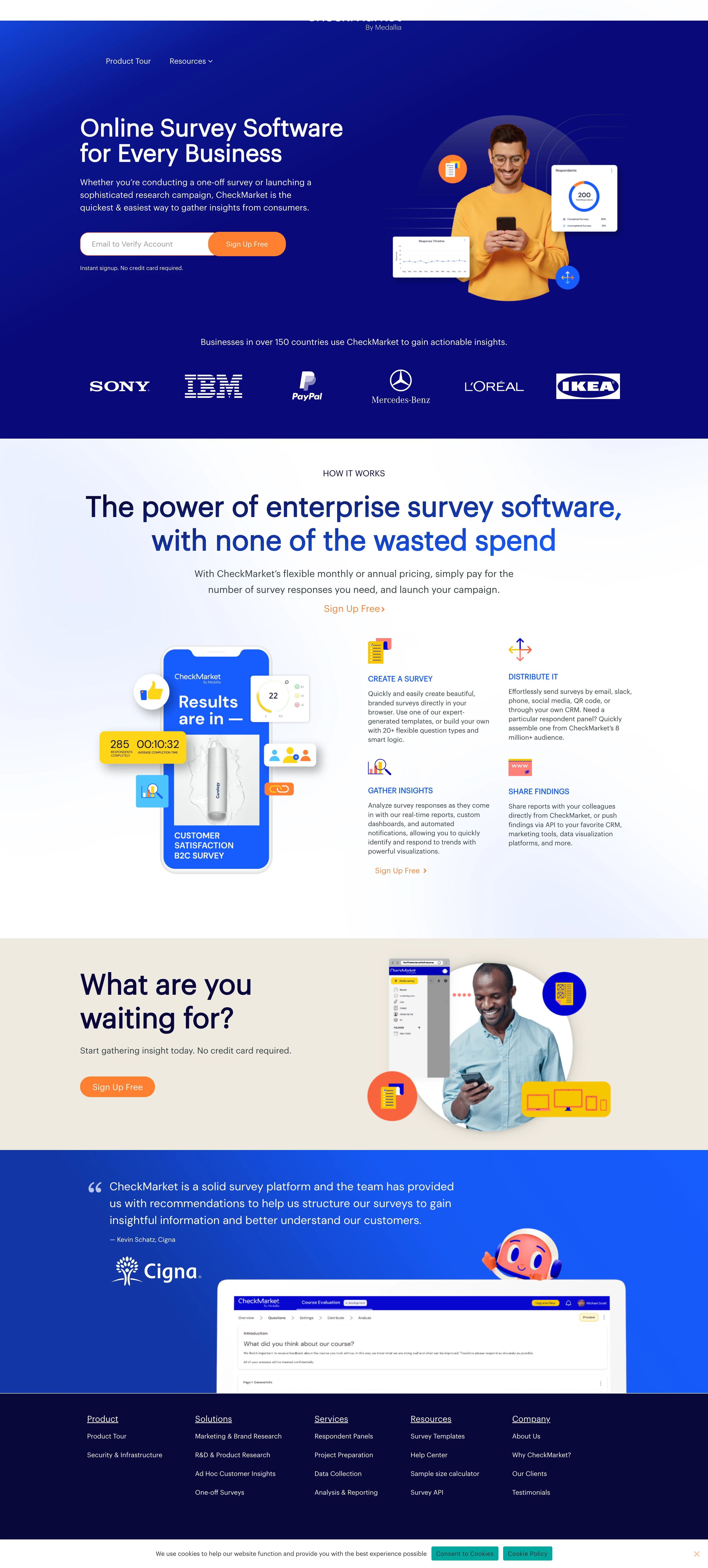
As a leading survey creation software in Europe coming off of a major acquisition deal, CheckMarket owns a significant amount of the market share in its space amid a gaggle of trailing competitors. However, the brand needed help showing its unique perspective through a visual identity.
We started exploring opportunities to bring the CheckMarket brand to life visually, from evolving their logo to pulling in a color palette and typography set that felt as fresh and innovative as their product itself. A software brand should have an identity that can be fully expressed through its UI—so that’s exactly what we did. Clean iconography gave the brand the ability to communicate with users visually and dispel any confusion about taking advantage of the software’s full lineup of features. And the face to tie it all together? An adventurous mascot, Rick the Explorer, makes it his mission to guide users through the software frontier.


Like this project
Posted Jul 22, 2024
Combining Sage and Jester archetypes, CheckMarket is a friendly, modern brand with an energetic, witty interface. This guide shows how our creative sets CheckMa
Likes
0
Views
5


