Playful Visual Identity for Mike’s Cream
GFX ProHub
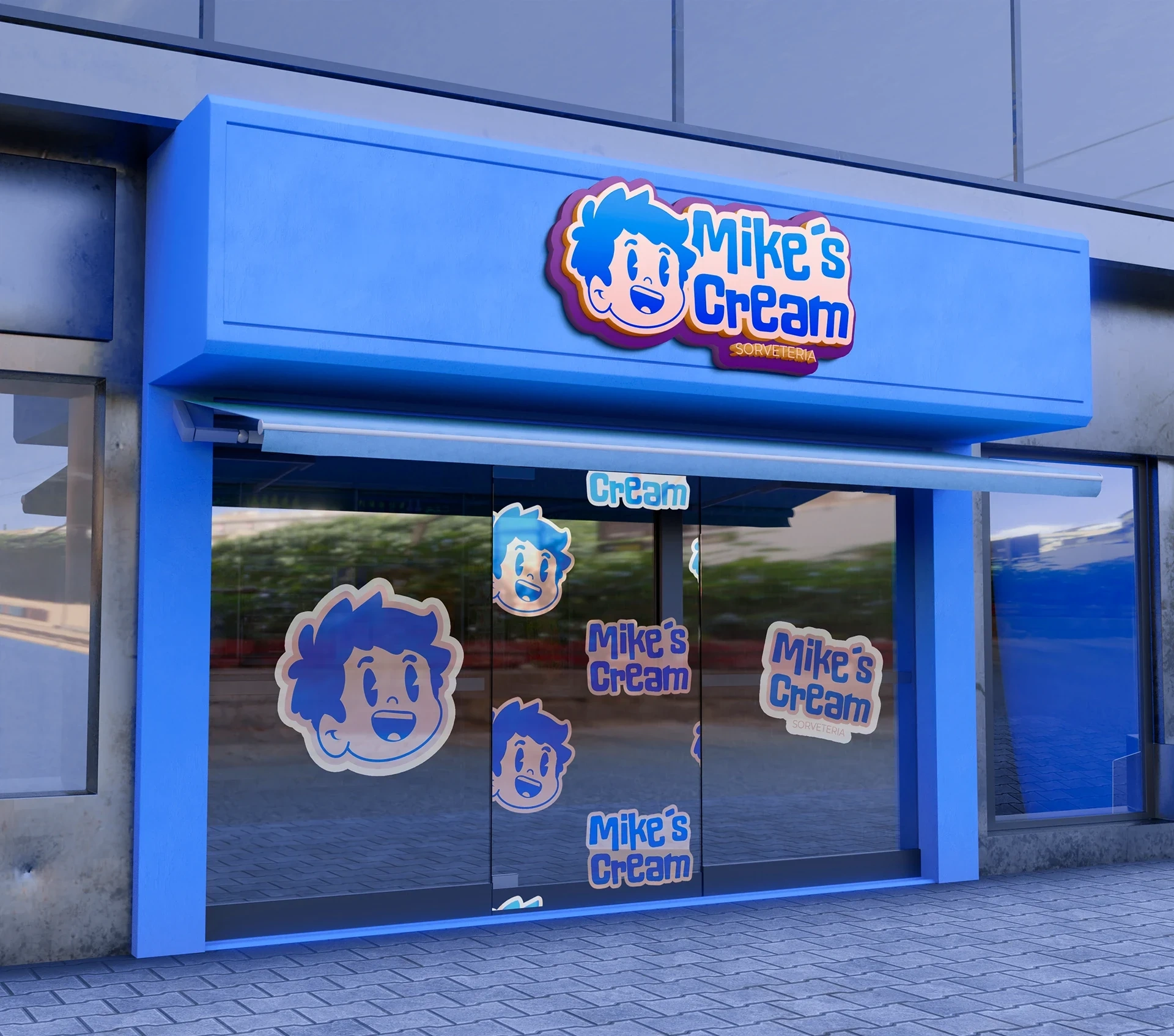
Mike’s Cream – A Playful and Nostalgic Visual Identity for a Brazilian Ice Cream Experience
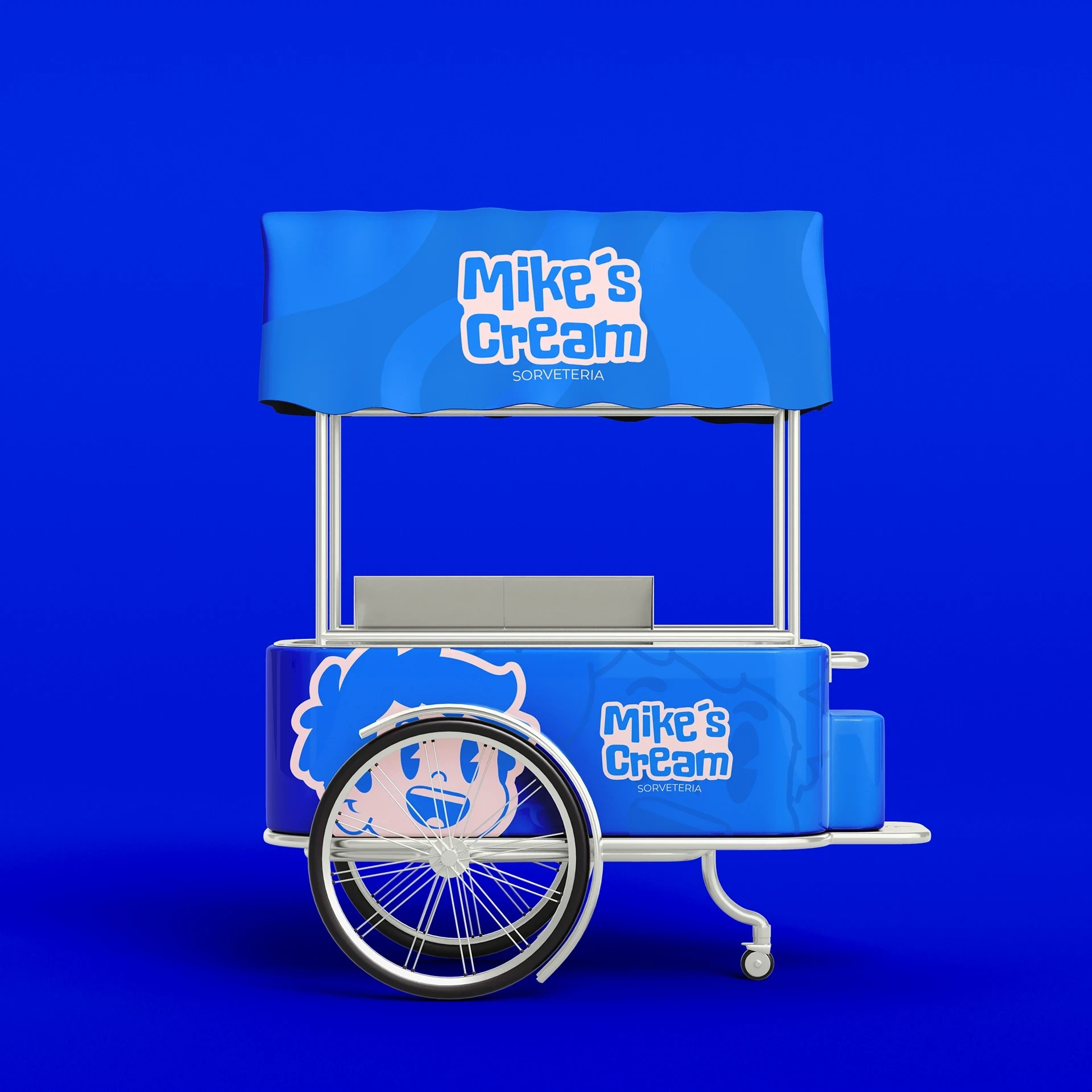
Mike’s Cream is more than just an ice cream shop—it’s a joyful experience rooted in flavor, tradition, and creativity. The visual identity was designed to reflect the brand’s personality: fun, fresh, and full of heart. Inspired by vintage American diners and classic Brazilian sorveterias, the branding blends retro aesthetics with modern sensibilities to create a vibrant and memorable look.
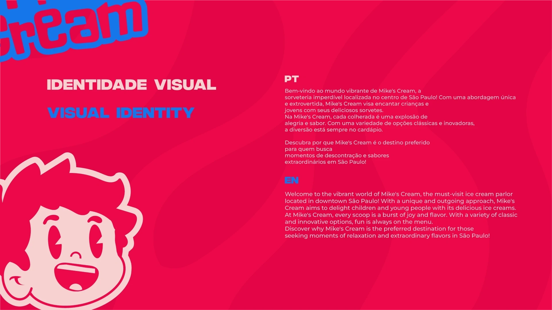
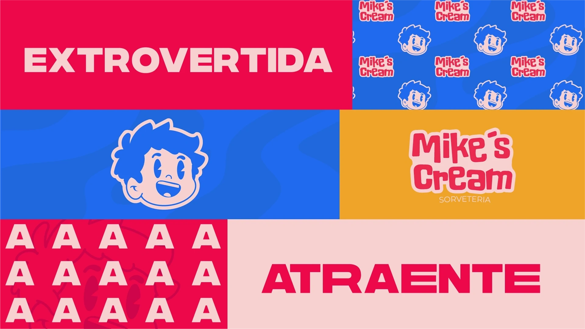
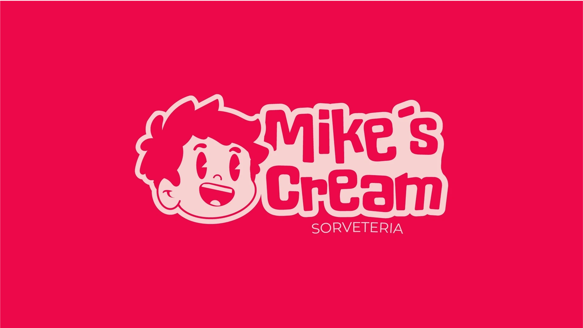

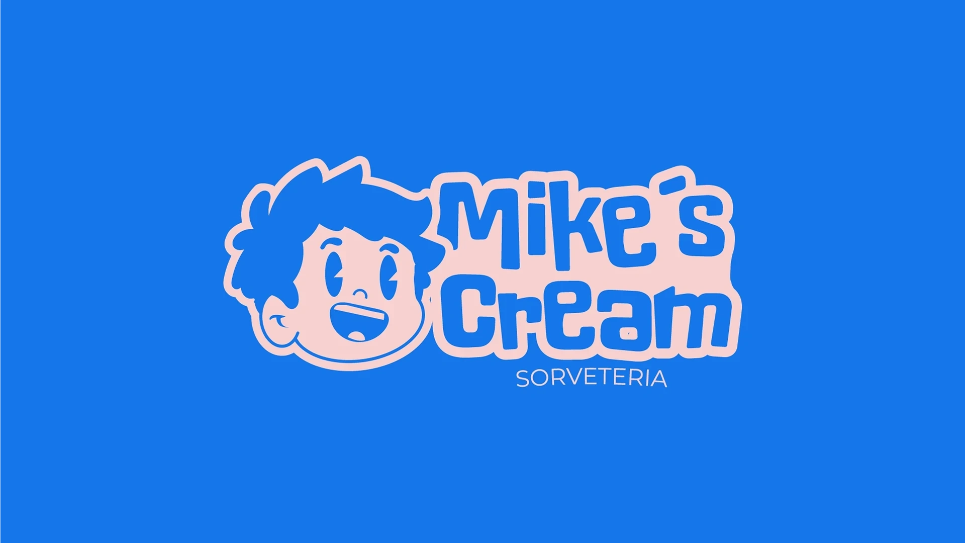
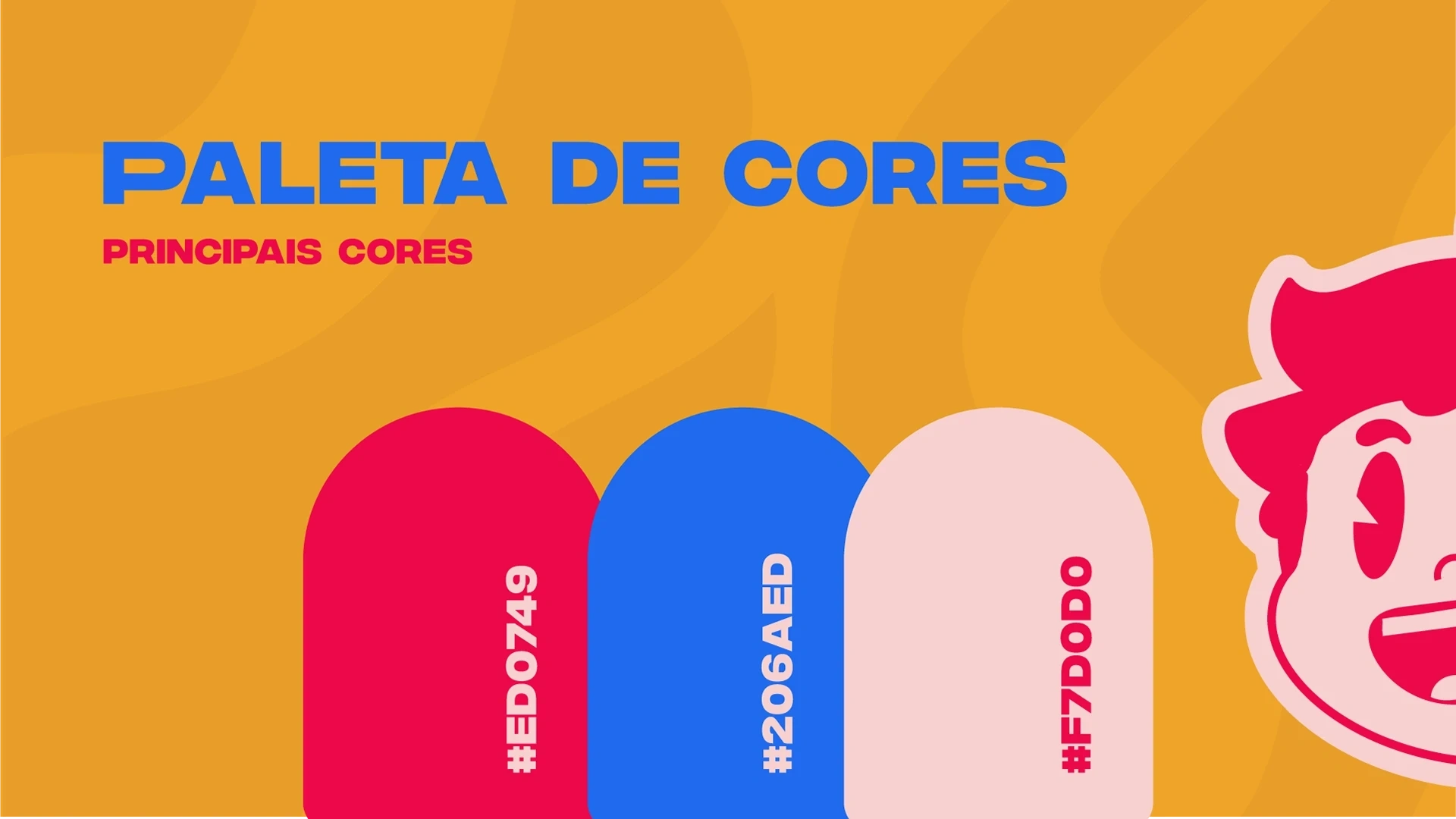
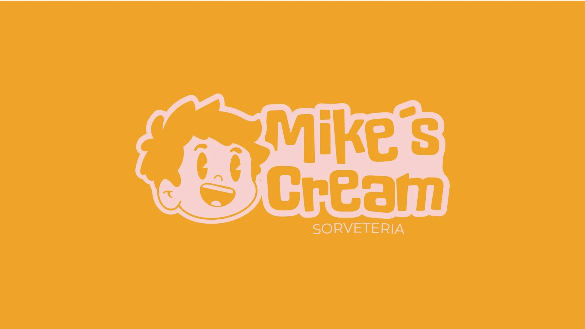
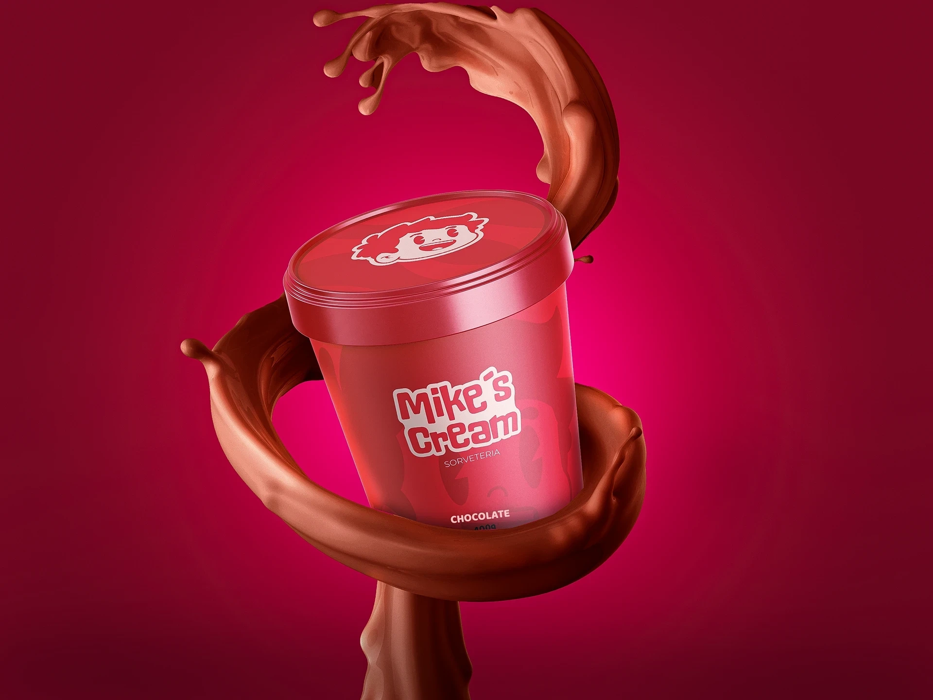
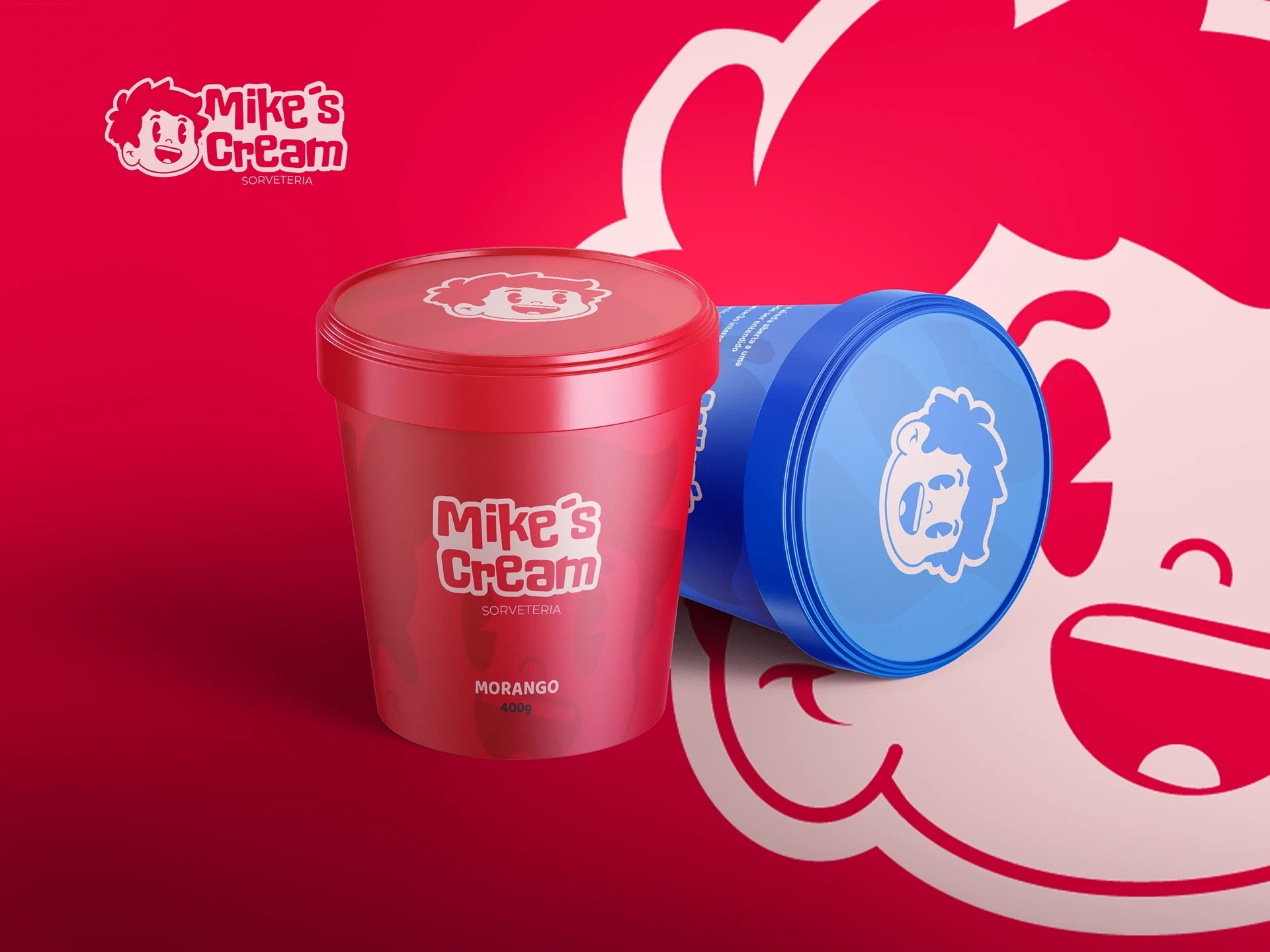

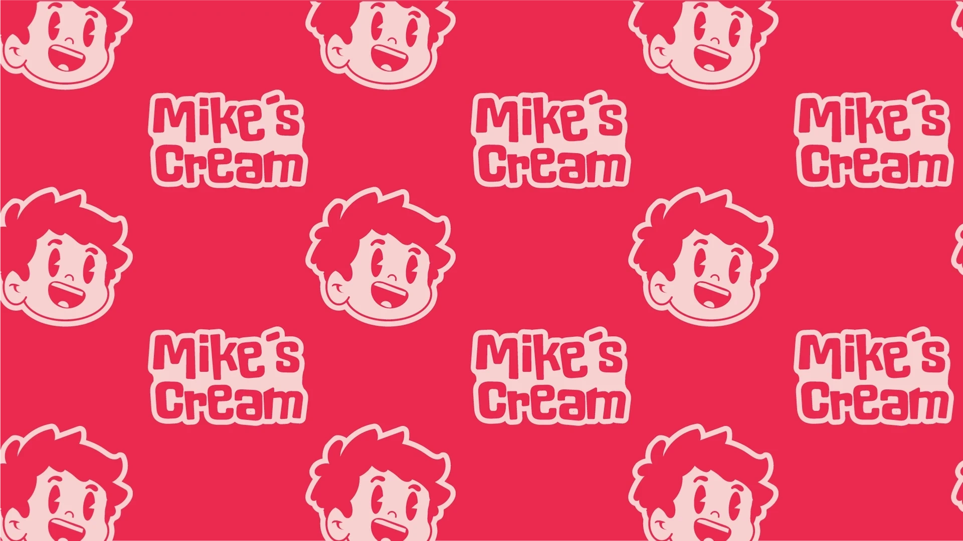
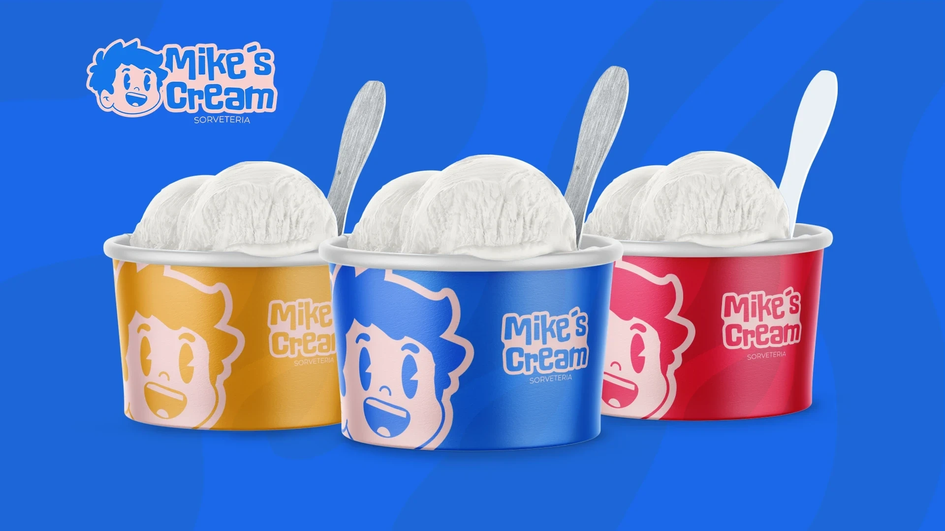

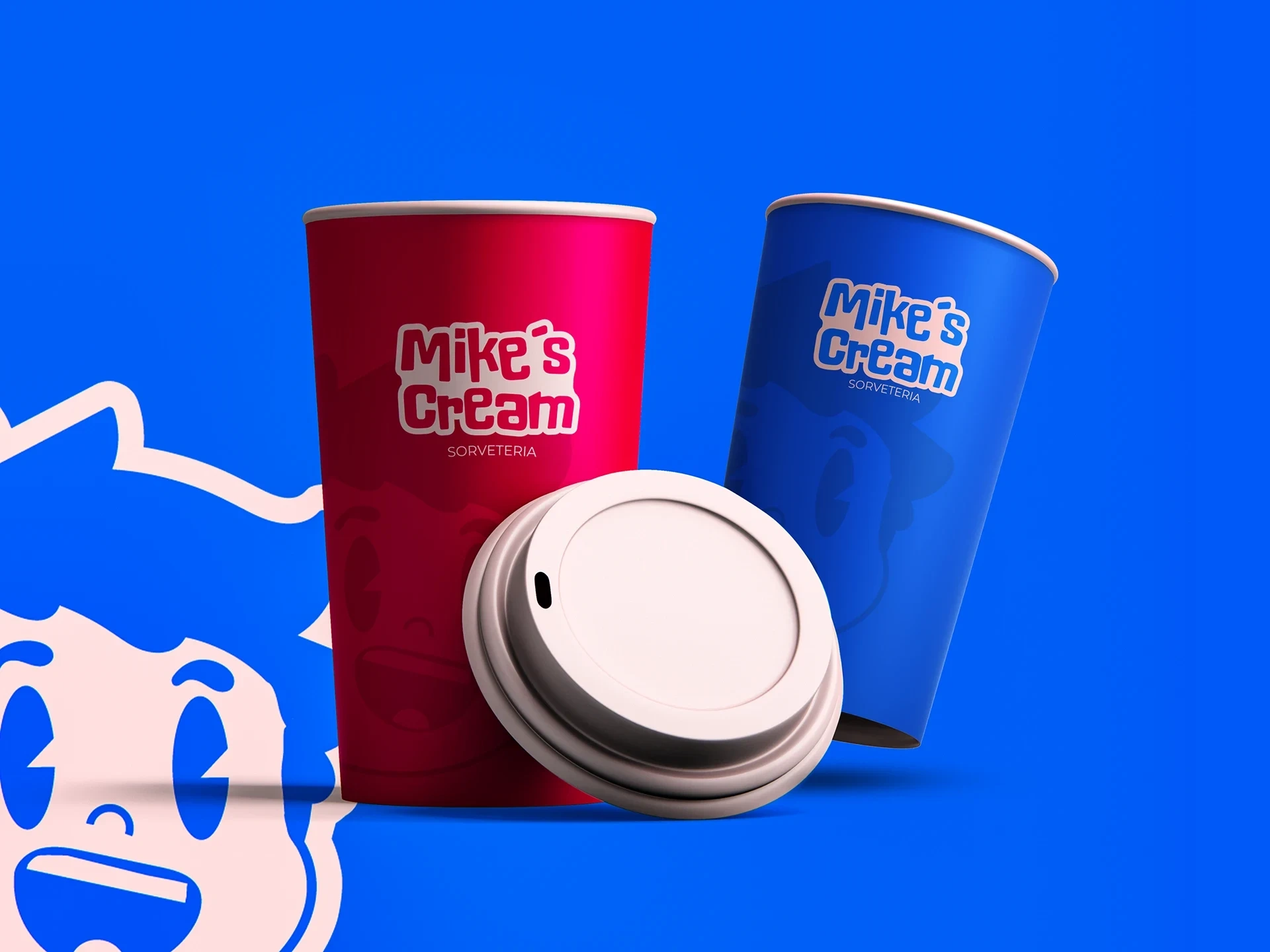
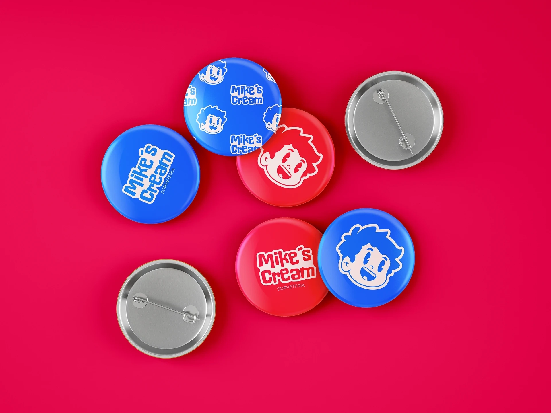
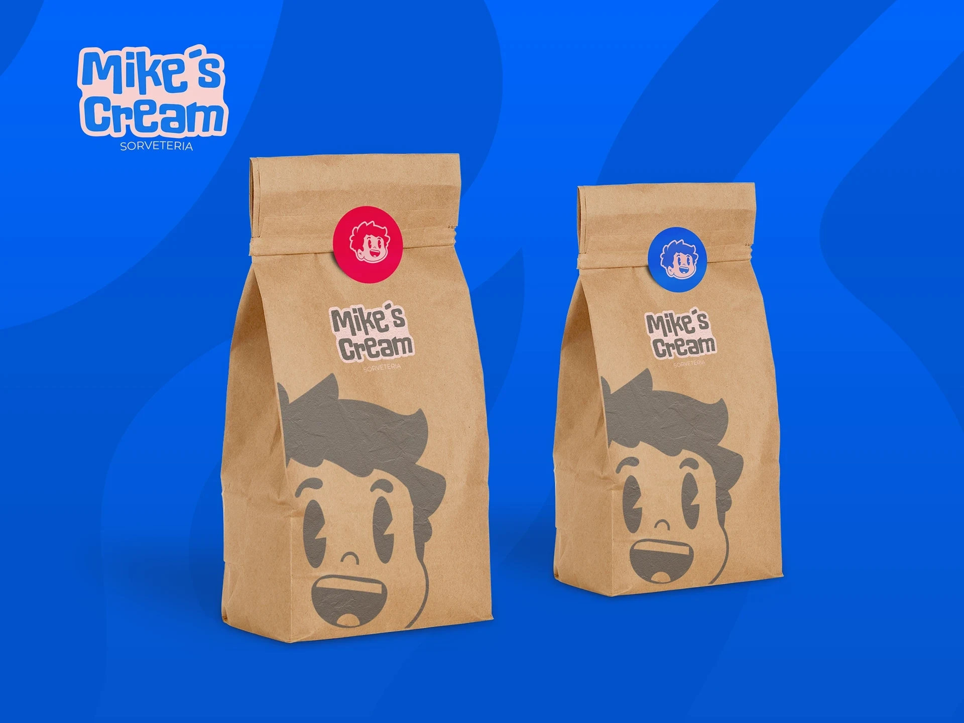
he logo is bold and whimsical, featuring soft curves and a creamy texture that mimics the swirls of ice cream itself. A pastel color palette—featuring strawberry pinks, vanilla creams, mint greens, and blueberry blues—evokes the sweetness and variety of the brand’s offerings. These colors are used consistently across packaging, signage, uniforms, and digital assets, creating a cohesive and inviting brand world.
custom illustrations and playful graphic elements—like dripping scoops, cones, and sunny smiles—add personality and help tell the story of joy, youthfulness, and delicious indulgence. Typography is rounded, bubbly, and friendly, enhancing the approachable tone of the brand.
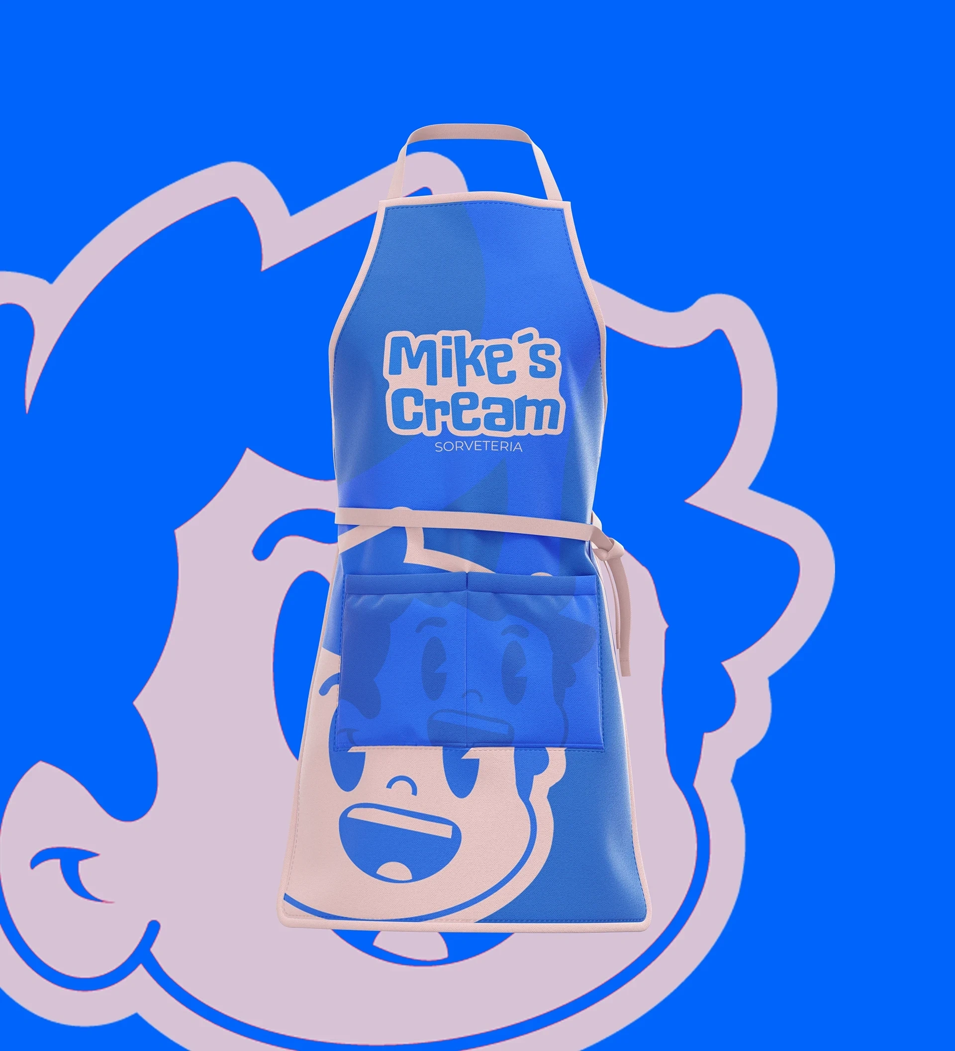
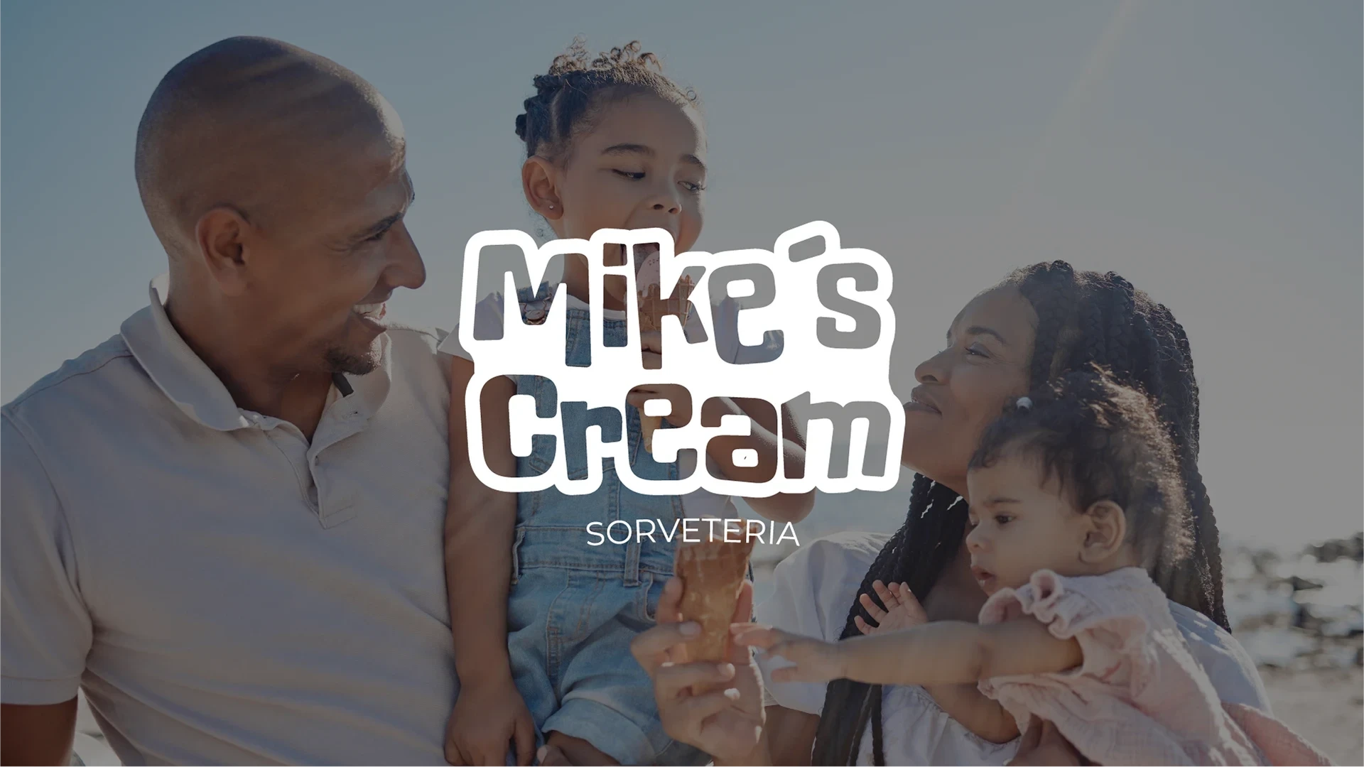
Each brand touchpoint—from the ice cream cups to the storefront design—was carefully considered to ensure a delightful and immersive experience for customers. Whether you’re visiting in person or engaging with the brand online, Mike’s Cream invites you to savor the moment and embrace your inner child.
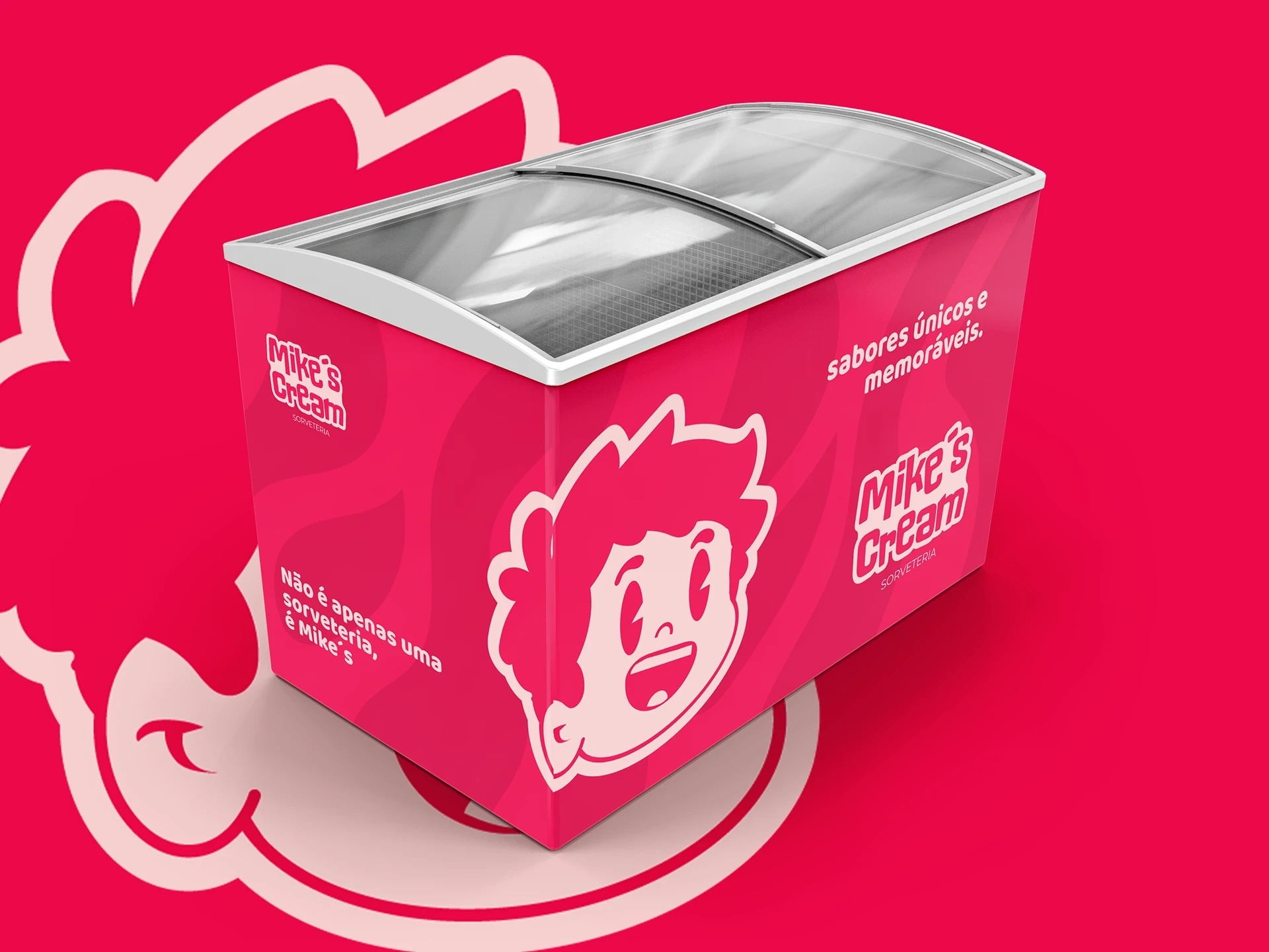
This project captures the essence of happiness in a scoop, creating a strong and emotional connection between the product and the customer. Mike’s Cream isn’t just a place to enjoy a frozen treat—it’s a place to make memories.
Like this project
Posted Jun 13, 2025
Designed a playful visual identity for Mike's Cream, a Brazilian ice cream shop.