Branding, Logo and identity design | Burguer House
Juliana Eisenhardt Escaleira

Munchies
BRAND CONCEPT
Munchies is a burger brand designed for those who seek instant pleasure: food that comforts, entertains, and delivers with an urban, laid-back aesthetic. It avoids the stiffness of gourmet pretension while standing apart from generic fast food. At Munchies, eating is positioned as a sensory, playful experience full of personality.
NAMING
The name derives from the English slang “munchies”—a craving for snacks or quick bites—widely used in youth and urban culture, especially tied to spontaneous, indulgent eating.
VALUE PROPOSITION
“Burgers made to feed the hunger of the soul.”
The brand delivers intense flavor, fresh ingredients, playful visuals, and a distinctly cool attitude.
STORYTELLING
“Everyone has felt the munchies: that sudden, irresistible hunger that demands something juicy and immediate. At Munchies, we turn that feeling into an experience. Our burgers aren’t just food—they are instant answers to cravings, created for people who live unpretentiously and want to satisfy hunger with style.”
TONE OF VOICE
Direct, playful, slightly ironic
Short words, quick impact
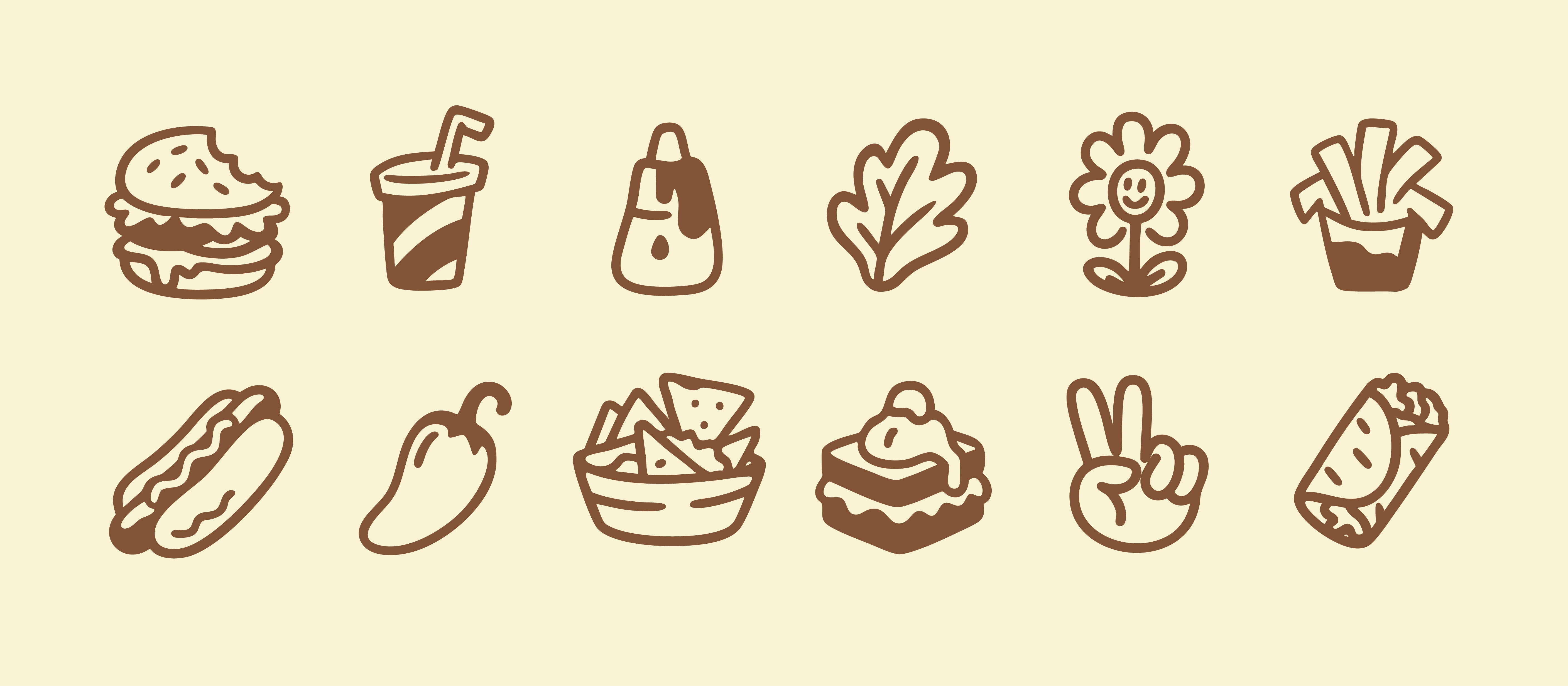
Custom icon set: doodle-style illustrations build a cohesive visual language across Munchies’ brand touchpoints
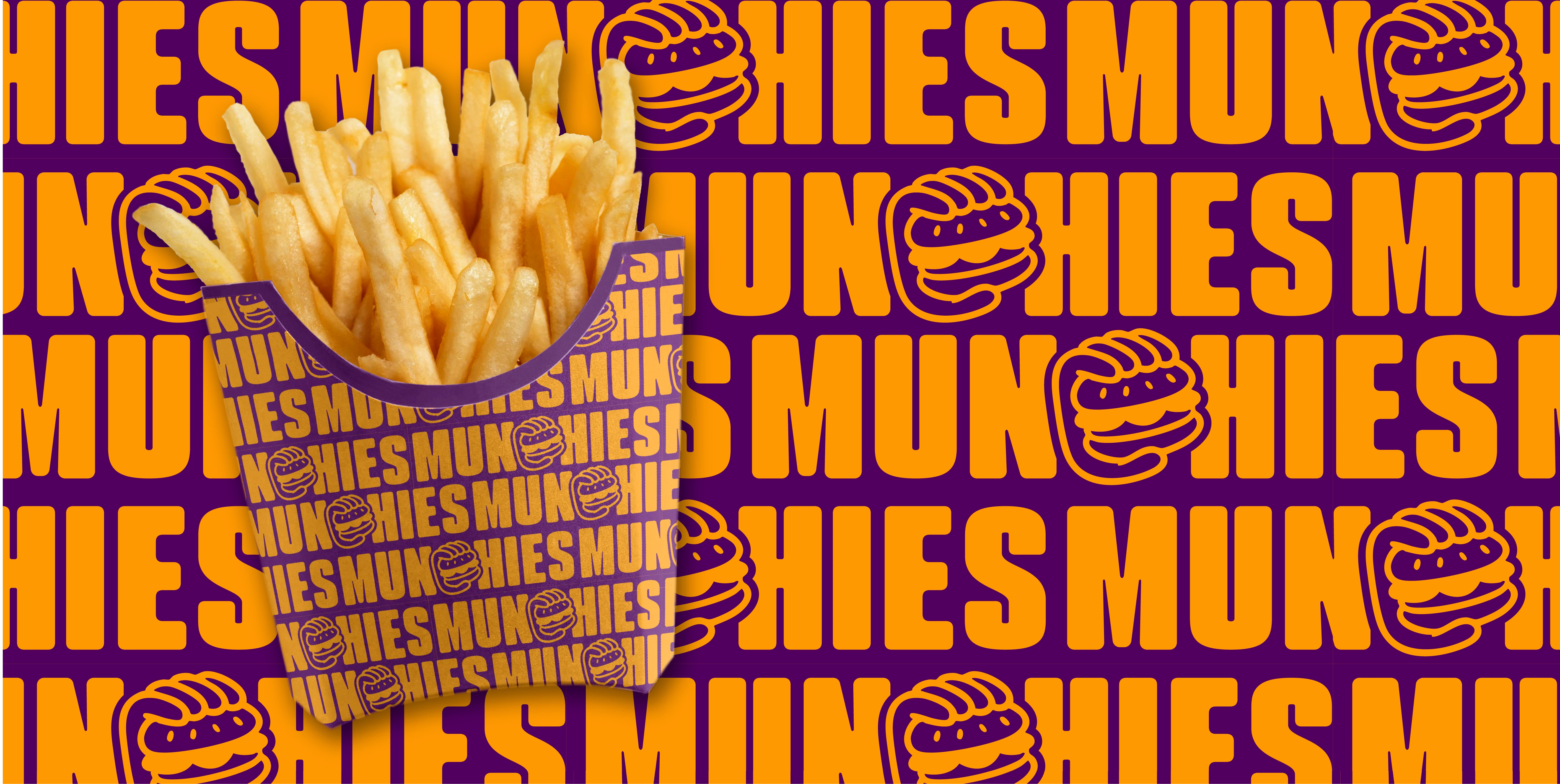
Branded fries packaging
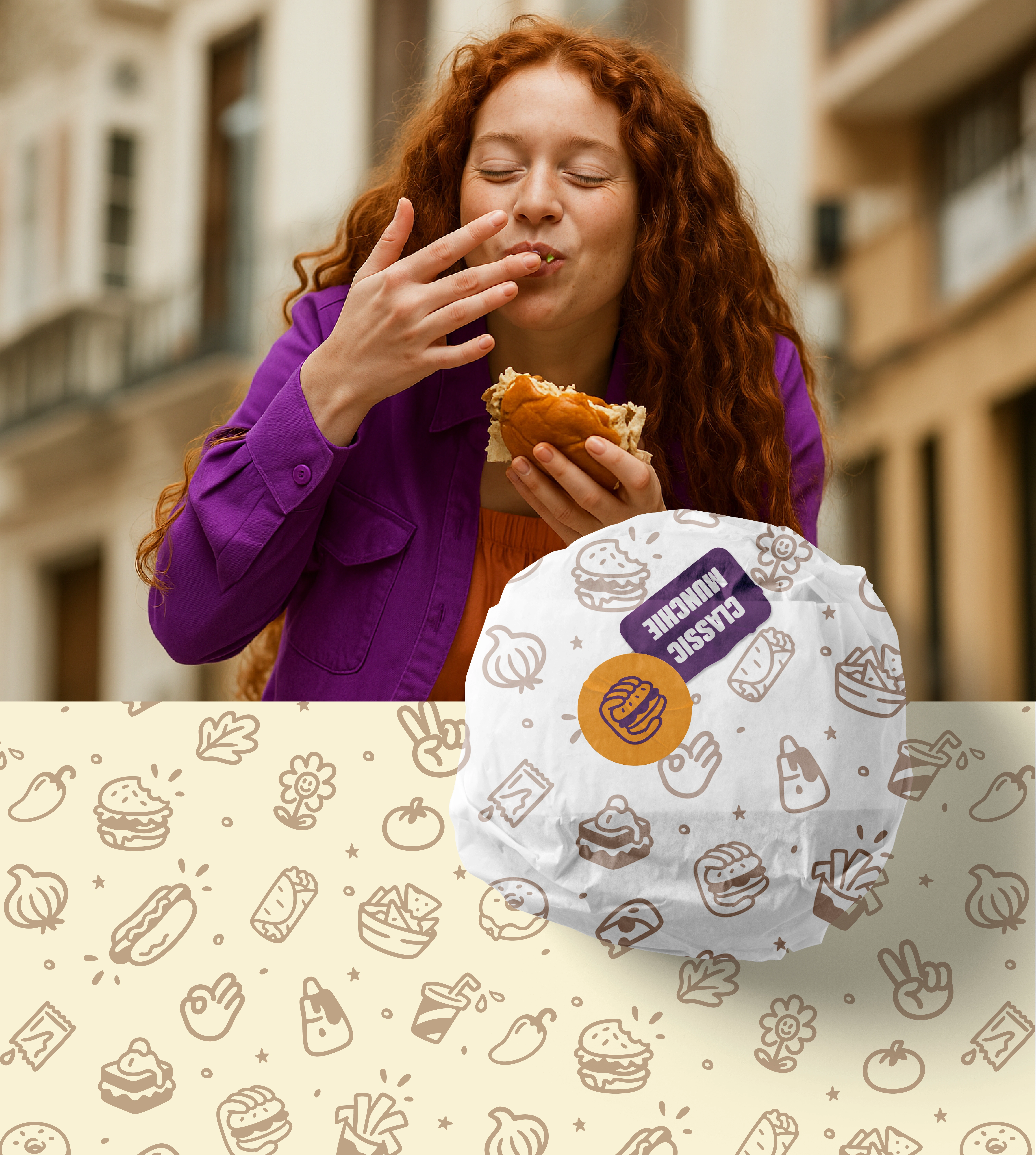
Custom burger wraps: playful seamless doodle-style pattern built from custom brand icons turns packaging into a brand storytelling tool
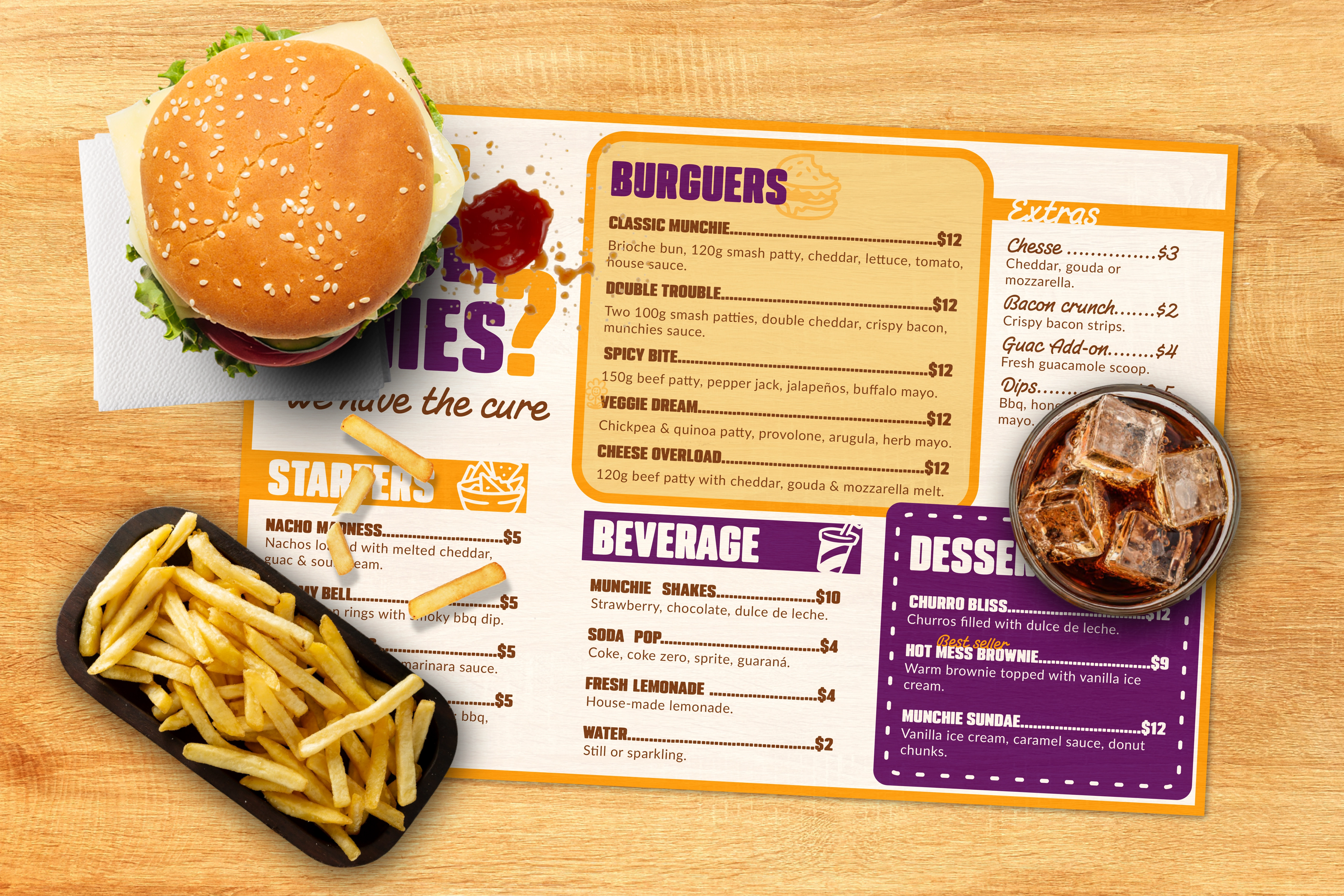
Munchies menu design: bold layouts and playful iconography highlight variety and flavor, creating a clear and engaging customer experience
The Munchies menu was structured to prioritize clarity and speed of choice, reflecting the brand’s energetic and indulgent positioning. A modular grid and color-coded sections create a strong visual hierarchy, guiding the eye seamlessly from starters to desserts. Playful icons act as intuitive markers that reinforce the brand identity while improving navigation. Typography choices balance impact and legibility, ensuring quick scanning in a busy dining environment. Overall, the design transforms the act of ordering into an extension of the Munchies experience — bold, fun, and effortless.
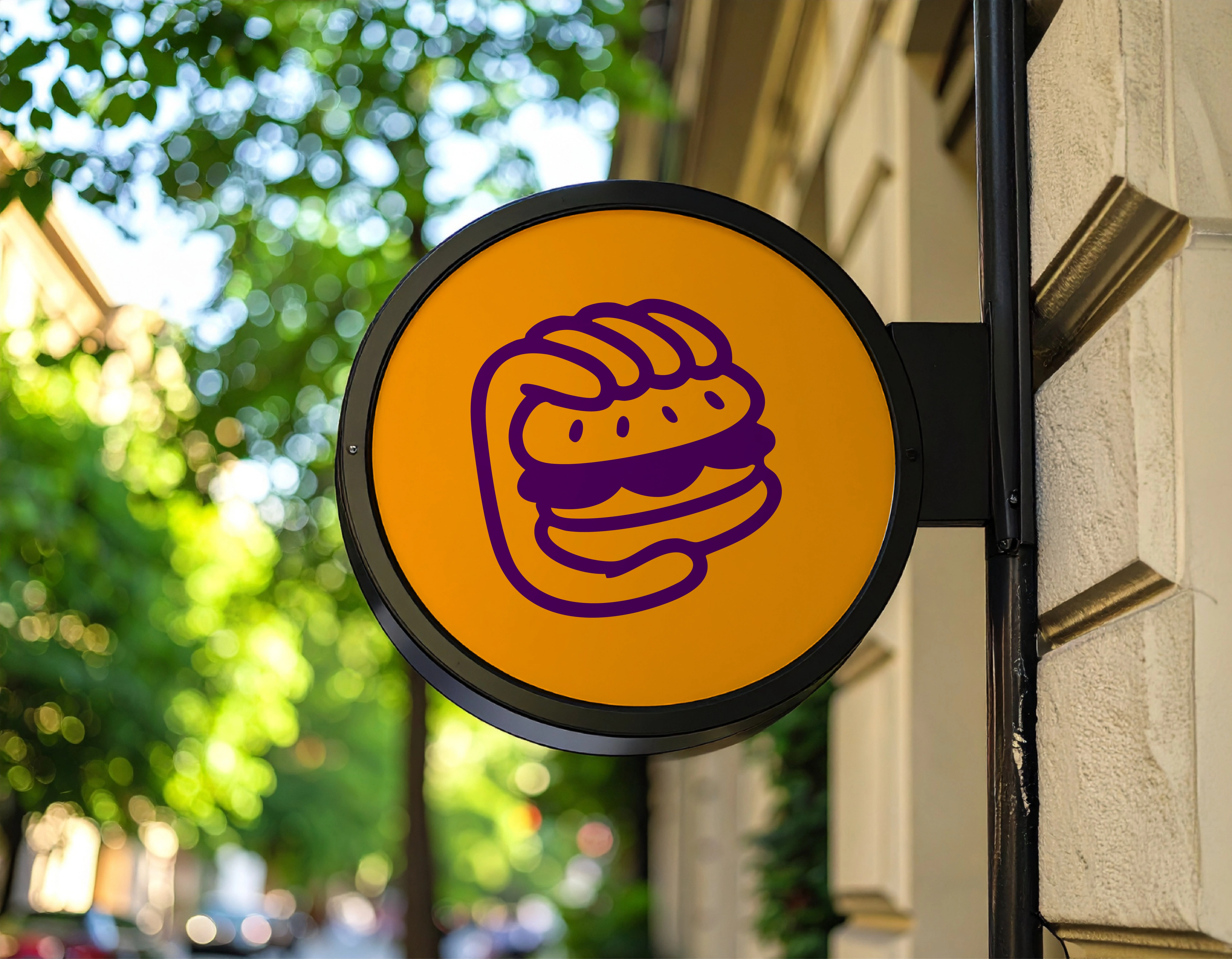
Vibrant Munchies brand mark applied to outdoor signage for instant recognition
This project shows how cohesive design and strategic branding can transform a simple dining concept into a memorable experience that resonates with its audience.
Looking to build an identity that captures your brand’s essence and connects authentically with your consumers?
Let’s talk! 😊
Like this project
Posted Sep 24, 2025
Developed Munchies brand concept, naming, visual identity, menu design and packaging for a unique burger experience.
Likes
1
Views
16
Clients
Munchies