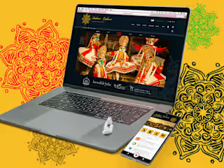
Designing Finance for the digital beginners
Designing for digital beginners - the not-so-digitally savvy.
A financial platform that would cater to both, the rural and the urban segments in India.
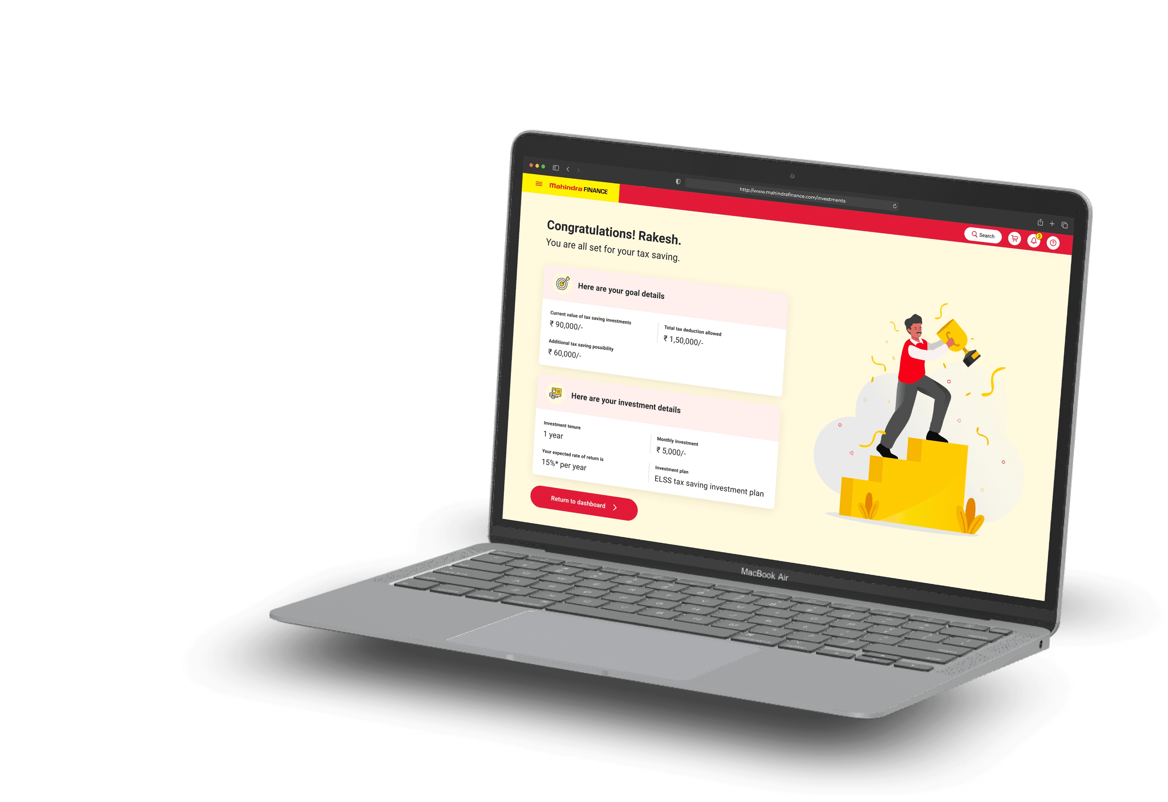
The project involved designing a customer mobile application and transactional website that aimed to bring together various financial products and services under a single login. The goal was to cater to both rural and urban segments and provide a platform for better cross-selling of financial services to users in each category.
With this digital solution, we aimed to empower users with greater access to financial services and help them make more informed decisions about their investments.
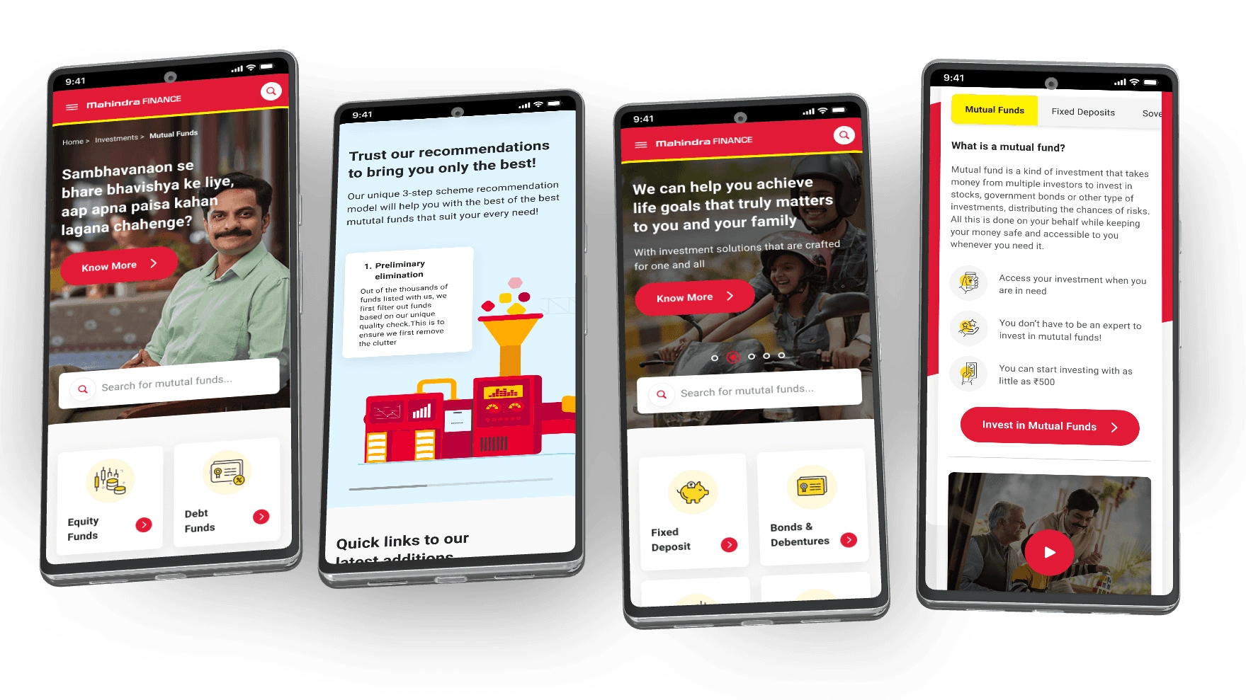
After analysis of user research, we identified these pain points:
The majority of the audience that was targeted were youths from tire-II and tire-III towns and rural or semi-urban areas in India.
After conducting in-depth user research, it was found that the following major pain points exist among the target demographic:
Language barriers and difficulties in understanding financial terminologies and jargon.
Low digital literacy and technical knowledge about digital interfaces.
Lack of trust and confidence in digital transactions and financial institutions.
Limited knowledge about investment options and financial instruments.
Complicated and time-consuming processes.
Additionally, it was observed that the majority of people even in urban areas, lacked technical knowledge about financial instruments and relied on external experts for advice.


How did we solve the pain points?
Language barriers and difficulties in understanding financial terminologies and jargon
Our target consumers lacked financial knowledge, and we aimed to educate them about our client's offerings and establish trust in the brand.
We used relatable examples and simple language to communicate effectively, as industry jargon may not be understood by the customers. It was important to empathize with them and use their language to ensure clear communication.
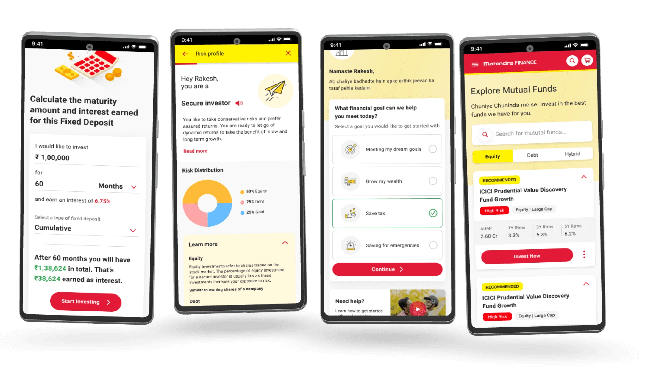
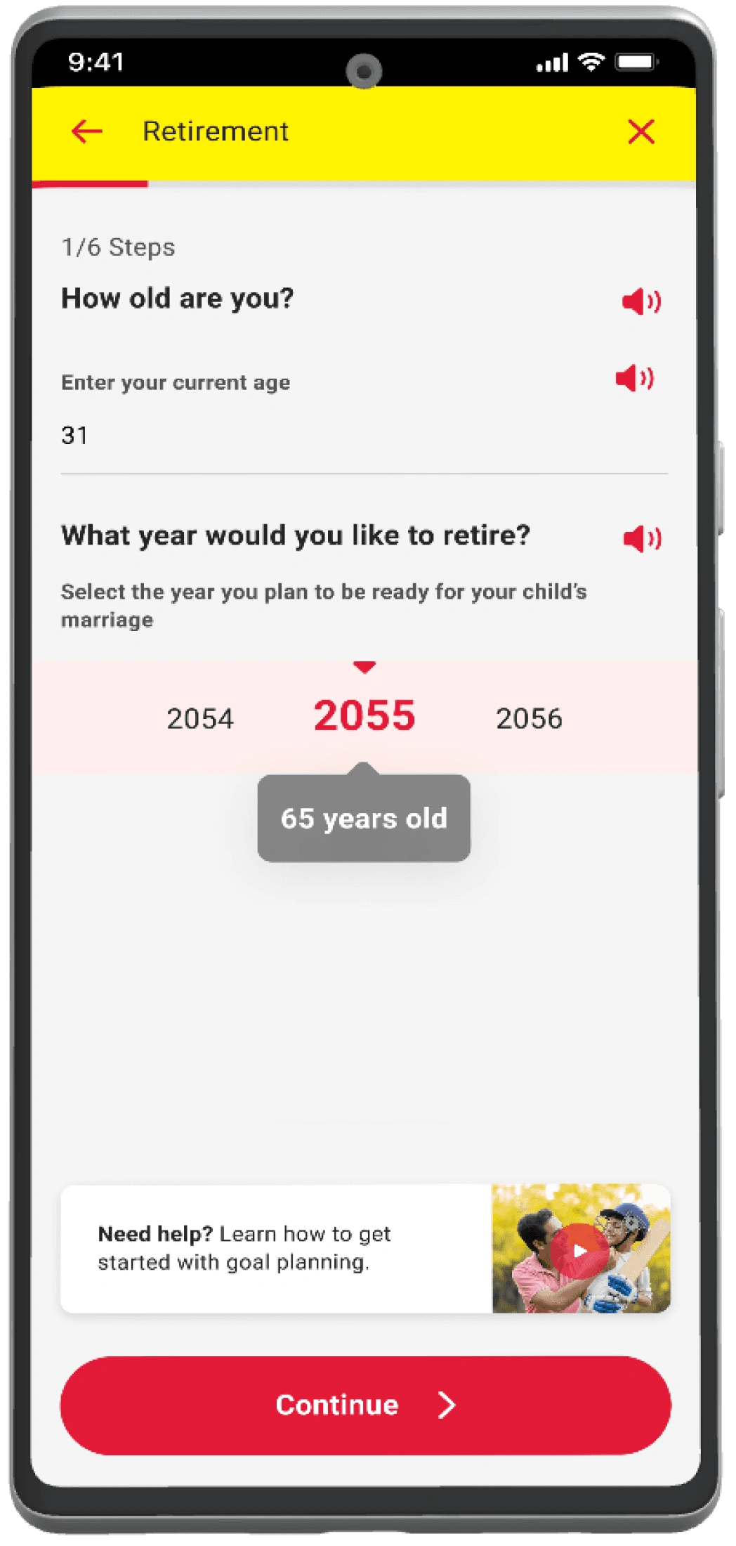
In the app, we provided an 'audio' or 'read aloud' option next to the input fields and other relevant places to tackle the issue of limited educational/reading capabilities. Users can simply tap on the read-aloud option and hear the details for clear and in-depth understanding.
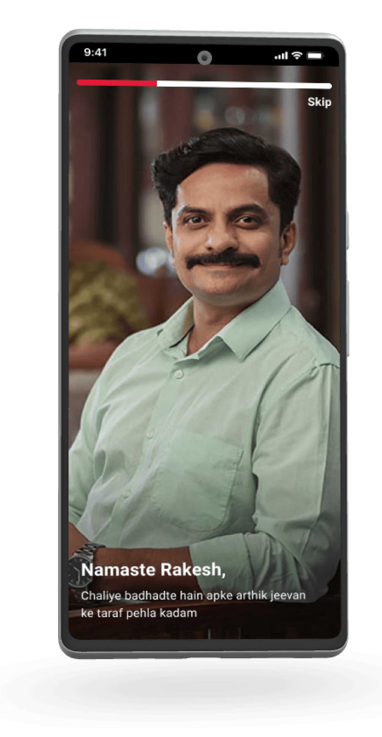
We used a mix of English and Hindi, or a 'hinglish' approach as it was the language and style that the users preferred in their usual routine and felt a direct connection. This approach caters to both the demographies in rural and urban areas, making the communication more relatable and easier to understand.
Apart form this the app was designed to be available in multiple Indian languages.
2. Low digital literacy and technical knowledge about digital interfaces
People from our user group were often the ones who are not very tech-savvy and frequently believe that digital/internet interactions are complicated and not their cup of tea.
We aim to remove this misconception as it can set them back and make them less confident while using digital platforms. Making people feel at ease while using the product is crucial because we intend to promote digital adoption. - This can be accomplished by creating predictable and recognizable interactions.
Our users, for instance, are accustomed to the visual components of the material design. (WhatsApp, Facebook, Instagram, YouTube, Google Pay, Paytm, BHIM, etc.)
We used popular interactions and added creativity within existing boundaries. It will help reduce the learning curve and make the product more intuitive to use.
For example, using "reels" to communicate instructions and combining chat and form filling to create ‘chat-based application forms’ was a user-friendly and engaging approach that met the needs of the target audience.
3. Lack of trust and confidence in digital transactions and financial institutions
It's hard for people in small and less advanced Indian cities to trust digital transactions and send their hard-earned money to someone they don't know or haven't seen in person. They prefer face-to-face interactions to learn about products and get help with problems.
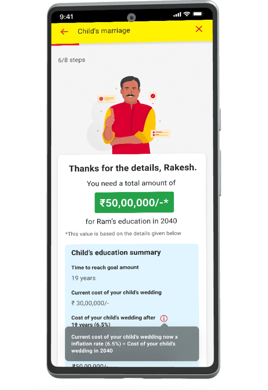
To build their trust, we need to be present and accessible in the digital world, just like in the physical world. We can achieve this by being omnipresent, so they feel like we're always there for them. It's also important to be transparent about costs and calculations, inform them in advance about any personal data collection, and communicate the intent in a language they can easily understand.
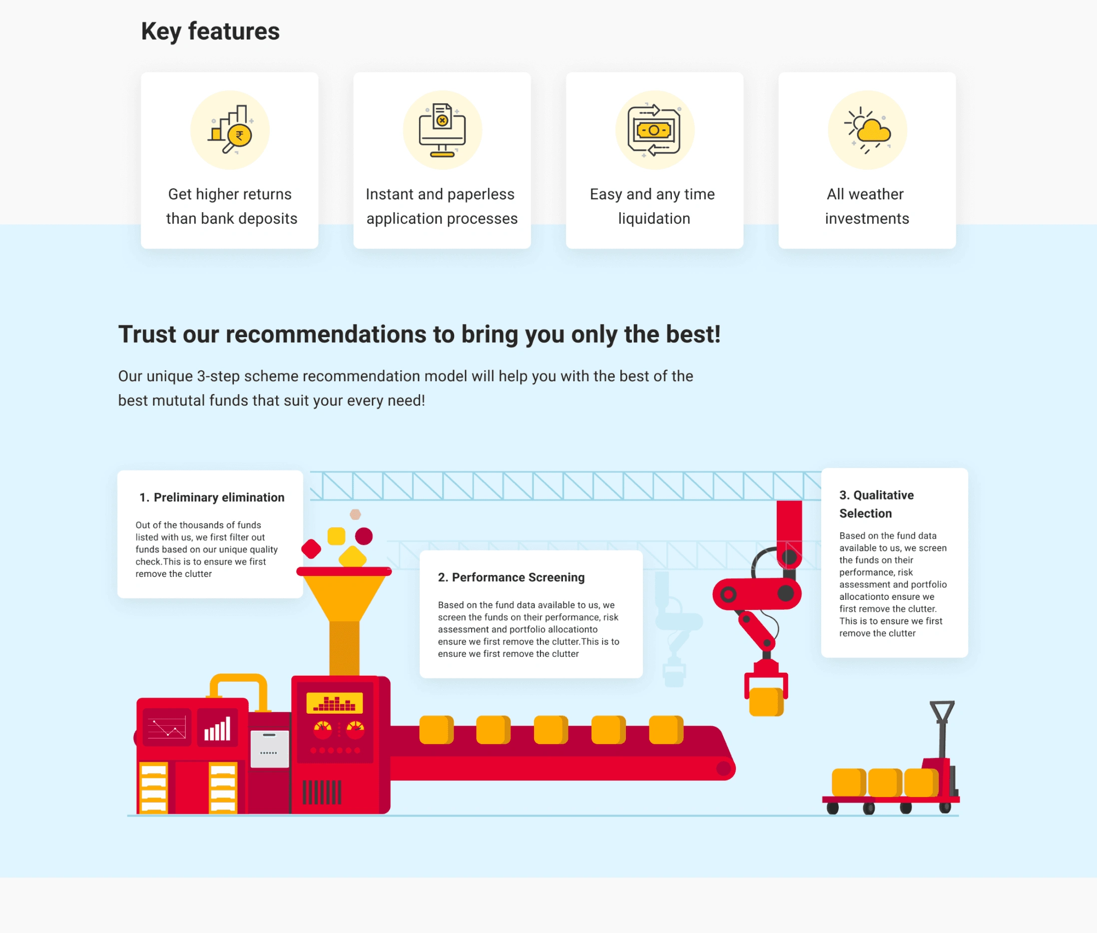
Apart from 24x7 chat support, visuals, texts, audio, and video explanations, we had picture-in-picture style short videos and gifs present across, whenever needed.
4. Limited knowledge of investment options and financial instruments
Our users were mainly focused on saving their hard-earned money and not investing it. Even if they did, it was mostly investing in physical assets like land or gold.
However, most of them were not aware of the various investment options available to them, which was limiting their potential growth and prosperity.
To change this, we aimed not only to offer our clients investment products and services but also to educate and empower our users about the different investment opportunities. We wanted to be the game-changer in their lives by providing them with financial knowledge that could make a significant difference.
That's why we included educational sections in various places throughout our product solution. We wanted to make it easy for them to understand the options available and choose what's best for them.
5. Complicated and time-consuming processes
To address this issue, we implemented several approaches:
We simplified the user interface to make it easier for users to navigate and focus on making logical decisions as cluttered UI can lead to confusion and frustration among users.
We broke up the information into small pieces and ask for one piece of information at a time to increase user confidence and reduce exhaustion during the transactional process.
Used an auto-fill feature to save user's information, making the transactional process faster and providing error-free results.
We streamlined the registration and login process, providing clear and concise instructions throughout the onboarding journey.
Implemented progress bars and steps to show users their progress through the transactional process, reducing uncertainty and providing a sense of accomplishment.
We did the math wherever possible to make calculations easier for the users and reduce their effort.
Provided the user's option to save their progress and return to complete the transaction at a later time, reducing time pressure and the feeling of being rushed.
Used visuals to convey information appealingly.

Like this project
Posted Sep 20, 2024
Solution for a leading Indian financial services provider. Our aim was to make financial management easier for everyone in India, regardless of their location.


