Lobsta — Brand Identity
Coastal culinary mastery: unveiling famous restaurant's unique identity
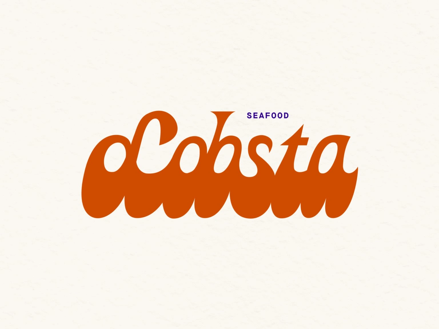
Lobsta, a beachside restaurant in sunny southern France, is your go-to spot for delicious lobster and other seafood sandwiches you can grab and enjoy by the shore.
When Lobsta first opened, we had the pleasure of crafting its unique identity.
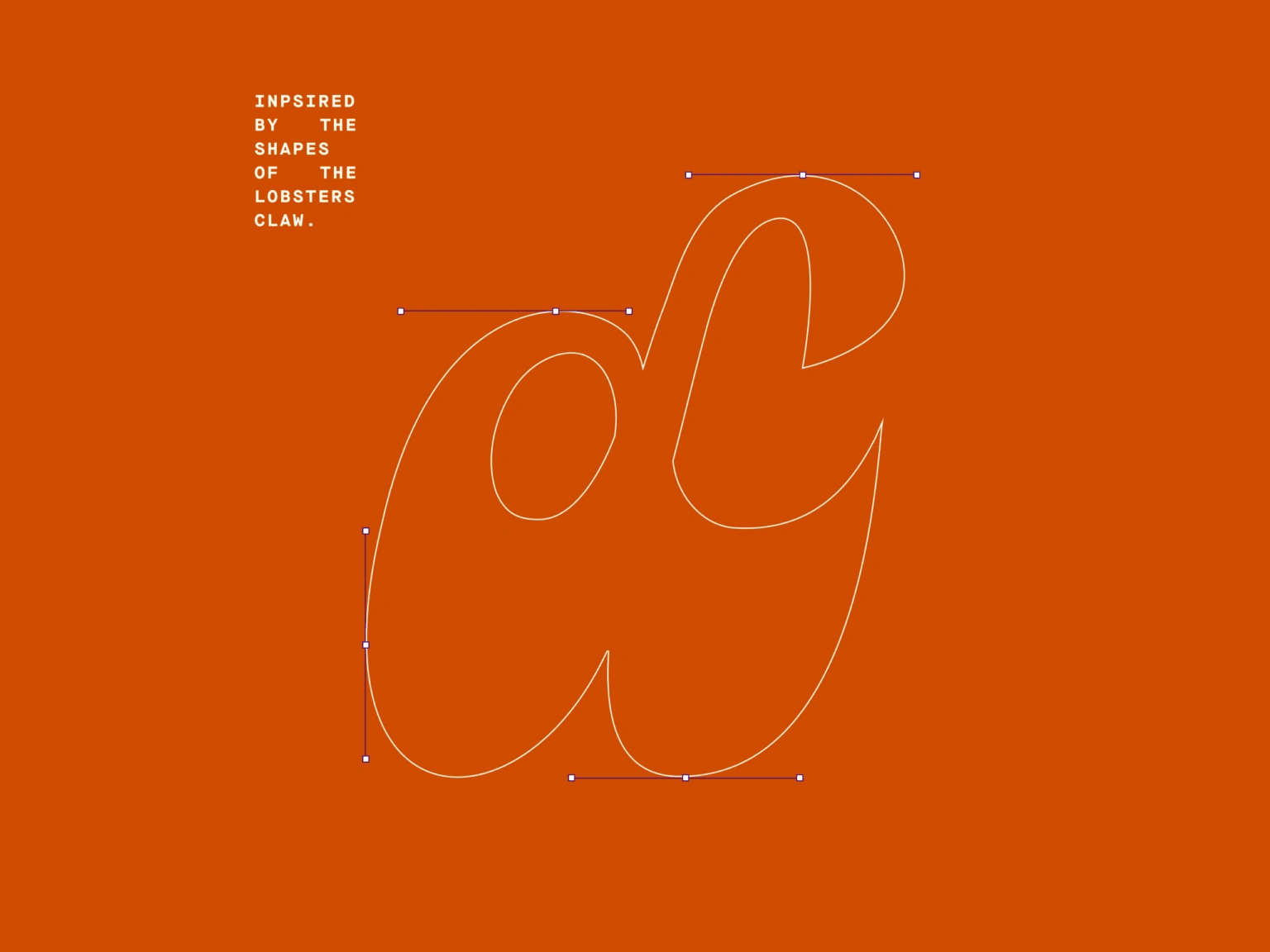
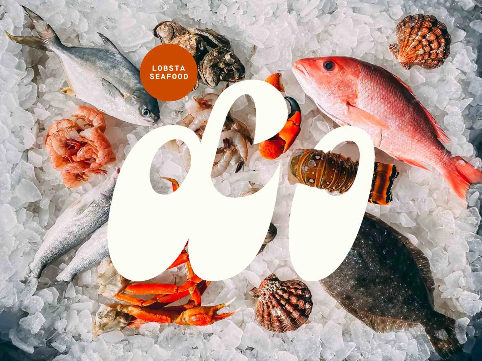
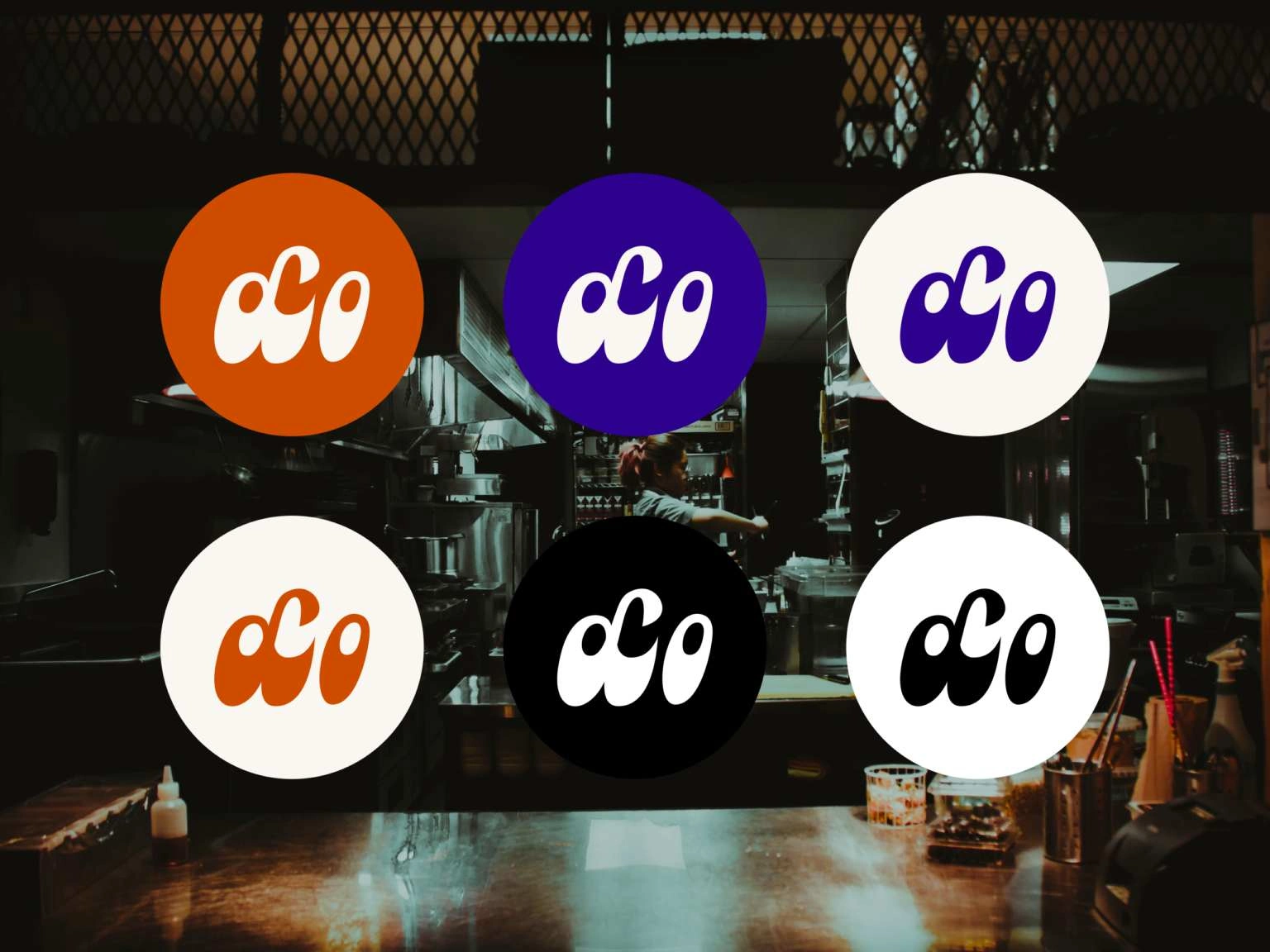
The inspiration for their logo came from the lobster itself, specifically its distinctive claw. This claw, with its unique shape and form, naturally lent itself to an exceptional and memorable logo style 🦞.
I also drew from the vibrant colors of the lobster - a brilliant orange, which we paired with a rich, dark purple to create an eye-catching and unforgettable contrast.
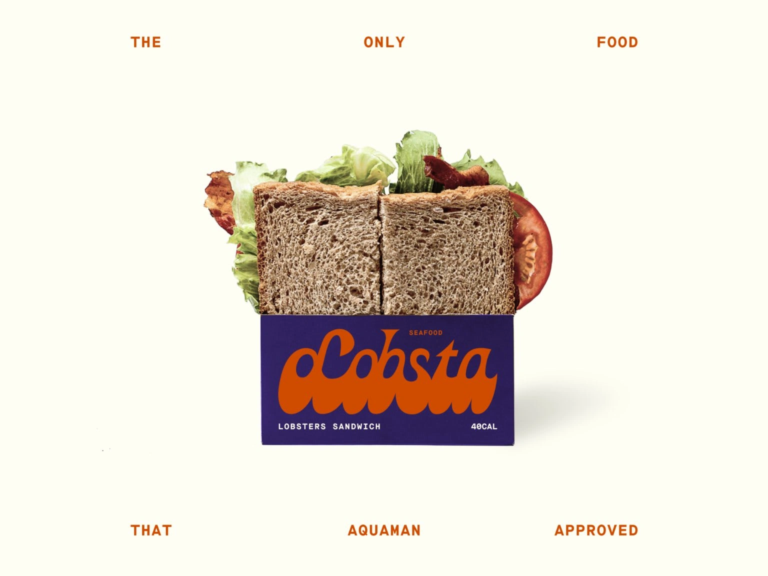
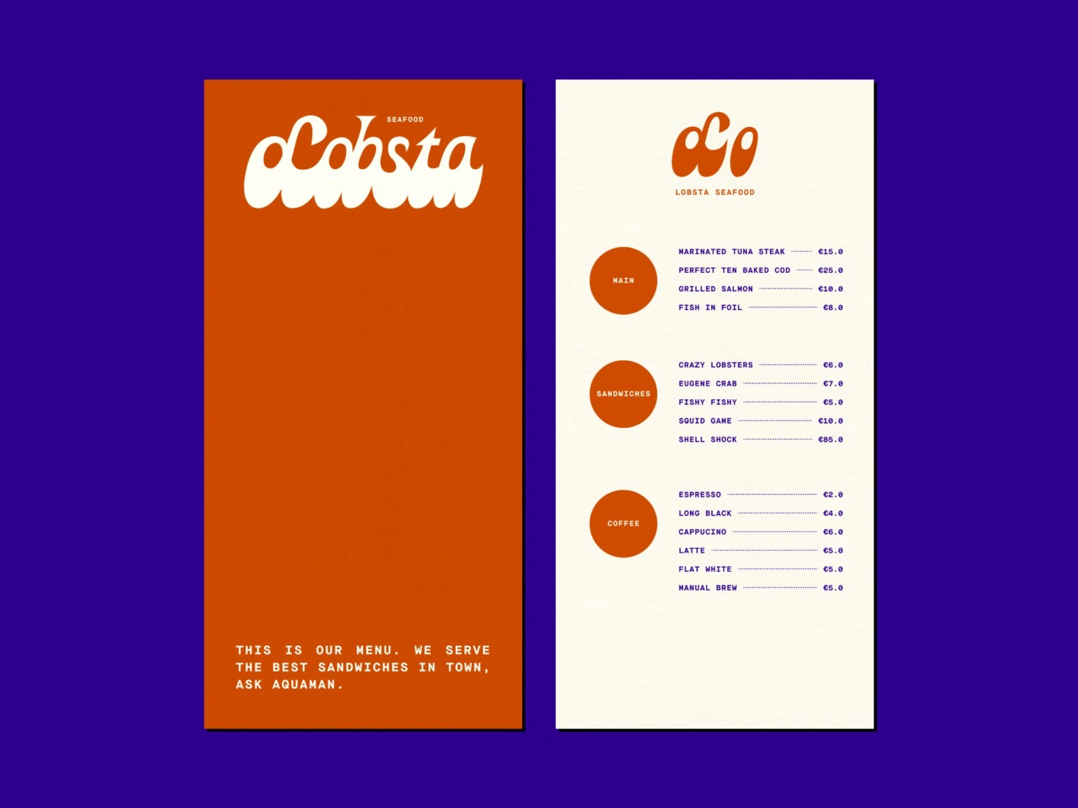
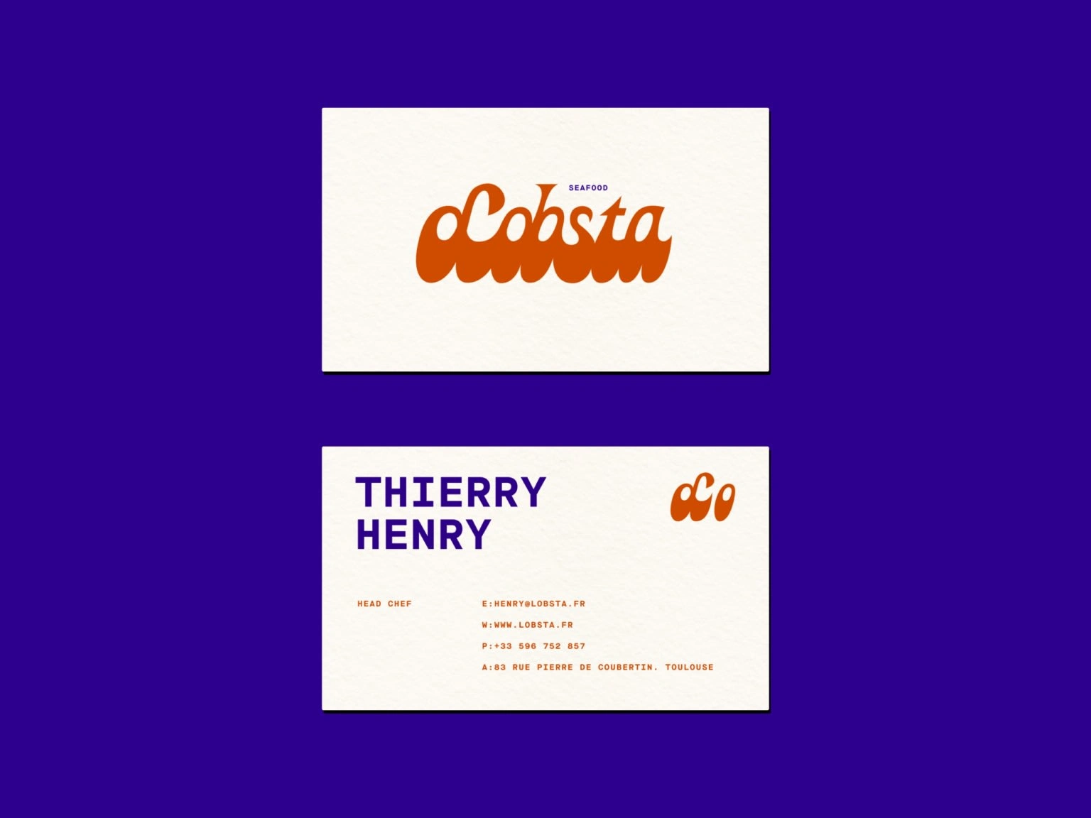
I designed logo marks for their stickers, crafted appealing packaging, cooked up a straightforward yet effective menu, and put together stylish business cards. All these elements came together to give Lobsta a standout brand image that truly sets it apart from neighboring restaurants.
Like this project
Posted Aug 10, 2023
Crafted a unique brand identity that captures the essence of coastal cuisine for a renowned seafood restaurant
Likes
0
Views
14

