Built with Framer
My Next Chapter | Branding and website for coaching business.
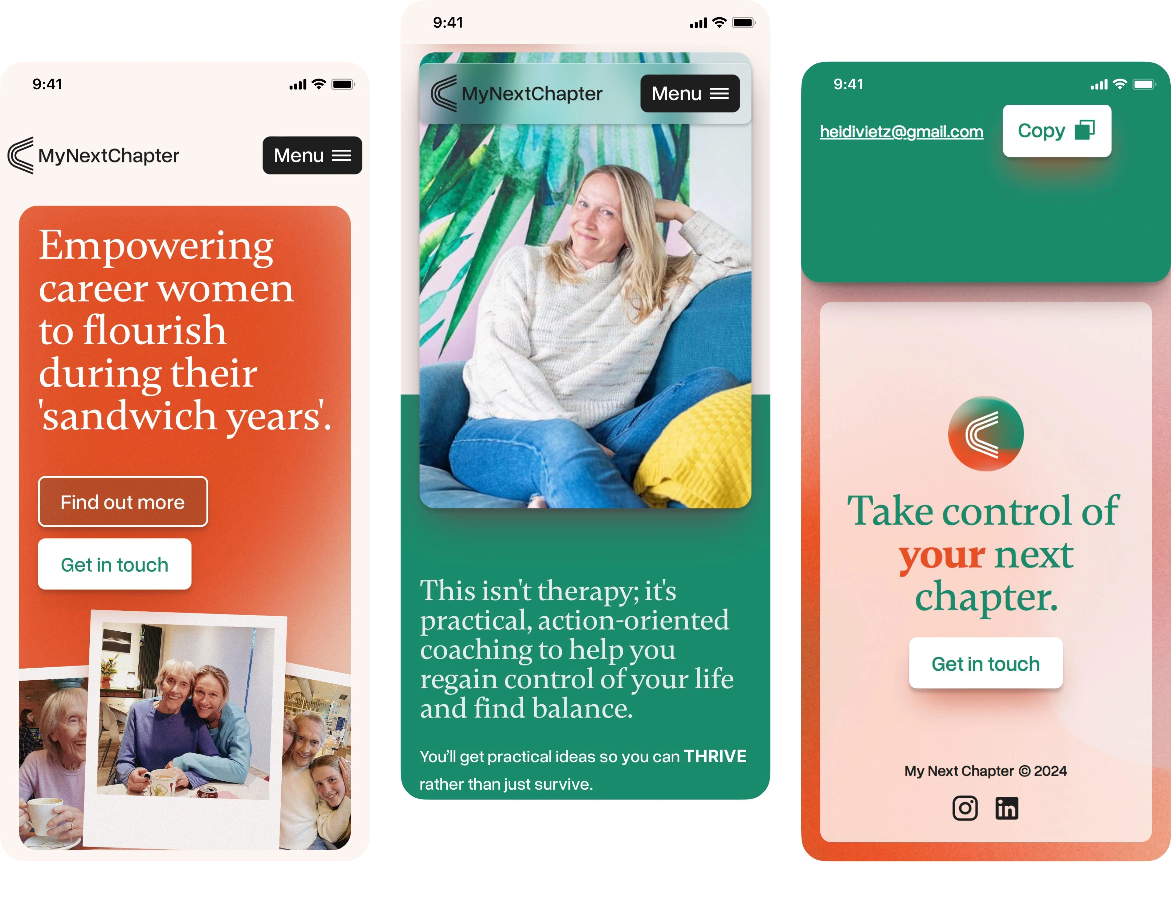
Heidi approached Good Looking Design for assistance in launching her new coaching business, targeting an often-overlooked demographic known as the sandwich generation. These individuals, typically women, juggle caring for their elderly parents and young children while maintaining professional careers.
Recognising the stress and emotional challenges of this phase, Heidi’s mission is to support those in this situation, helping them balance their careers and navigate the next chapter of their lives. After thoroughly understanding her business, we developed the name “My Next Chapter.” With Heidi’s guidance, clients can now take control of their narratives and plan their future.
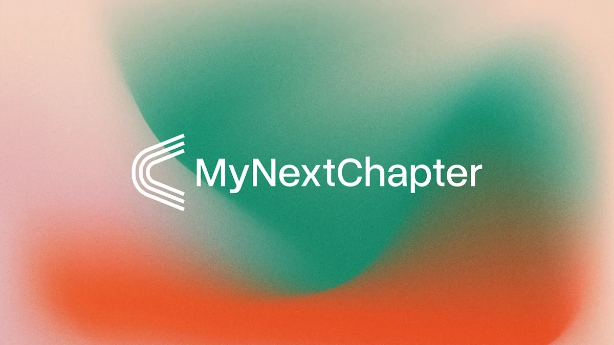
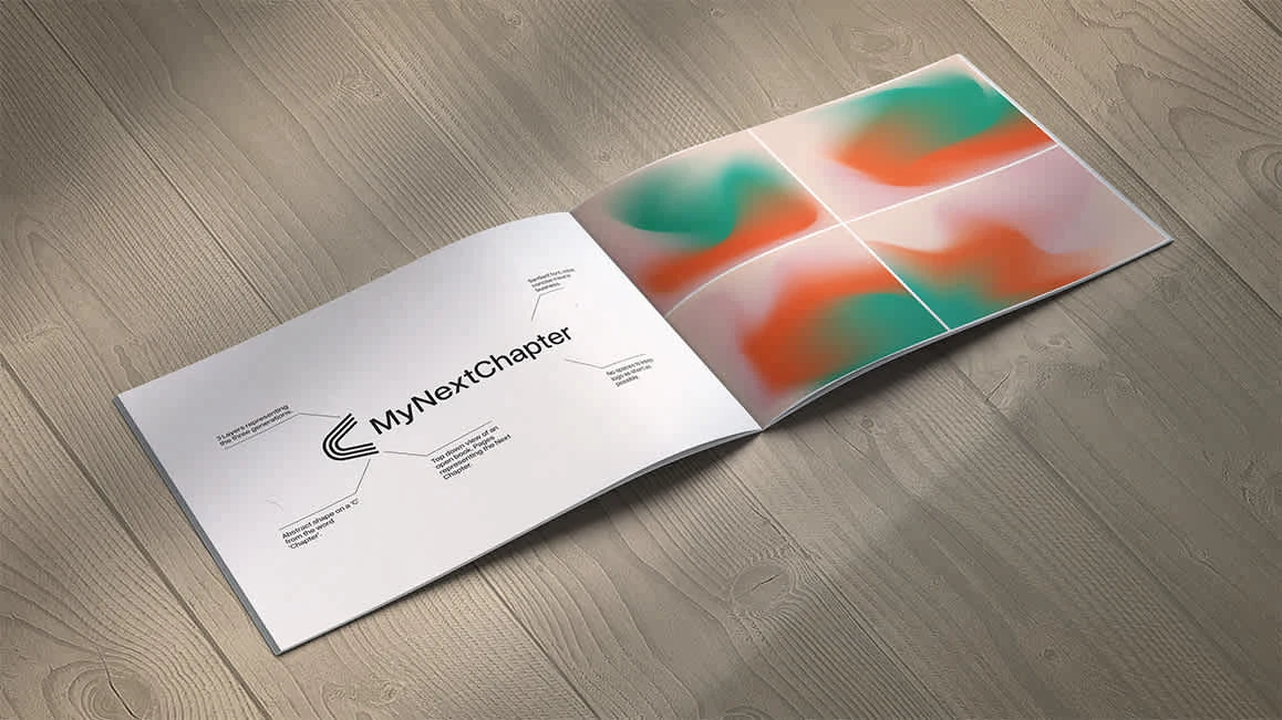
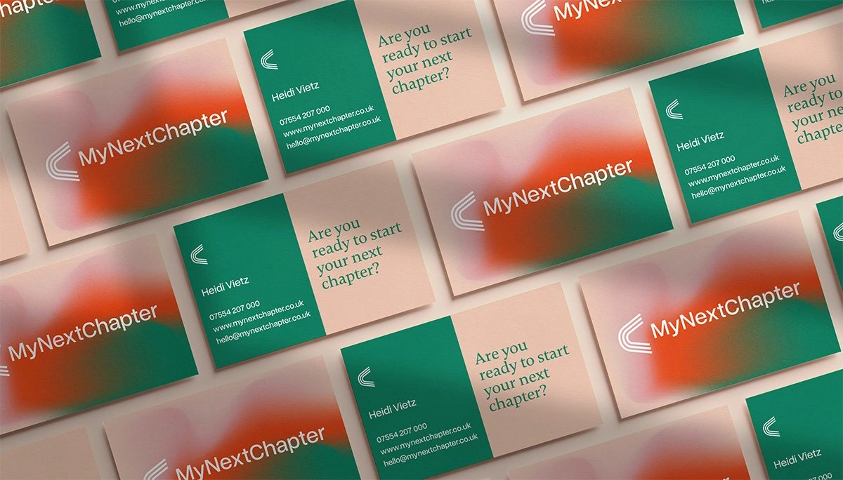
For the branding, our goal was to evoke cherished memories of loved ones. We used grain, mesh gradients, and family photos to create a nostalgic, retro atmosphere reminiscent of times when they were the ones being cared for. The logo features three lines representing each generation involved, abstractly shaped like a ‘C’ for ‘Chapter,’ and resembling a top-down view of an open book, symbolising the beginning of a new chapter.
The website continues the brand’s story. Without being overly salesy, it guides users through the site, helping them understand the offerings and how Heidi can support them.
Like this project
Posted Sep 10, 2024
How do you brand a business that is appealing to an unseen demographic?

