Josef's Buffalo Wings — Full Brand Identity, Hamburg

Hamza Ashraf


Josef's Buffalo Wings — full brand system: mascot logo, packaging, restaurant interior, motion, and social.
What They Came With:

No logo. No colour system. No visual language. Just a product worth believing in, and a category already owned by Buffalo Wild Wings. The brief: build a restaurant brand identity that reads as its own, halal-friendly from the first glance.
The Colour System:
Green wasn't a style choice, it's a halal-branding signal. The fastest way to say "halal" without saying it, and the anchor for the entire visual identity.
The Mascot Logo:
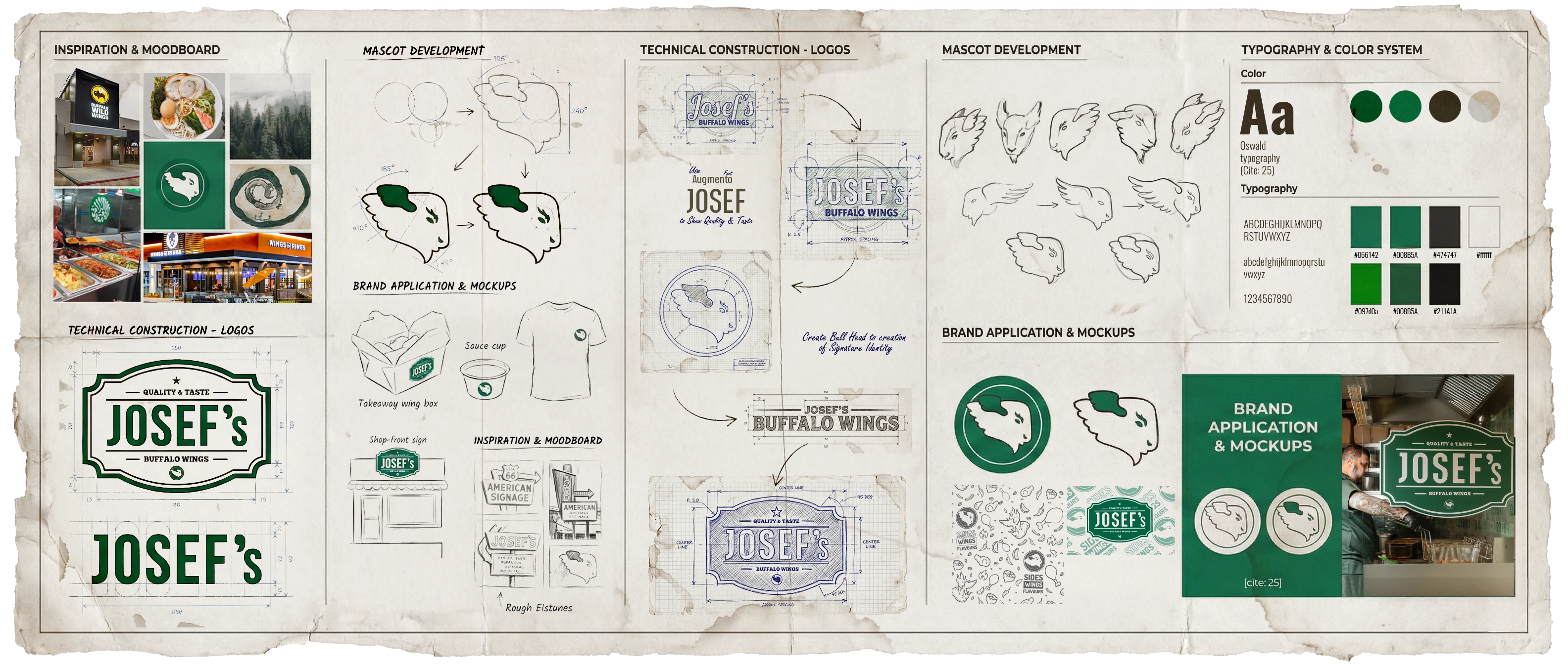
Face, not full body, for a mascot logo that holds up at packaging and app-icon size. Rounded character design over sharp edges, because sharp reads aggressive, not family-friendly.
Three Marks
Mascot logo, emblem badge, and full lockup, three registers of one brand identity, built for the places a full character mark is too casual to sit.
Packaging Design:
The part of the restaurant that leaves the building. Boxes, bags, and wing tubs, packaging design built to read as one brand long after the meal ends.
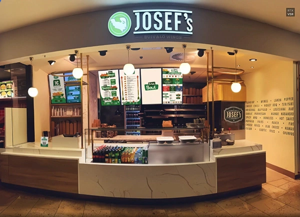
Interior & Facade:
Phoenix Center first, Europa Passage second. The second build wasn't a second design; the system already existed, so opening a new restaurant location became a matter of applying it.
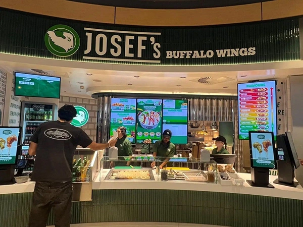
Animated LED Menu Screens:
Static graphics get walked past in a mall. Motion graphics don't. A deliberate choice for a moving-crowd environment, not a decorative one.
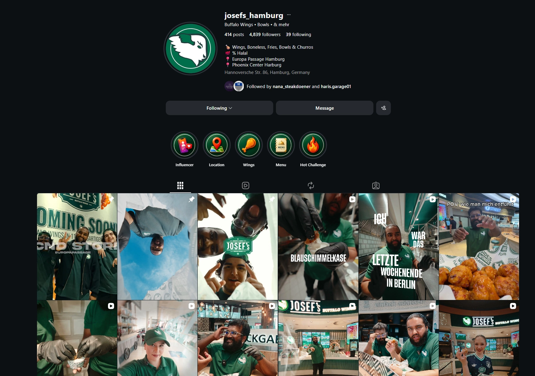
Social Media Design:
Built for the feed, not cut down for it. Vertical-first social media content, shot for the platform, carrying the same mascot, colour, and type as the packaging and the walls.
Thank you for visiting my portfolio!
Where It Landed:
Zero to ~4,800 followers in two years and six months, on original content alone. One restaurant to two, the second funded by the first. Word of mouth became its own channel.
Like this project
Posted Sep 18, 2026
Full brand identity for a halal-friendly wings shop in Hamburg, solo, since 2023. Logo to packaging to social. 0 to 4,800 followers, 1 branch to 2.