Branding, Visual Identity, Logo | Gluten-Free Company
Juliana Eisenhardt Escaleira
Branding for a Gluten-Free and Lactose-Free Artisanal Product Company
CHALLENGE
The task was to design a captivating visual identity for an artisanal gluten-free and lactose-free product company. The goal was to convey the passion and care the owner pours into her products, highlight their exceptional taste, and shift the common perception that gluten-free and lactose-free products lack flavor. Additionally, the identity needed to reflect the company’s commitment to environmental sustainability and community welfare through the use of local ingredients, recyclable and compostable packaging, compensation for dry ingredient production, organic waste composting, and the utilization of solar energy.
STRATEGY & SOLUTION
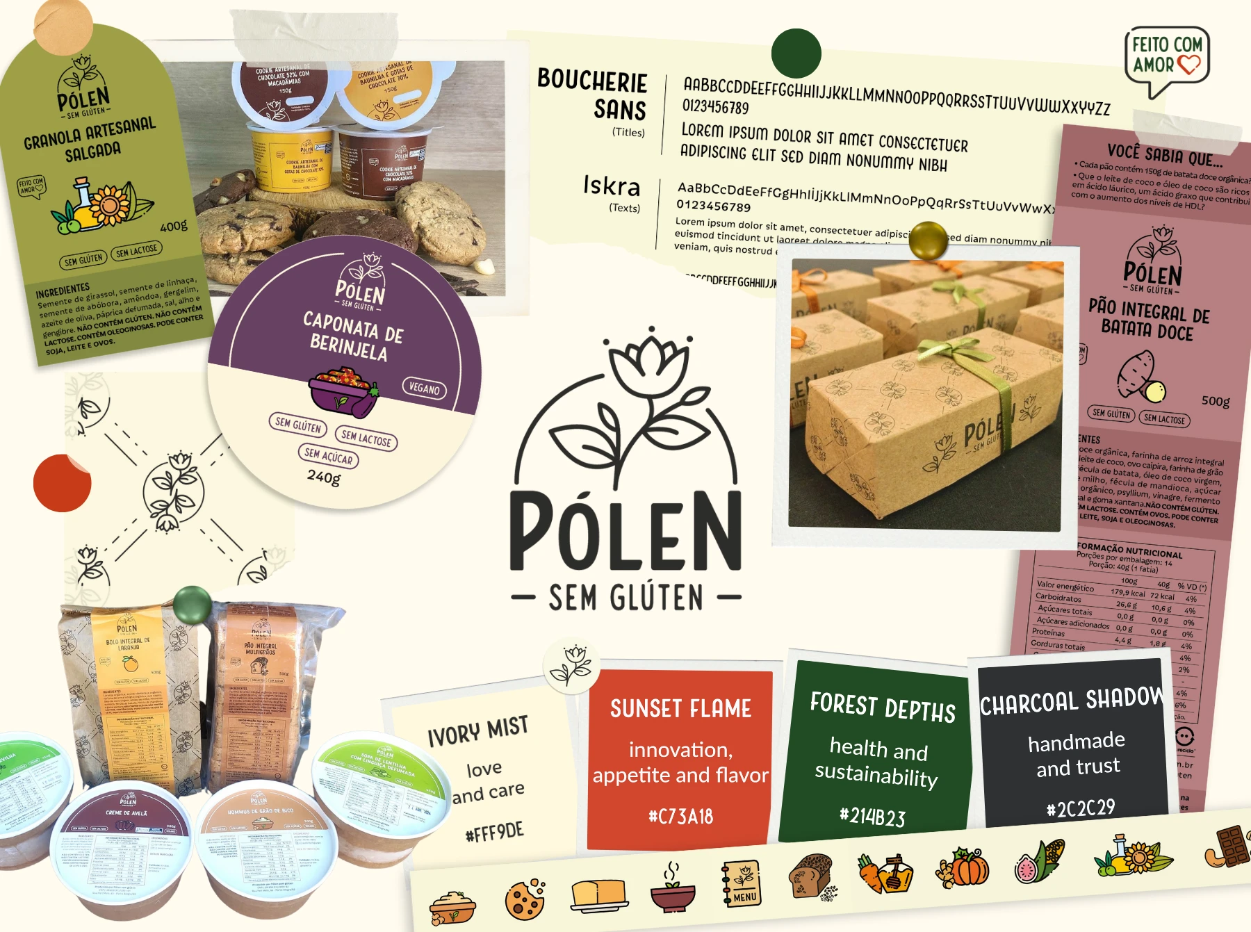
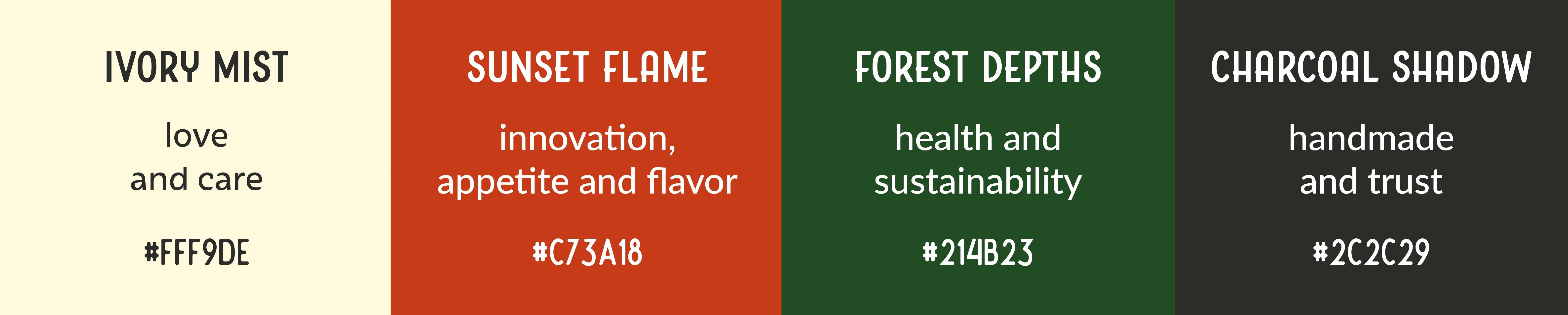
Main color palette
Each color was carefully selected to represent specific aspects of the brand philosophy, ensuring that the visual identity clearly conveys quality, innovation and sustainability.
Ivory Mist: Symbolizes love and care in preparation, reflecting that products are handcrafted in exclusive kitchens without the risk of gluten cross-contamination.
Sunset Flame: Highlights the products as flavorful and appealing, countering the common perception that gluten-free foods are dry and bland. It also represents the brand's innovative stance, continually creating new product lines and flavors.
Forest Depths: Conveys a commitment to sustainability throughout the entire product cycle. Additionally, it emphasizes a health focus by prioritizing whole ingredients and avoiding preservatives and ultra-processed products.
Charcoal Shadow: Represents the artisanal nature of the products and the trust that consumers place in the brand, ensuring quality and integrity.
Main color palette
Typography
Three distinct typefaces were selected to accommodate various aspects of the brand's communication.
Boucherie Sans for titles: This typeface is clean and contemporary, making it ideal for catching the eye and establishing a strong presence on any visual medium. It is used primarily for headings and important callouts, providing clarity and impact.
Iskra for body text: Known for its readability and friendly appearance, Iskra is utilized for main text areas such as product descriptions and informational content. Its balanced structure helps ensure that longer texts are easy to navigate and pleasant to read.
Nature Spirit for small notices: This rustic font is used for small warnings and side notes. Its handcrafted appearance enhances the artisanal vibe of the products, linking back to the brand’s emphasis on traditional methods and natural origins.
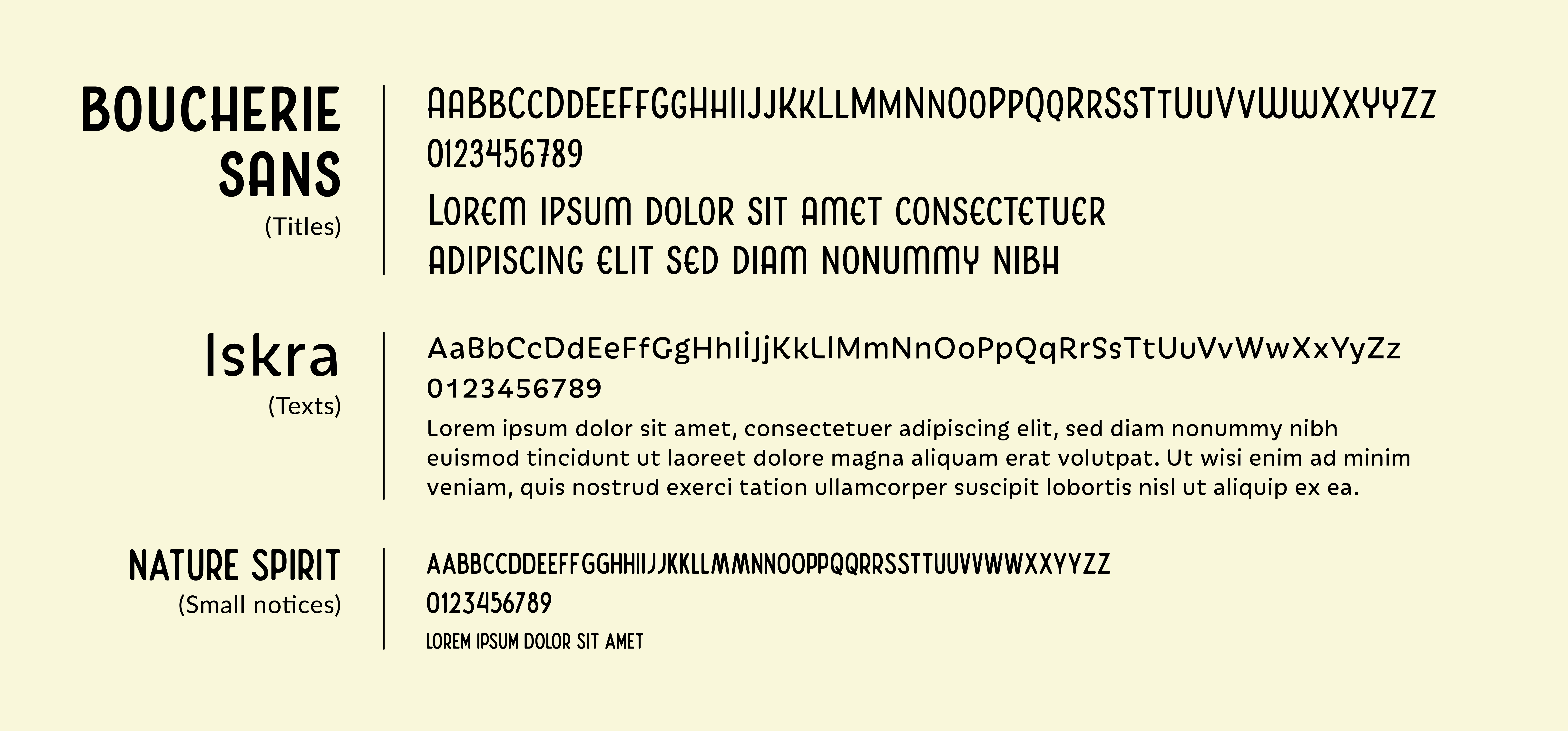
Typography
Logo
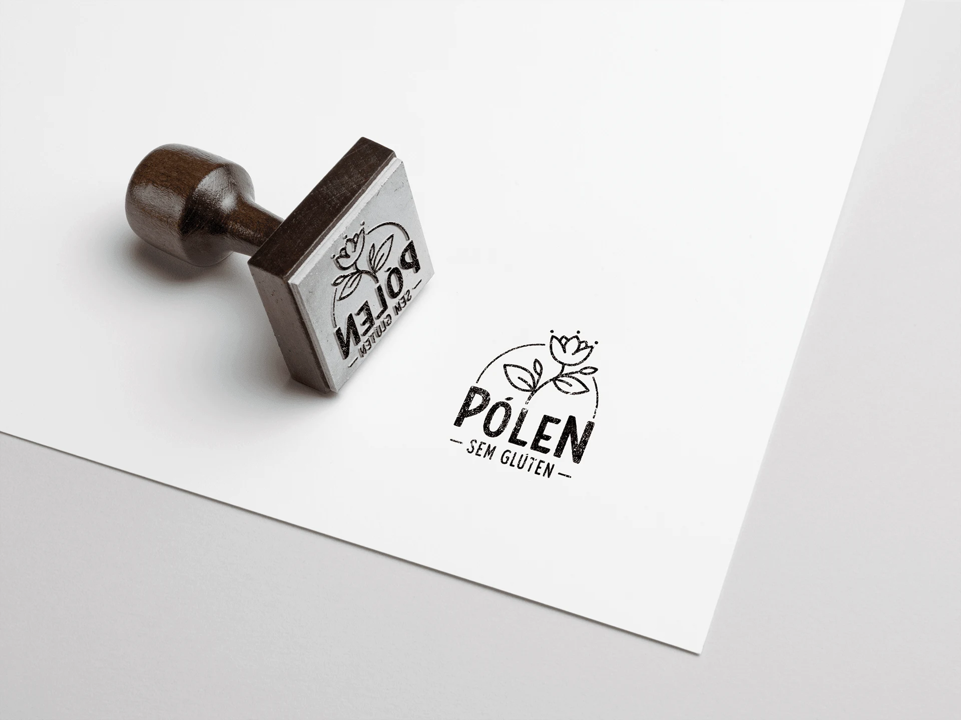
Logo
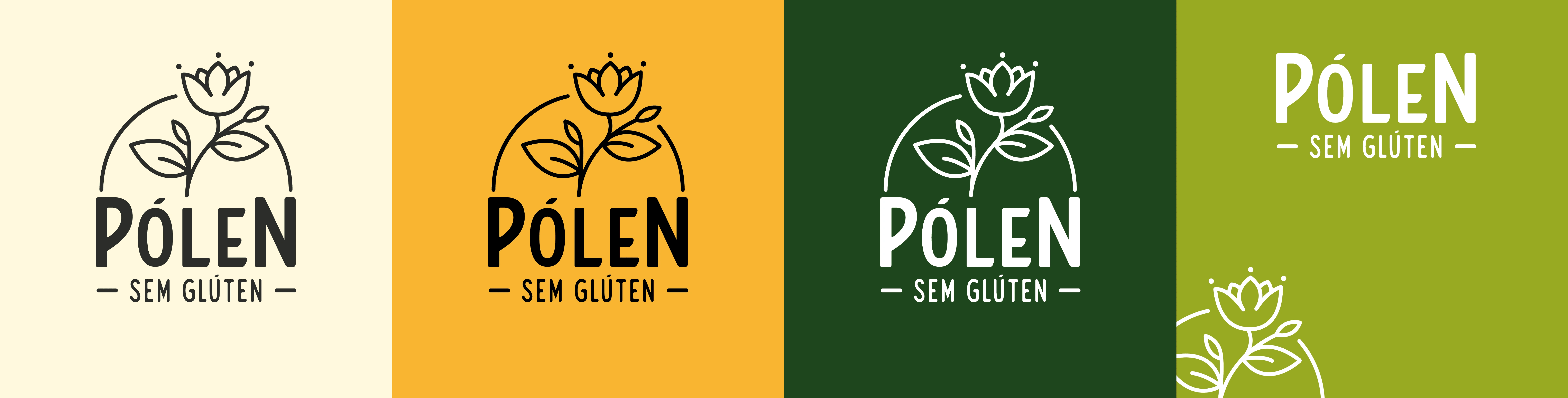
Logo applications
Pattern

Additional elements
To enhance the consumer experience and make browsing product information more intuitive and enjoyable, the application of the brand’s visual identity on product packaging was enriched with the introduction of additional elements. These elements were carefully designed to complement and strengthen the brand’s visual communication, ensuring that the values and characteristics of the products were instantly recognizable and easily understood.
Icons: Friendly and uniquely identifiable icons with rounded corners were designed to convey the brand's approachability. These icons feature simple yet memorable outlines with a distinctive black line and a dot opening. They are used as visual elements for easy identification of product flavors and ingredients, as well as to highlight the brand’s sustainable practices, enhancing both visual appeal and brand recognition.

Icons Example
Secundary color palette: Each secondary color is assigned to a specific flavor, allowing consumers to quickly and intuitively associate flavors. The colors in the secondary palette have been carefully selected to harmonize with the brand’s primary color palette, ensuring aesthetic consistency across the product line and contributing to a visually cohesive and appealing packaging package.

Secundary color palette
VISUAL IDENTITY APPLICATIONS
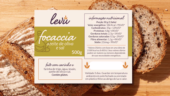
Packaging
The packaging design created serves more than just the informational needs of consumers with dietary restrictions. Each package includes cooking tips, interesting facts about the ingredients, and charming designs that evoke a sense of care and quality. This approach has not only elevated the consumer experience but has also encouraged customers to share their positive interactions with the brand on social media.
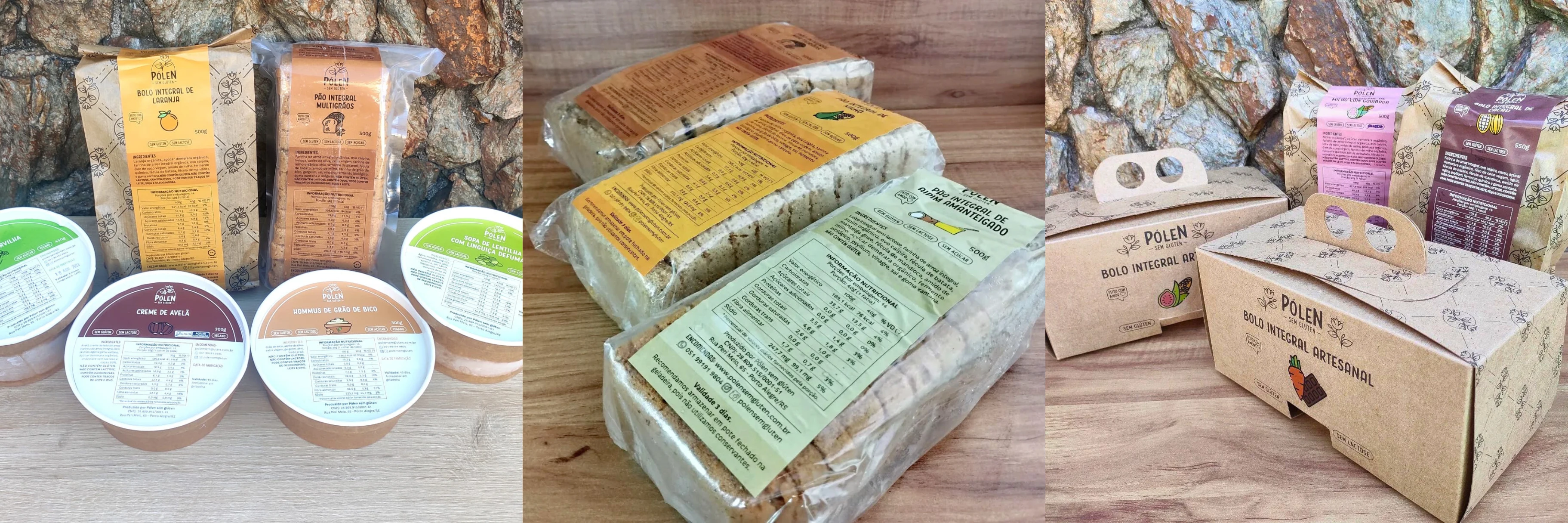
Packaging
To see a more complete application of this visual identity on different types of packaging, click below
Website
To see the brand's online store (which was also designed and created by me), click below
Social Media
Menu digital
RESULTS
Growth and Impact
Starting as a small one-person operation, the company has thrived for over eight years, growing to more than 15 employees and amassing over 31,000 followers on Instagram, even amidst the challenges of a global pandemic. This success story showcases the power of effective branding combined with genuine product quality and environmental consciousness.
This project exemplifies how thoughtful design and strategic branding can revolutionize the market presence of a company by authentically representing its core values and engaging a community of like-minded consumers.
Ready to create an identity that conveys your brand values and creates a connection with your consumers?
Let’s talk! 😊
Like this project
Posted Mar 20, 2025
Crafted a visual identity for a gluten-free brand, using earthy tones, cozy typography, and friendly icons to highlight its natural and sustainable ethos.