Leo Aden — A Street Photographer Portfolio Concept

Valko Sylvaine


Leo Aden — A Street Photographer Portfolio Website Concept
— the city, seen in passing
Leo Aden is a portfolio website concept for a street photographer. I created it to explore how collage-inspired visuals could coexist with a nostalgic yet restrained web experience.
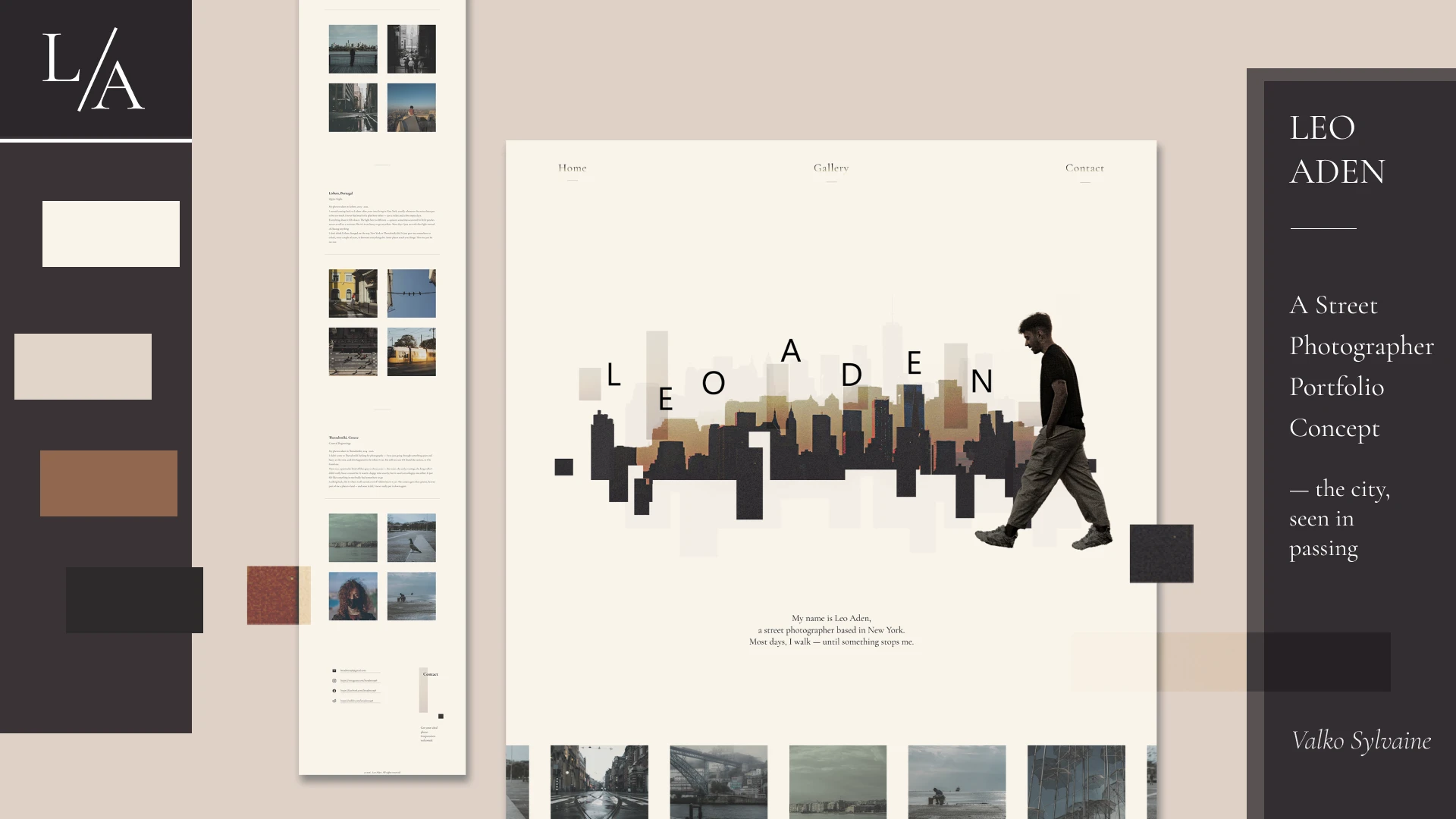
Moddboard
Concept
The project began with a question: how could a slightly nostalgic, art-led visual language coexist with a clean and easy-to-use interface?
In my mind, Leo is not a photographer who simply romanticizes the past through antique streets or classical architecture. His photographs carry traces of loss, but they remain quiet and restrained.
As the subtitle suggests, he quietly records the city’s fleeting moments rather than mourning or losing himself in the past. That tension became the foundation of the site’s visual language: melancholic, yet composed—the perspective of a solitary wanderer moving through the city with a camera.
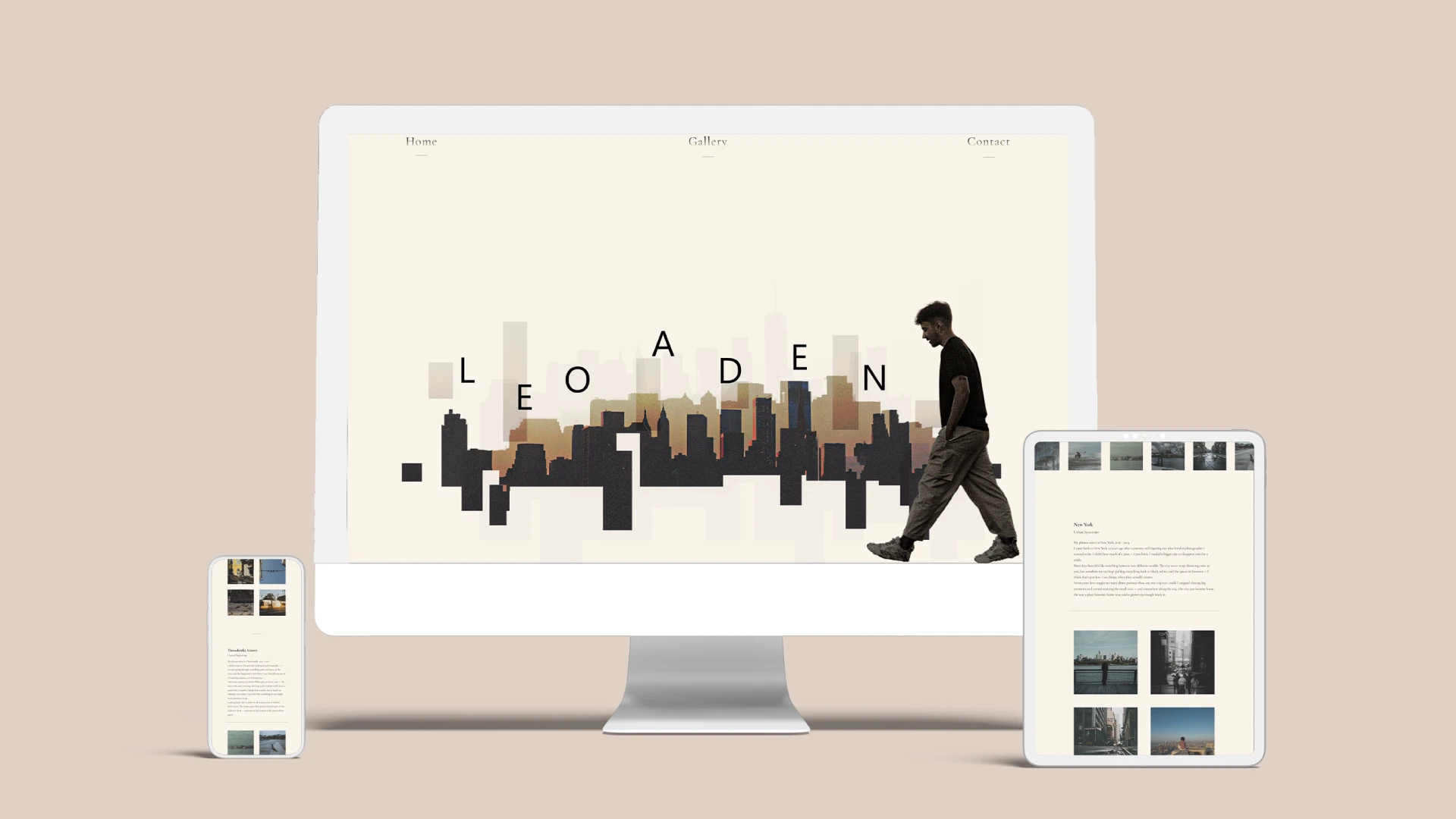
Mockup
Structure and Functionality
To support this artistic direction, I kept the layout simple while making the interactions useful and purposeful.
The website includes a hero section, a clean and intuitive carousel, an expandable City Albums gallery, lightbox viewing for every photograph, and a minimal contact section. Each element was designed to make the work easy to explore without disrupting the atmosphere of the site.
Hero Section
Hero Section & Visual Direction
For the hero section, I created a collage from a photograph of the New York skyline at sunset. I intentionally avoided adding other collage elements, keeping the city itself as the sole focus—just as Leo’s lens does.
The cropped fragments of the city image created a bold, almost abstract effect. I later reused them in the contact section and the presentation video to create a more consistent visual system across the project.
For the color palette, I chose #F9F4EB (parchment), paired with #E0D6C9 (stone beige) and #2D2A2B (charcoal). The overall palette stays muted, with restrained, low-saturation yellow tones.
The navigation text transitions from #000000 (black) to #E8D5A3 (muted gold), echoing the gradual change of light at sunset. Cormorant Garamond is used throughout the site for its elegant, understated character.
Carousel
Carousel & Image Treatment
All portfolio images use a low-saturation filter to create a slightly faded appearance. This prevents photographs with different color palettes from making the interface feel visually fragmented.
On hover, each photograph returns to its original color, creating the feeling of a faded image coming back to life. This interaction also reflects Leo’s relationship with the photographs he collects while wandering through the city.
Each photograph can also be opened in a lightbox for closer viewing.
Gallery Section
Gallery
The gallery can be expanded because I believe the photographer’s state of mind is just as important as the image itself when shaping how a photograph is understood.
Visitors can read the accompanying writing while viewing the thumbnails, or expand the gallery and browse the photographs one by one. The images can also be opened individually in a lightbox.
Contact Section
Contact
The contact section is intentionally simple and direct without losing the visual character of the rest of the site.
Hovering over the email address reveals a copy prompt, and clicking it copies the address instantly.
View the live site here:
Website Walkthrough
Like this project
Posted Jul 22, 2026
A cinematic portfolio website concept for a New York street photographer, combining editorial layouts, urban collage, and subtle interaction.
Likes
1
Views
6
Timeline
May 29, 2026 - Jun 14, 2026