Visual Exploration & Logo Design for Noozle
Supreet
Brand Exploration for a Quiet Digital Space Designed for Thought, Focus, and Flow
Project Overview
Noozle is a digital mindspace designed to reduce cognitive clutter and support clear, uninterrupted thinking. Built around the idea that productivity begins with clarity, the product moves away from feature-heavy systems and instead creates a focused environment where ideas can flow, evolve, and turn into action.
Visual exploration - Core aesthetic
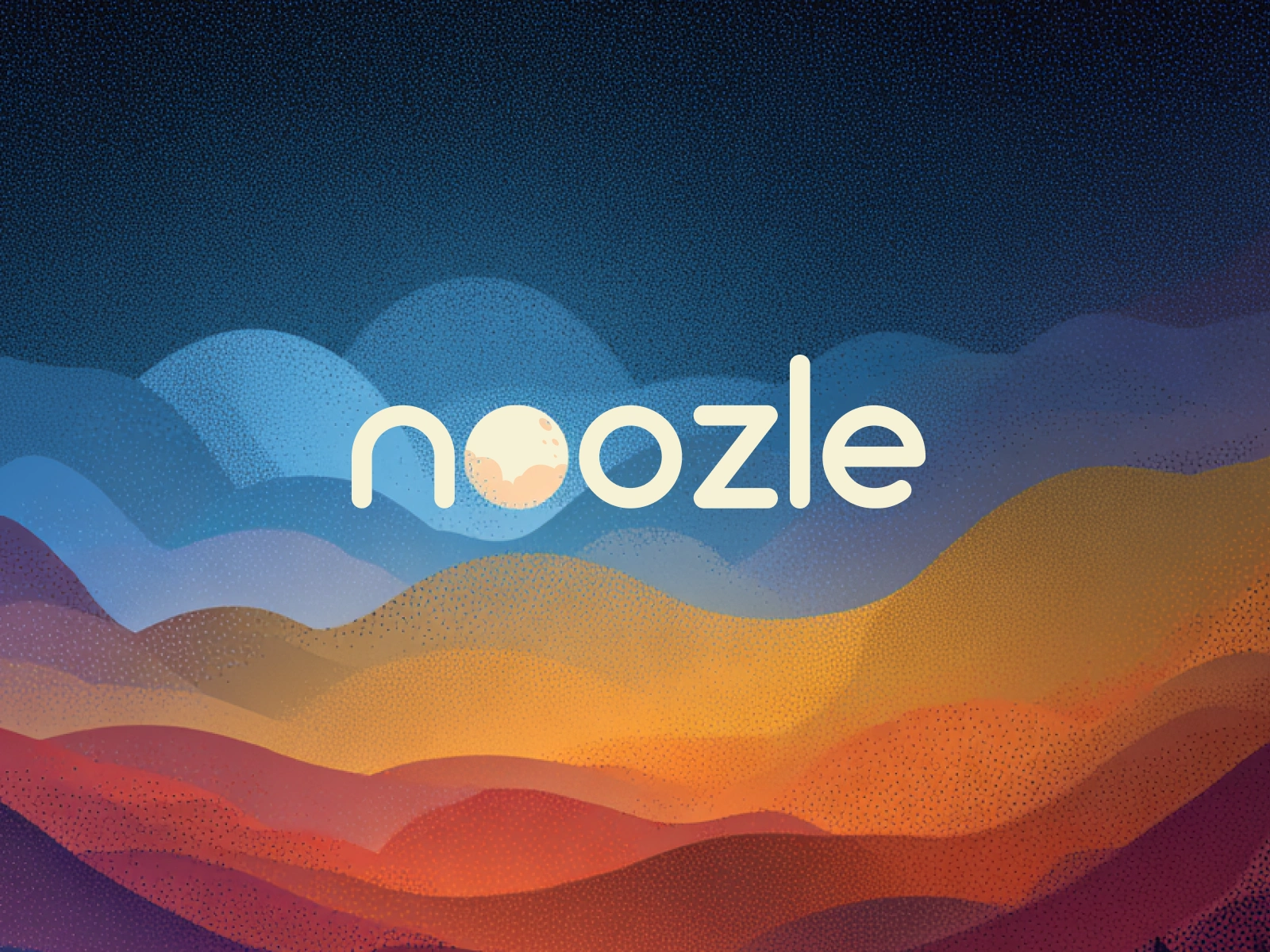
Logo Exploration
The Noozle wordmark is designed to feel soft, fluid, and unobtrusive, aligning with the overall ambient nature of the brand.
A key detail within the identity is the treatment of the “oo” as a moon form. This element is not just decorative but symbolic. The moon represents stillness, rhythm, and quiet presence, qualities that directly connect to the idea of a mental space. It acts as a visual anchor across the brand, grounding the otherwise fluid and expansive compositions.
This subtle emphasis allows the logo to feel integrated into the environment rather than placed on top of it. It becomes part of the landscape, not separate from it.
Visual Language
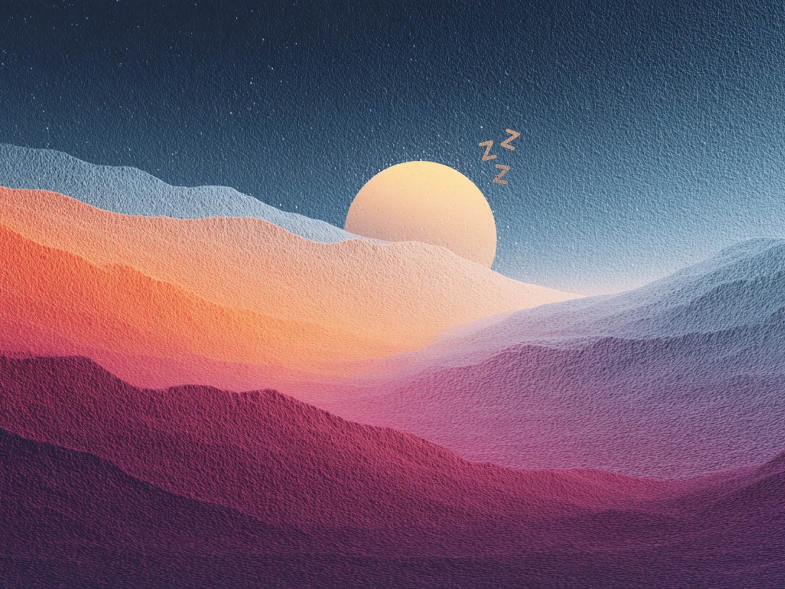
The visual system is defined by restraint and softness. There is no harsh contrast or rigid structure. Instead, the compositions rely on gradual gradients, layered forms, and textured noise to create depth without overwhelming the viewer.
Color plays a key role in shaping emotion. Warmer tones introduce comfort and familiarity, while cooler tones create distance and introspection. The transitions between them are intentionally smooth, reinforcing a sense of continuity.
The grain texture adds tactility, making the visuals feel almost physical, as if the mindspace can be felt rather than just seen.
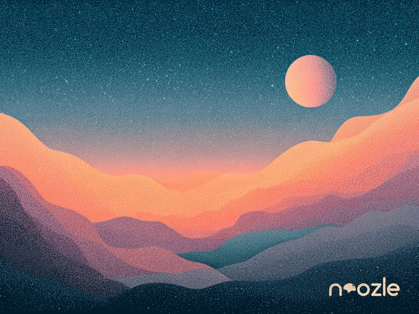
Illustration Design and AI layering
Process
The process began with exploring how abstract landscapes could represent different states of the mind. Instead of sketching defined forms, the approach focused on building depth through layers, gradually shaping compositions that feel organic and immersive.
Early iterations were focused on color relationships and transitions. The goal was to achieve a balance where no single element dominates, allowing the eye to move naturally across the frame. From there, forms were refined to create a sense of horizon, depth, and flow without introducing hard boundaries.
Tools & Techniques
The visual compositions were primarily created using Procreate, allowing for a more tactile and intuitive approach to building gradients, textures, and organic forms. Figma was used for refining the brand identity, including the Noozle wordmark and its integration within the compositions.
A key part of the final output involved using AI-assisted layering techniques to enhance depth and texture. After establishing the base compositions, AI was used to generate additional granular layers that introduced controlled noise and variation across surfaces.
These layers were not used as final outputs but as enhancement passes. They were carefully blended back into the original artwork to achieve a richer, more dimensional texture while maintaining the softness of the visuals. This approach helped create the signature grainy finish that gives the work its tactile, almost atmospheric quality.
The combination of manual composition and AI-assisted refinement allowed for greater control while still introducing subtle complexity that would be difficult to achieve purely by hand.
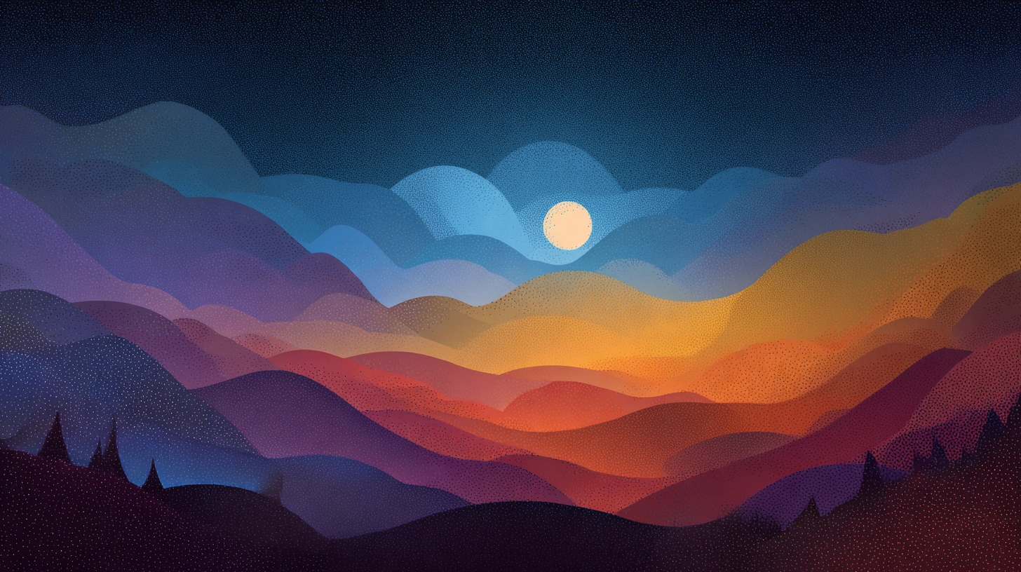
Illustration Design
This exploration reflects my approach to design. Thoughtful, minimal, and experience-driven.
Available for branding, visual systems, and digital explorations.
Hire me on Contra.
Like this project
Posted Apr 12, 2026
A visual exploration of a calm, ambient digital mindspace expressed through textured landscapes and a minimal, moon-inspired identity system.
Likes
1
Views
1