HENKIN • BRAND
Overview 🔎
In a constantly changing world and with a high level of competition, the metal mechanic industry is one of the most important parts of the everyday life of many. This project’s objective was to create an identity that connects with its audience with a modern sans-serif logo and an atemporal design.
Problem & Solution 🤝
Create a brand identity reflecting the main qualities: precision, technology, transformation and tooling.
Process 🛣
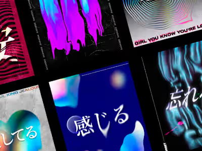
HENKIN brand identity was built around creative conceptualization inspired by Japanese influences and esoteric belief that is linked to the transmutation of matter, just as alchemists do.
With bold typography, a strong color palette, and the addition of orange to create contrast, is hot it's created an infinite spectrum of possibilities, with dynamic movement showing adaptable structures, symbols and
Like this project
Posted Nov 3, 2022
HENKIN is a metal mechanic company located in Monterrey, MX. Faced the need to reinvent itself to conquer the market with an aesthetic and new perspective.


