Ezicargo UI/UX Redesign Project

Syah

Background
Ezicargo is a forwarder and warehouse provider specialising in managing and storing goods purchased from China, offering a streamlined solution for e-commerce businesses, physical stores, and individual buyers. With a focus on simplifying the logistics process, Ezicargo securely stores purchased items in its state-of-the-art warehouse and ensures that they are delivered directly to customers' doorsteps. Whether the purchase is from an online marketplace, a physical store, or any other source, Ezicargo takes care of the entire journey—from secure storage to final delivery—ensuring a seamless experience for both businesses and end consumers. By providing reliable and efficient freight forwarding and warehousing services, Ezicargo aims to simplify global shipping and enhance convenience for customers worldwide.
Core problem
The current system suffers from an outdated UI and a poor user experience, resulting in:
Unattractive and non-intuitive visual design that lacks modern appeal
Complicated, disorganised navigation, making the system difficult to use
A steep learning curve, especially for new users, leading to low adoption
Inefficient and confusing workflows that frustrate users and hinder productivity
Lack of responsive design, with no support for mobile or tablet devices
Steps Taken
User Research & Pain Point Analysis
Conducted user interviews and gathered feedback
Identified key frustrations and usage patterns
UI Redesign
Applied a modern visual design system aligned with current trends
Introduced a clean, consistent layout and intuitive iconography
Navigation Overhaul
Reorganised information architecture for easier access
Implemented a simplified menu and clear pathways for key tasks
UX Optimisation
Streamlined task flows to reduce clicks and confusion
Designed onboarding tips and contextual help for new users
Responsive Design Implementation
Ensured full compatibility across desktop and tablet
Usability Testing
Ran usability tests to validate design decisions
Iterated based on real user feedback
Wireframes
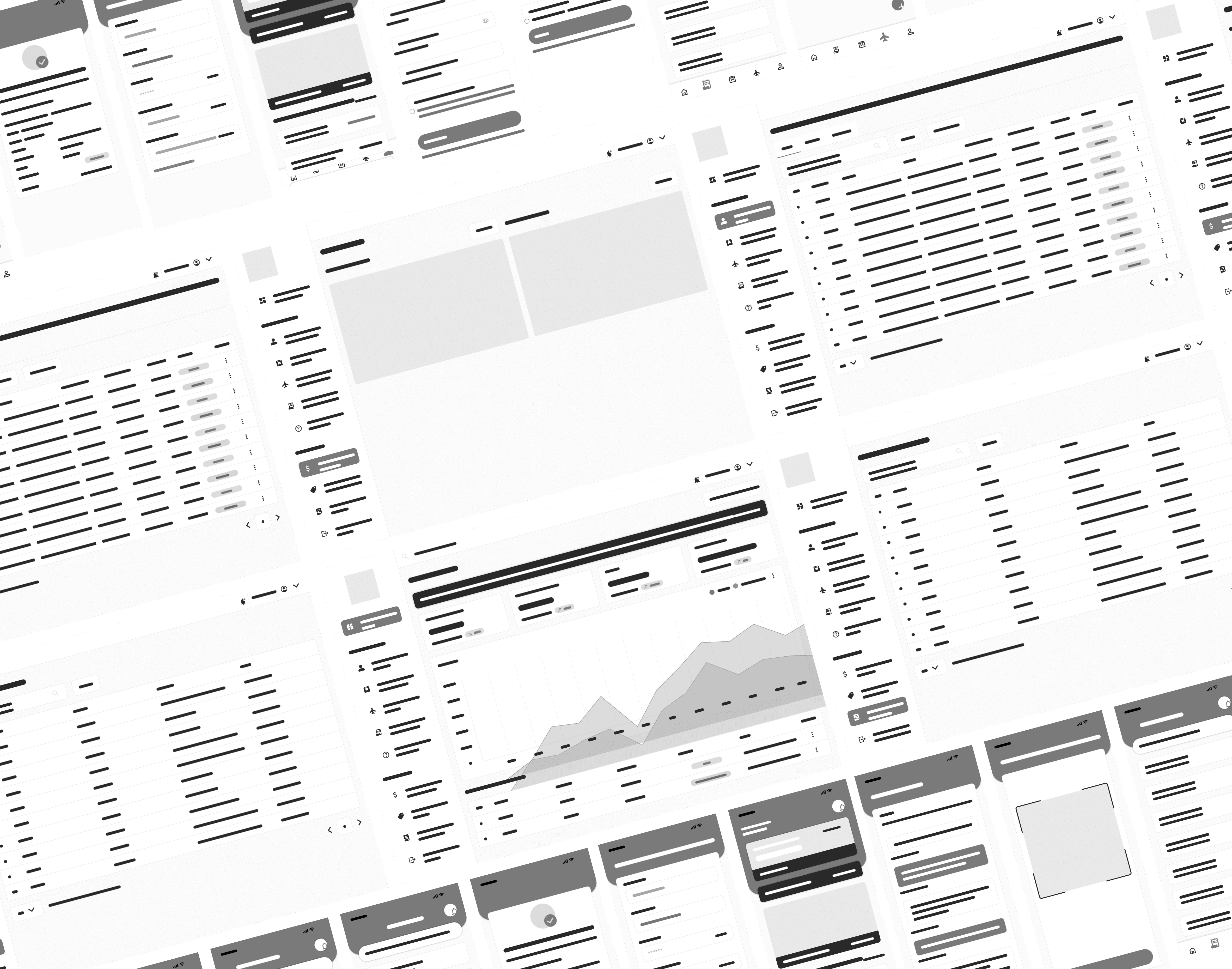
These are the low-fidelity wireframe concepts approved by the client, developed by addressing key user pain points and analysing the limitations of the current system. The design process focused on improving usability, simplifying navigation, and ensuring a more intuitive user flow.
Key findings from user research revealed the following pain points:
A steep learning curve, especially for new users
Unfriendly and cluttered navigation, making the system hard to use
Lack of support for mobile and tablet devices
Confusing workflows that disrupted task completion
These insights guided the wireframe development, ensuring the proposed solution directly tackled these issues while laying a strong foundation for high-fidelity design and further validation.
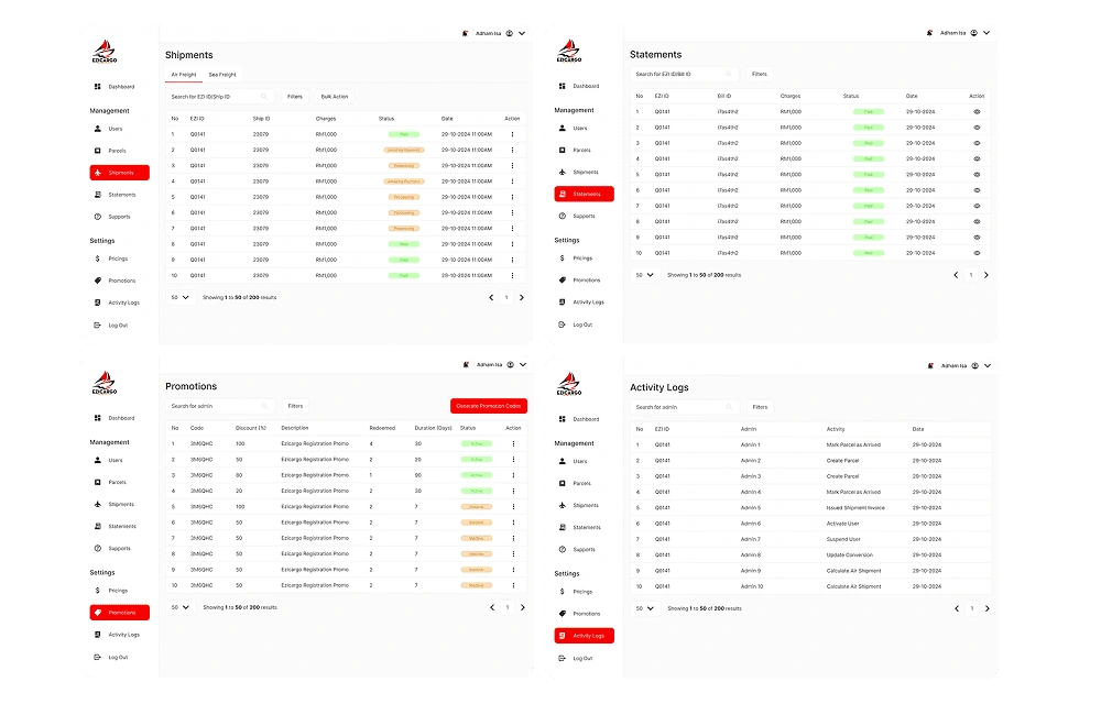
Hi-Fi Design Concept
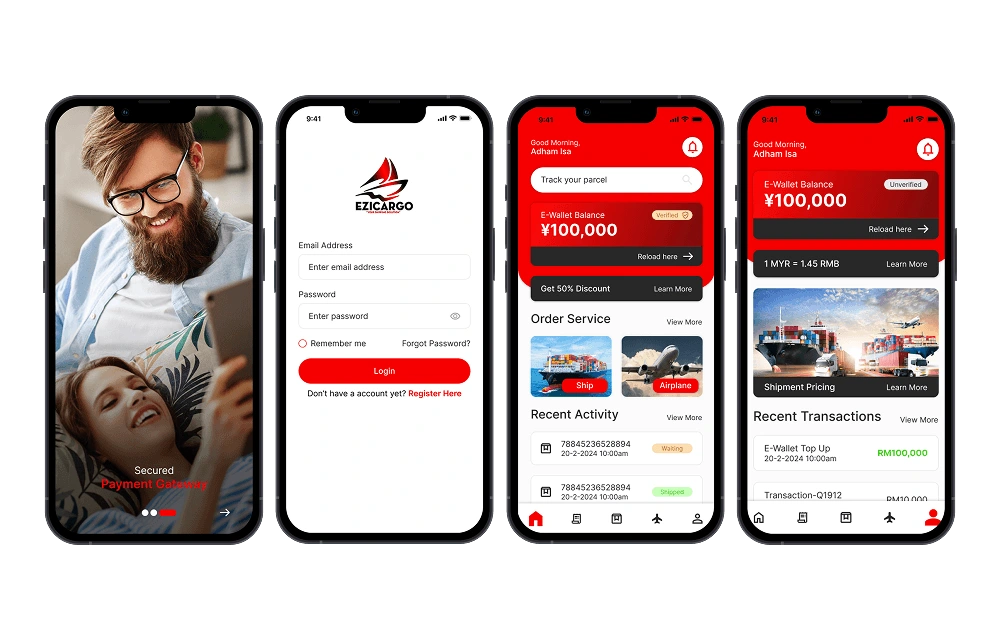
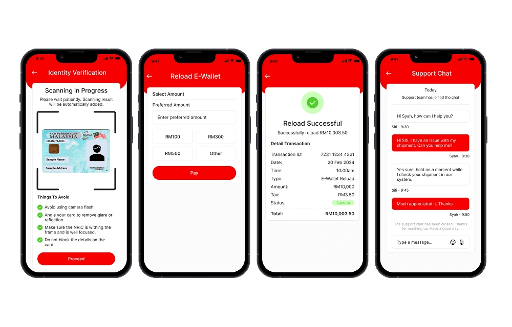
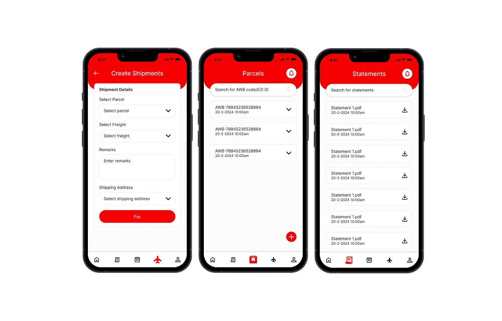
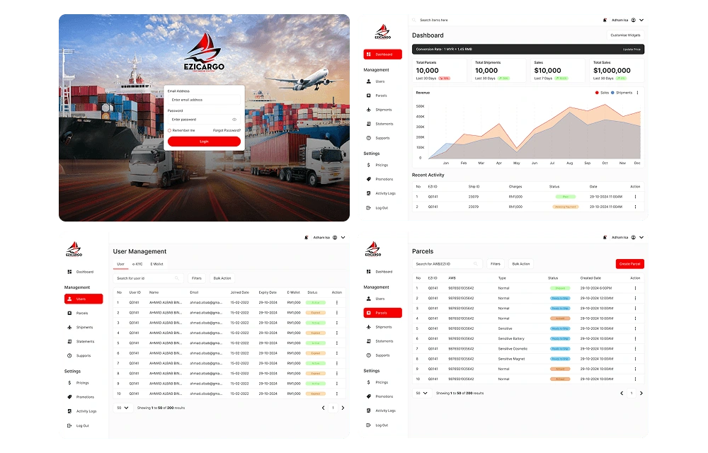
These pages highlight the major improvements implemented based on earlier user feedback and the approved wireframes. They incorporate key enhancements in usability, navigation, and visual consistency—directly addressing the pain points identified during research.
Each page was carefully refined to ensure a more intuitive user experience, optimised layout structure, and better content hierarchy. The finalised designs are now ready for handoff to the development team for implementation.
Results and Impact
The Ezicargo redesign delivered measurable improvements across both user experience and system performance. Through focused UI/UX enhancements, the platform became more intuitive, visually appealing, and efficient, resulting in clear benefits for users and business outcomes.
Key Improvements
Modernised UI with clean visuals and consistent components
Improved navigation with simplified menus and logical structure
Cross-device compatibility for mobile, tablet, and desktop
Reduced learning curve through intuitive design and onboarding support
Streamlined workflows that save time and reduce user frustration
Positive user feedback indicating increased satisfaction and usability
Key Outcomes
40% increase in user satisfaction
Improved navigation and modern visual design contributed to a more enjoyable and intuitive user experience.
50% boost in workflow efficiency
Streamlined processes and clearer task flows enabled users to complete actions faster and with greater confidence.
50% improvement in content and interface clarity
Better structure and layout made the system easier to understand, especially for first-time users.
20% increase in feedback clarity
User feedback became more constructive and specific, highlighting clearer communication between users and the design team.
60% increase in successful transactions
The improved usability led to a dramatic rise in successful task completions and overall platform reliability.
Like this project
Posted Oct 13, 2026
Redesigned Ezicargo's UI/UX to enhance usability and modernize visual appeal.
Likes
0
Views
0