Brand Identity Design for Stéphanie Petit
SWEAKID
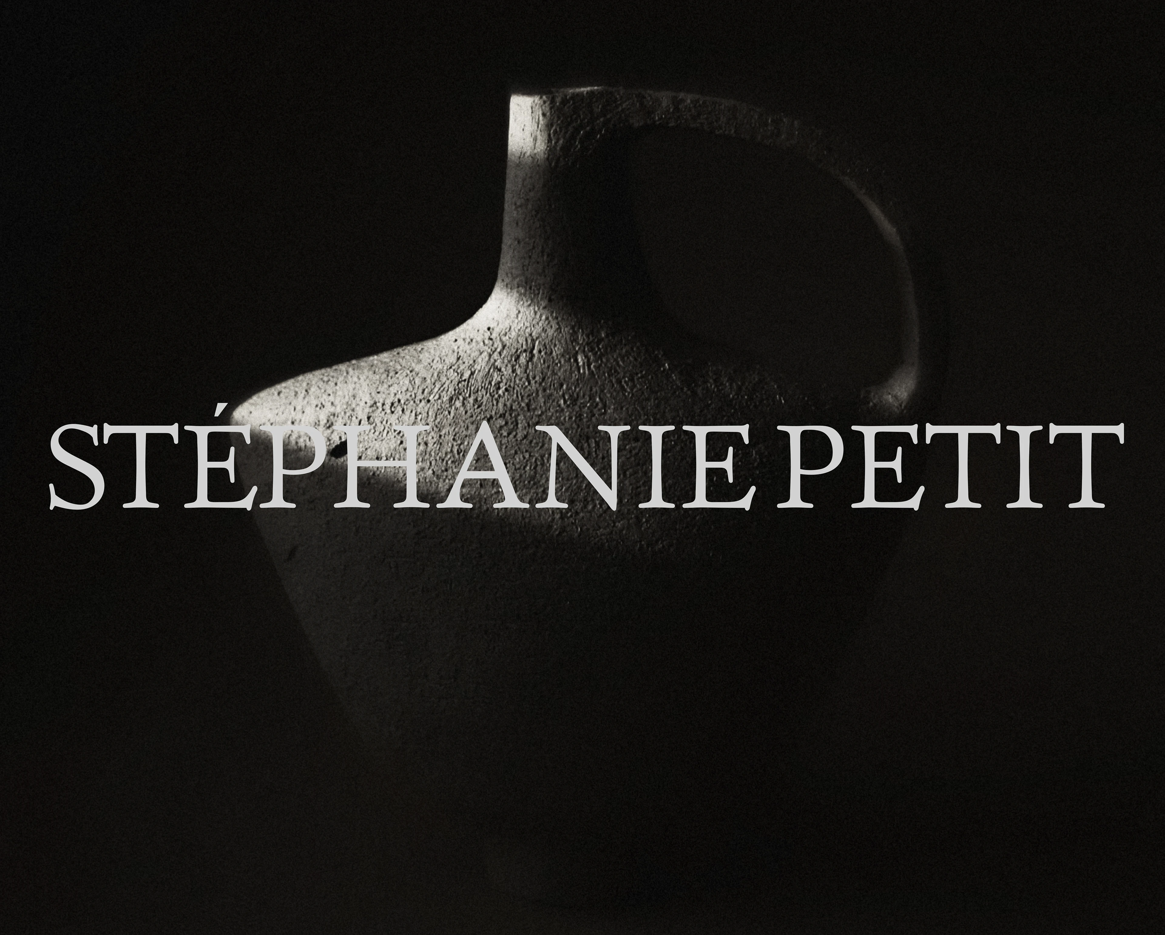

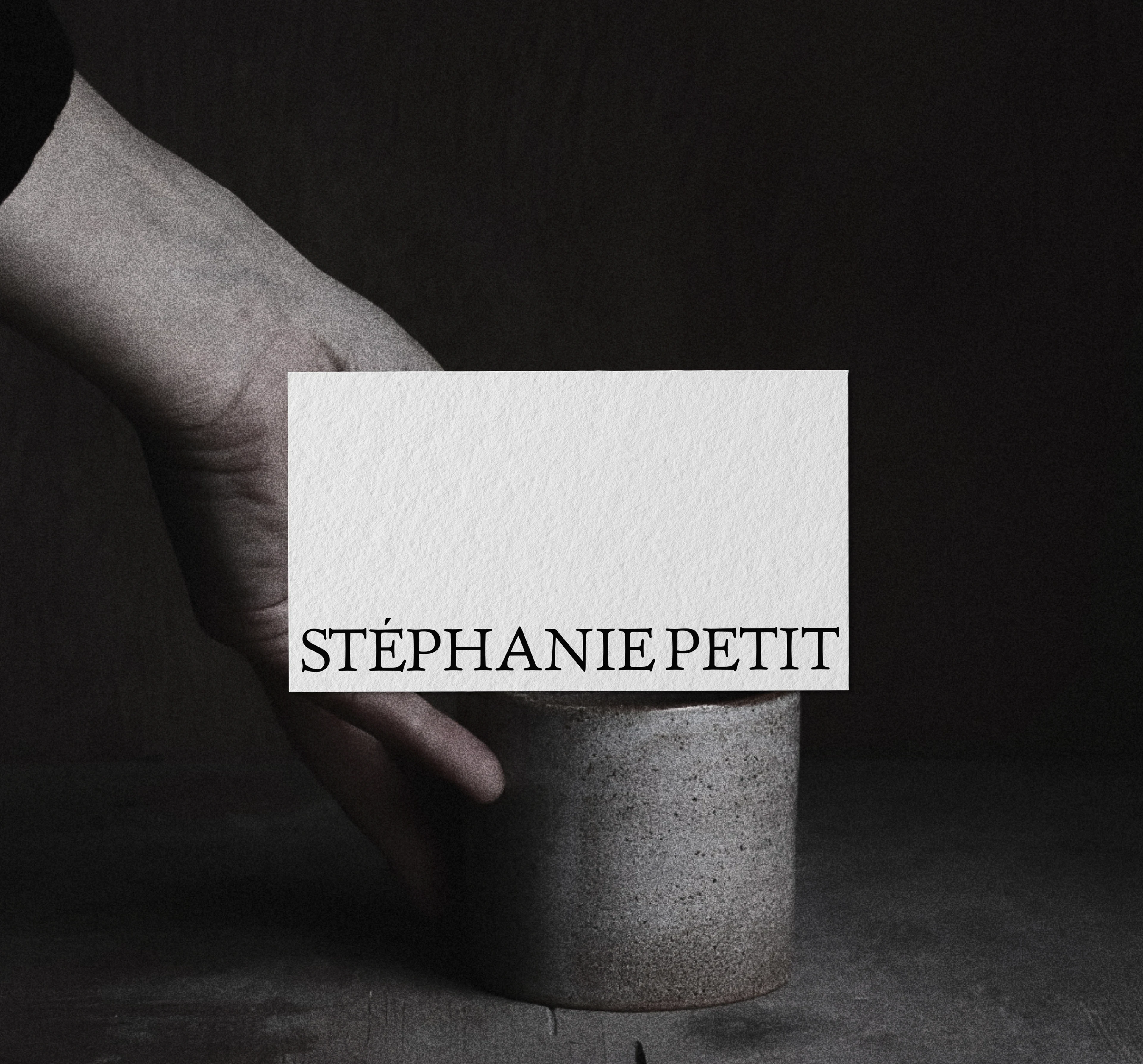
Stéphanie Petit
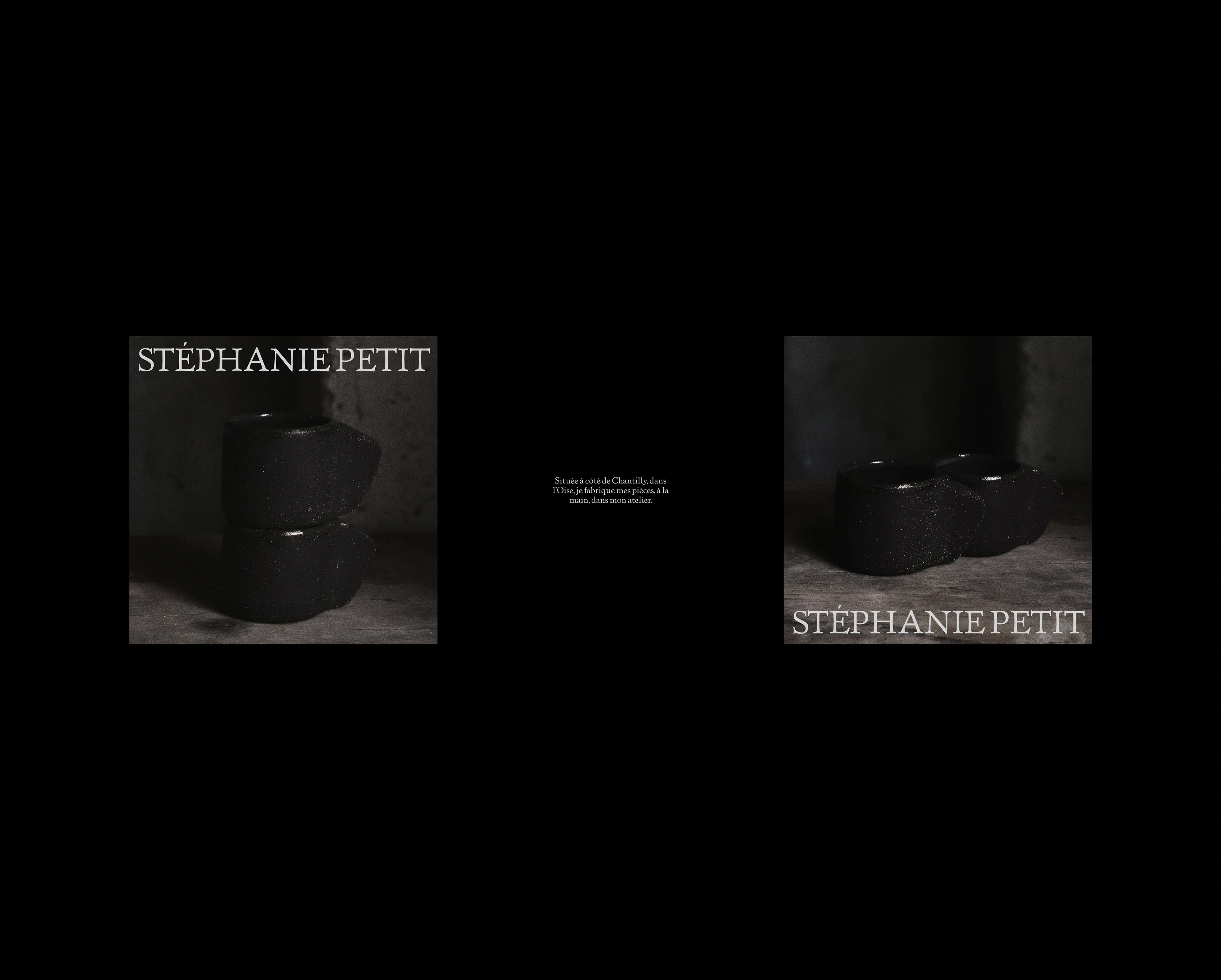
STÉPHANIE PETIT
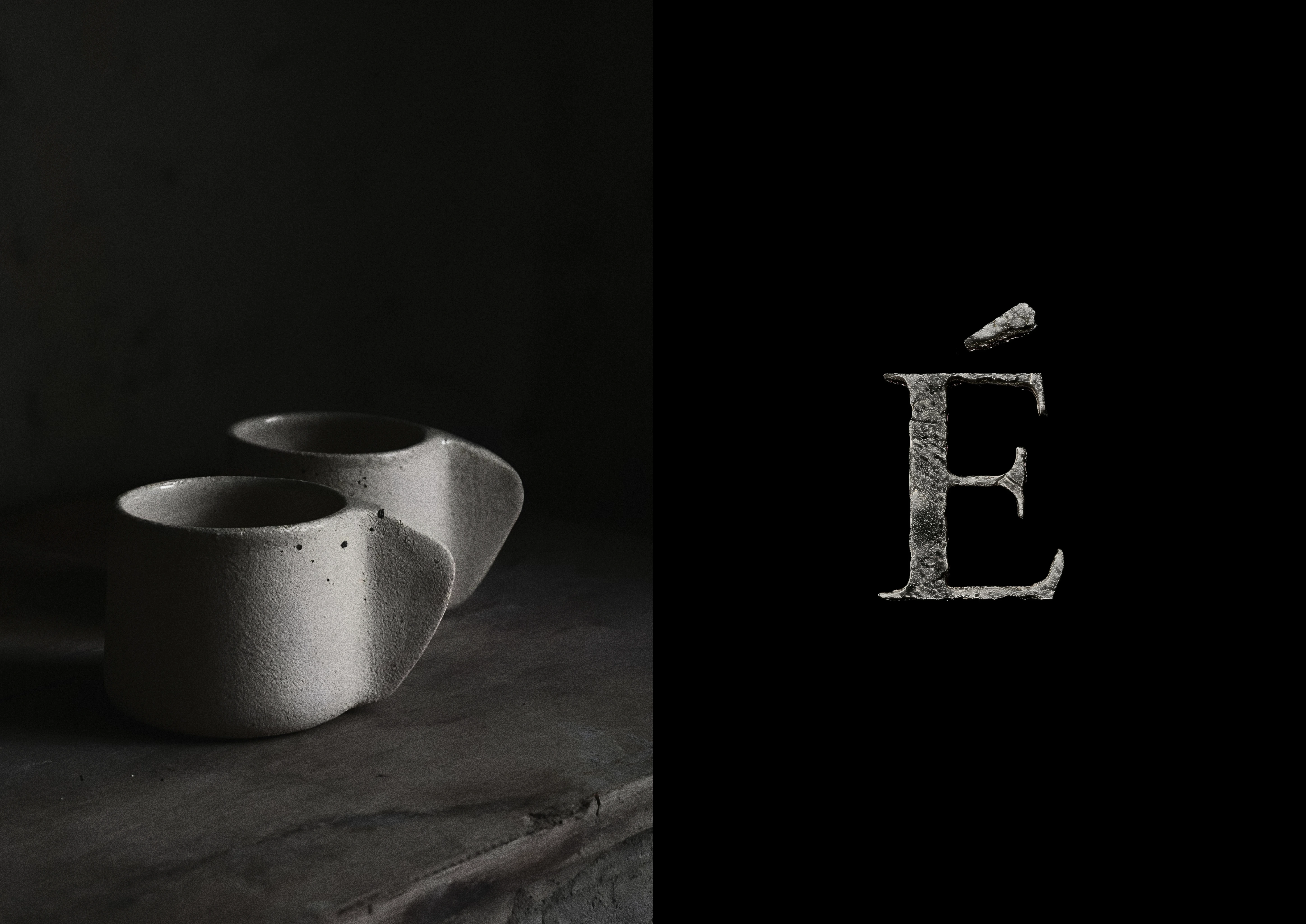
The quiet precision of imperfection.
A refined brand identity rooted in the philosophy of wabi-sabi and crafted detail.
The wordmark stands with understated clarity, while the É becomes a distinctive typographic signature — a point of tension and character.
A separate symbol, carved from the idea of rough stone, introduces tactility and presence into the system.
The visual language embraces shadow, structure, and restraint.
Each element — from print to interface — honors the hand-touched nature of the brand, with a focus on clarity, weight, and raw elegance.
Social content was designed as extensions of the studio’s tone — deliberate, minimal, quietly expressive.

Like this project
Posted Jun 9, 2026
Developed a refined brand identity rooted in wabi-sabi for Stéphanie Petit.