Gaya Brand Identity Design
KABUYE ADILU
Intro
We cultivate an atmosphere where wellness is not merely flexibility, but a profound architecture of the self. We facilitate a disciplined return to focus and high-performance physical recovery through the medium of precision movement. The Gaya aesthetic, while elegant, is designed to be a universally exclusive sanctuary for the uncompromising individual.
Colours
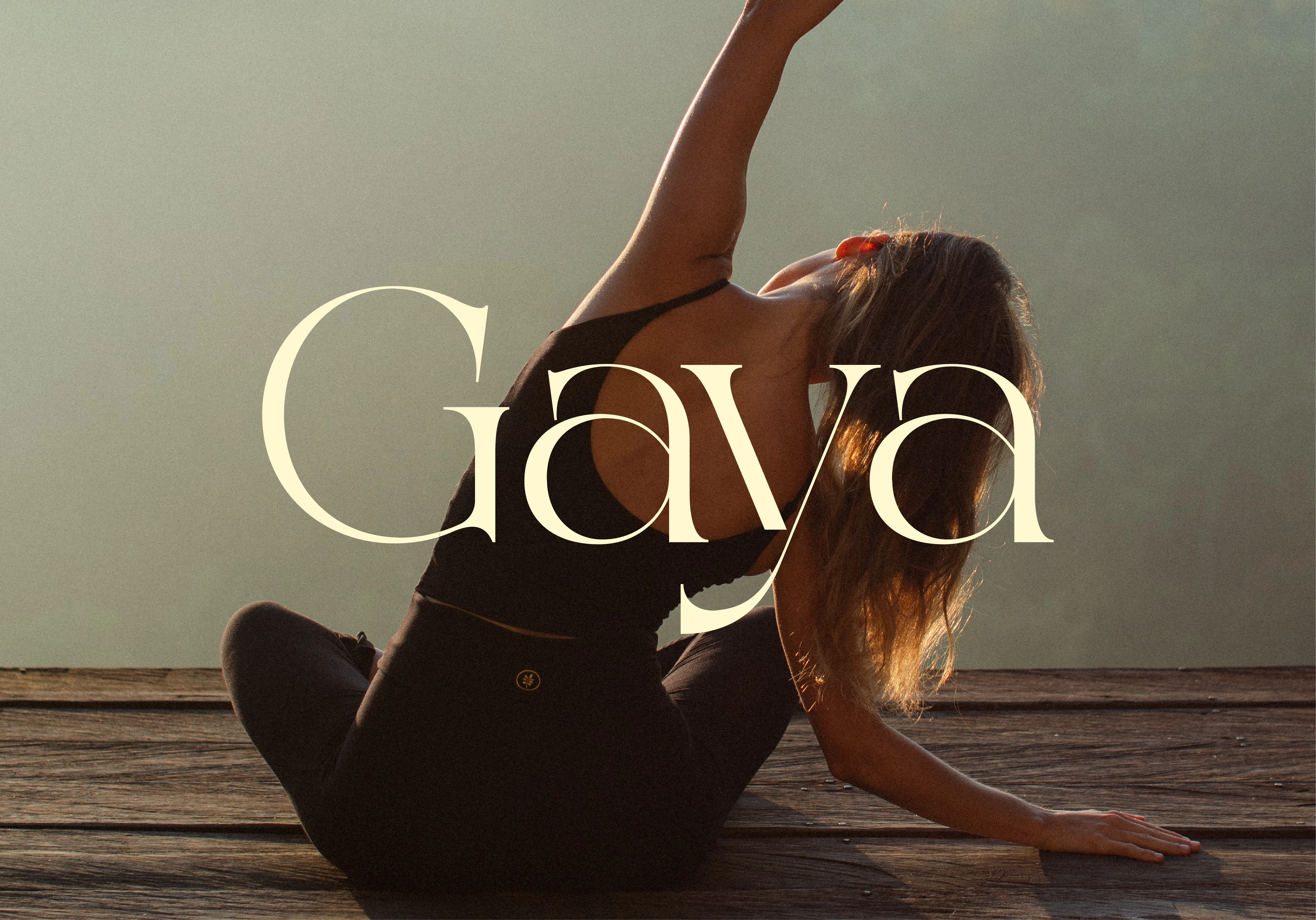
The color strategy for Gaya is defined by its structure and absence of clutter. We use Deep Obsidian, Concrete Slate, and Frosted Champagne to establish a visual language of quiet authority and technical excellence. This is a deliberate aesthetic, profound, structural, and architecturally inspired.
Typography
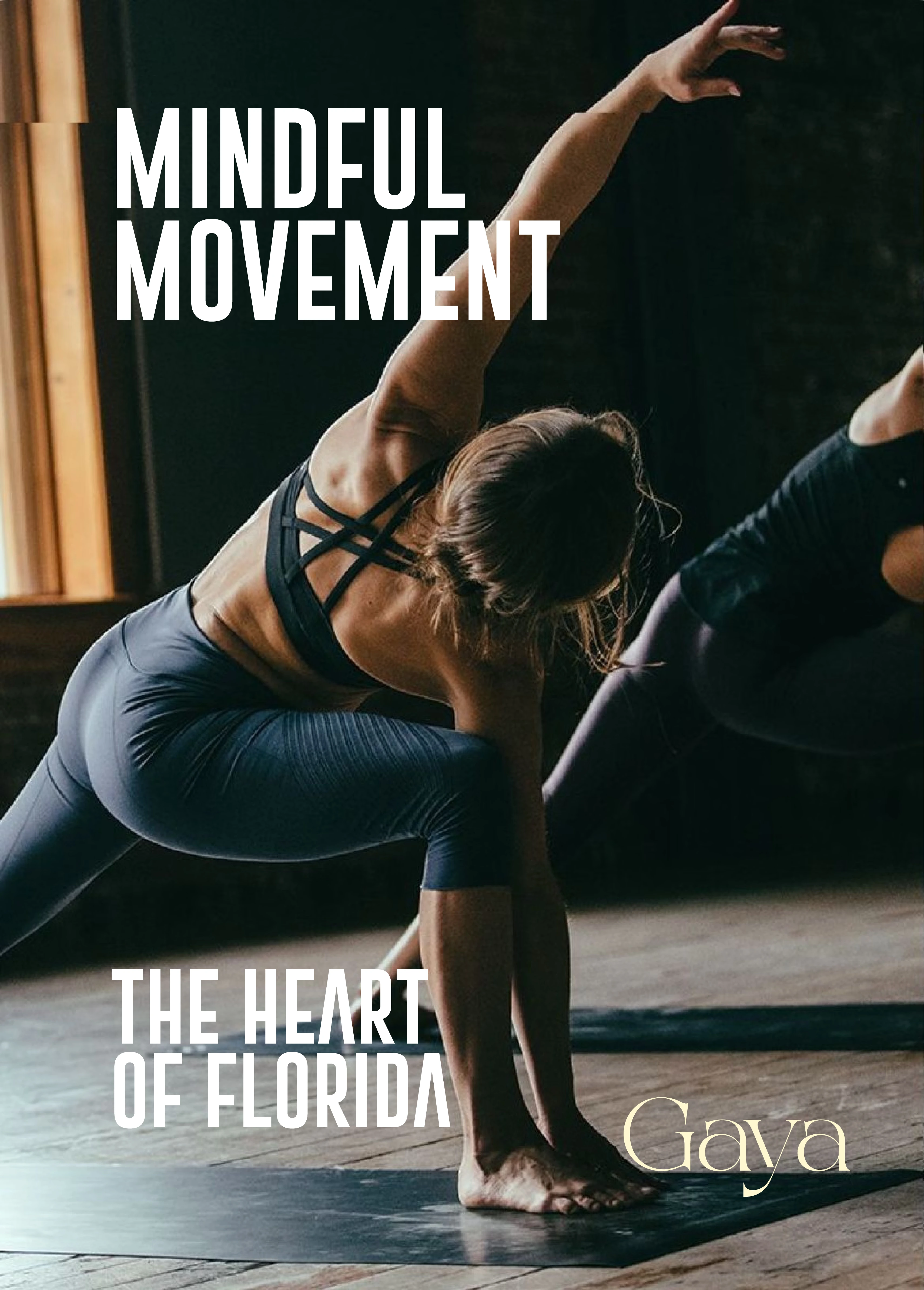
Our typography is precise, spaced with immense intent to command space. We pair a refined, high-contrast serif for the logo with a rational, geometric sans-serif for body content, occasionally utilizing a precise monospace for technical specifications. This combination creates an elevated, curated voice that is authoritative and deeply sophisticated
The Curated Gaze (Imagery)
Like this project
Posted Apr 3, 2026
Developed a structured visual identity for Gaya, an architectural wellness sanctuary. The system prioritizes a minimalist hierarchy to reflect commitment
Likes
0
Views
3
Clients
Gaya