Brand Identity for Wifey with a Knifey

Nigel Jordan


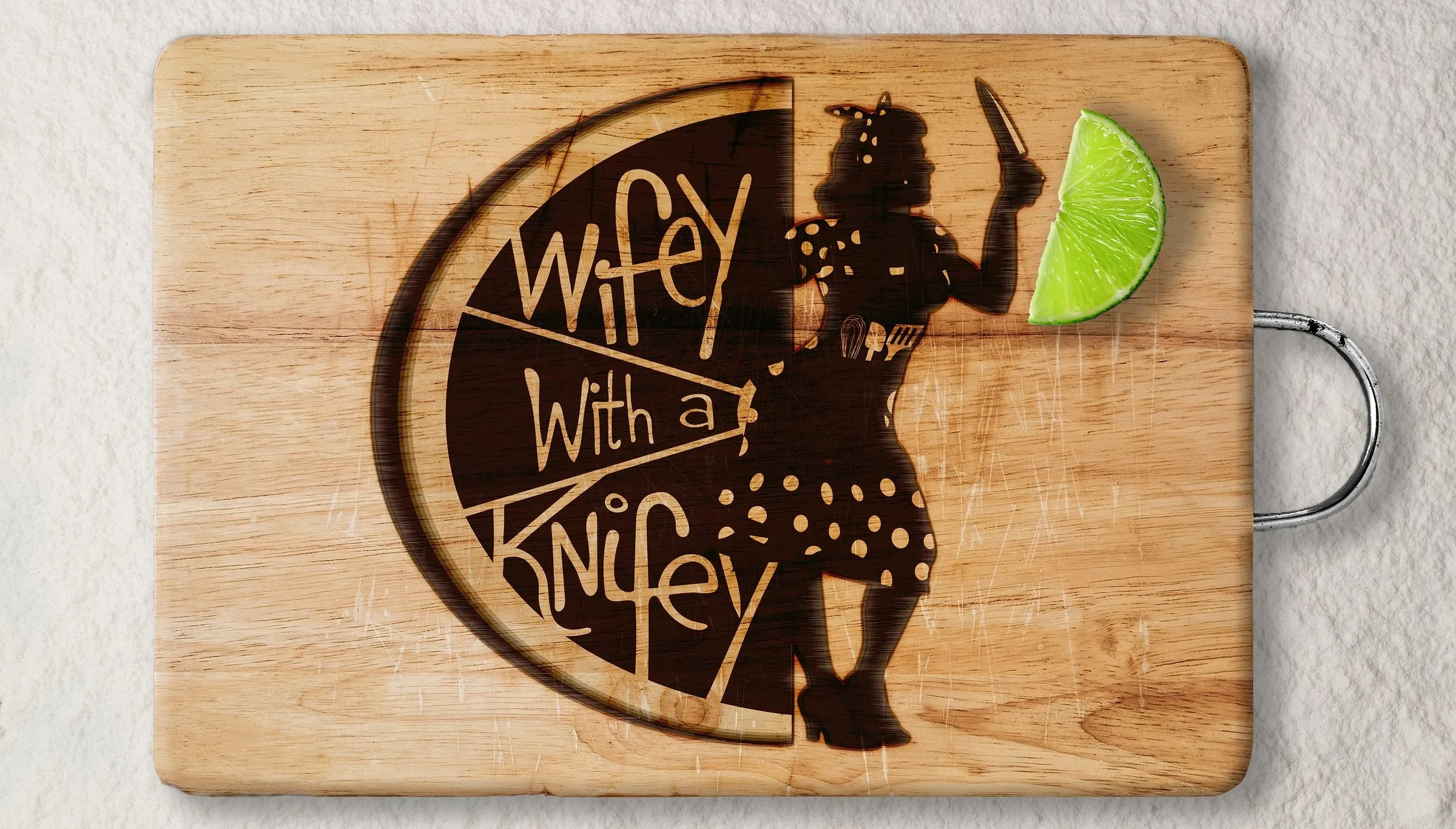
The Wifey with a Knifey mark branded into a wooden cutting board, the hand-lettered name filling a lime slice with the mascot stepping out of it, a lime wedge resting on the board
Brand identity for a mobile food business that had to be seen before it could be tasted.
At a Glance
Client
Wifey with a Knifey
Sector
Mobile food service, BC interior
Brand identity, illustration, style guide, signage, packaging, merchandise
The problem
The Problem
A new mobile food business launching into a crowded market. Working markets, fairs and local stops across the Okanagan and Kootenays, where the truck has to be recognised from across a field. Food trucks compete on visibility before anyone tastes the food.
The approach
The owner had the personality to be her own mascot, so I made her one. The name came from how she signed off lunch notes to her husband. It borders on sinister, which makes people look twice and then work out what the knife is actually for.
The system
What the Brand Is Made Of
Primary logo: the pin-up mascot with a raised knife, standing against a half lime carrying the Wifey with a Knifey lettering
Submark: a chef's knife threaded through the word Wifey, a red lipstick mark on the blade, on a purple cabbage ground
One-colour version of the primary logo, mascot and lime rendered in solid black
Colour palette swatches labelled avocado, lime, purple cabbage, mango, sour cream and black beans
Horizontal logo lockup showing the custom Wifey lettering above the word Knifey in heavy type
Hand-drawn pin-up character in a green polka-dot dress holding a kitchen knife
In application
Out in the World
Result
What Happened Next
Launched in 2022 into markets and fairs across the Okanagan and Kootenays. The identity carried across signage, packaging, apparel, drinkware and a full vehicle setup without a single redraw. Four years later it is still running unchanged.
Need a launch cut or a sound to go with it? That gets built here too. The sound →
Like this project
Posted Sep 3, 2026
Created a distinctive brand identity for a mobile food business, featuring a unique mascot and comprehensive style guide.
Likes
0
Views
1
Timeline
Mar 2, 2022 - Ongoing