The Diplomatic Post
Tim Bungard
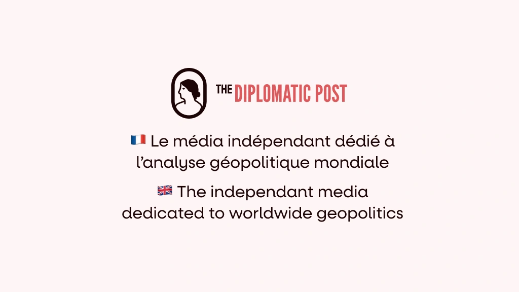
The Diplomatic Post is a French independent web-based media focused on diplomatic reporting. As you may have guessed, I operated a full redesign of the first version of the website that needed a proper refresh. Before we begin, here are the services The Diplomatic Post provides :
Free articles covering news from the diplomatic world, providing the most neutral coverage possible.
Le Signal, a Spotify podcast to stay informed even on the go !
Paid Workshops, Conferences and Courses to refine your skills and knowledge.
The brand of The Diplomatic Post
Before I even started, The Diplomatic Post already had a solid brand identity with a logo, colours and fonts. Here are the basics :
The Logo
The logo of The Diplomatic Post is a simple but distinguishable icon with the name of the brand. It can of course be declines to a simple icon or a custom page title :
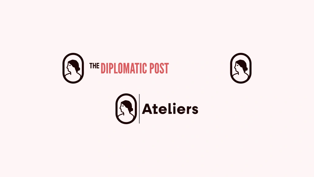
The declinations of The Diplomatic Post's logo
The colours
The primary colours of The Diplomatic Post are the ones from the logo : Nuit, Rose, and Blanc. These colours are the most present in the UI, as the three secondary colours, Sable, Aurore, and Sauge are only to be found in graphic visuals.
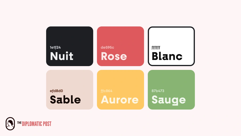
The colour palette of The Diplomatic Post
The fonts
The Diplomatic Post is represented by two unique fonts : Fractual for the titles and Neulis (neue for the subtitles and alt for the body text). We tried to choose recognisable fonts while keeping the UI simple, and I think we nailed it !
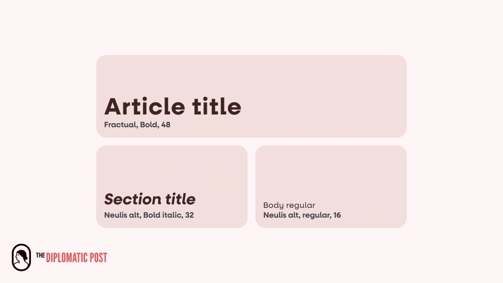
Some of the type tokens used for the prototype
The collections
The article library of The Diplomatic Post is divided in categories (known as collections). Each collection has it’s own colour for fast identification. These colours are found on tags, headers and even sometimes article thumbnails !
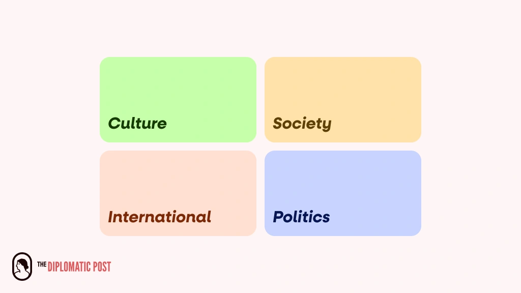
The collections of The Diplomatic Post
See more on the branding in the full brandbook at behance.net.
Quick credit : I am not the author of this brandbook. You can find the original author on the link above !
Designing the UI for The Diplomatic Post
Being a feature-rich website, The Diplomatic Post is still an ongoing project, but most of the design is complete ! To the client’s request, I designed breakpoints, just like the ones used in Framer. Here is the full design :
Most of the data shown on the prototypes is sample data, please keep this in mind while reading. Have a good time !
The home and podcasts pages
First things first, let’s talk about the first impression of The Diplomatic post to any new user ! The latest article is clearly highlighted and is followed by previous articles. The user can then quickly access categories with coloured cards. The podcasts page is quite similar, without the categories.
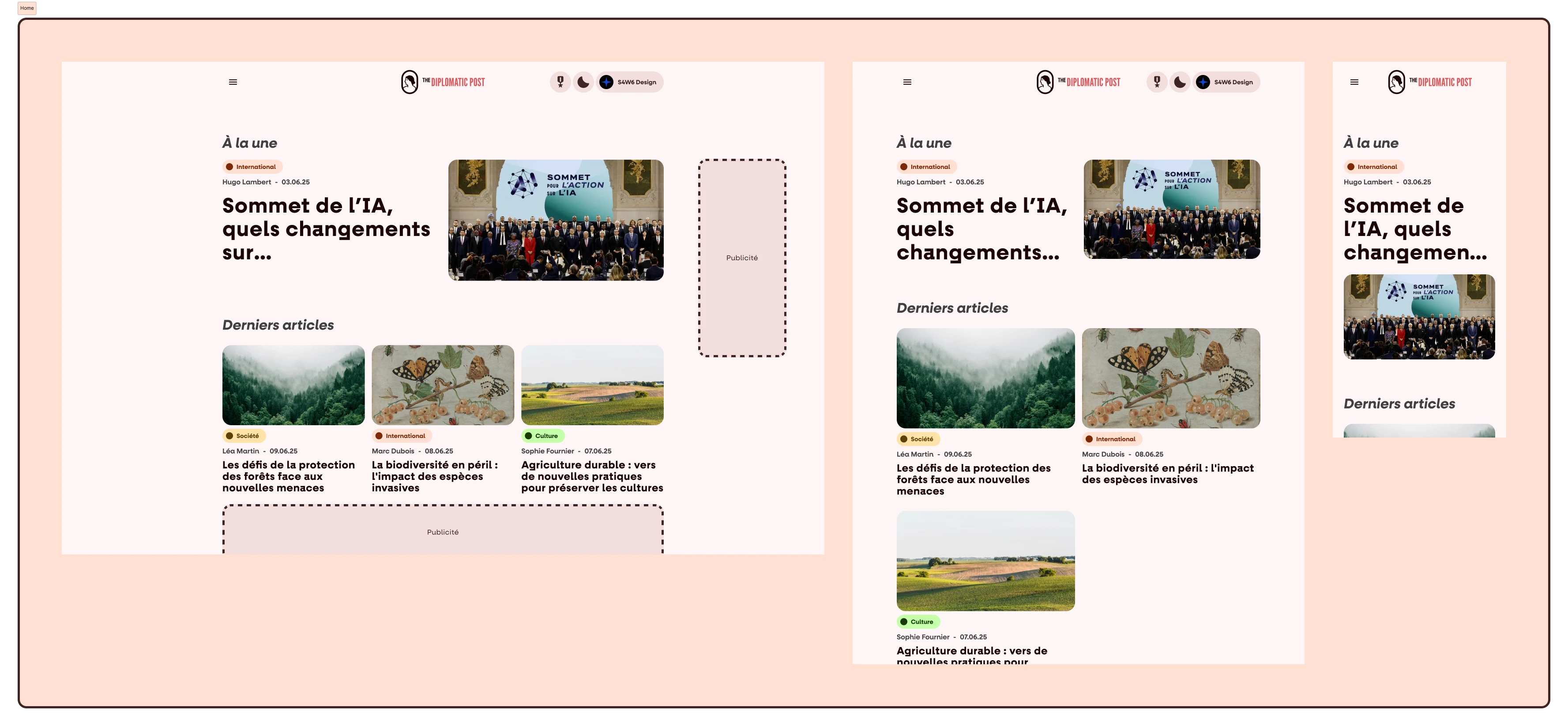
The home page for all viewports
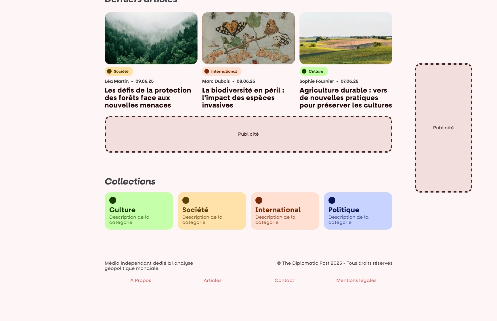
The collections on the desktop homepage
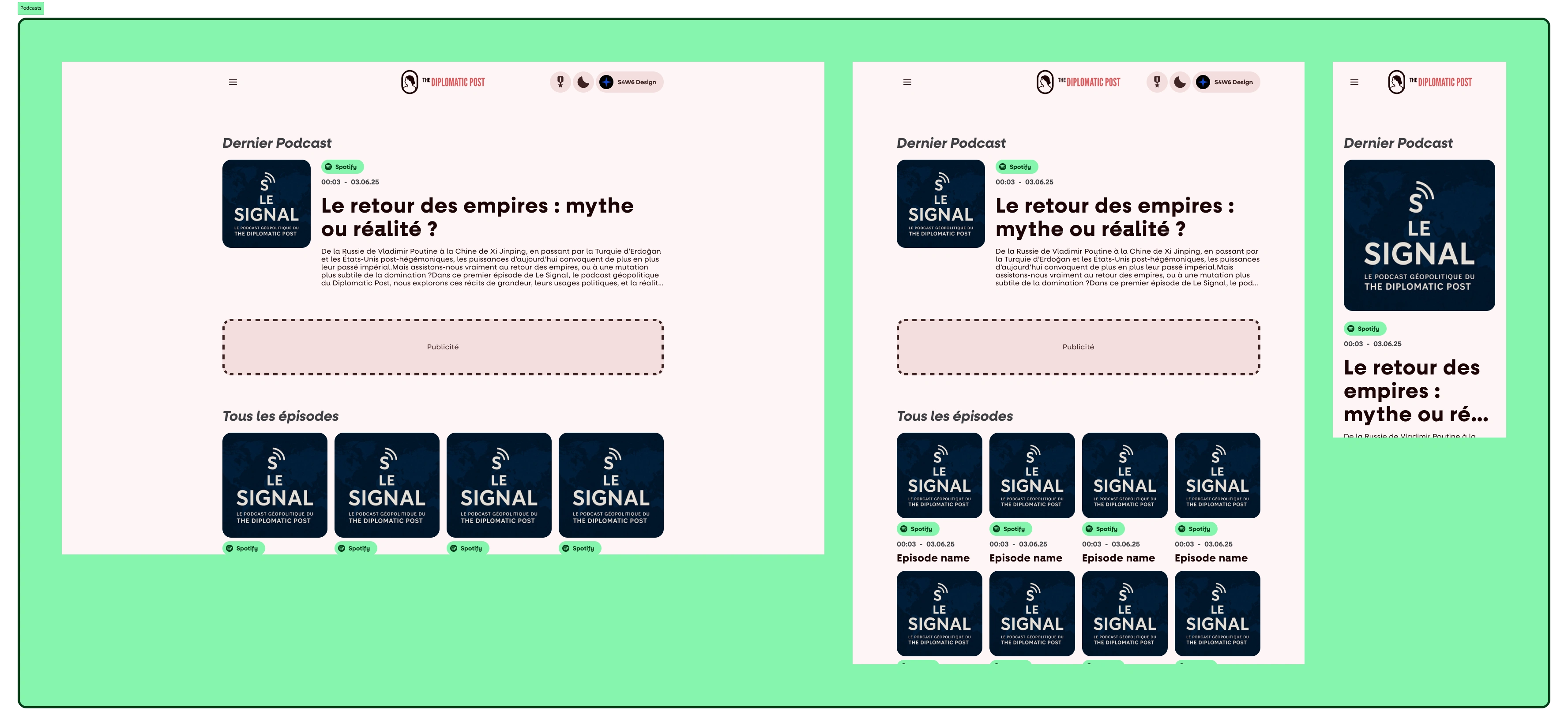
The Podcasts page
The collection page
The collection page show the colour of the viewed collection as a small but noticeable dot in the header. The header is followed by a list of the matching articles.
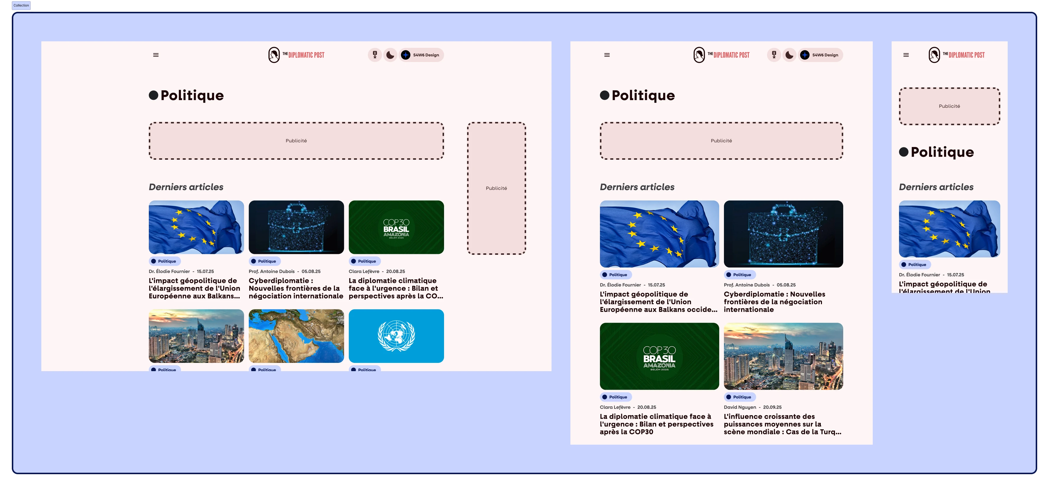
The page for the "Politics" collection
The article reader
The article reader is a classic. It is quite simple, with features such as liking and commenting for logged users. I’ll let you see with your own eyes :
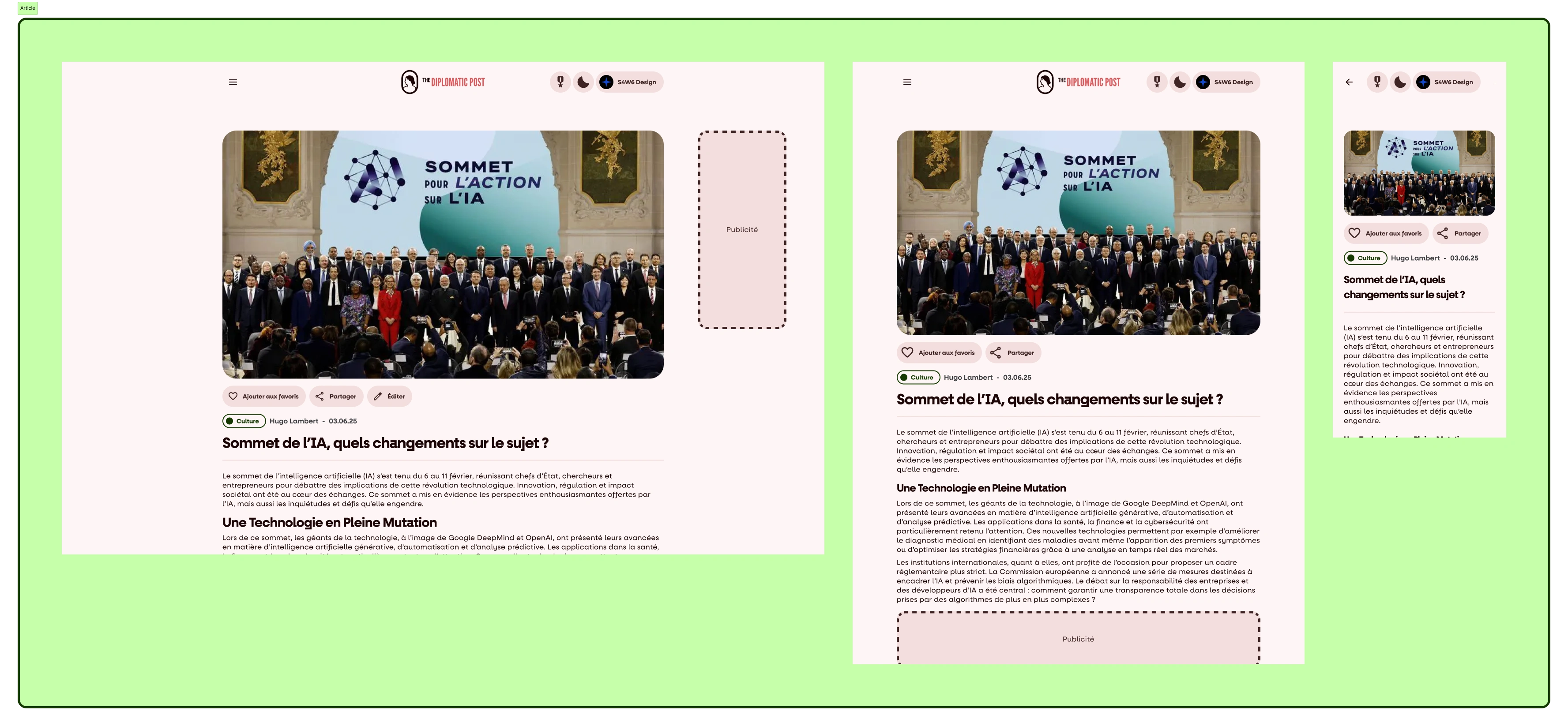
The article reader (this is a real article, go check it out !)
The account pages
These were the fun ones, as I naturally had to do one for each type of user : simple reader, writer, and admin.
Reader
The reader account has no surprises : a large pill-shaped header displaying key info and CTAs to edit profile informations and settings, quick stats, a reading history and liked articles.
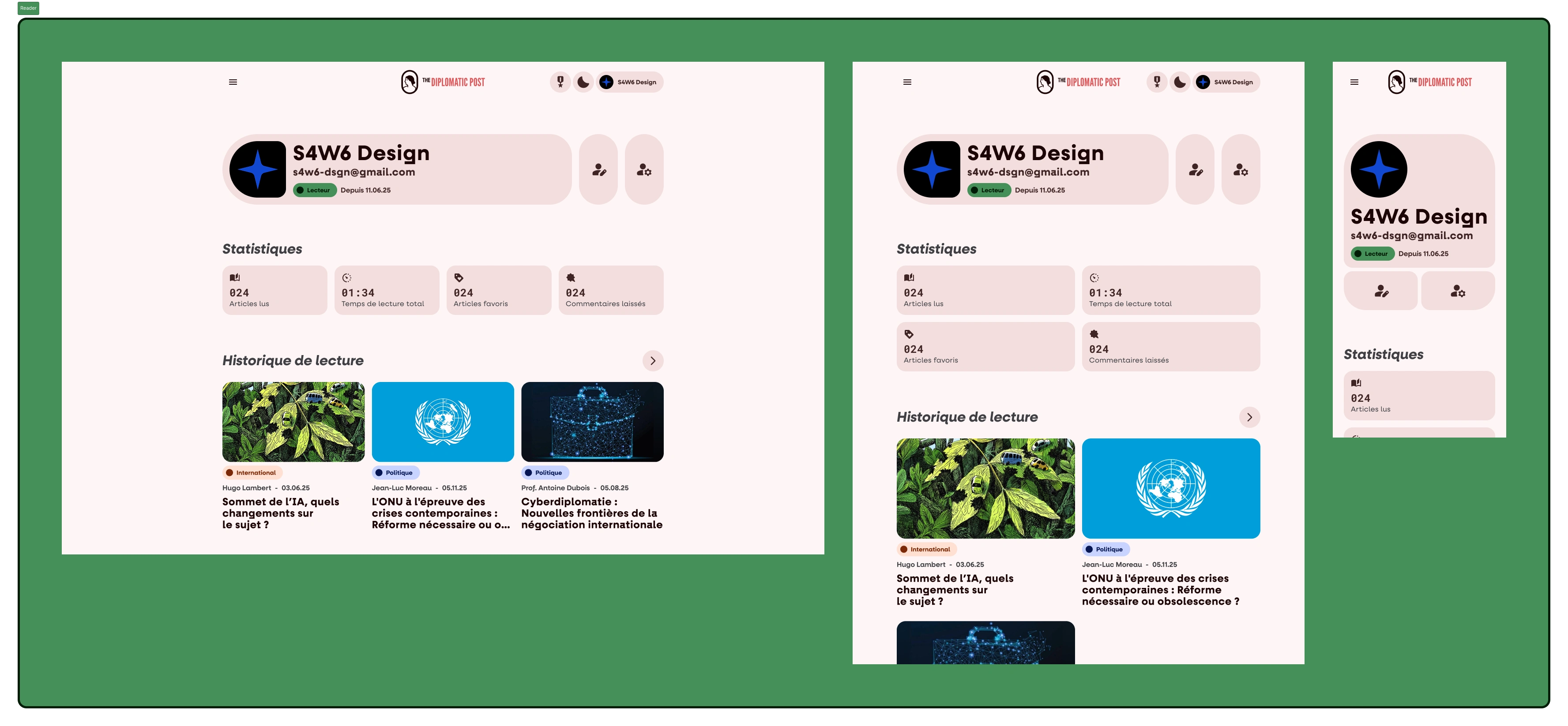
The reader profile page
Writer
The writer one was funnier : I had more stats to come up with and most of all : an article edit page !
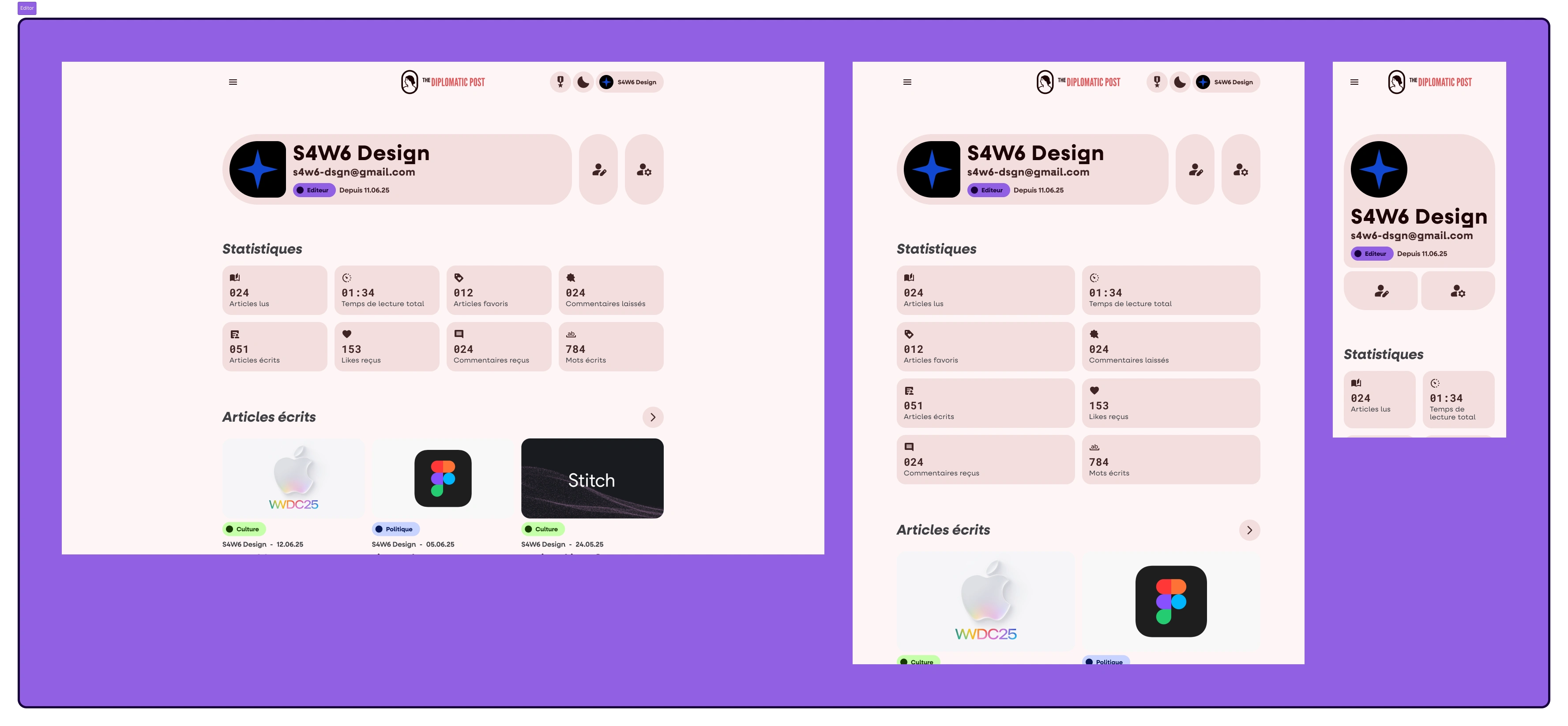
The writer profile page
Admin
Here comes the bomb : with the Admin page, I designed the admin panel, and that was a cool thing to do ! The admin panel centralises all of the site’s info for clear display and immediate understanding. Users, articles, contact form submissions, everything is glanceable !
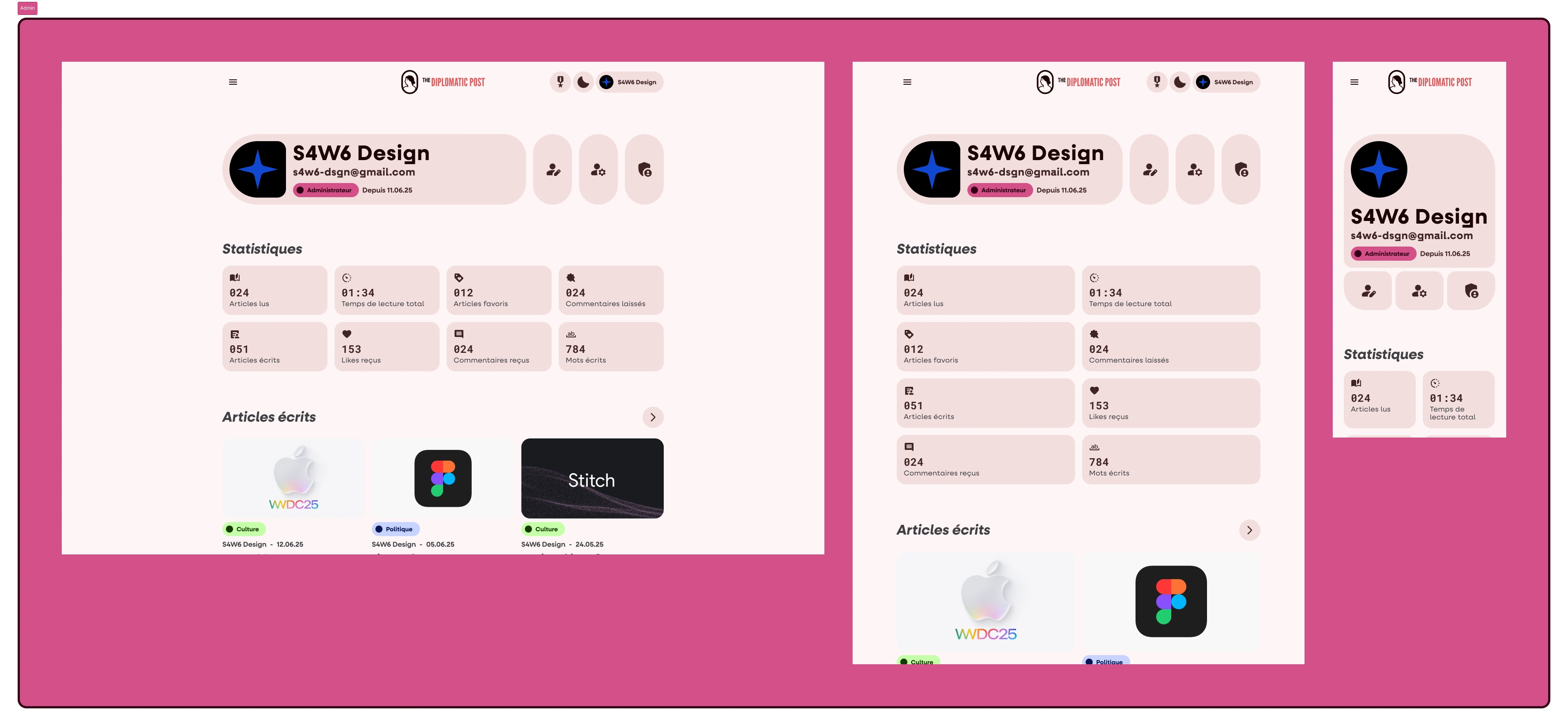
The admin profile page
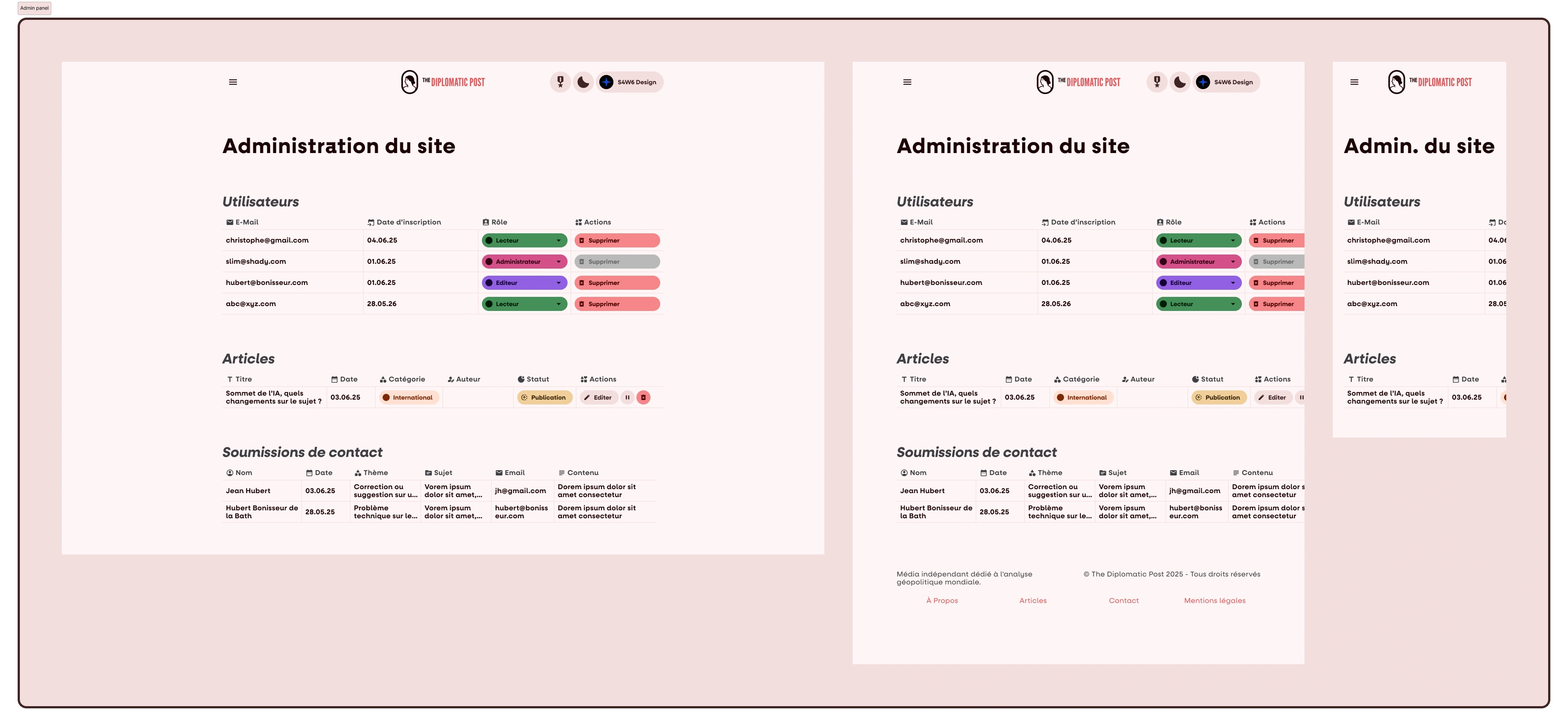
The admin panel - For security reasons, some content has been masked
Profile customisation and settings
These ones are pretty classic, so I’ll just let you have a look :
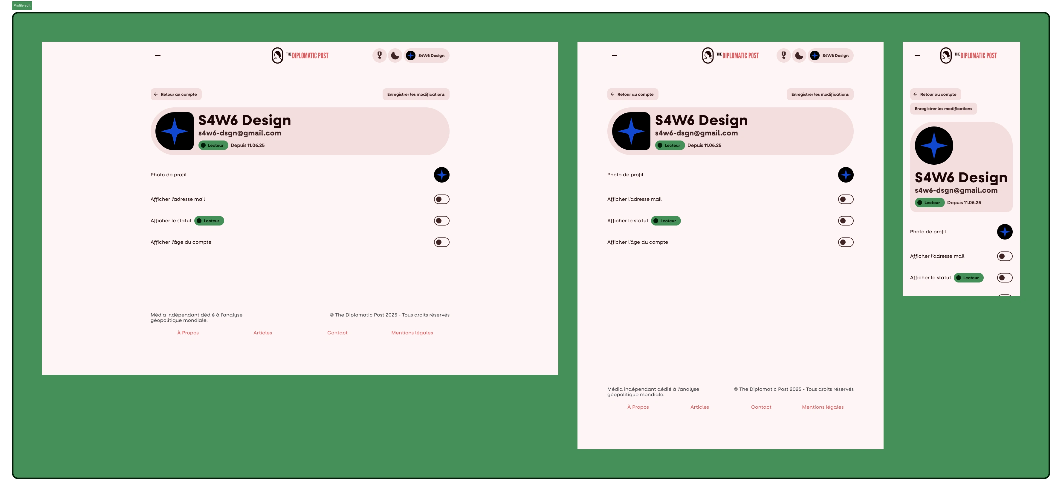
The profile edit page
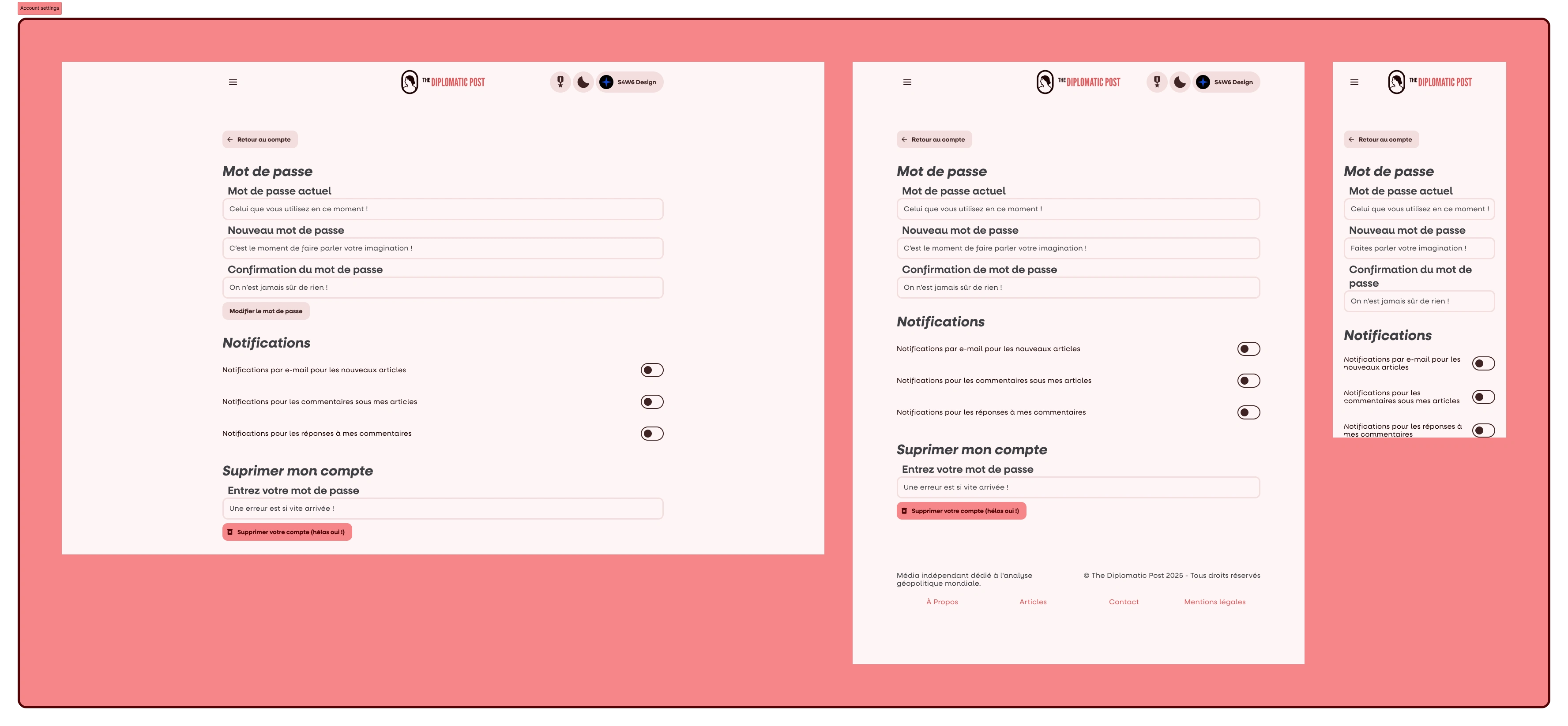
The account settings page
Article editor
This one was a cool one too ! It’s pretty basic, with a thumbnail, a title, a collection, tags and text formatting, but I spend a good time designing it !
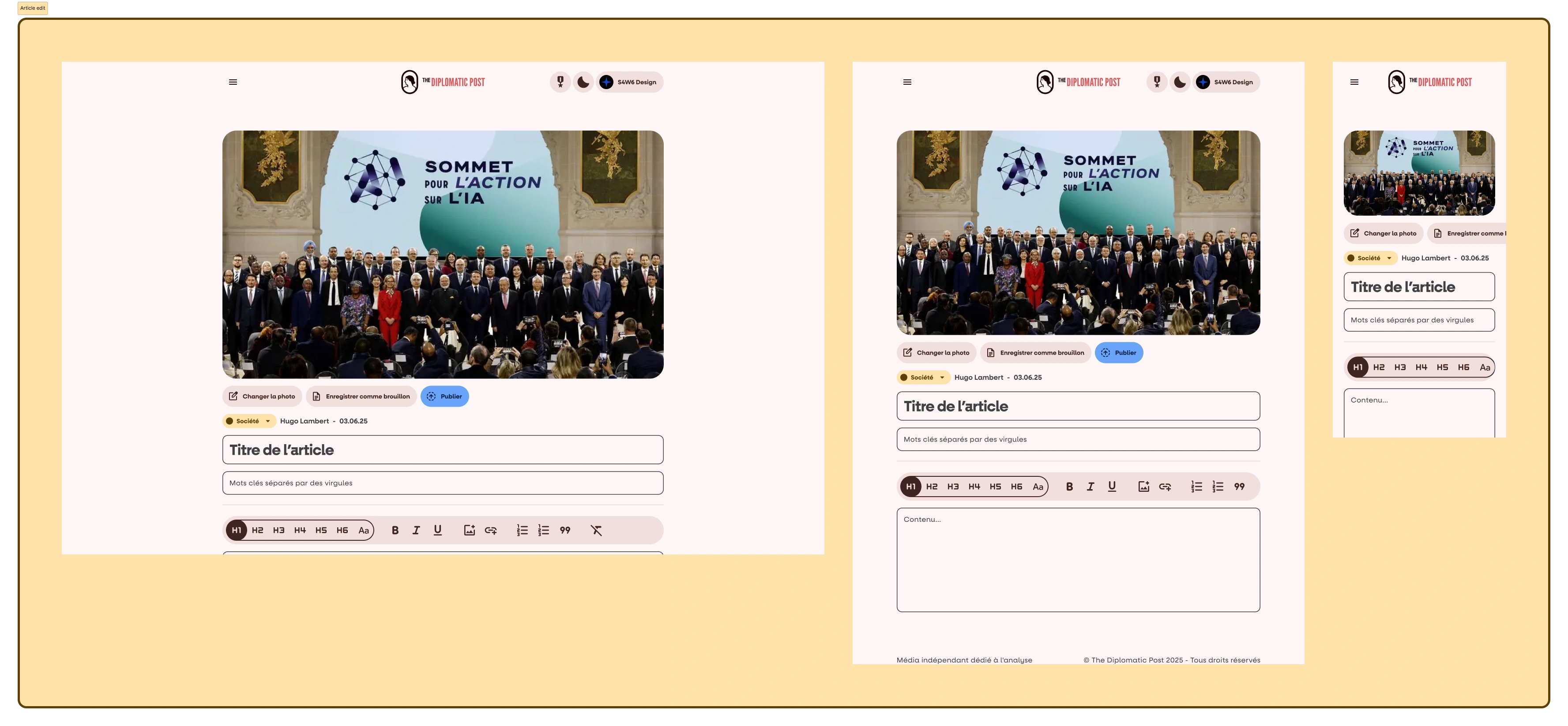
The article editor
Paywalls
I know nobody likes them, but The Diplomatic Post is a small team, so in order to keep ads as minimal as possible, some articles have to go this way. Anyways look at this cool little ticket I’ve done !
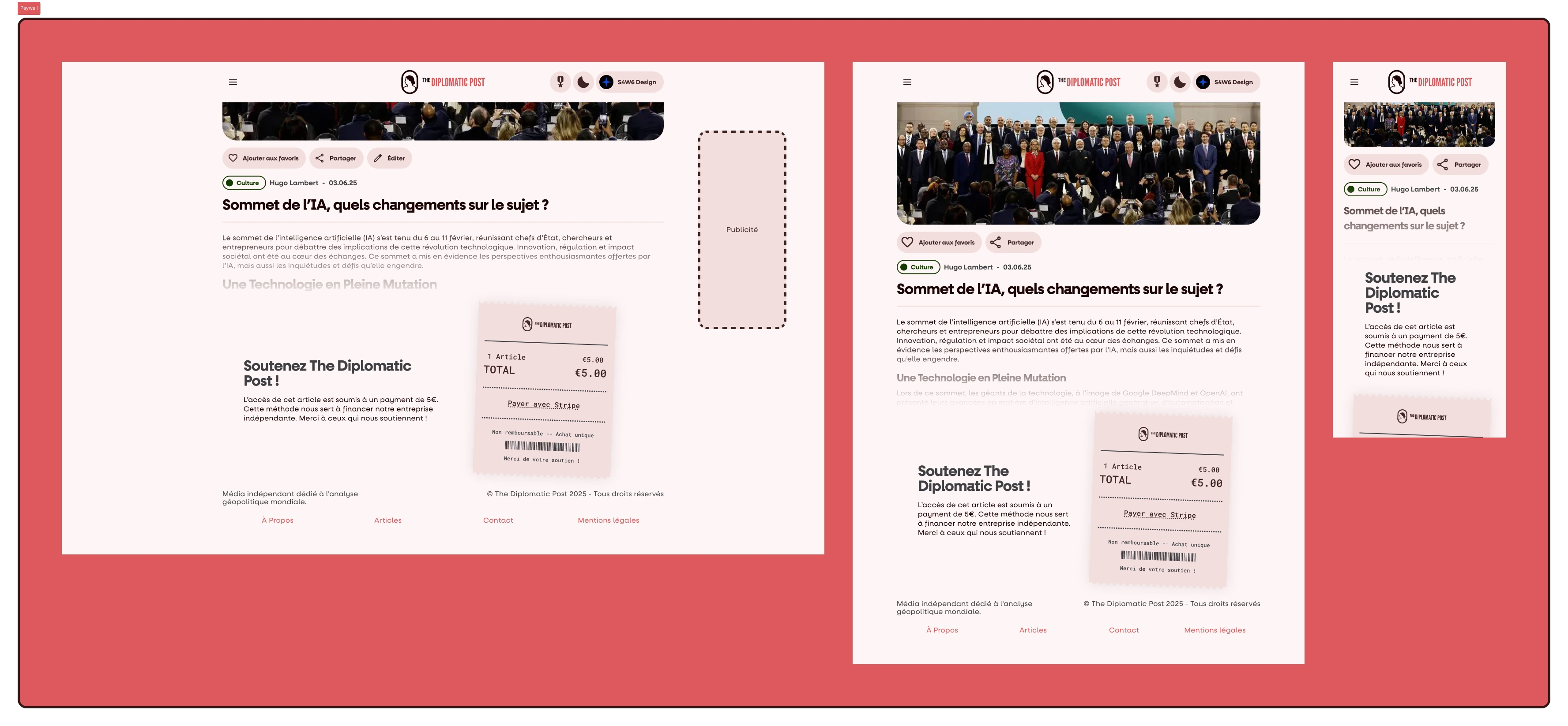
A paywall example
There is also articles blocked by a member paywall. The name is kinda self-explanatory, you have to log in or sign up to read the article. Not so bad after all !
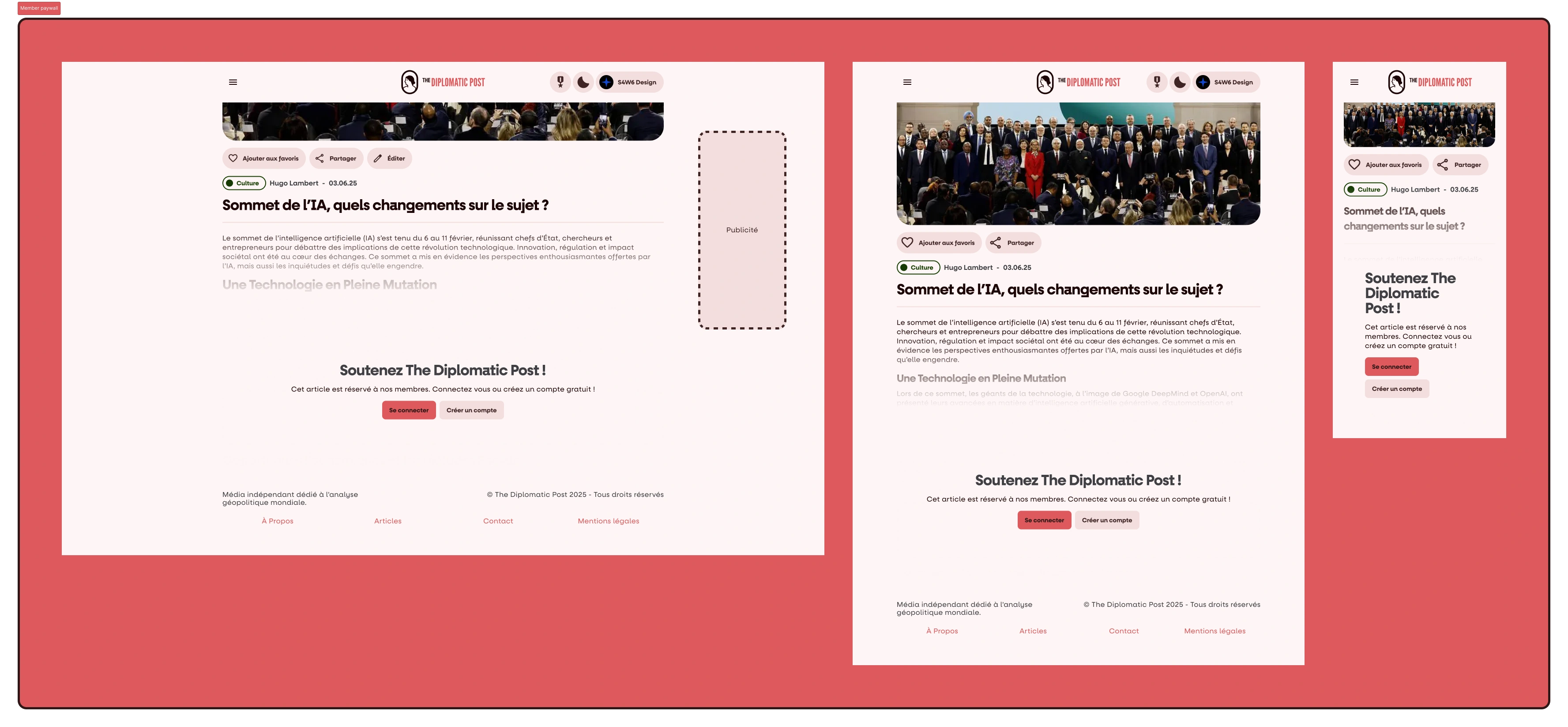
A member paywall example
Pricings
That’s the bright side : if you are tired of paywalls and ads, you’d be better of with a subscription ! I’ve put my heart into these little gift-card style plans, so I hope you like them !
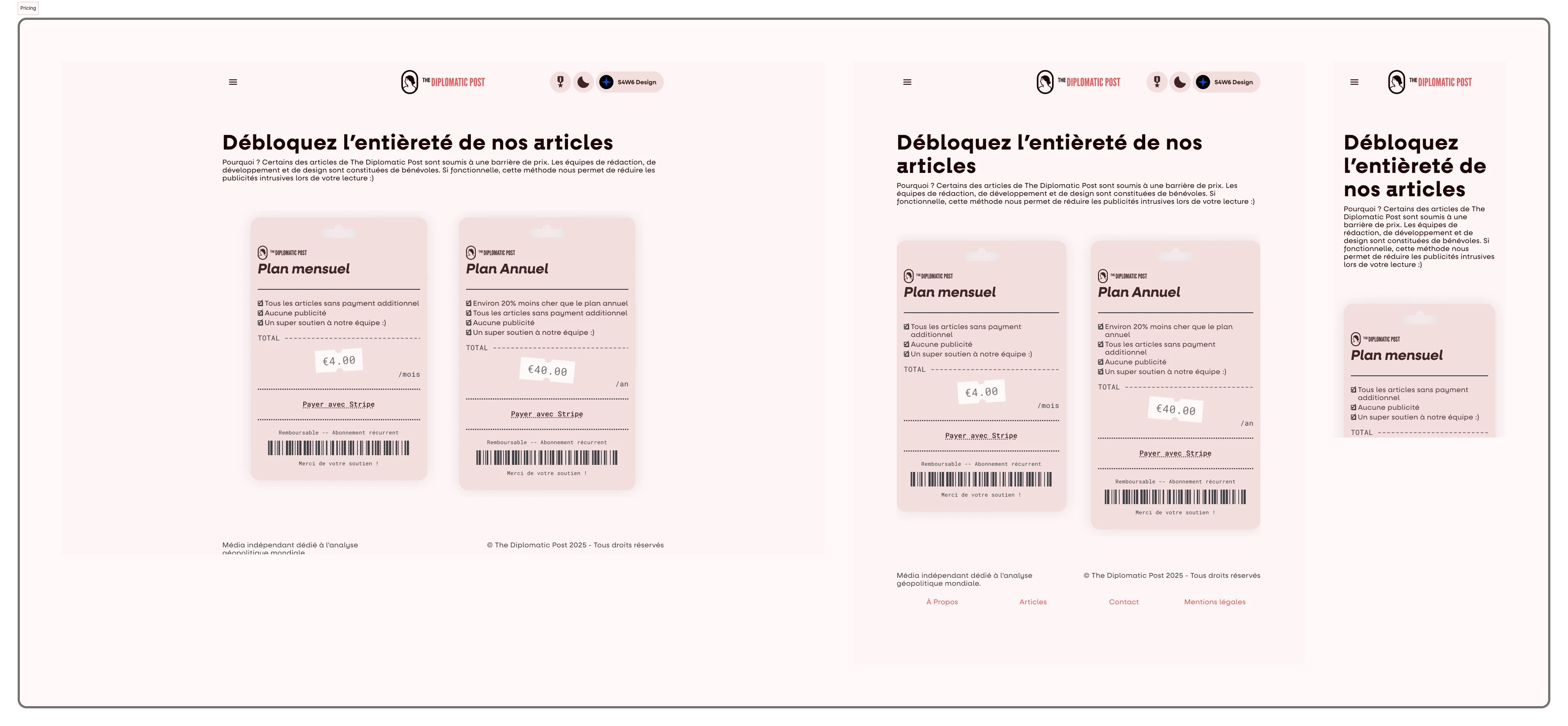
The pricing page
The end ?
You’ve reached the end of this blog post… or have you ? The Diplomatic Post is an ongoing project, and more screenshots are coming ! Even though this ✨✨gorgeous✨✨ new design is still in dev status, you can still go check out The Diplomatic Post, they’ve got cool articles ! And don’t forget to come back here in case something new was added (and it will be the case very soon)!
Like this project
Posted Jun 23, 2025
The independant media dedicated to worldwide geopolitics
Likes
1
Views
9
Timeline
Oct 6, 2025 - Ongoing