Moucha - Visual Identity & Packaging
Ali Arshad
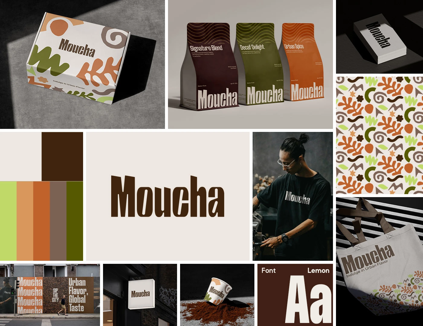
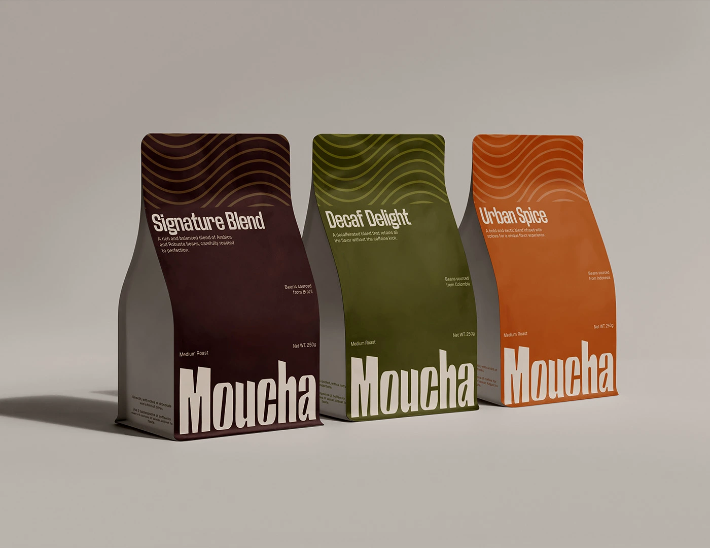
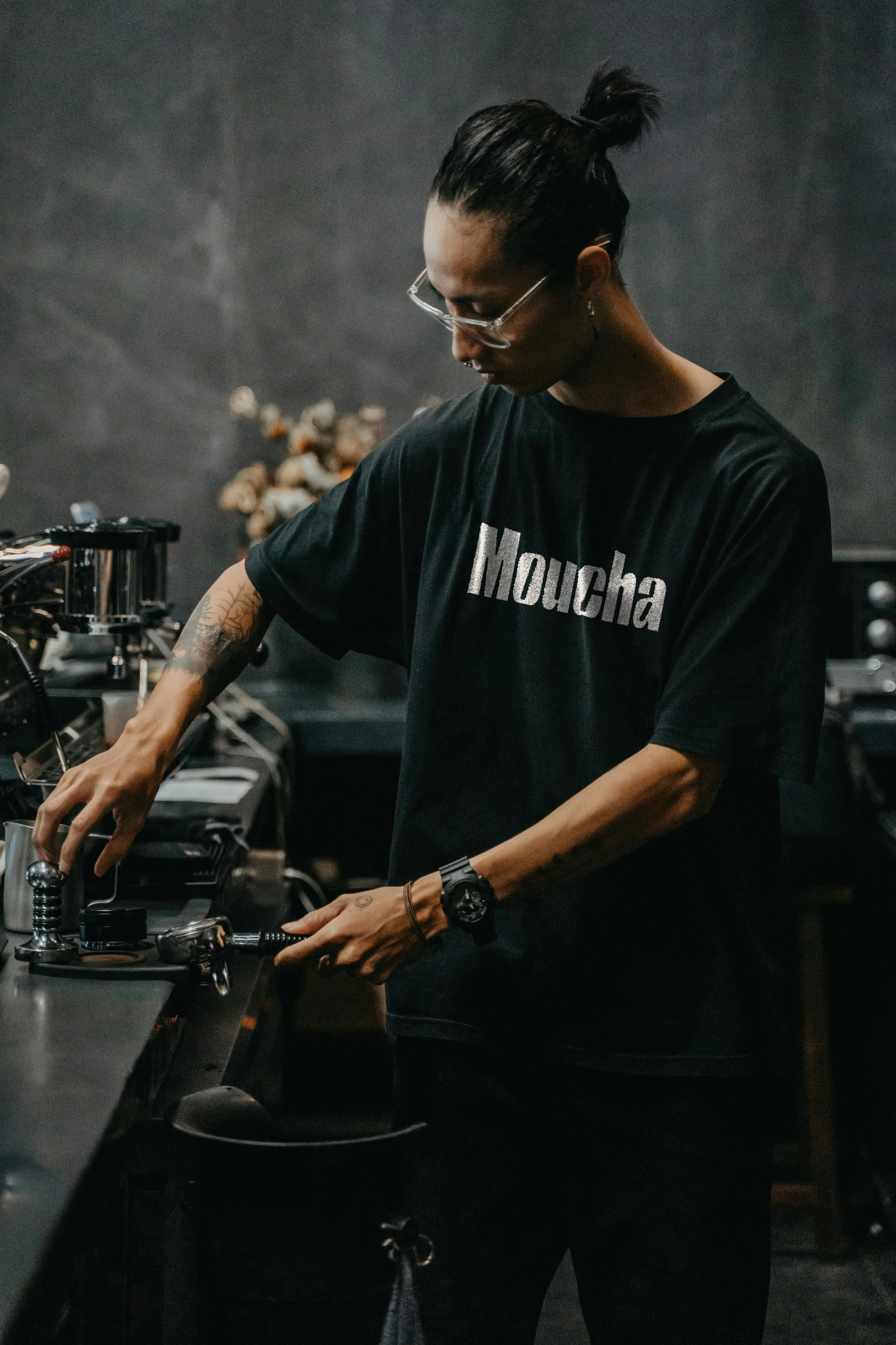
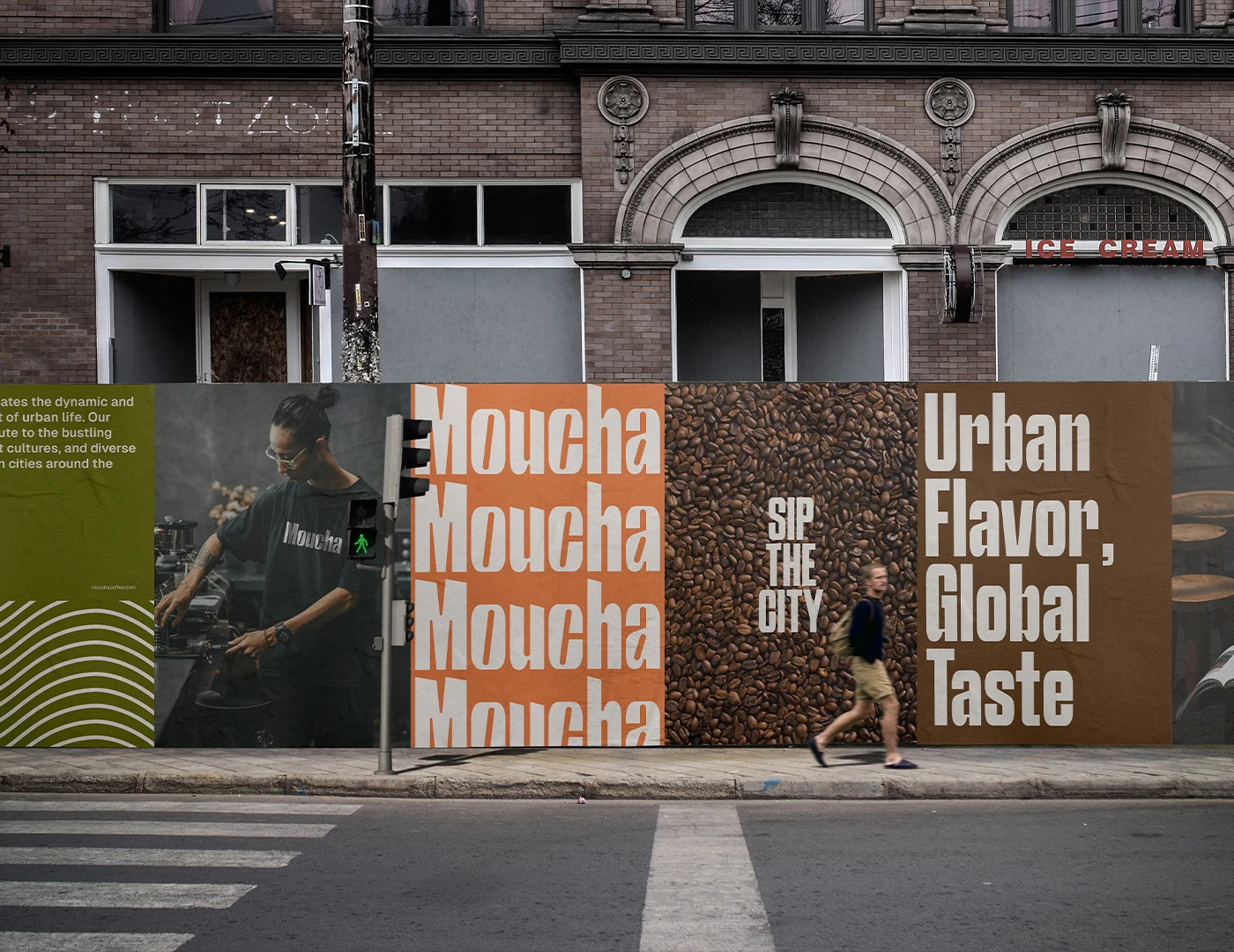
Moucha is a contemporary coffee brand that embodies the essence of urban living. Our mission is to provide coffee enthusiasts with a premium coffee experience that captures the vibrancy and energy of city life. From carefully selected beans to expertly crafted blends, Moucha is dedicated to delivering quality and innovation in every cup.
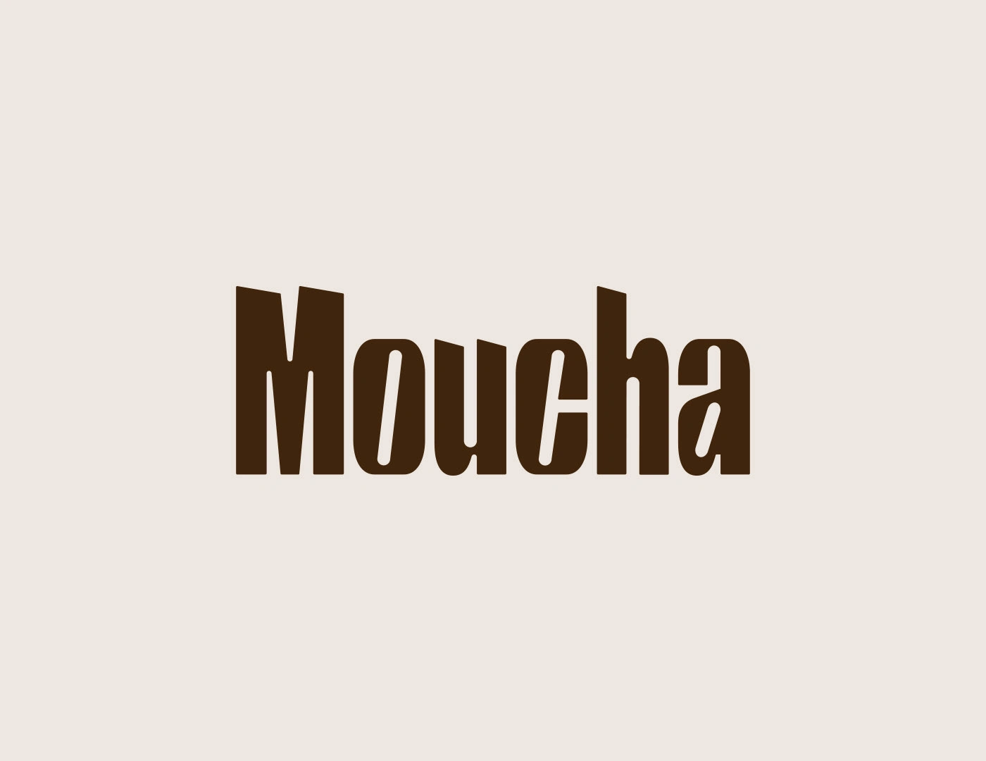
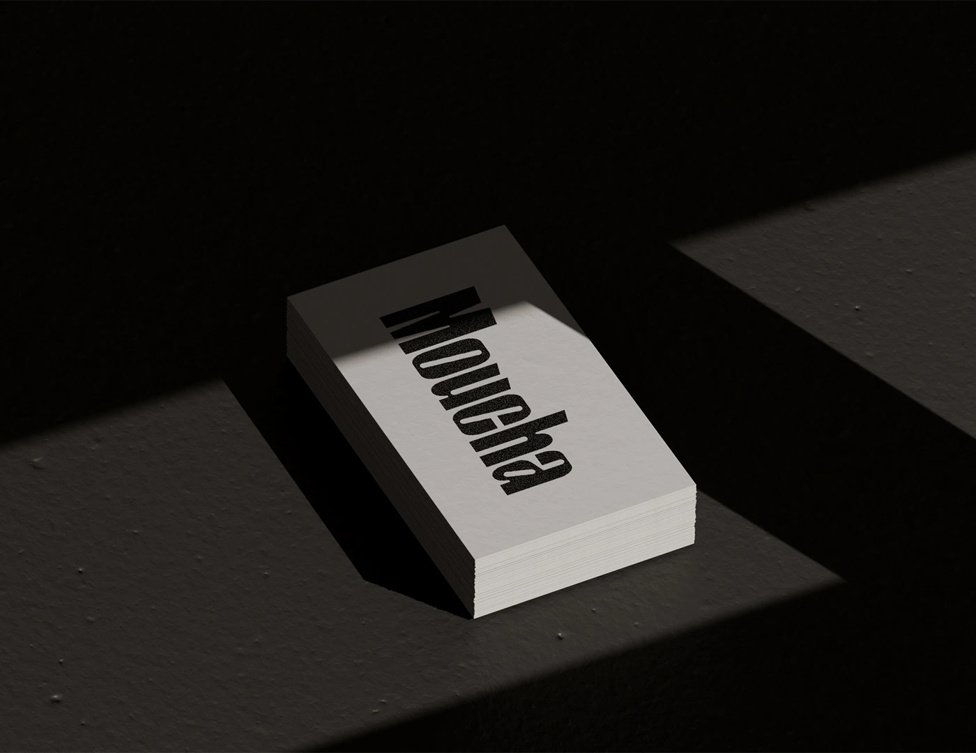
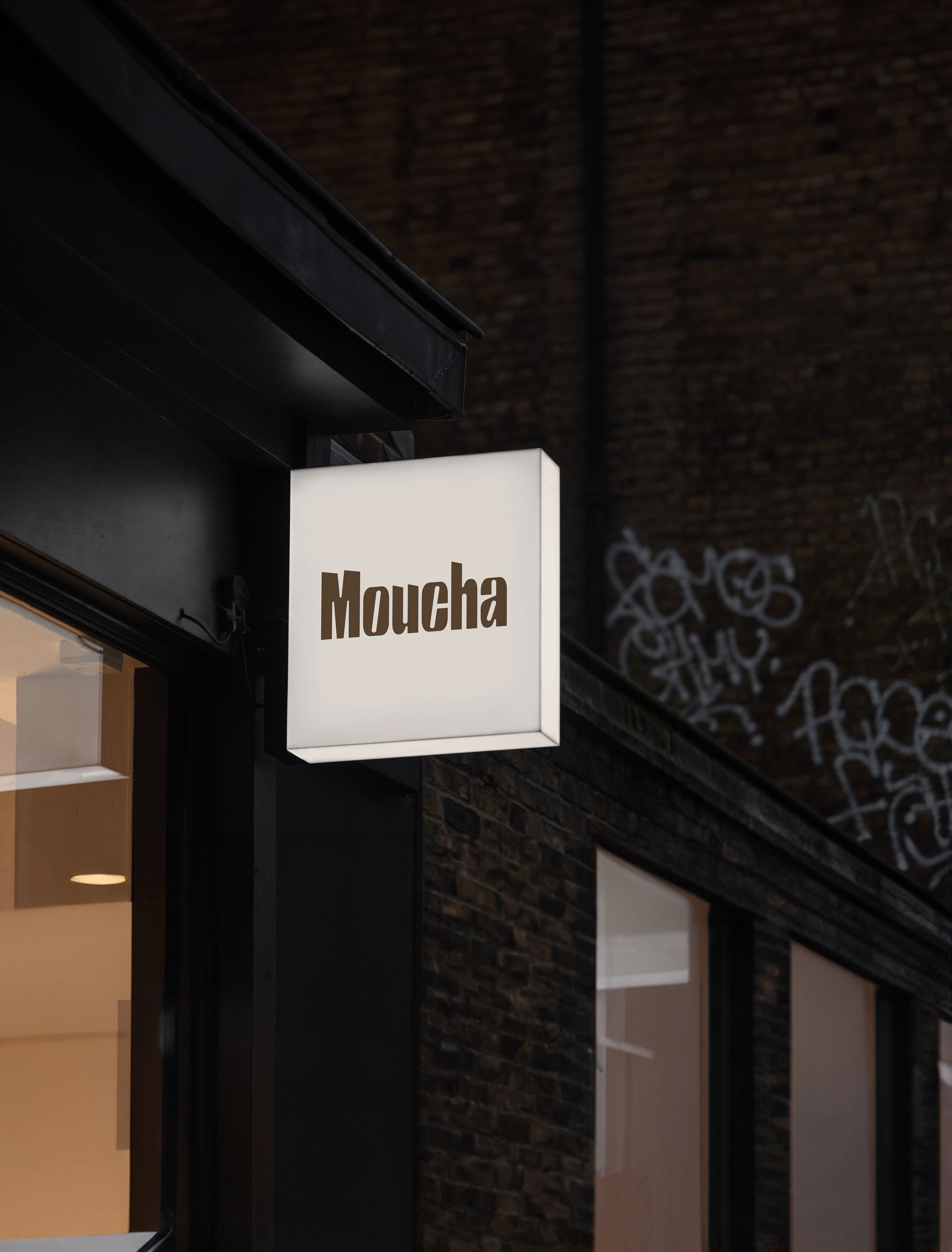
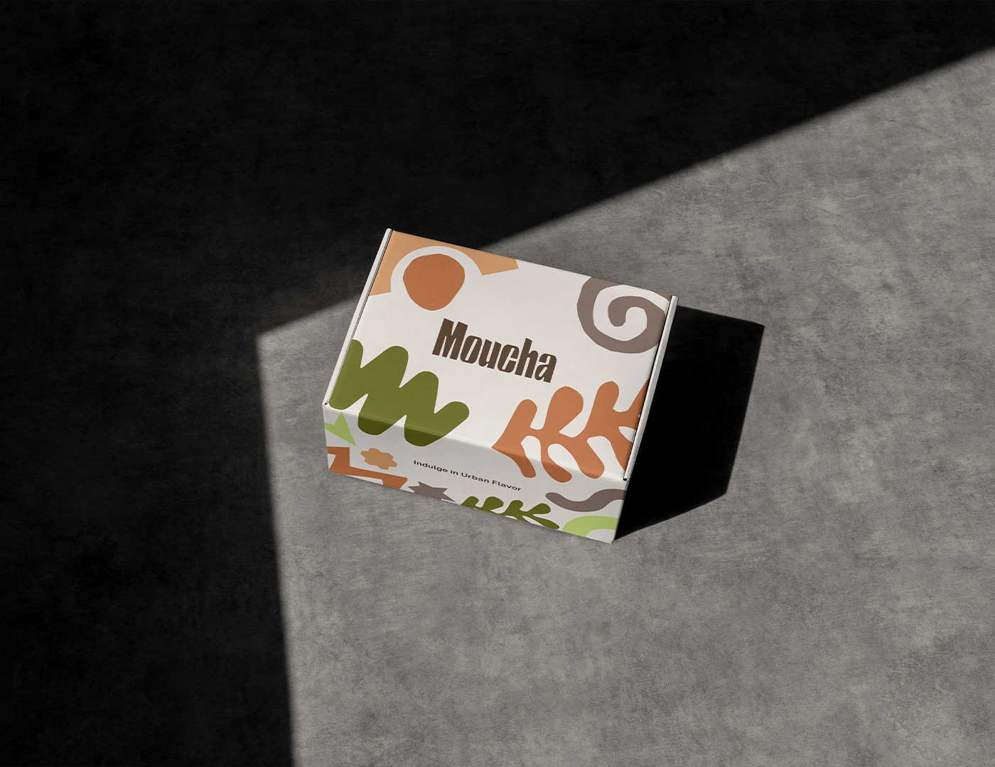
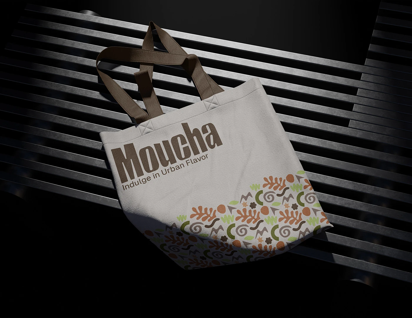
The logo design for Moucha features a distinctive wordmark with bold typography. The unique aspect of the design is the slight tilt in the upper edges of the letters, reminiscent of the iconic cityscape skyline. This tilt adds a dynamic and modern feel to the logo and symbolizes the urban environment that inspires the brand.
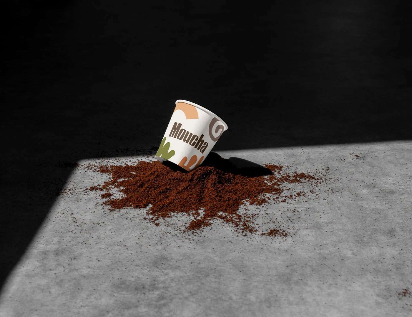
In the Moucha brand, I've chosen colors to evoke a warm and inviting atmosphere reminiscent of a cozy urban café. The cream color adds a sense of sophistication and elegance, while the brown tones symbolize the rich and earthy nature of coffee. The greens are inspired by nature, bringing a fresh and organic element to the brand. Finally, the orange accents add a pop of energy and excitement, reflecting the vibrant urban culture that Moucha embodies. Together, these colors create a harmonious and inviting palette that enhances the overall brand experience.
Like this project
Posted Dec 20, 2024
Moucha is a contemporary coffee brand that embodies the essence of urban living.