Aék Coffee Brand Identity Development

Shrutillusion | Branding+Editorial Studio


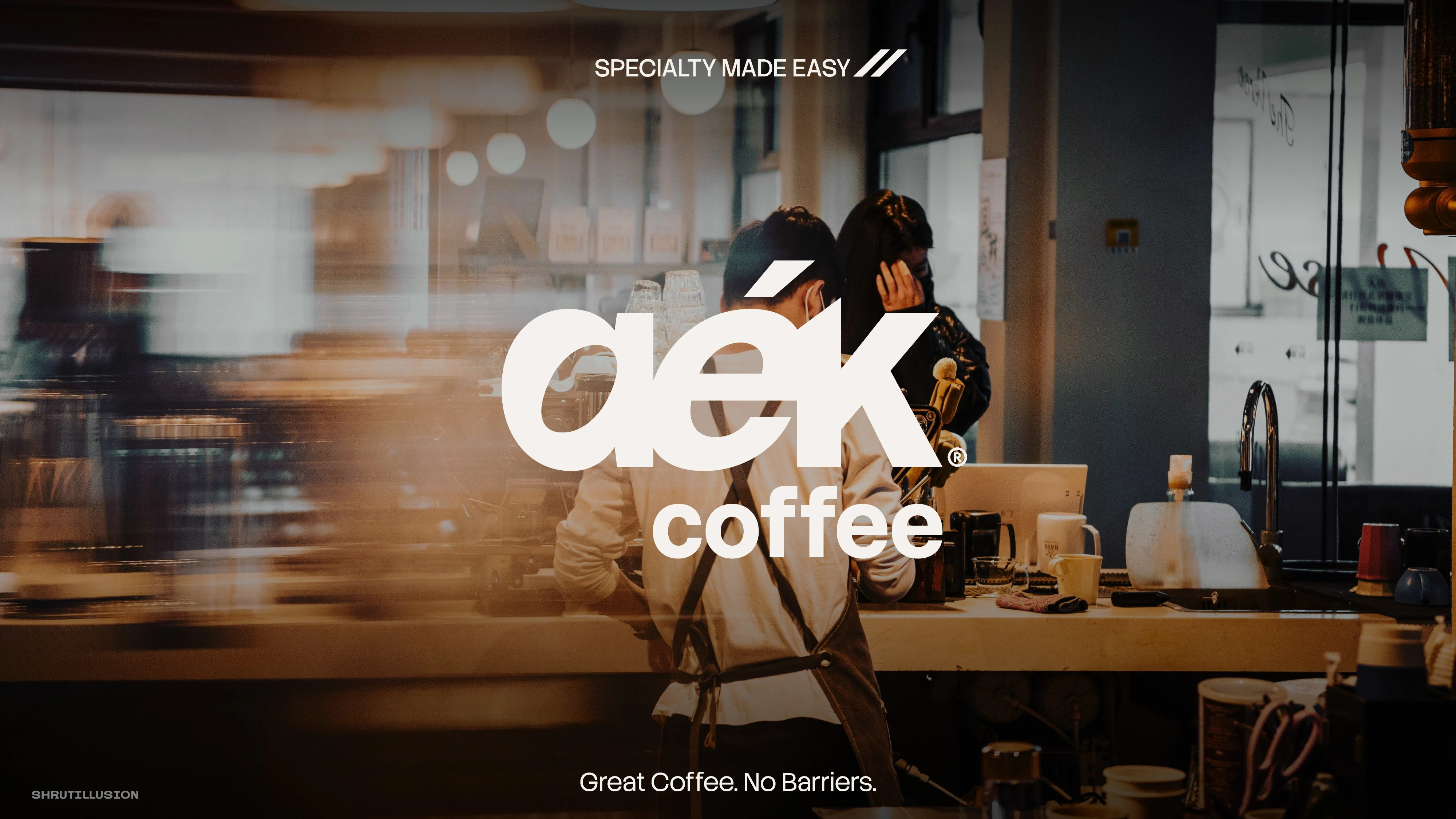
Aék Coffee ®
The Project
Aek Coffee is a specialty coffee brand built around a simple idea: good coffee shouldn't feel intimidating.
While many specialty coffee brands lean heavily on origin stories and technical language, Aek takes a different approach. The brand is designed to make specialty coffee feel approachable, familiar and part of everyday life without compromising on quality.
The visual identity reflects that thinking through a restrained colour palette, confident typography and a minimal logo system that works consistently across packaging, menus, merchandise and digital touchpoints. Every element is designed to feel calm, clear and effortless, allowing the coffee and the experience to take centre stage.
The goal was to build a brand identity that gives the business a clear position, helps customers connect with the brand instantly, and provides a strong foundation for every future touchpoint.
Specialty Cafe Branding
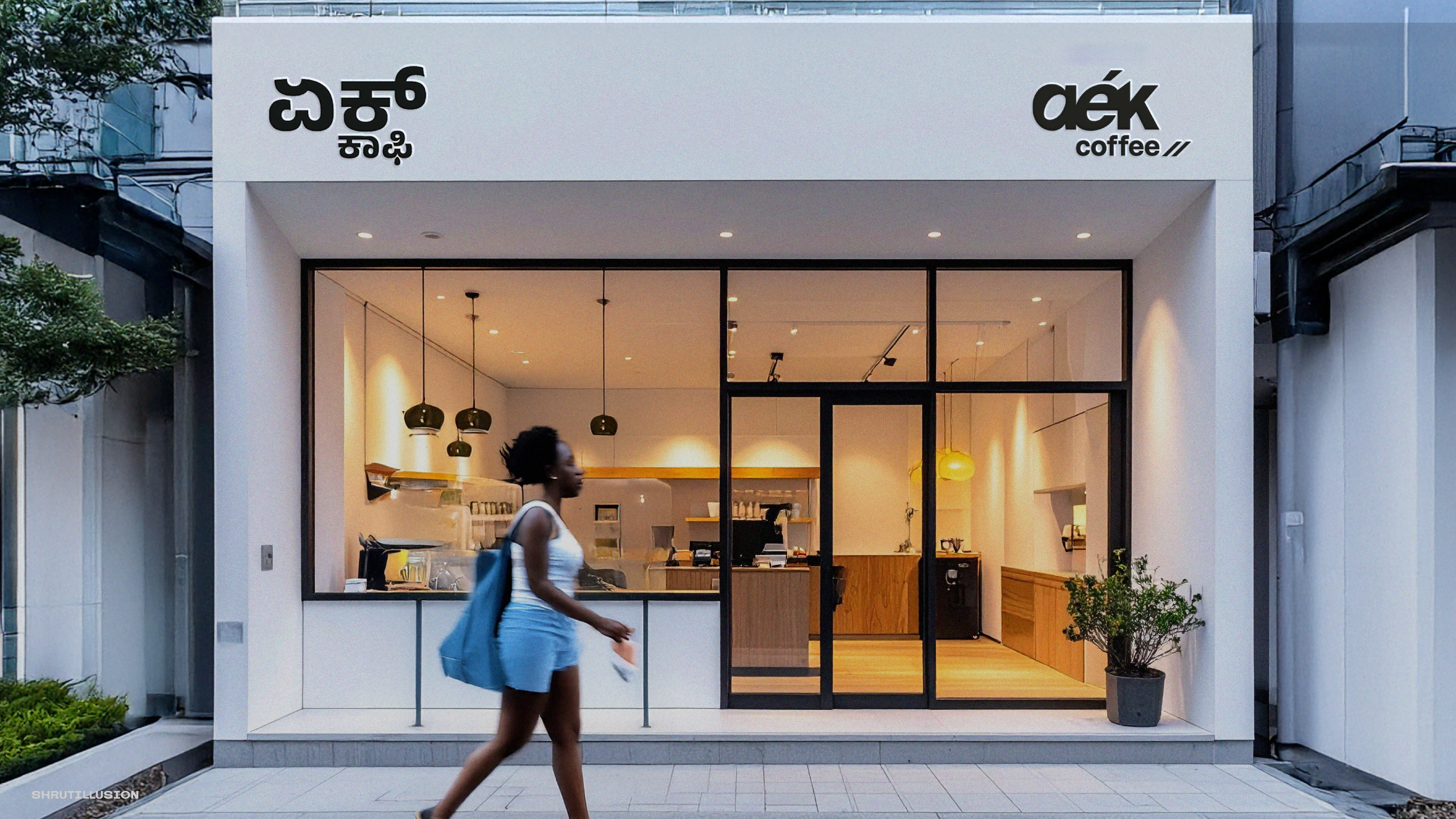
Specialty Cafe Store Facade
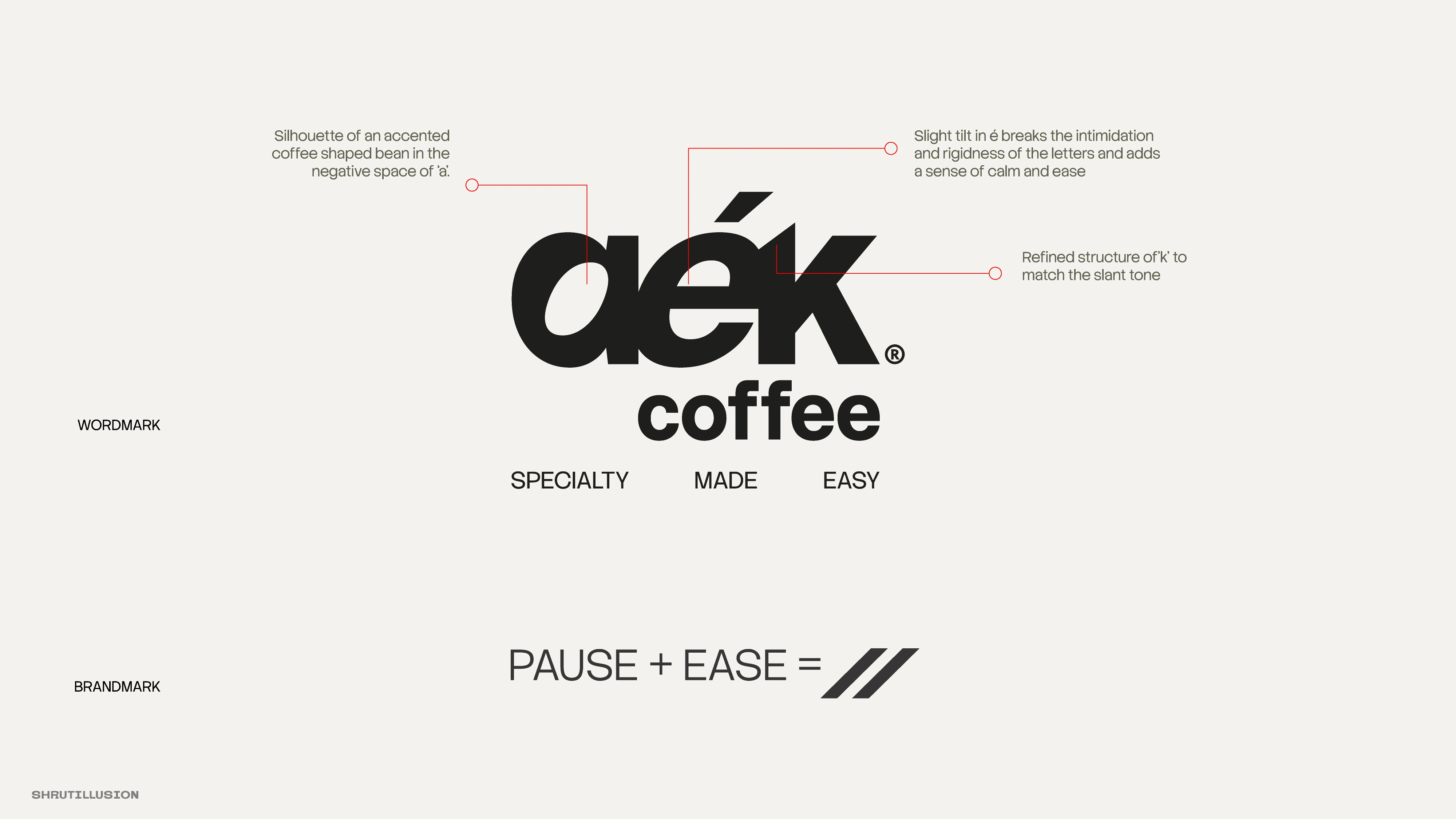
Specialty Cafe Logo Construction
Identity
The wordmark carries a slanted é - a small leaning relaxed gesture.
The brandmark further reenforces pause+ease gesture.
The tagline - Specialty Made Easy - ties it together.
A system that asks you to slow down.
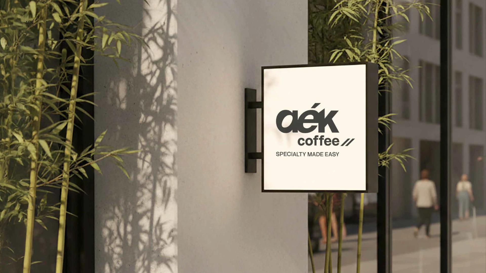
Specialty Cafe Lightbox

Brand Colour Palette

Brand Packaging Touch-points
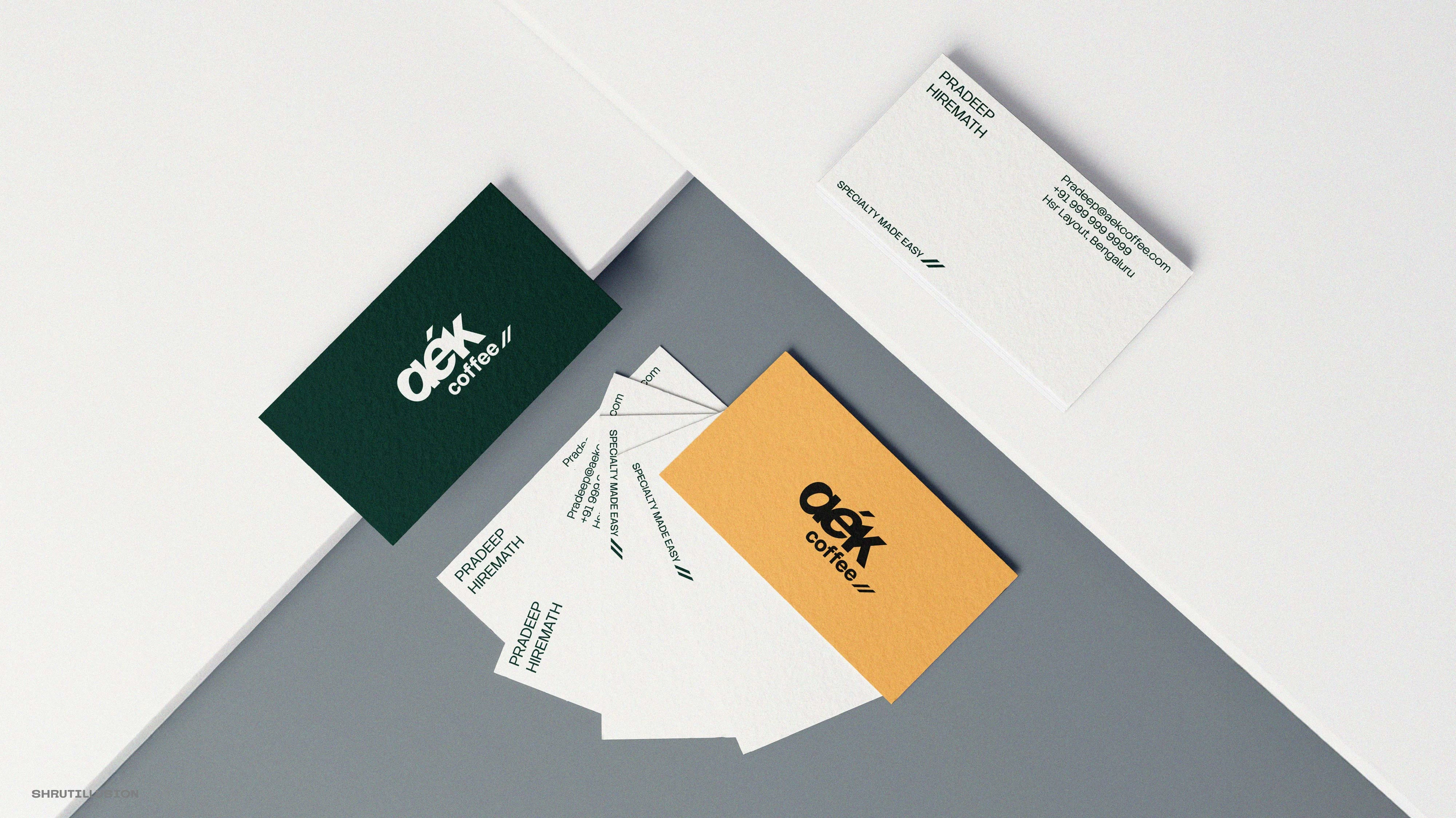
Brand Packagings
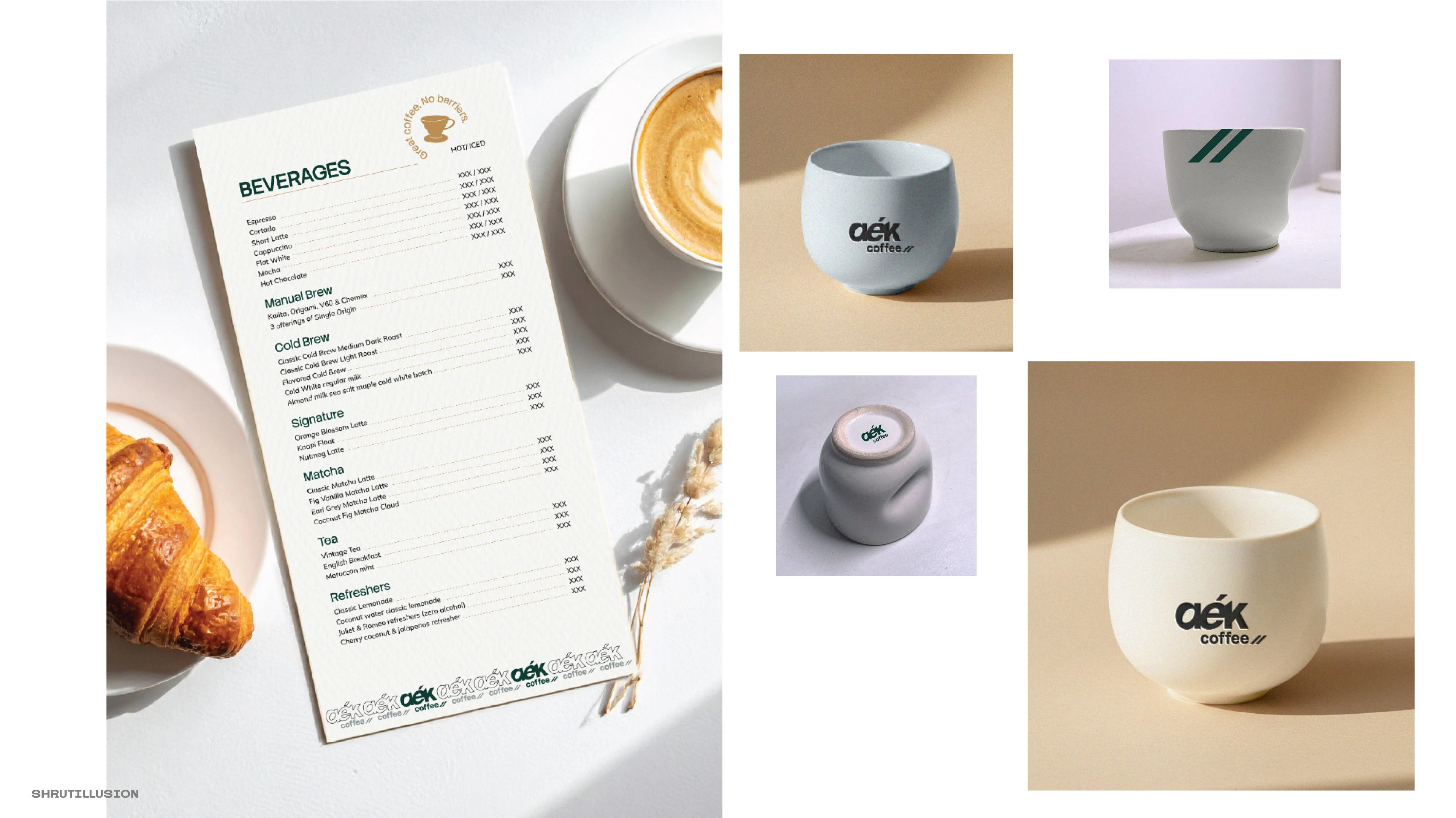
Brand Packagings
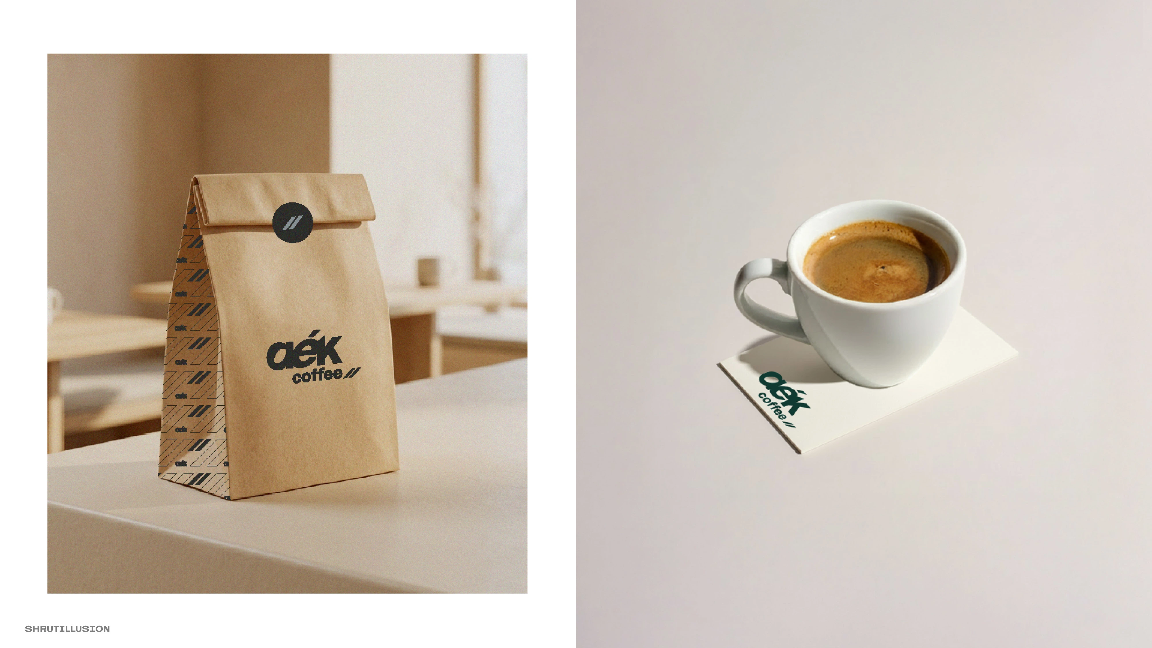
Brand Packagings
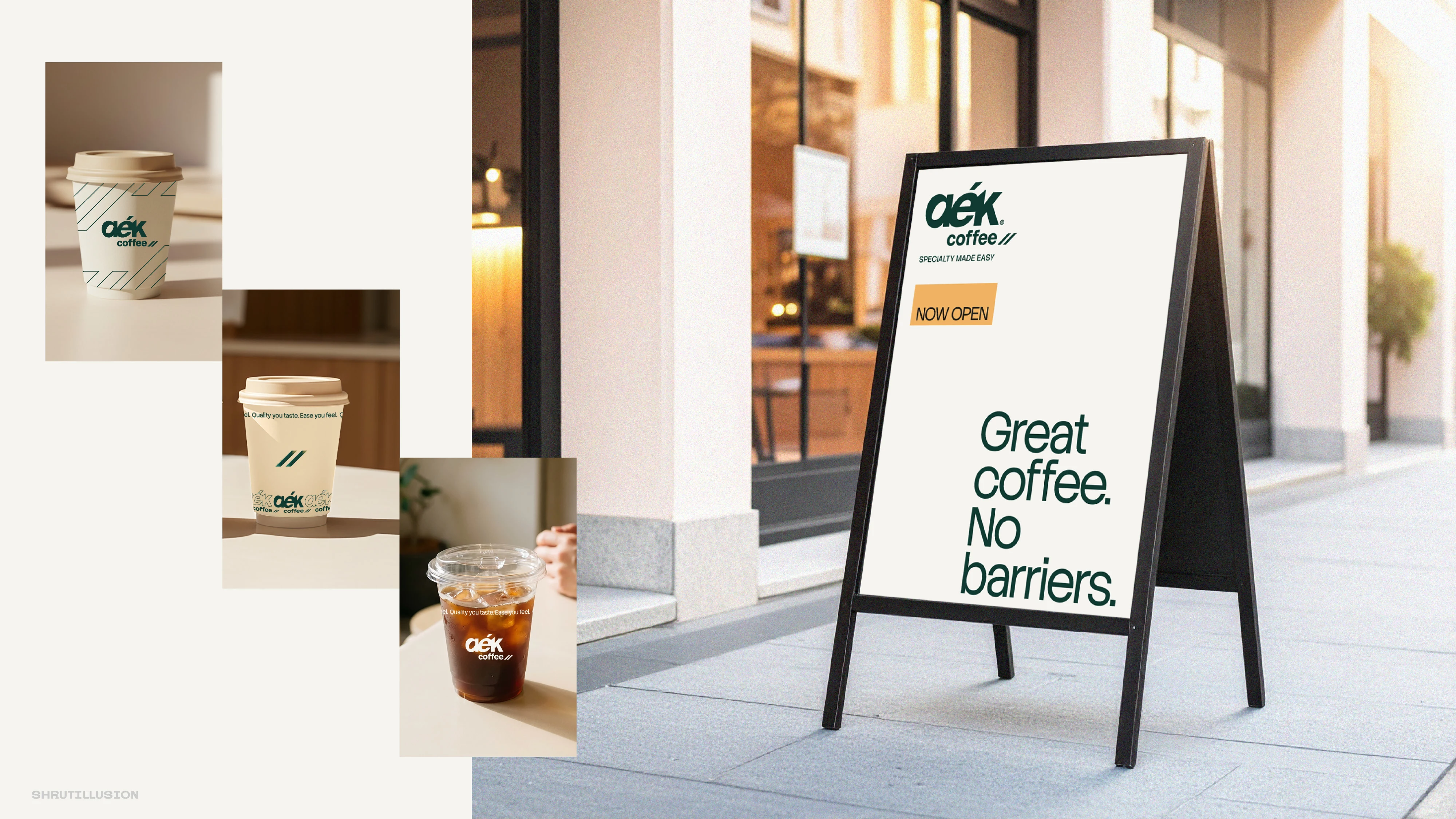
Brand Packagings
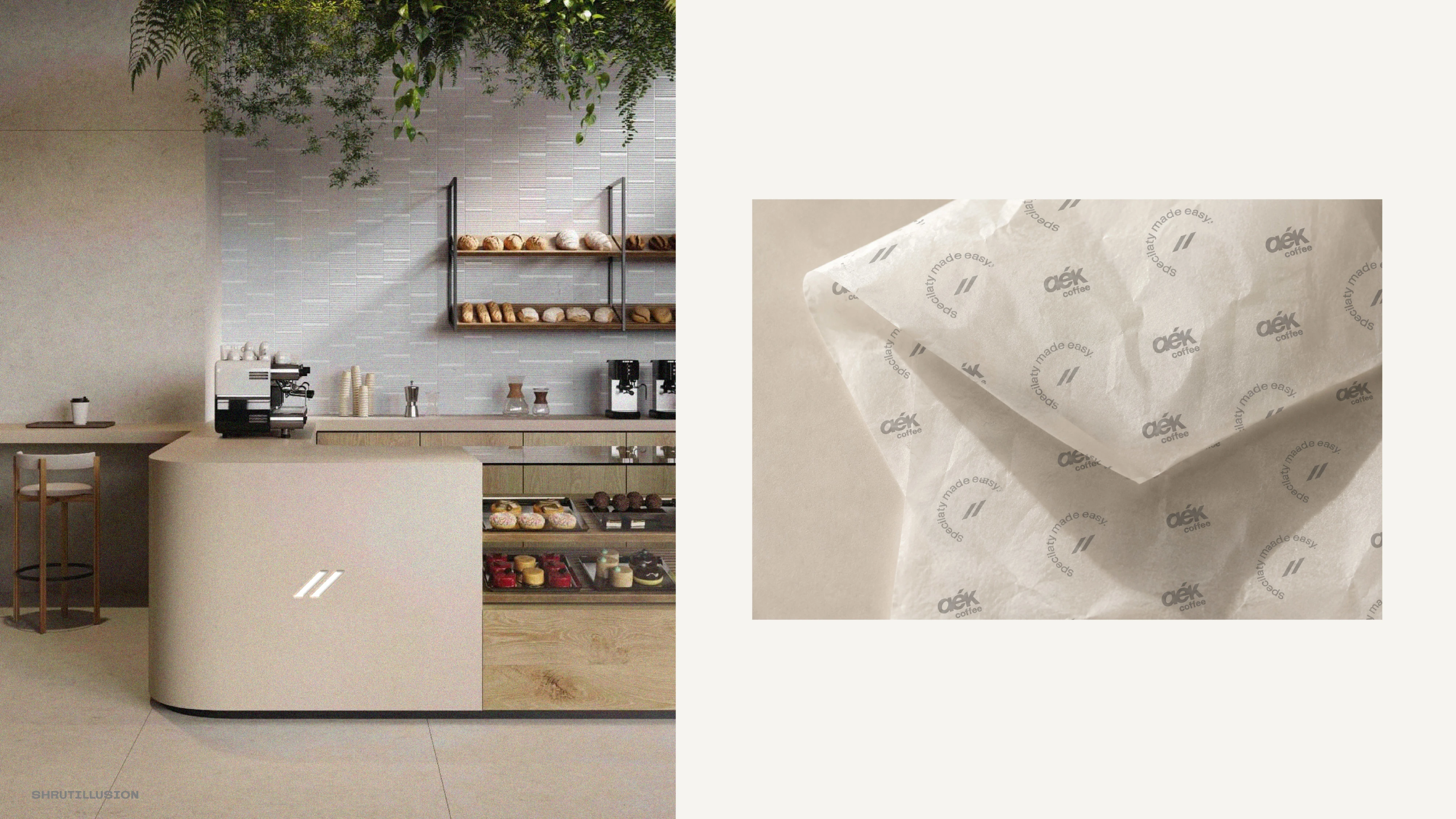
Brand Packagings
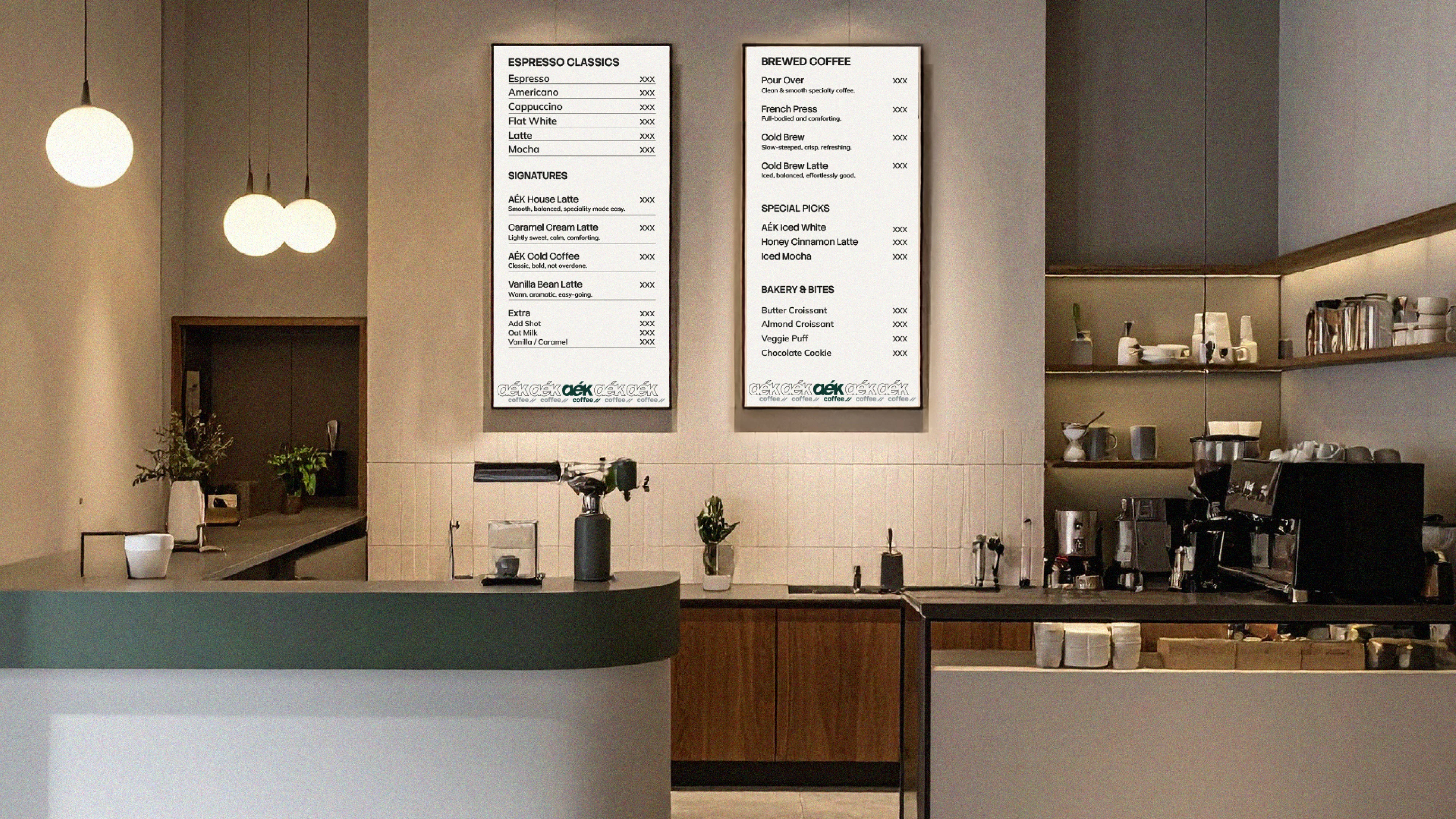
Branding Touch-points
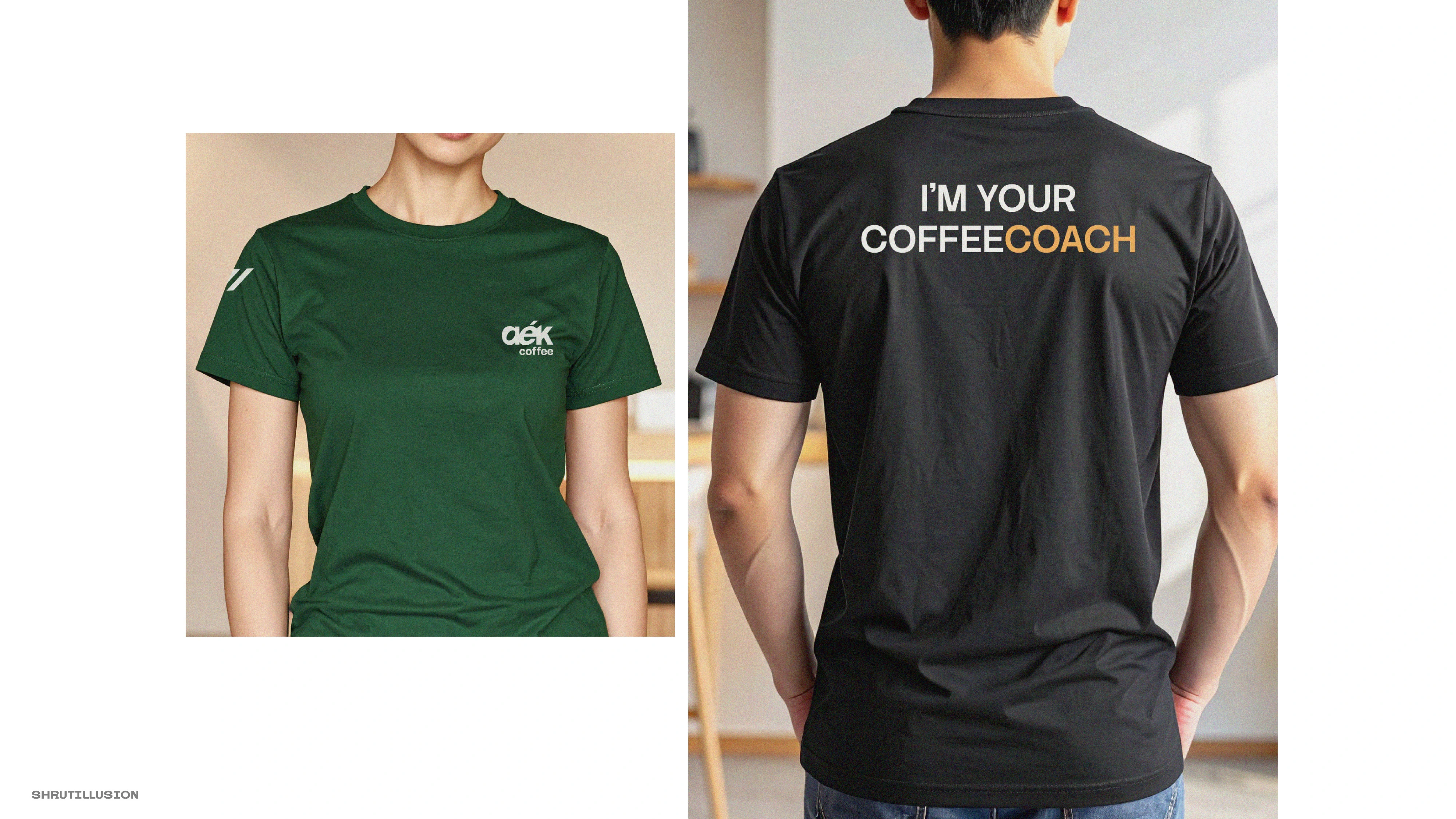
Brand Merchandise
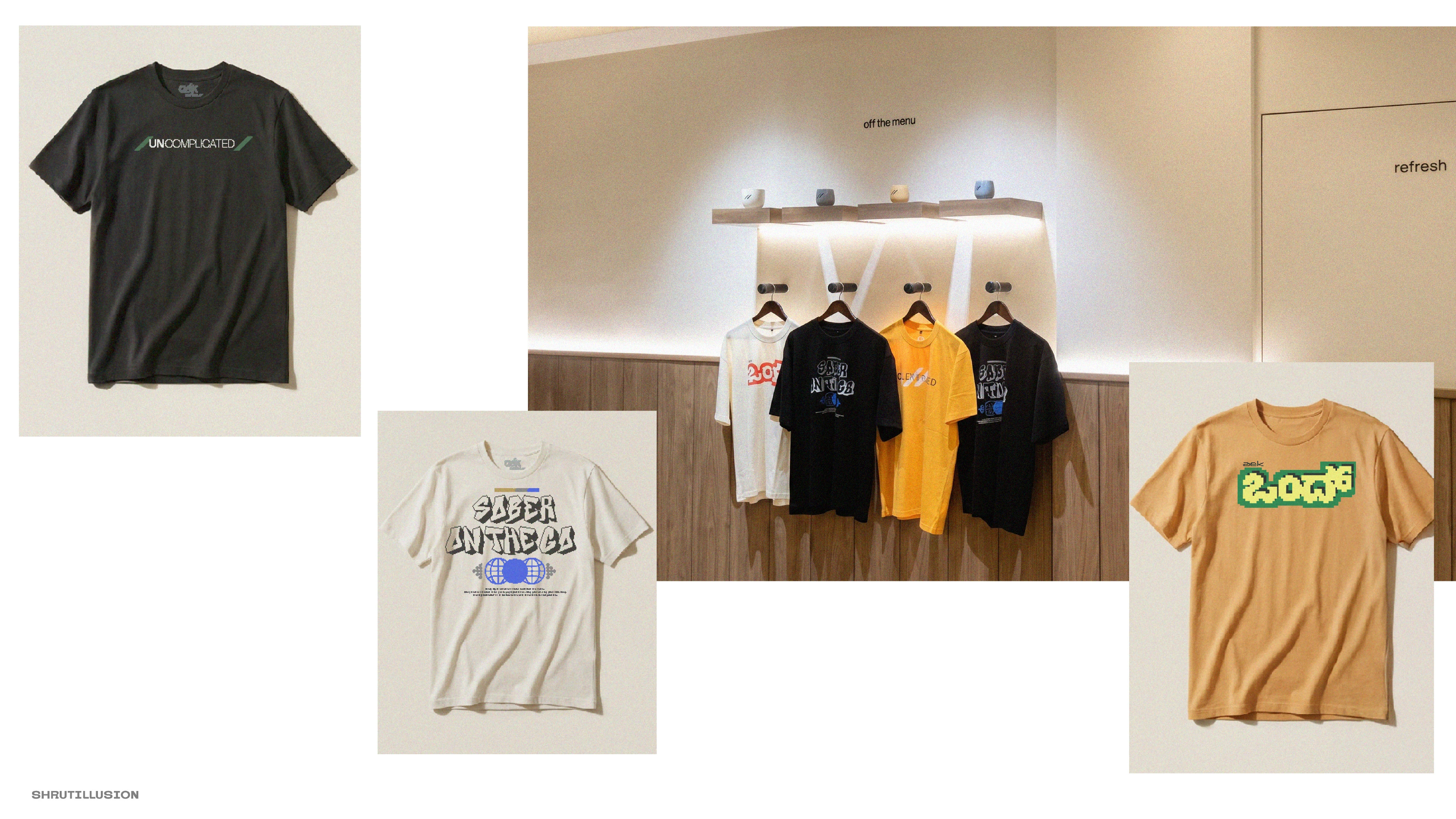
Brand Merchandise
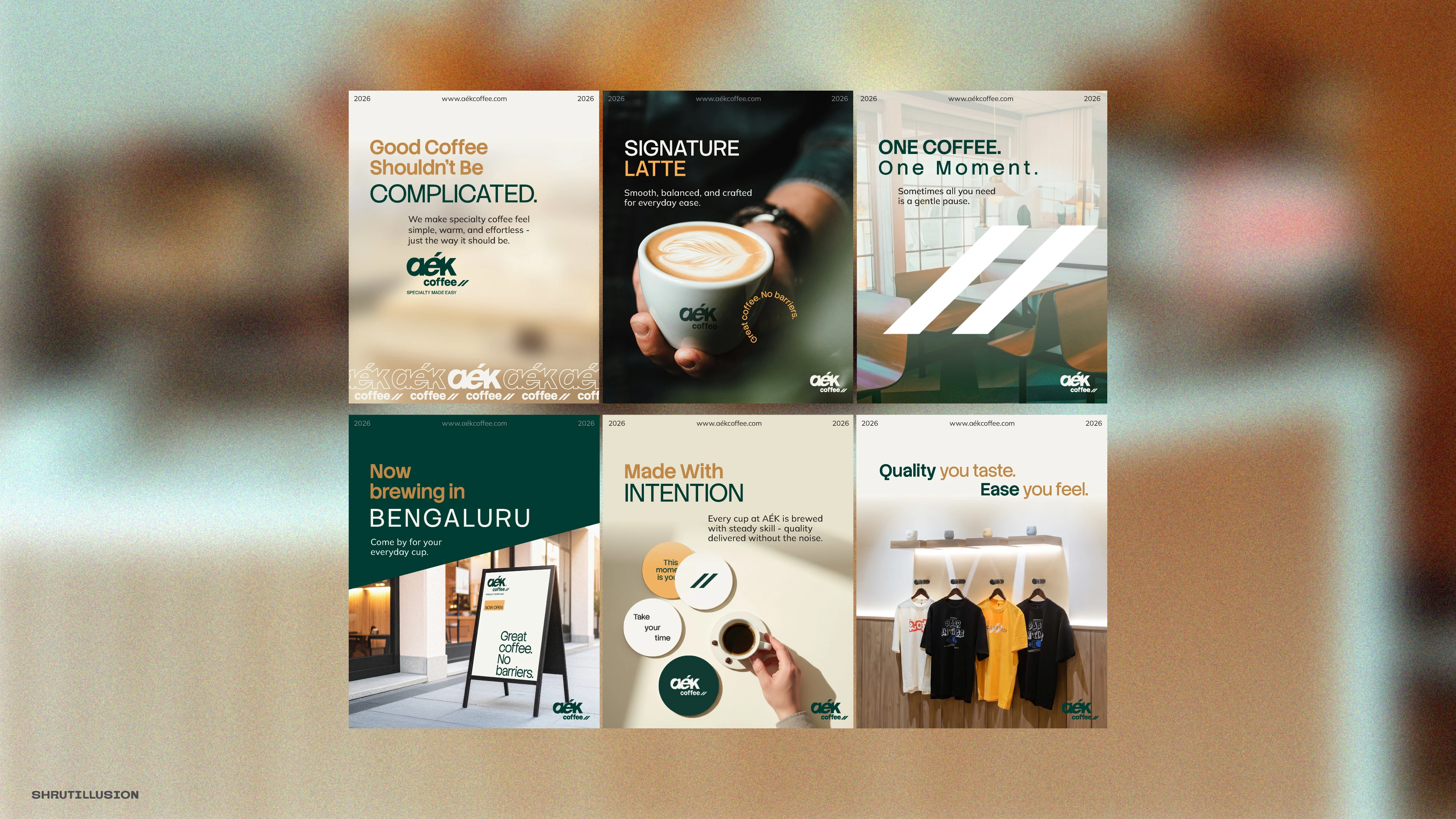
Brand Digital Touch-points
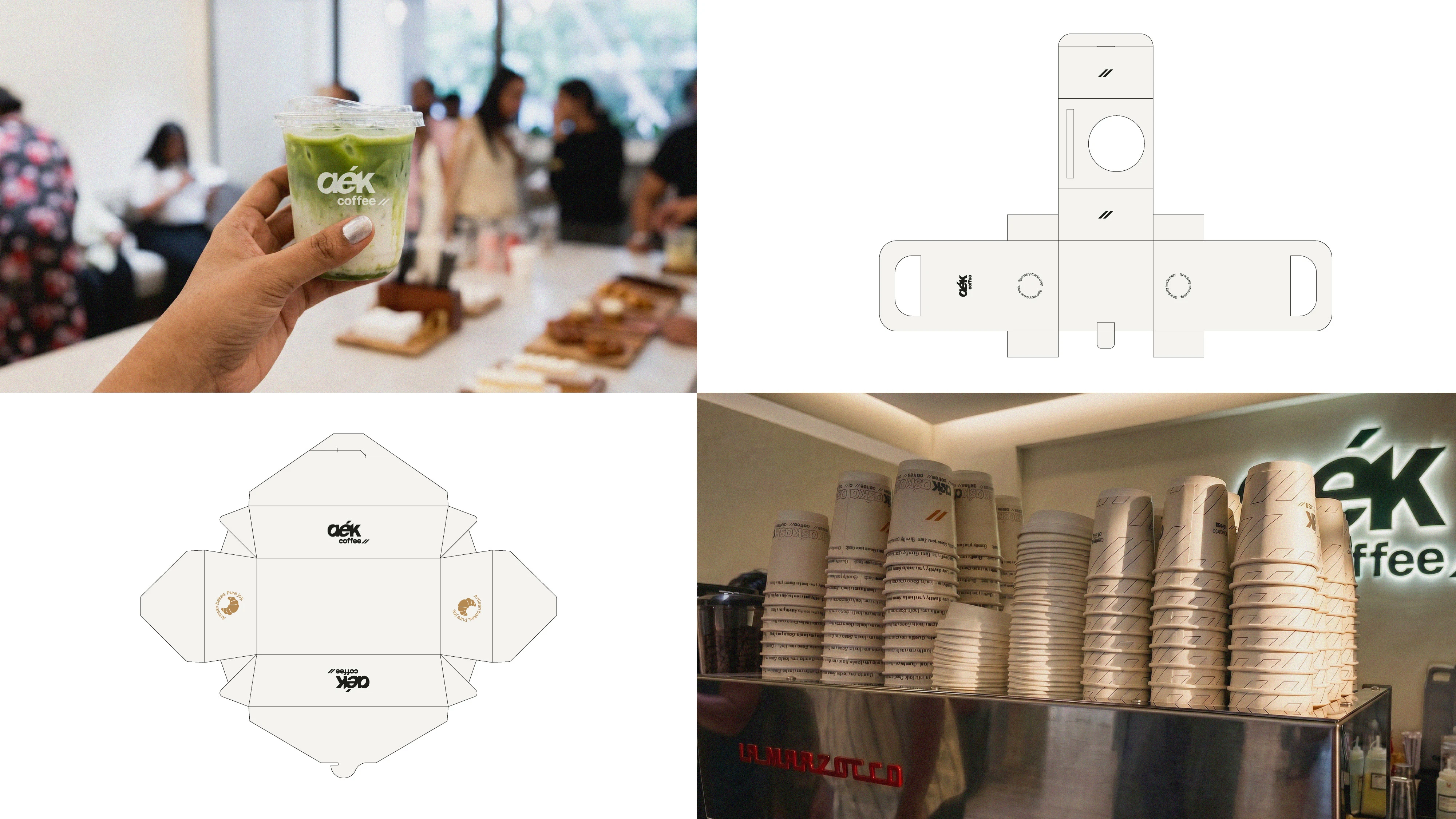
Brand Packagings
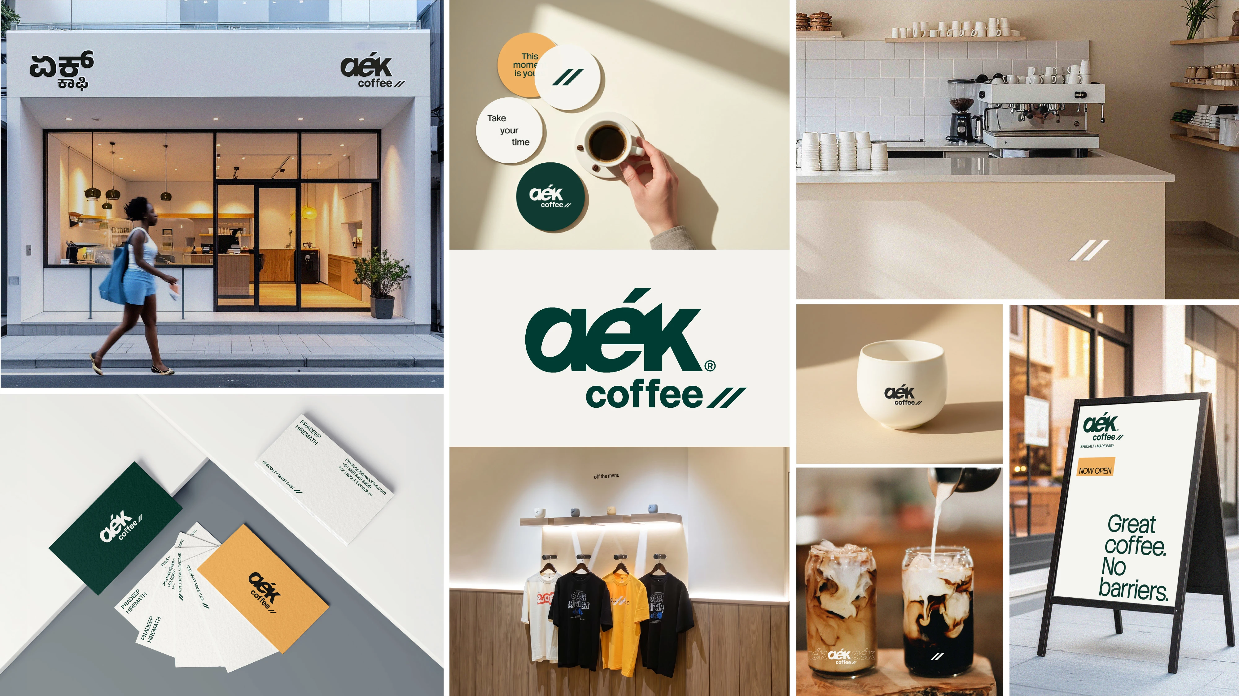
Specialty Cafe Brand Identity
Aék Coffee ®
Foundational Brand Strategy · Name Refining · Logo & Visual Identity System · Packagings · Merchandise · Brand Guidelines
Shrutillusion Studio · 2026
See the brand live at instagram.com/aekcoffee_/
Like this project
Posted Aug 3, 2026
A specialty cafe minimal identity designed to balance refinement with approachability, creating a brand that feels equally at home or on a retail shelf.
Likes
0
Views
11
Clients
Aék Coffee