The Very Berry - Landing Page Design & Build

Brendan Kavanagh
Web Designer
Low-Code/No-Code
Squarespace Developer
CSS
Figma
Squarespace
Project Cover Image

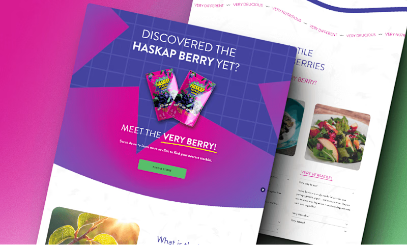
Stylized spread of landing page for promo/thumbnail use.
Table of Contents
Project Case Study
Project Overview
John reached out to me seeking my expertise in crafting a visually compelling landing page to provide both product information and a call to action for an ad campaign promoting Nova Scotia's Own Frozen Haskap Berries.
As a single-page landing page, no multi-page functionality was needed, so the header navigation, along with the entire footer section, was removed to avoid distraction or misdirection concerning the core purpose of the landing page.
The page needed to be mobile first since a significant portion of ad traffic would be driven via mobile, so the main hero section was designed to be center-aligned with a prominent call to action button leading to the store location section.
Various sections were added to provide details about Haskap Berries in general, as well as about this specific product, and its producers. To add relatability & use case options, some recipe samples were also included.
The core purpose of the page was to direct potential buyers to the store locator section of the page, which presents the user with a map of nearby grocery store locations currently stocking the product in their frozen aisle.
John and I collaborated on assets and imagery as well as a copy to bring together a cohesive vision from the existing assets provided, as well as the initial copy & direction intended for the ad campaign. This resulted in a beautiful, visually appealing, and responsive landing page suited exactly to the purpose at hand.
Live Project Link
Project Showcase
Full Landing Page Screenshot

The Very Berry Landing Page - Nova Scotia's Own Hazkap Berries


