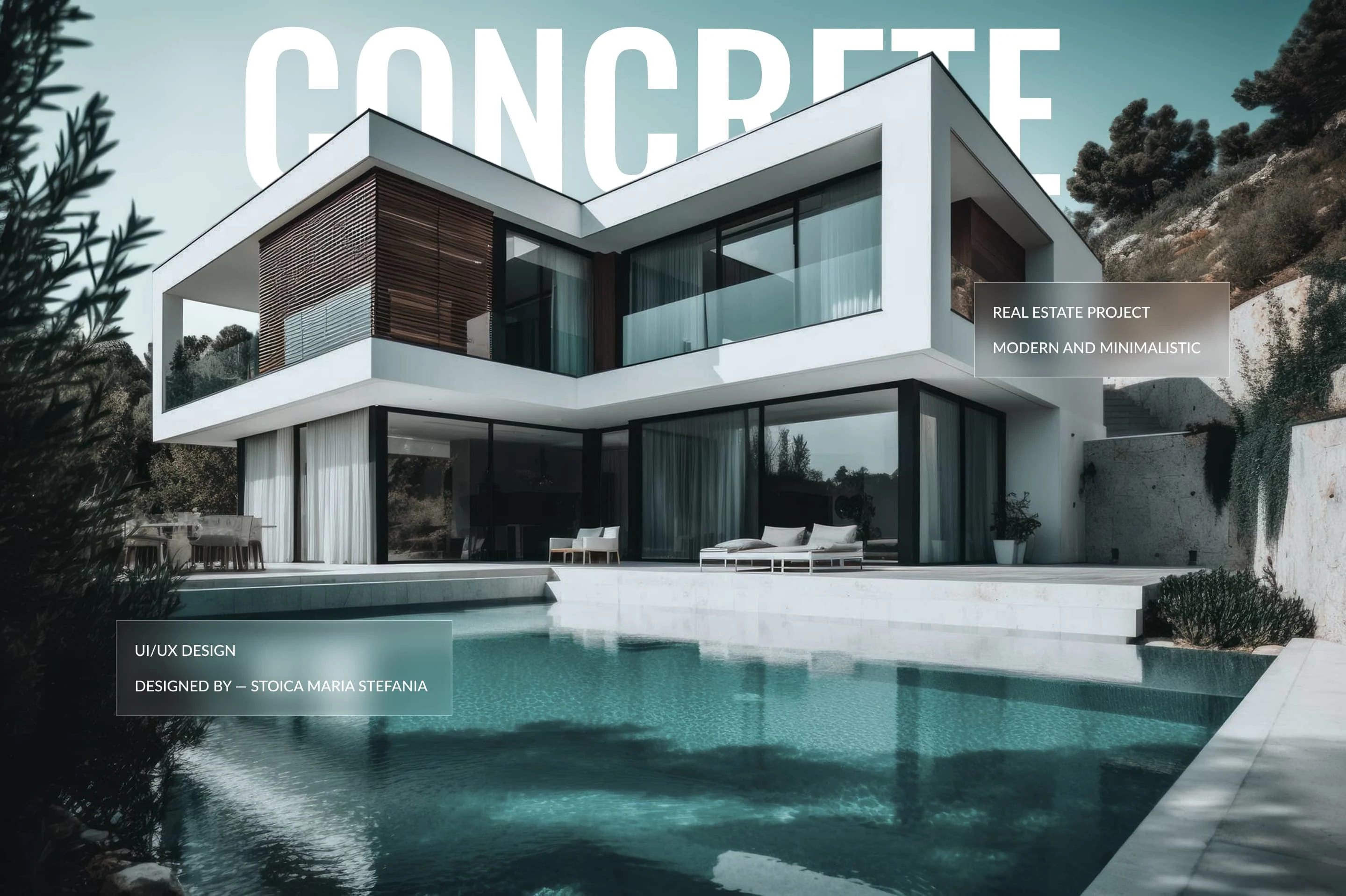
CONCRETE. | REAL ESTATE PROJECT
Stefania Stoica
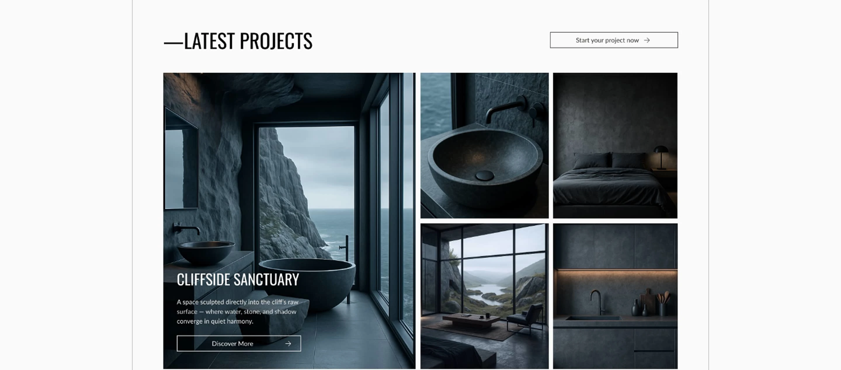
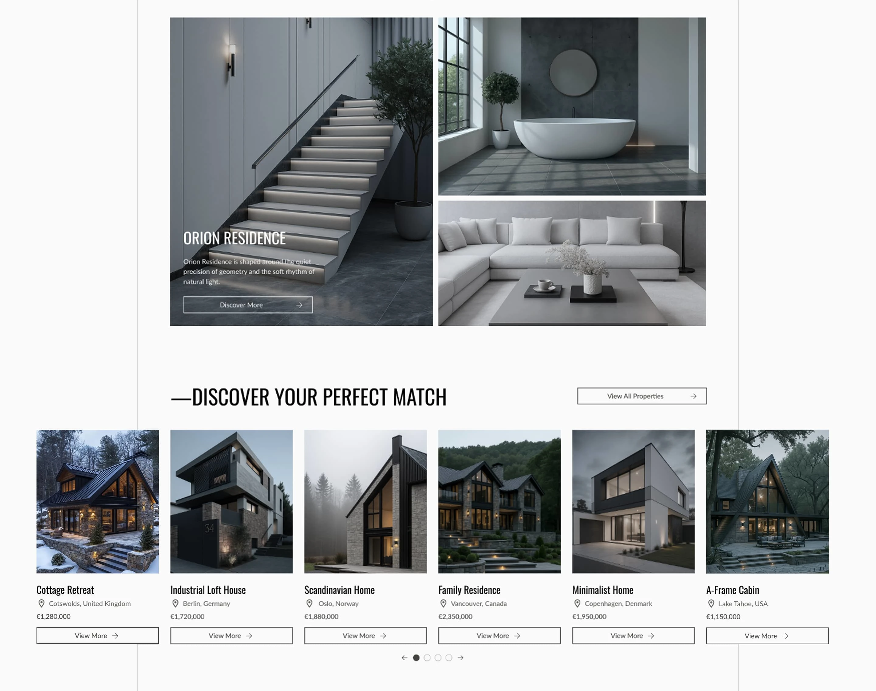
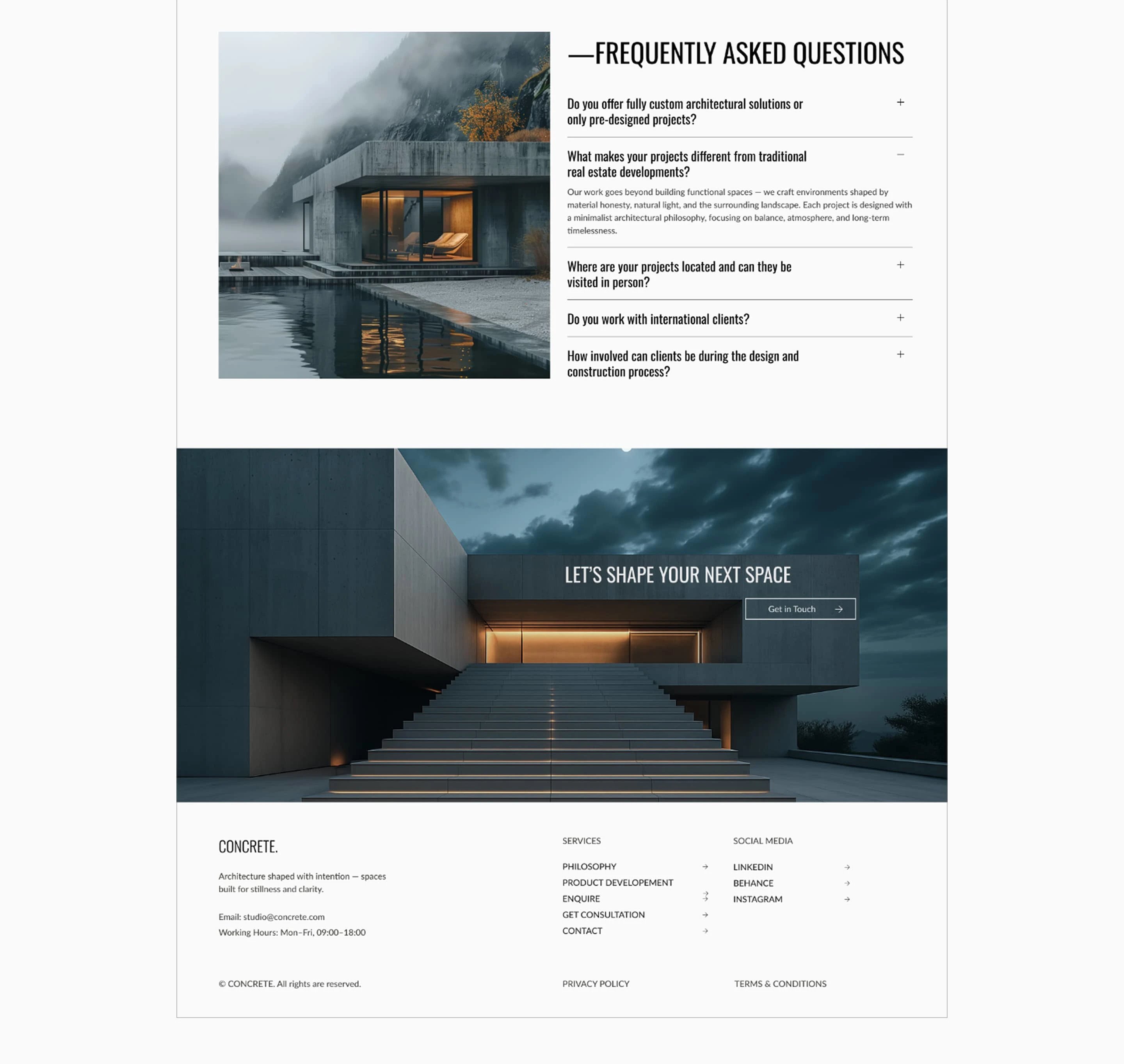
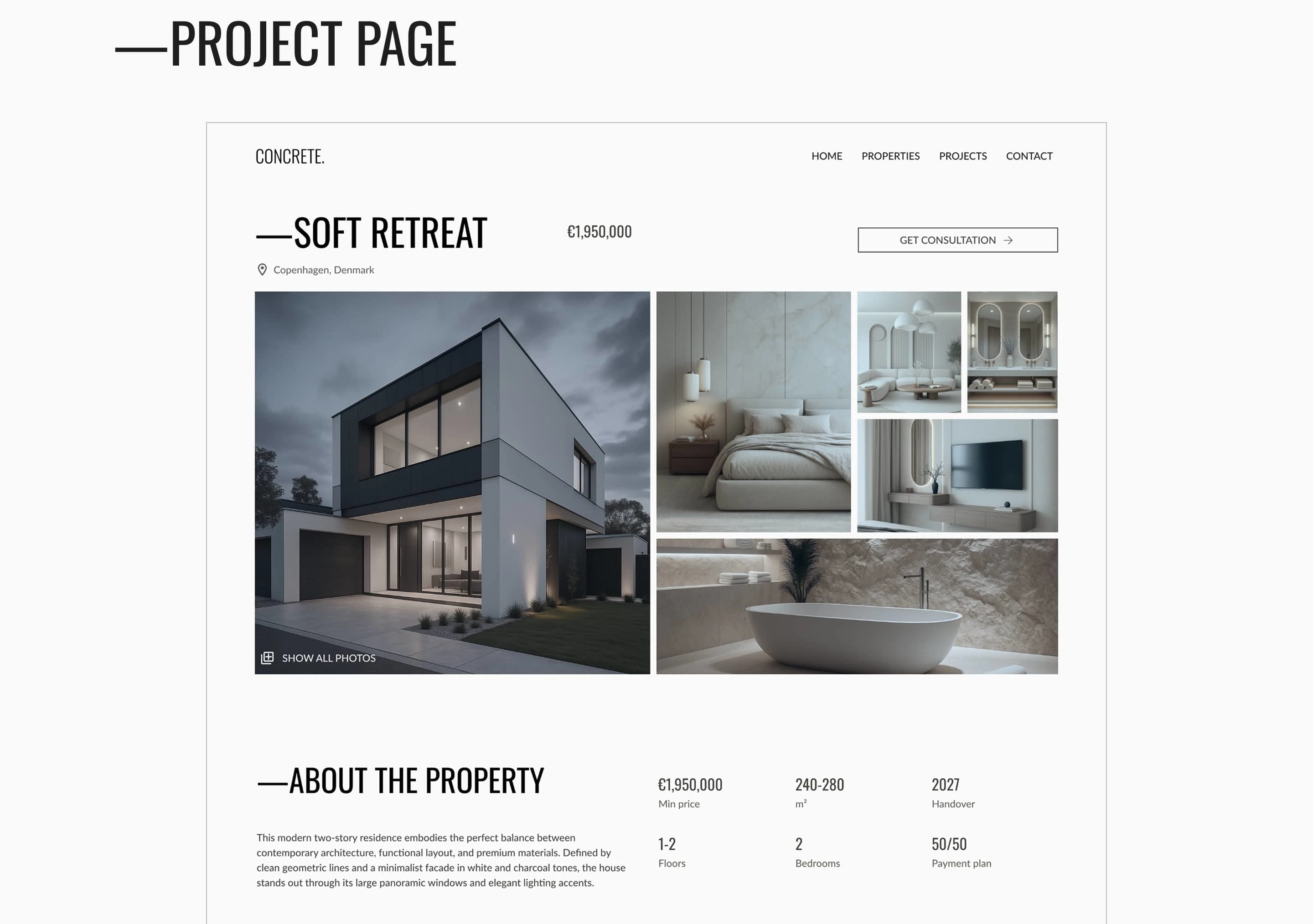
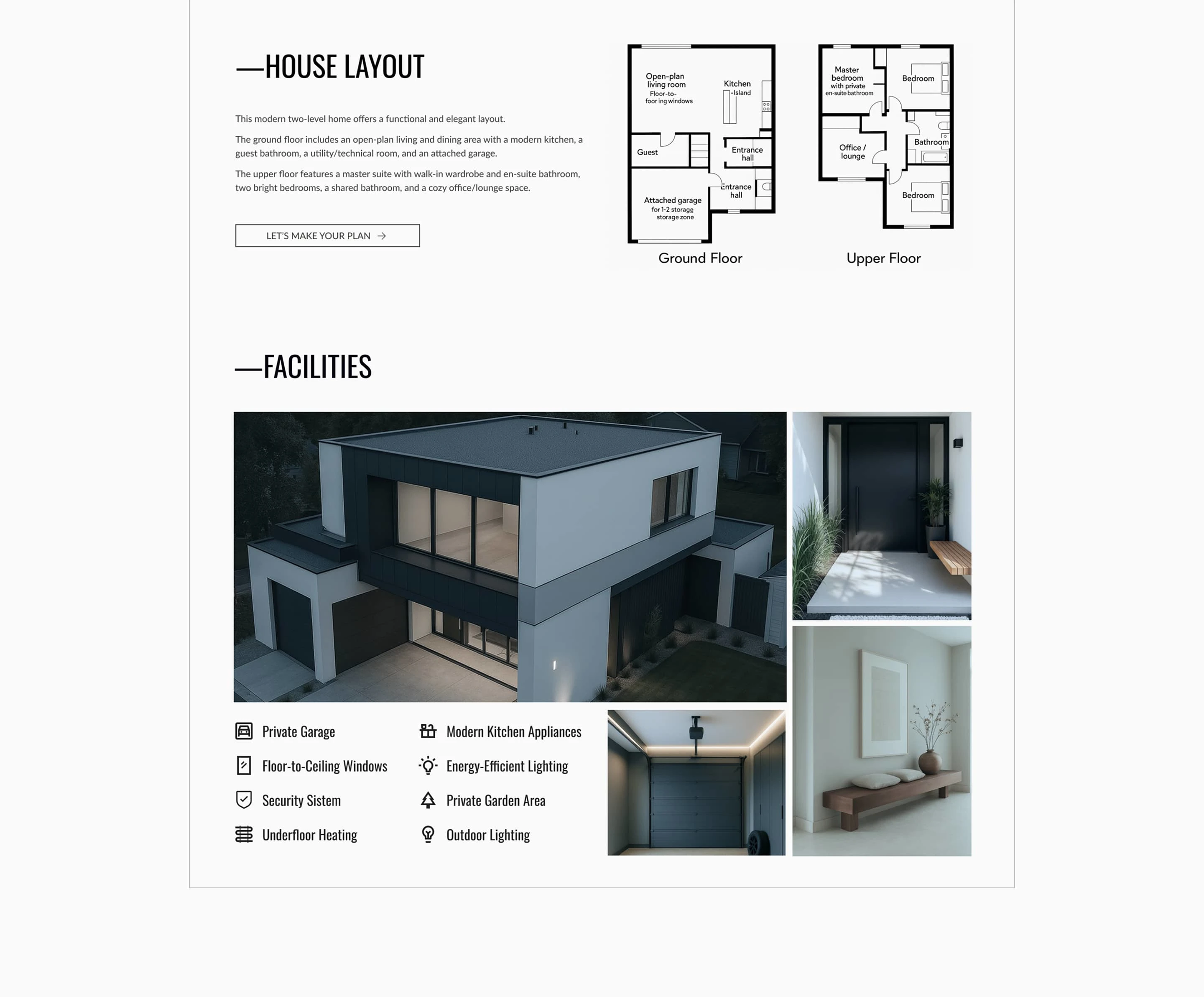
In this project, I moved away from traditional real estate templates to embrace a minimalist layout that highlights space and materiality. The core challenge was that most industry platforms feel overcrowded and sales-driven, failing to communicate the emotional value of premium architecture. My solution was to redefine the luxury experience through a non-standard layout and a carefully curated visual rhythm. By implementing a clear hierarchy and subtle CTAs, I created a calm, trust-driven journey that encourages exploration rather than immediate conversion pressure, mirroring the high-end feel of the properties themselves.
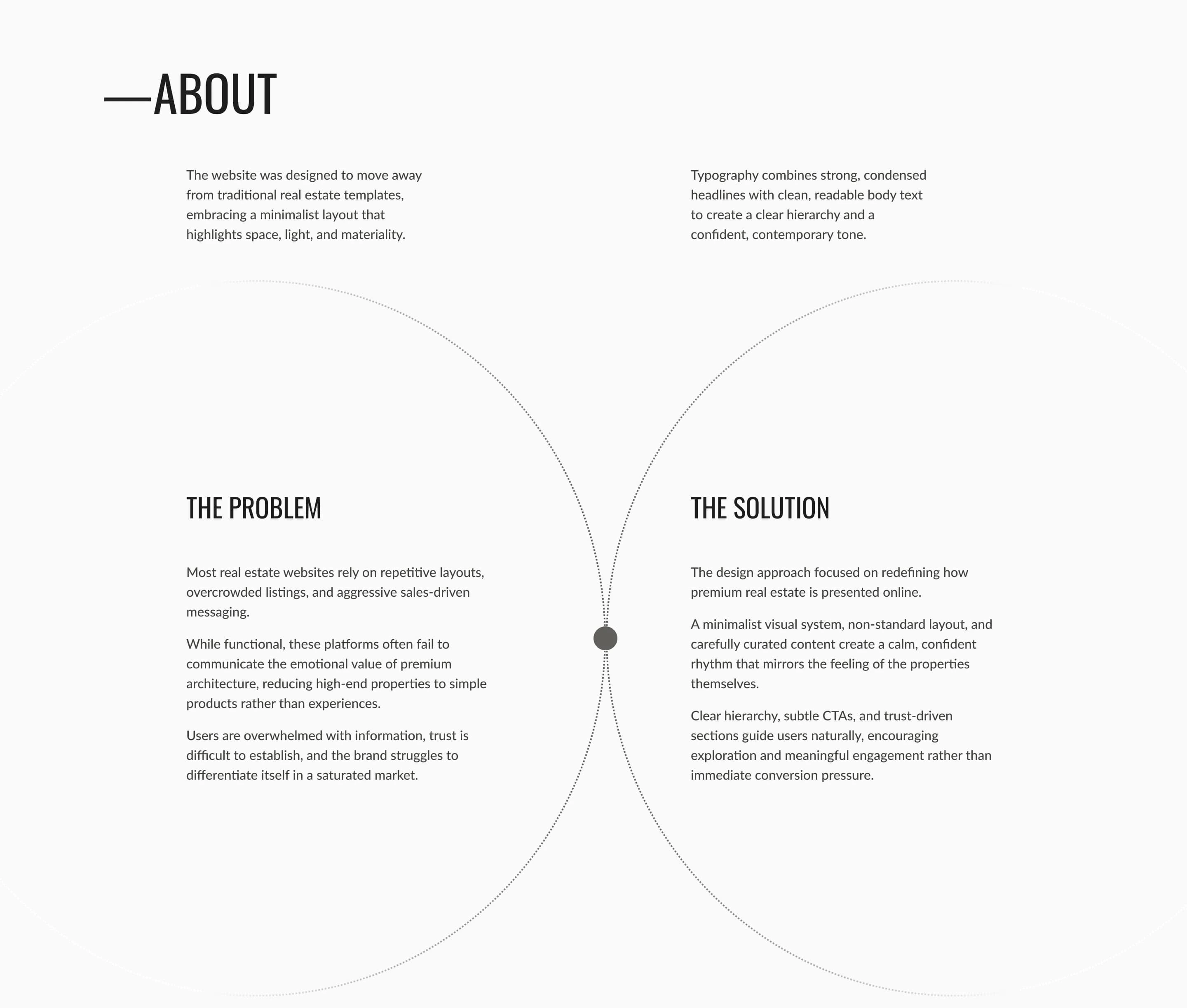
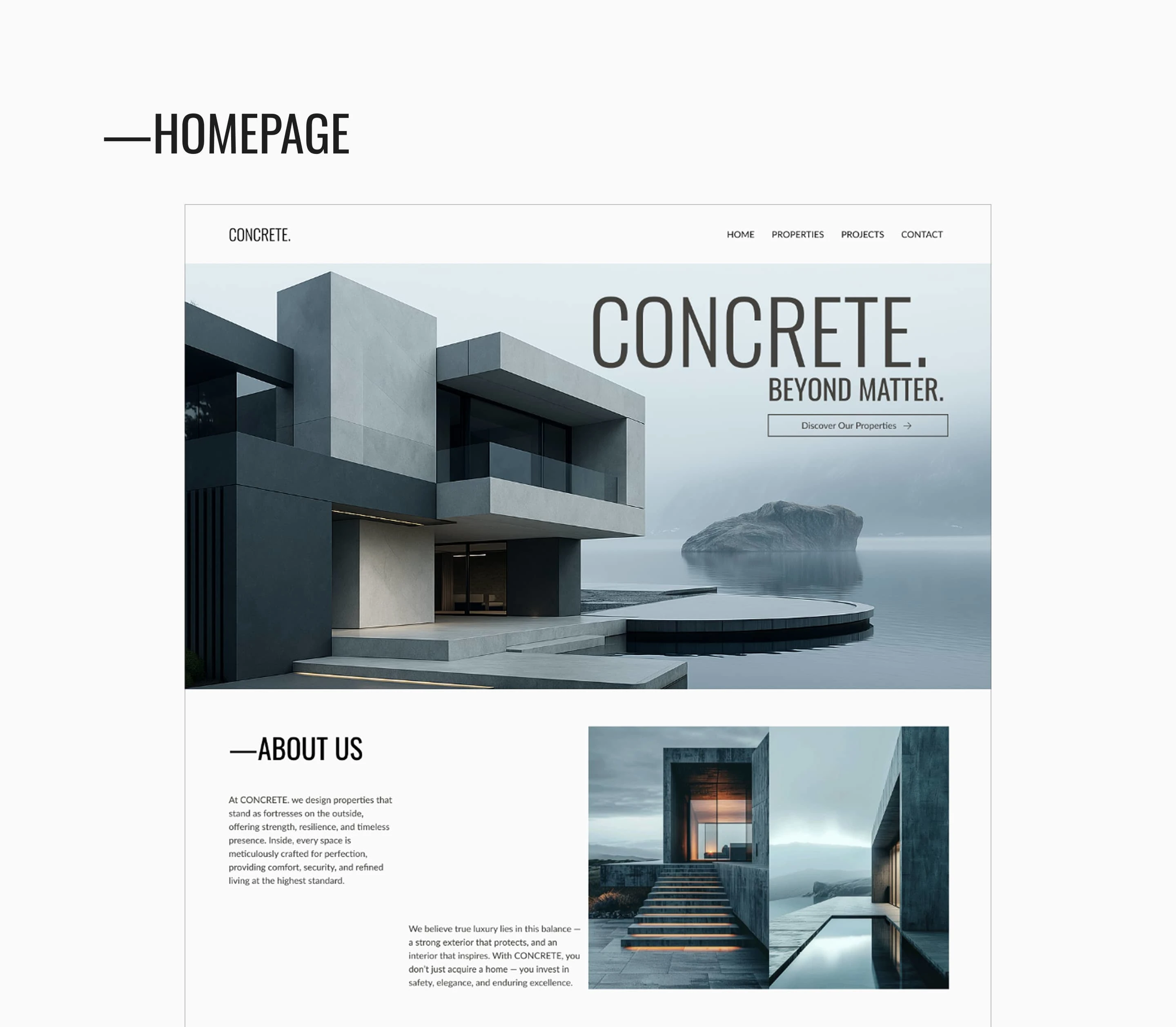
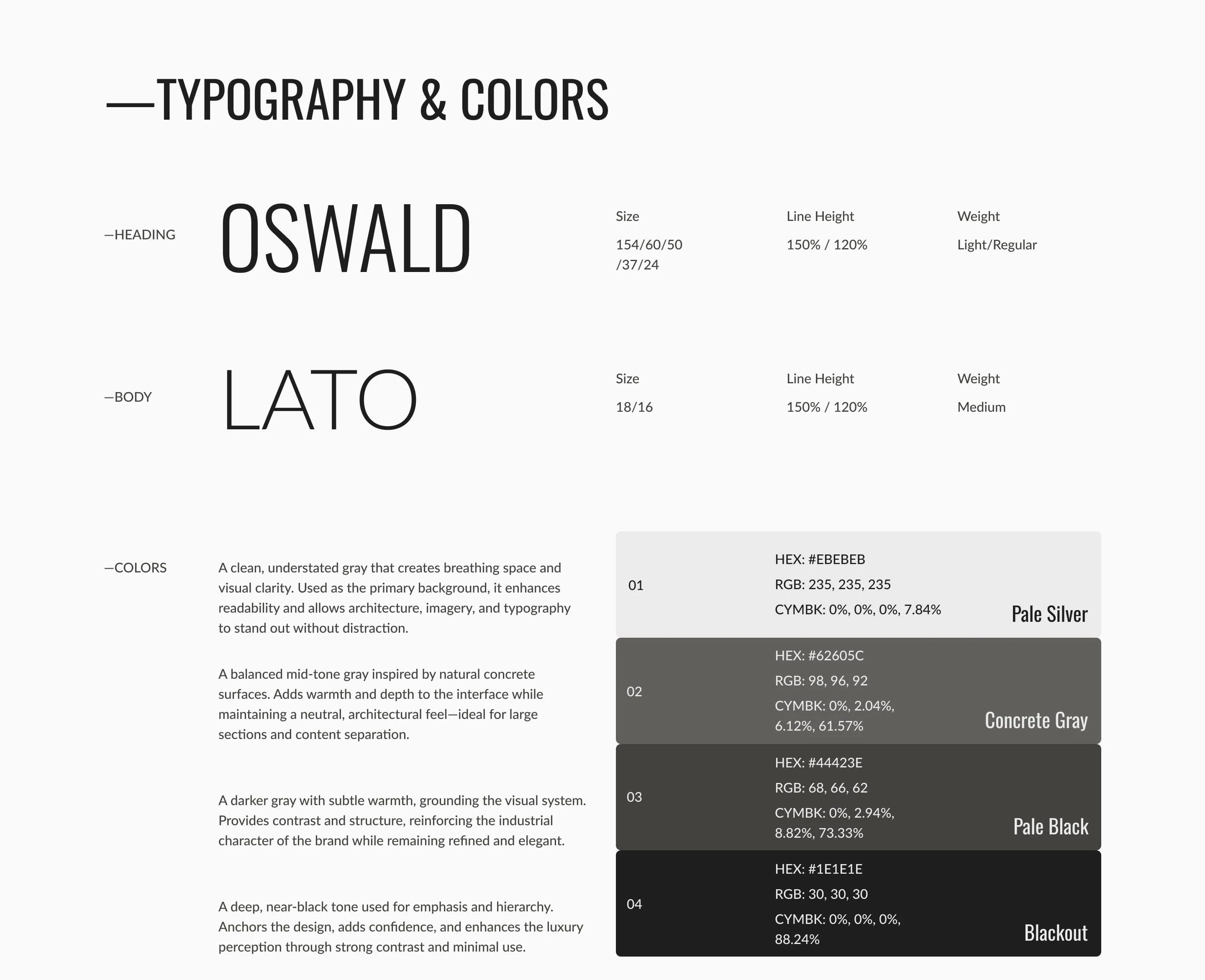
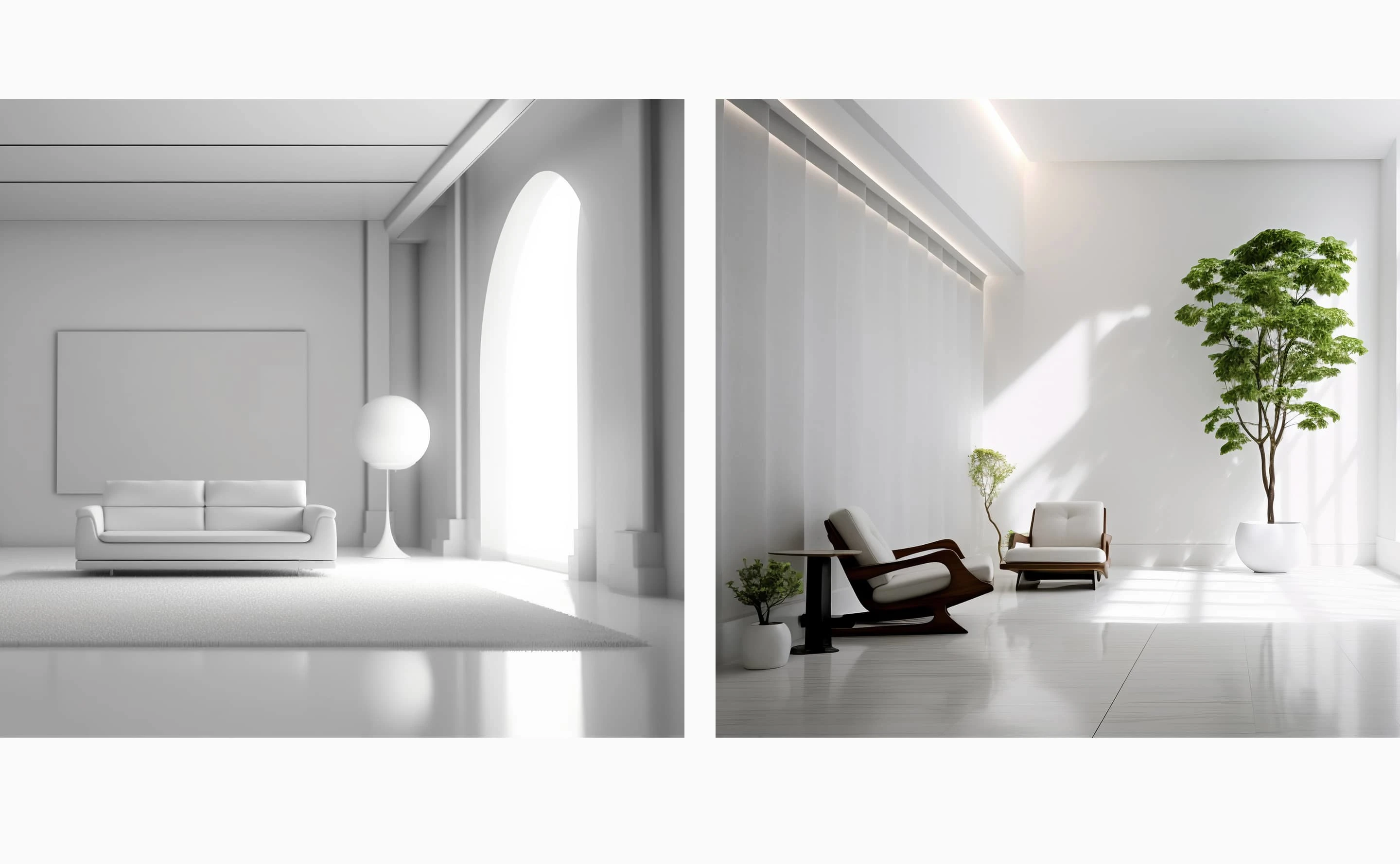
The typography and color system were designed to reinforce the project's architectural and industrial feel. I paired Oswald, a strong and condensed sans-serif, for headings to create a bold, confident statement, with Lato for body text to ensure maximum readability and a contemporary tone. The color palette follows a monochromatic, neutral approach—featuring 'Pale Silver' for breathing space and 'Concrete Gray' for structural depth. This understated selection allows the imagery and architectural details to remain the focal point, while providing a clean, sophisticated backdrop that feels both grounded and high-end.

Like this project
Posted Mar 16, 2026
The project explores the balance between raw architecture and refined living, using a clean layout, strong typography, and a restrained color palette.
Likes
0
Views
4