Klaaryo Branding
Dario⚡️ Ferrando
1 collaborator
Klaaryo Rebrand
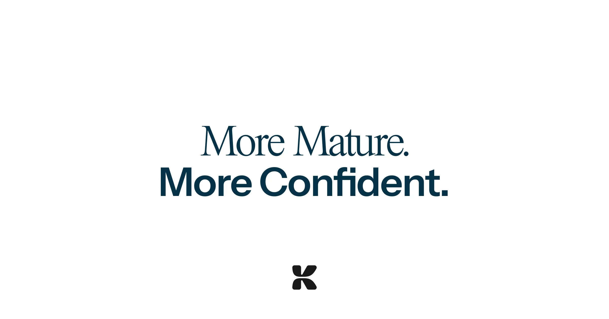
Klaaryo approached me in December with a relatively big scope. Redesigning their branding from scratch, in order to shift from a more startup look and feel, to a more human, established and mature company look and feel. And with that look, secure their next funding steps. Which is precisely what I achieved.
The New Branding
As with every new branding, the first step is the design of a new logo. After testing a couple options, we landed on a modern looking interpretation of the letter K. Clean, modern, and sharp. Just like the Klaaryo product.
We then extended the branding language, defining typography, colors and creating various sets of assets for the team socials, events and merchandise.


The new Logo
Typography treatment

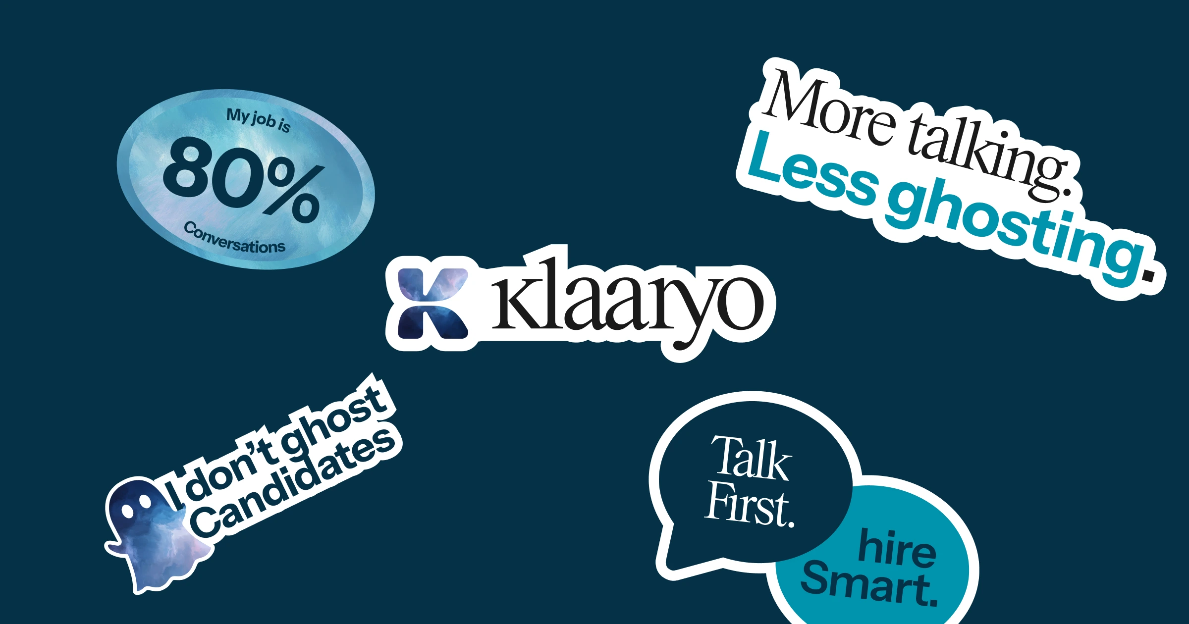
Stickers
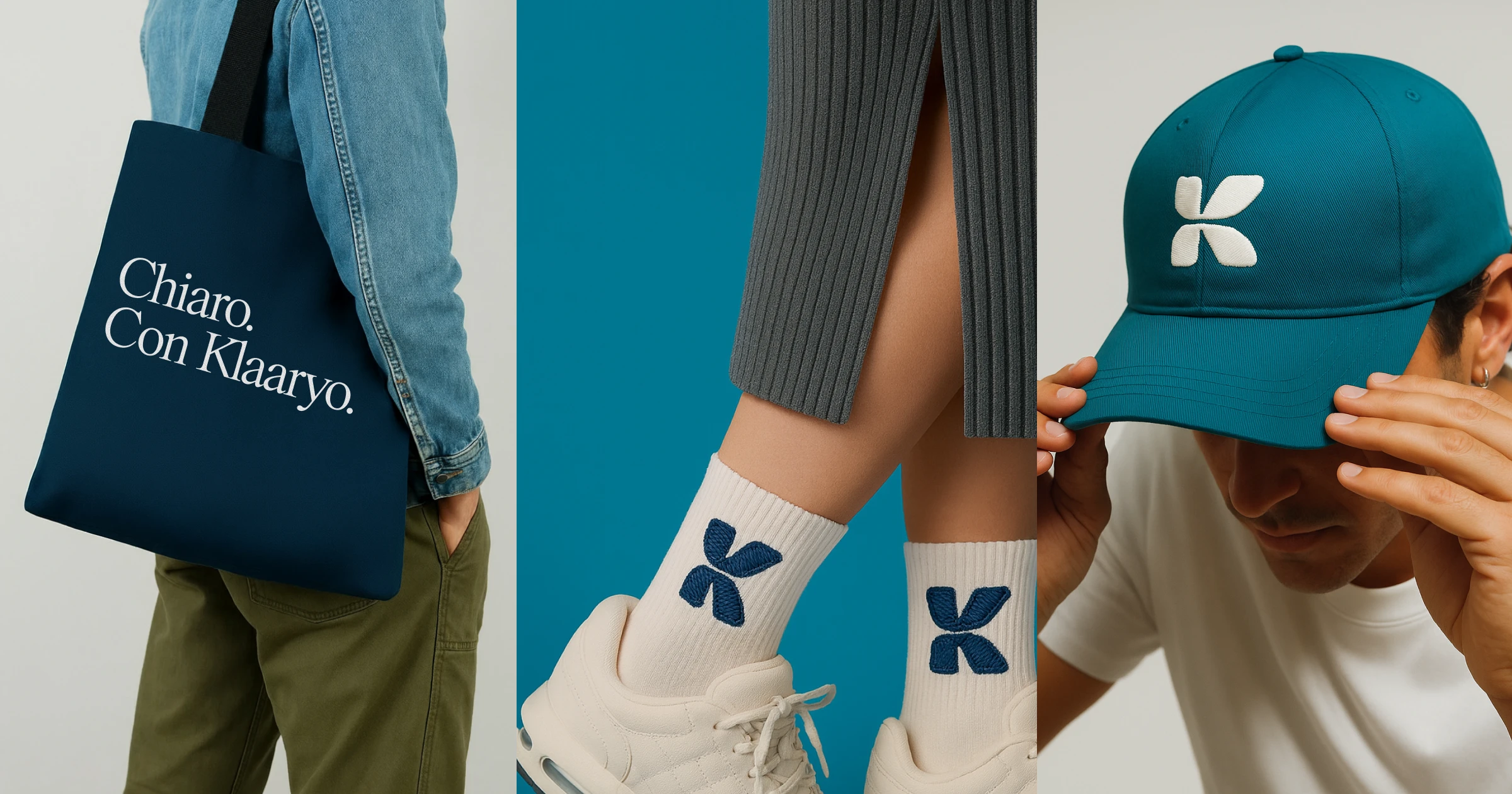
Merch concepts
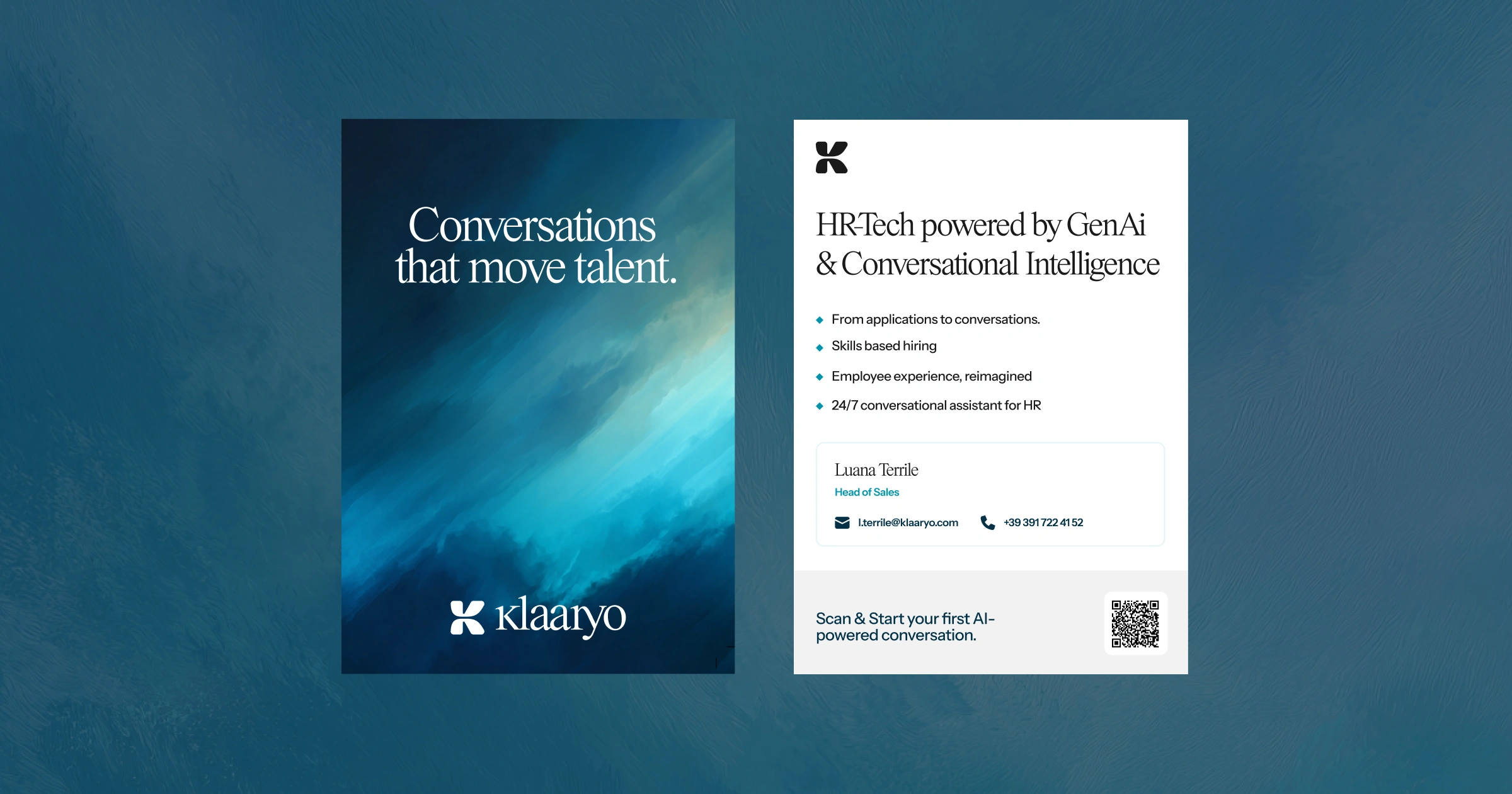
Printed Booklet
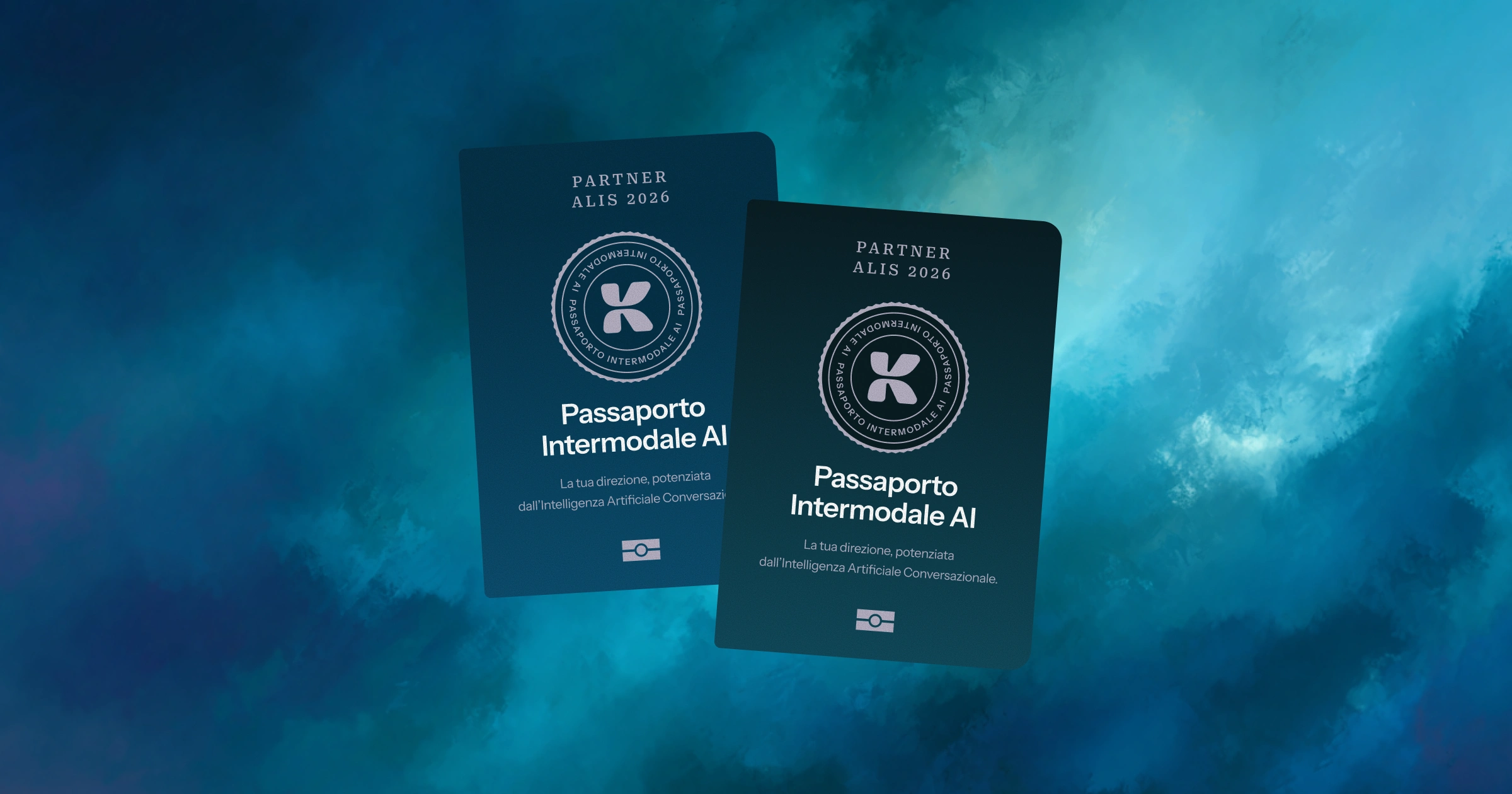
Event Printed Materials
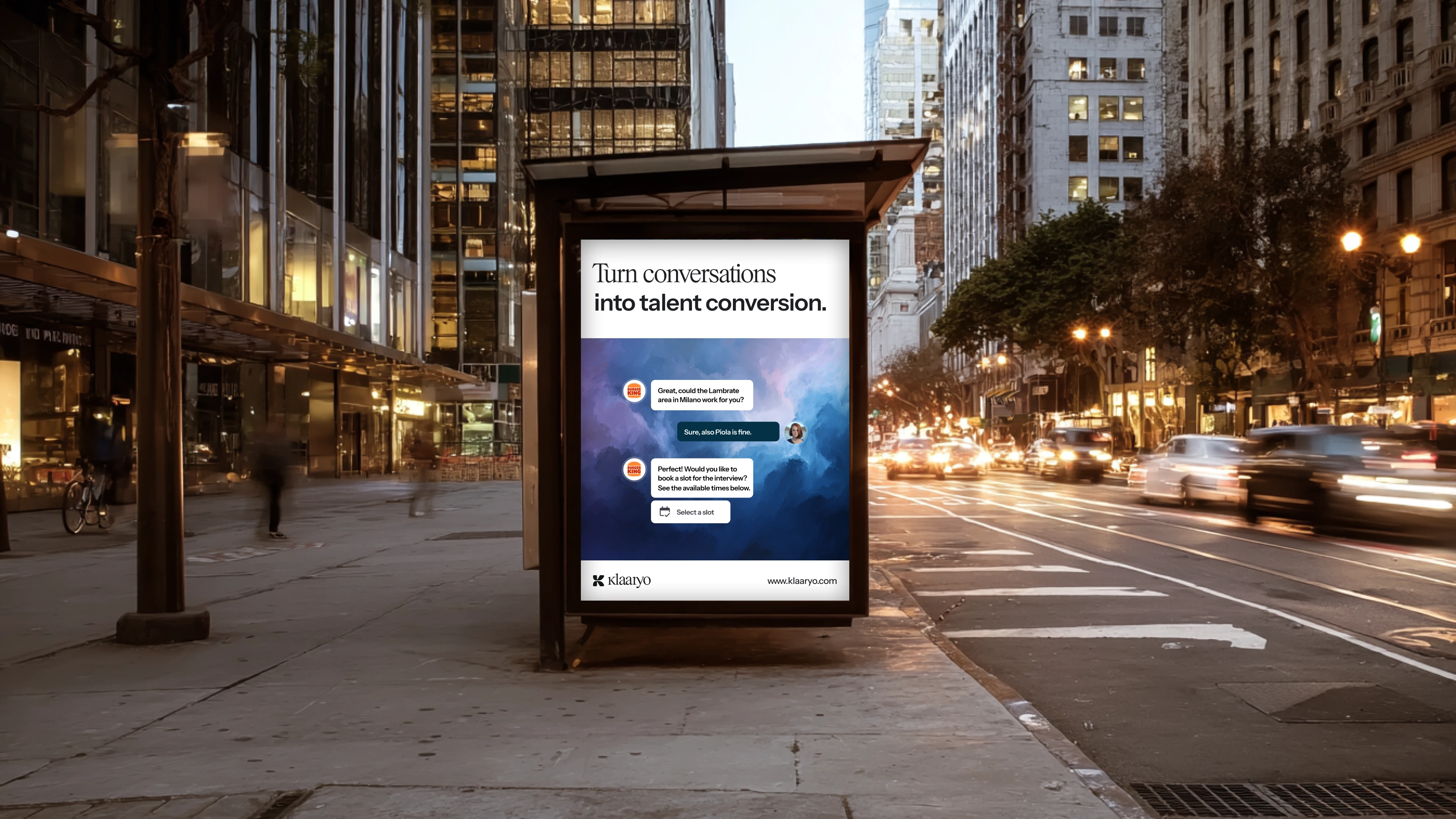
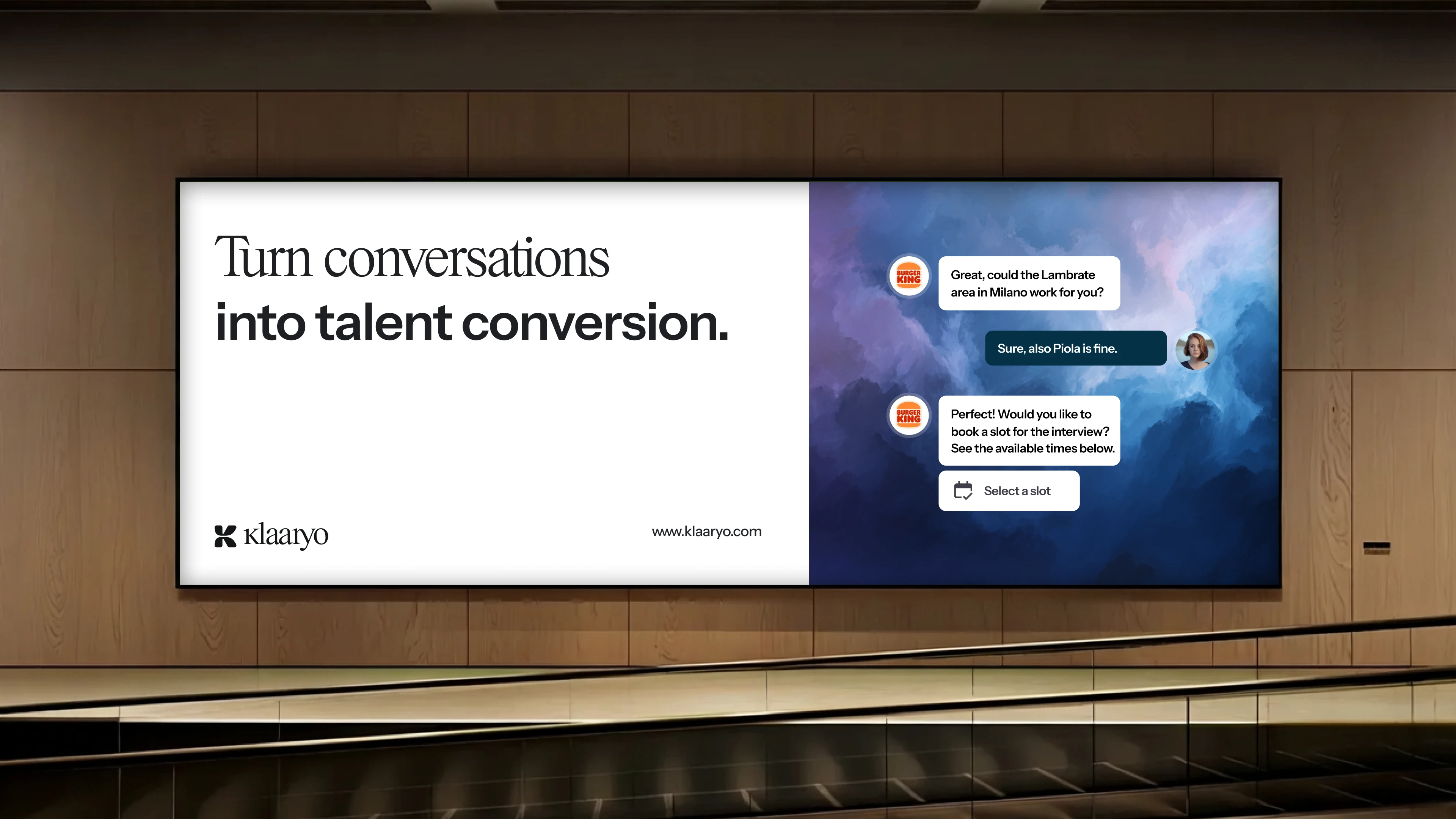
OOH Posters
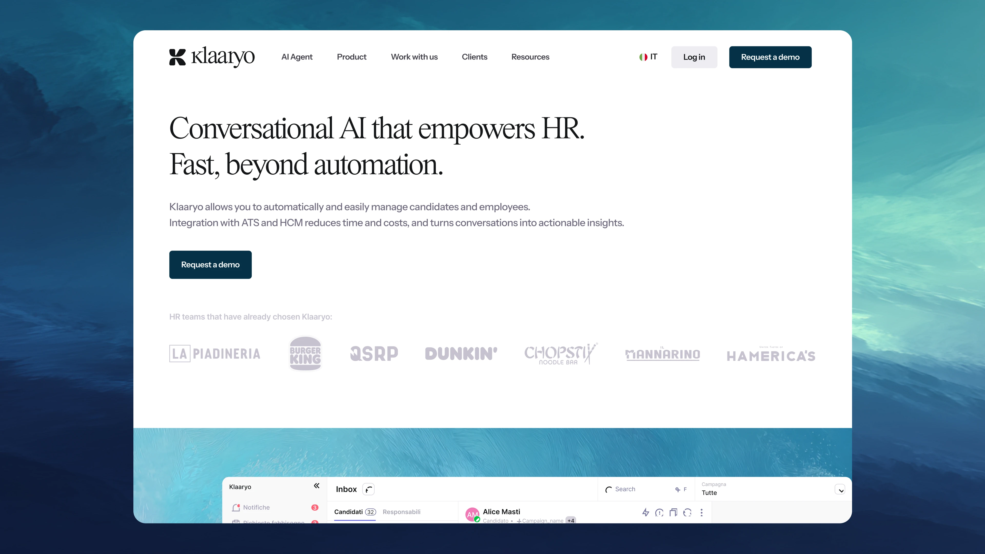
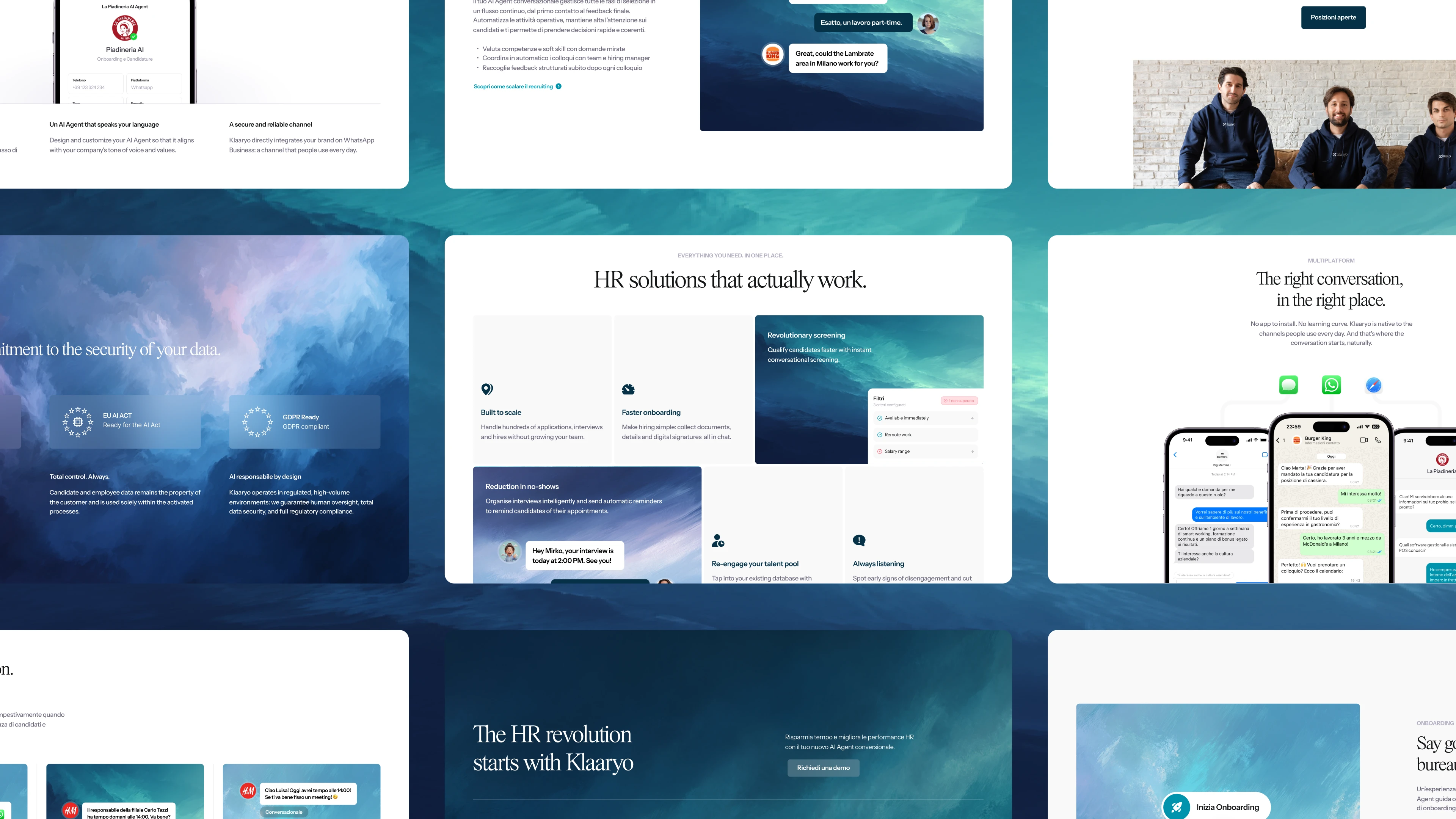
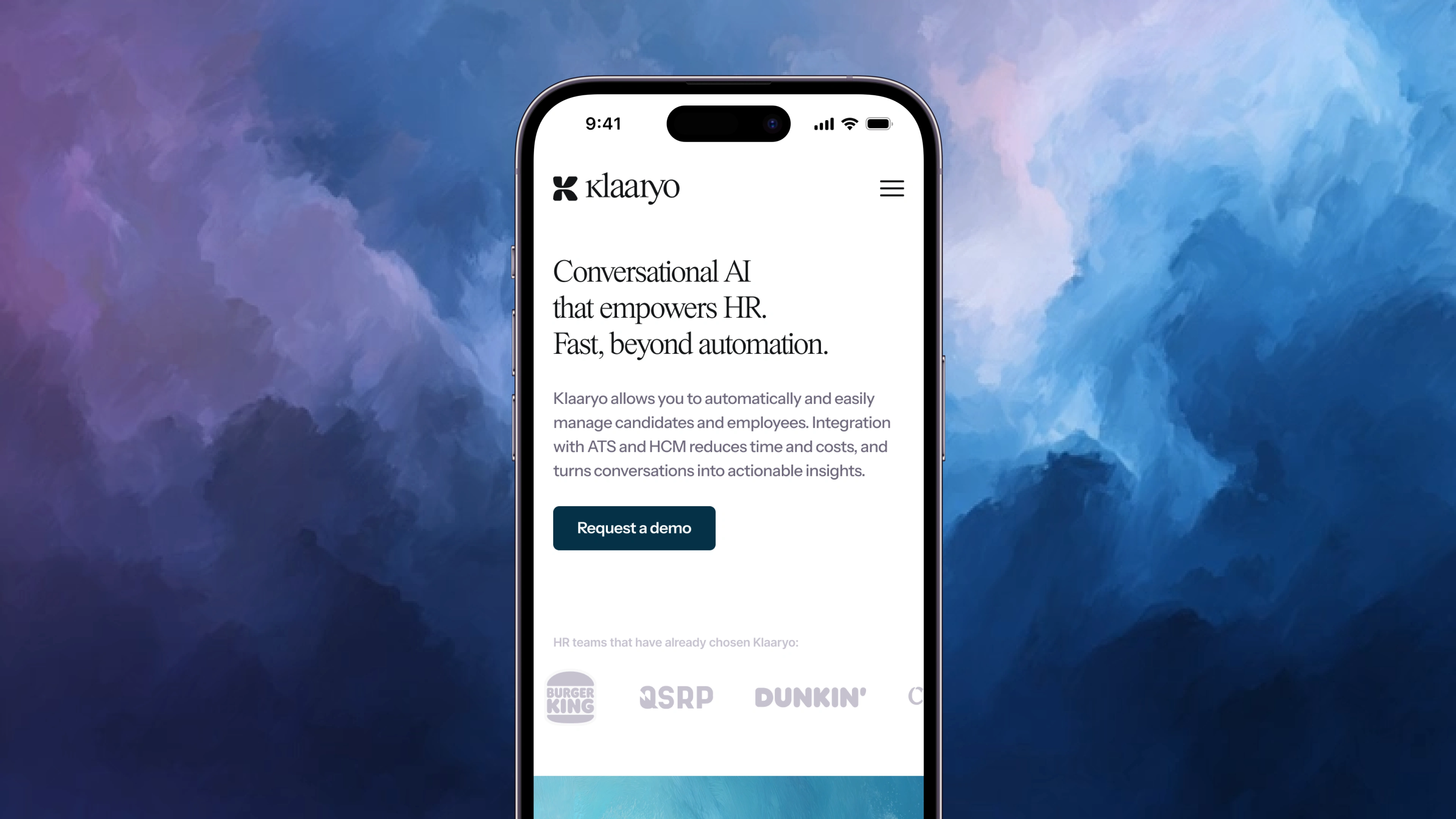
A new website
Unsurprisingly, redesigning the entire website was the first thing we did after reworking the brand. A new desktop app is also in the works, but it will take a bit of time to see any updates on that.
The new Klaaryo website was designed and built with conversion in mind, with a feature first approach tailored to target the business managers and HR Managers of the Italian market, where Klaaryo operates at scale.
You are more than welcome to check the live link on https://www.klaaryo.com/
An announcement Reel
To top it off, we created a short announcement reel to introduce the new klaaryo branding to the market, while reinforcing the product focus and teasing some of the USPs of Klaaryo.
The Results
The client was overwhelmingly happy with the results of the rebrand, and so was the market and investors. Klaaryo quickly received their next cash injection, and the relaunch was very well received across their audience.
Like this project
Posted Mar 17, 2026
Revamped Klaaryo's brand and online presence, securing funding and increasing market engagement.
Likes
0
Views
39
Timeline
Nov 15, 2025 - Feb 1, 2026
Clients
Klaaryo
Collaborators