TritonWear - Product Design
Nico Contreras
TritonWear
Product design
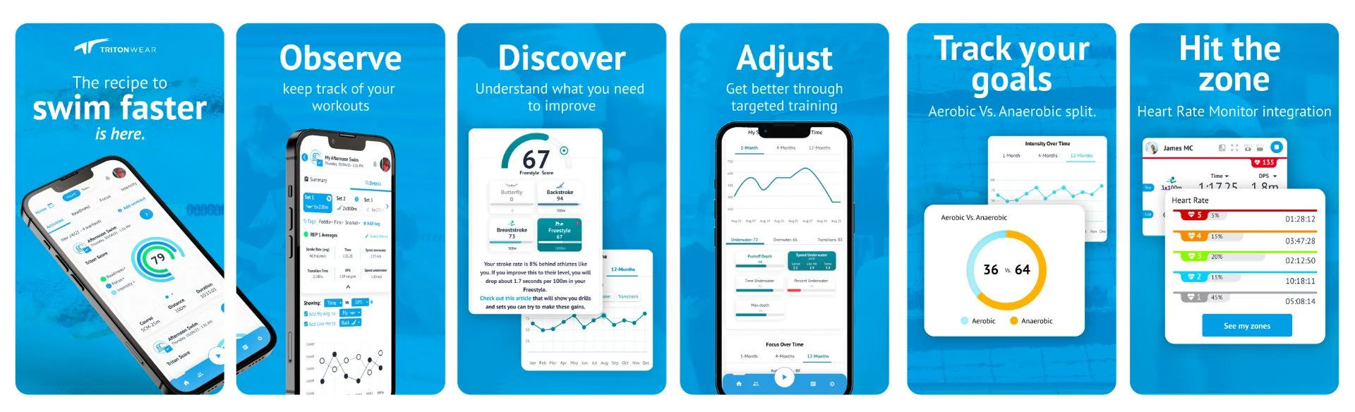
TritonWear is redefining athlete limits with a wearable and app that actually guide consistently better training for swimmers around the world. With a Triton Score for every workout, TritonWear provides the actionable insights any swimmer needs to swim faster.
The challenge
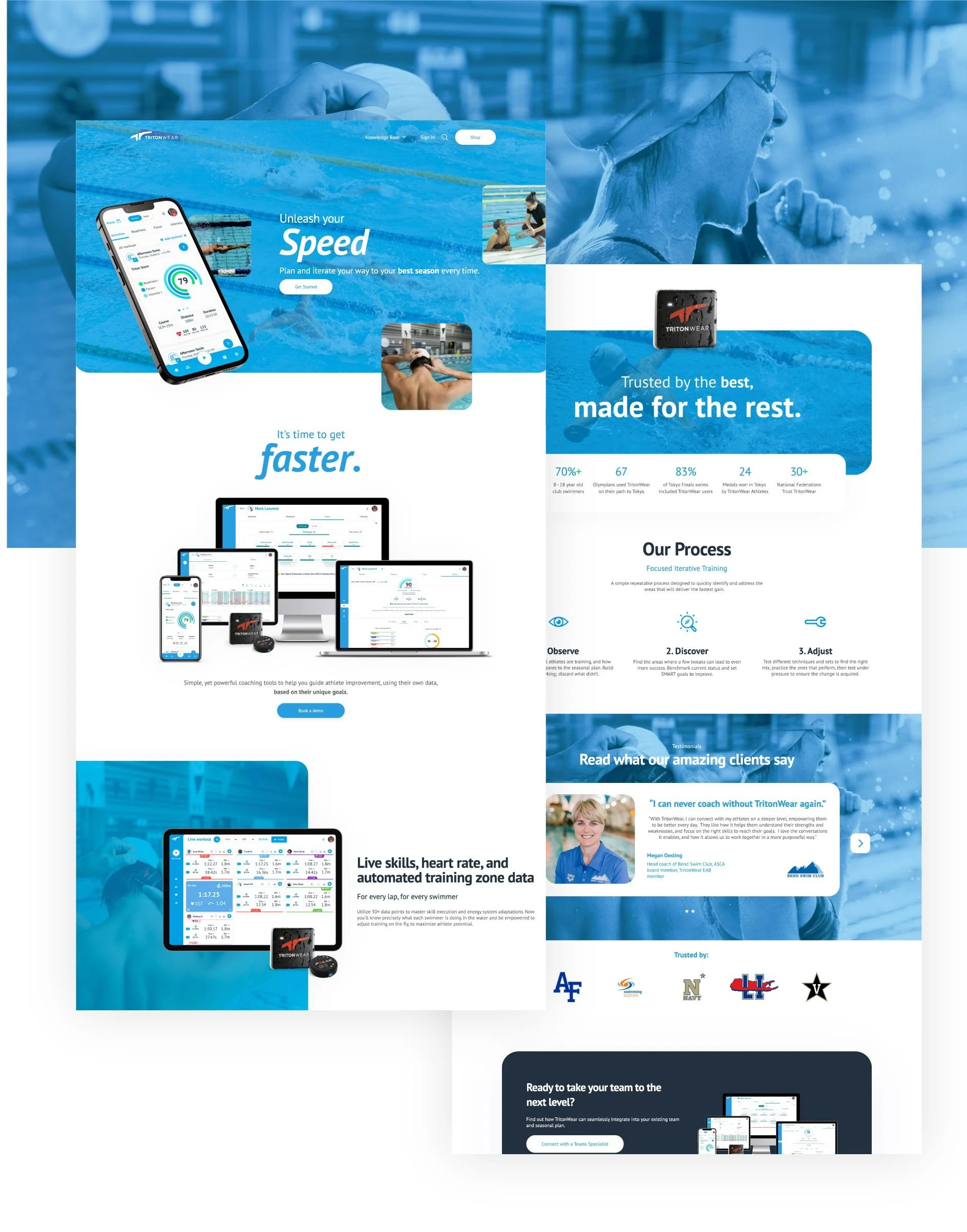
TritonWear is a system that allows swimming coaches to perform complex data analysis taken live through proprietary hardware, in a simple and fast manner. This brings many usability and data display challenges.
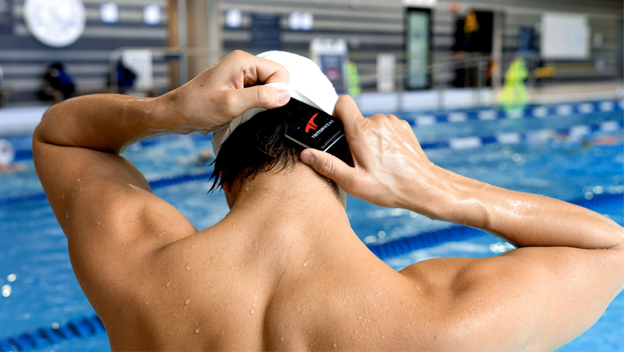
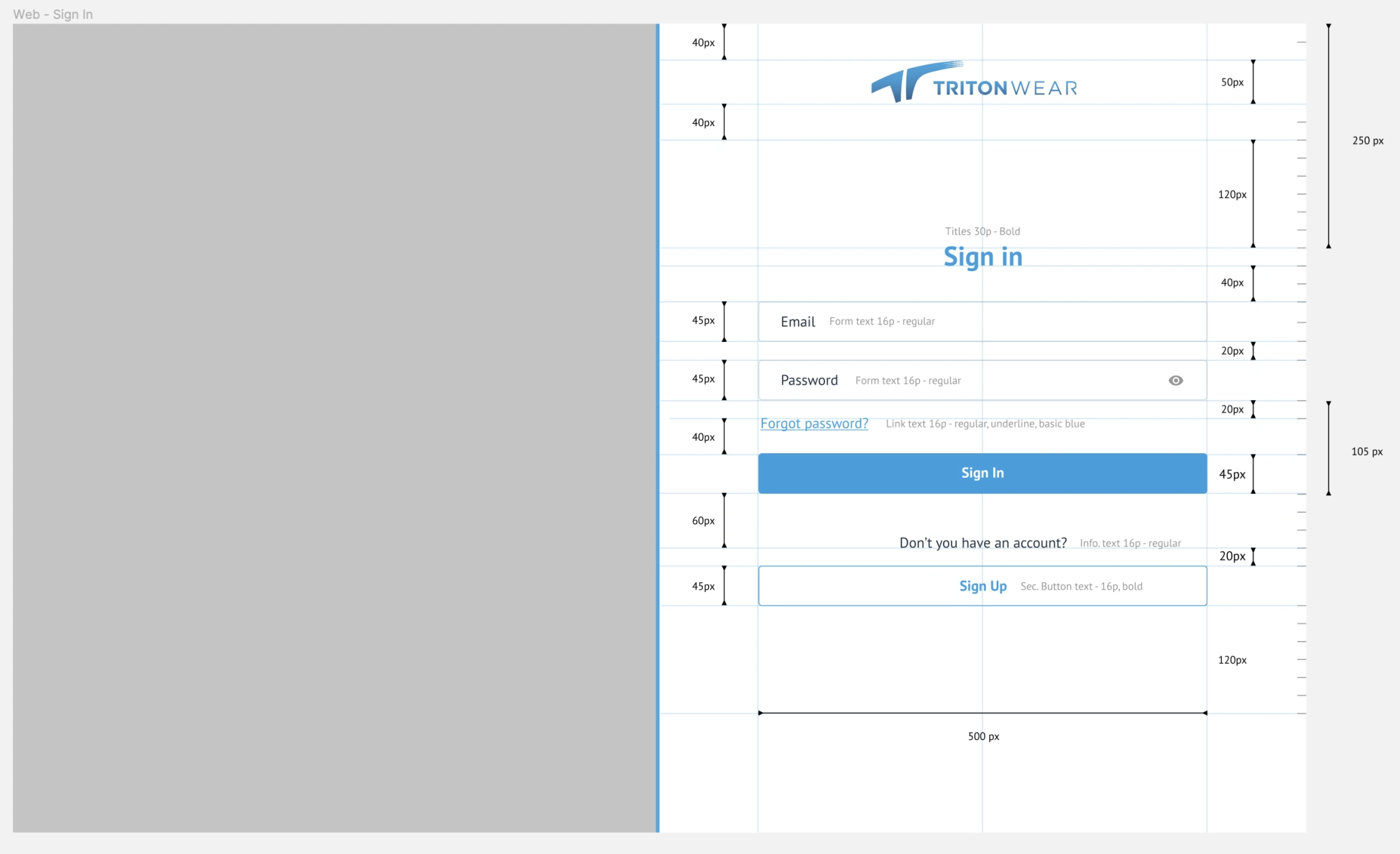
In order for users to adapt to the use of the device, we had to enhance the user experience starting from the physical action of correctly placing the unit, to synchronizing the device with the application that will receive and display the real-time information. However, the way this information is presented must be very easy to comprehend since coaches are not very tech-savvy and are used to handling data manually or on whiteboards.
Therefore, the first step was to conduct a thorough mapping of user actions and interactions, allowing us to identify opportunities for improvement and outline a design plan.
THE DESIGN SYSTEM
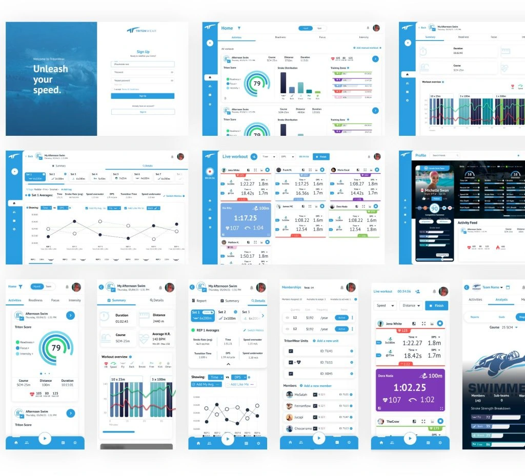
The initial product of TritonWear was heavily focused on its scientific aspect, resulting in an interface that solely rendered data on the screen without considering a coherent, intuitive, and user-friendly design system. However, once we understood how to improve the user experience, we started creating a design system inspired by Material Design with slight modifications to optimize the display of complex data and graphs.
The UI components are based on a card system that groups teams, users, and data, allowing easy grouping and access to information. To design the shape of these components, we drew inspiration from the shape of the unit itself, which is a rectangle with rounded corners, resulting in a visually cohesive system.
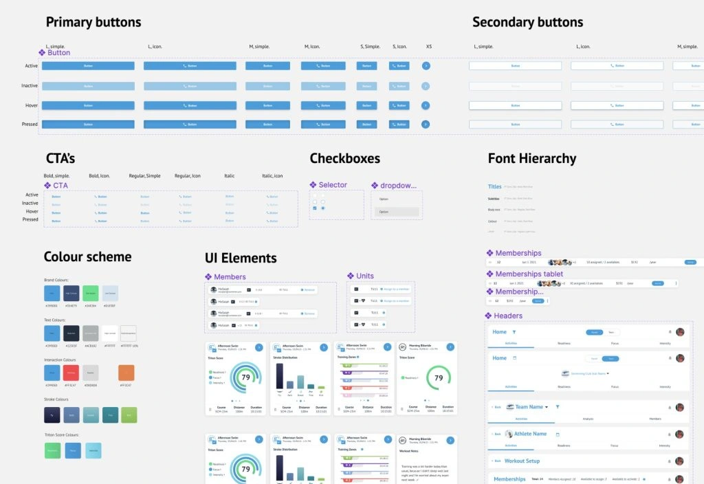
The outcome was a completely redesigned product that retained all its complexity and value but now presented everything in a simple and intuitive manner with a visually striking and modern design. TritonWear presented numerous challenges, from dealing with the complexity of the data being displayed to ensuring the product worked effectively in the environment it was used in. As it is primarily oriented towards tablets, which are the devices most commonly used by coaches during practices, we had to consider the form factor and usability on these devices.
The redesign process involved tackling the intricacies of data representation, creating an intuitive user interface, and optimizing the product for tablet usage. Despite the challenges, the end result was a cohesive and efficient system that allowed coaches to easily access and interpret complex data during swimming practices, enhancing their coaching capabilities and helping swimmers improve their performance.
Product testing and VQA
As we were designing the platform, we conducted user tests with a group of beta testers and power users. Additionally, we created a Slack channel to obtain real-time feedback. The result was very positive as users were amazed by the design changes and finally started using many functionalities that were previously buried due to their complexity. At the same time, we worked closely with the development team to guide and help them understand the design changes and ensure the quality of the final implementation.
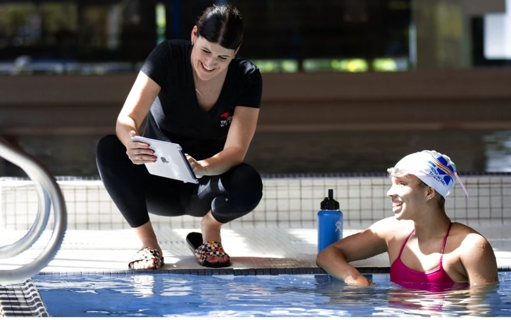
We also participated in multiple real-life tests by visiting new swimmers and coaches.
The new product design for TritonWear has opened the door to a new era of growth. In addition to launching the product to the market, we also redesigned their communication systems and collaterals, and developed their website. The impact has been overwhelmingly positive, with exponential growth in product sales, increased frequency of product usage, and a reduction in the number of people seeking support due to not understanding how to use the product.
Like this project
Posted Aug 13, 2025
Redesigned TritonWear's product for better user experience and increased retention
Likes
0
Views
5