Velora: ParaSwap Rebranding Strategy
Younes Hadry
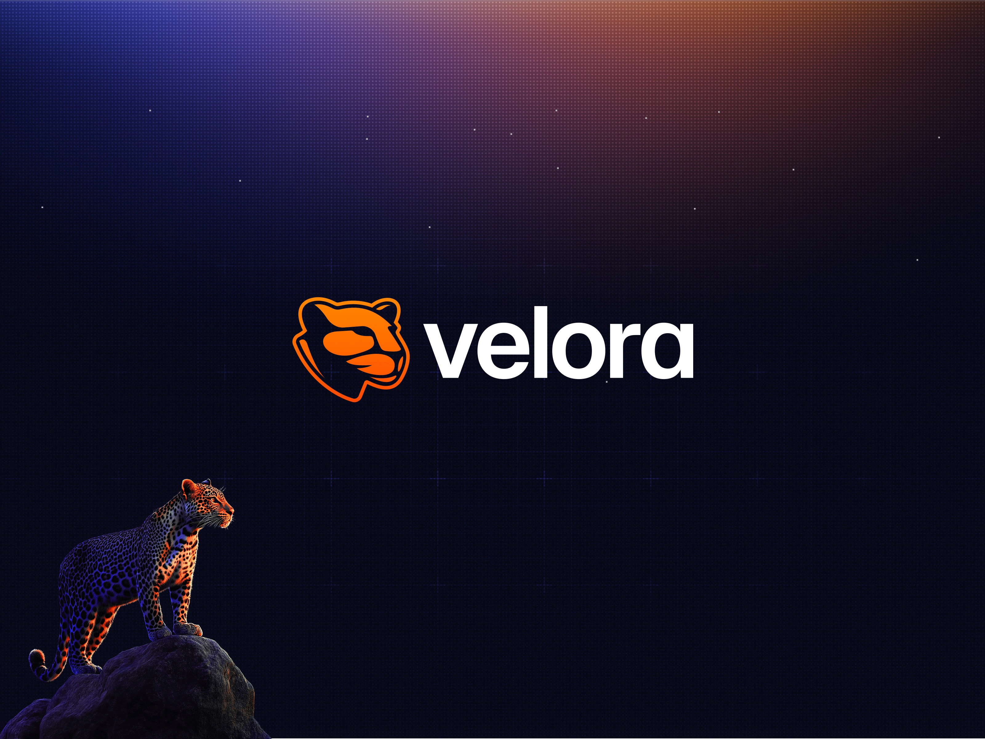
Velora: rebranding and developing a visual identity for the next generation of DeFi trading.
Velora is the next big step for the ParaSwap ecosystem. After five years growing ParaSwap into one of DeFi’s top aggregators, reaching 5M users and $140B in trading volume, the protocol was ready for its next chapter: intent-based trading.
Our rebranding introduces a new name, unified sub-brands, a compelling illustration system, and an engaging product experience, all supported by a comprehensive brand strategy and guidelines for consistent application across platforms.
Velora: rebranding and developing a visual identity for the next generation of DeFi trading.My RoleScopeToolsVelora, A New Era for ParaSwapThe process: hunting for a new brand nameBrand Symbolism: Velocity + AuraThe Leopard as a reflection of brand personalityProduct-led Color StrategyBrand Identity SystemThe Trading Experience, AKA The Hunt PartyEngaging TouchpointsThe Impact: product-led branding strategy
My Role
As Head of Design, I took charge when the DeFi-focused branding agencies we wanted were unavailable. I led the in-house rebrand, running extensive design sprints with the team to align on brand positioning, brainstorm a new name, and explore visuals. Meanwhile, I was hiring a lead brand designer to help execute the logo, illustrations, animations, and all the brand assets we needed.
Scope
Creative Direction, Product-led Branding, Brand Strategy, Design System, Interaction Design
Tools
Figma, Figjam, Framer, Midjourney, Jitter
Velora, A New Era for ParaSwap
Child of the Project Miro initiative, Velora builds on ParaSwap’s trusted foundation, driving a new era of decentralized trading through an intent-based architecture and a scalable product ecosystem. Under the Velora brand, the PSP token migrates into VLR, marking the protocol’s next chapter.
This wasn’t about a visual refresh. It was a full strategic repositioning: a new name, a new token, a new product direction, and a new character representing the brand.
Teaser video before announcing Velora as the new name of the protocol. Animation by Mihajlo Martinovic
The process: hunting for a new brand name
I rallied the core team for two fast-paced design sprints, making sure everyone was hands-on and aligned from the start.
We audited ParaSwap's existing brand, studied how other DeFi projects approach rebranding, and defined the brand attributes that would guide our strategy: limitless, cypherpunk, decentralized, reliable, and community-first. A competitive brand assessment helped us spot white space on a value-versus-complexity matrix. From there, we moved into naming through structured brainstorming, card sorting, team voting, and domain checks, landing on Velora.xyz.
The sprint format kept sessions focused enough to drive decisions but open enough for the strongest ideas to surface.
Brand Symbolism: Velocity + Aura
Velora is built around the idea of the Digital Jungle, inspired by five years of learning and adapting in DeFi and cypherpunk culture. This concept captures the platform’s complexity and the strong sense of community we’ve built among traders and degens.
The name Velora comes from Velocity and Aura, reflecting a personality that’s protective, reliable, and always on the lookout for opportunity. The visual language system is designed to connect with how traders actually feel: navigating complexity, hunting for value, and celebrating every win.
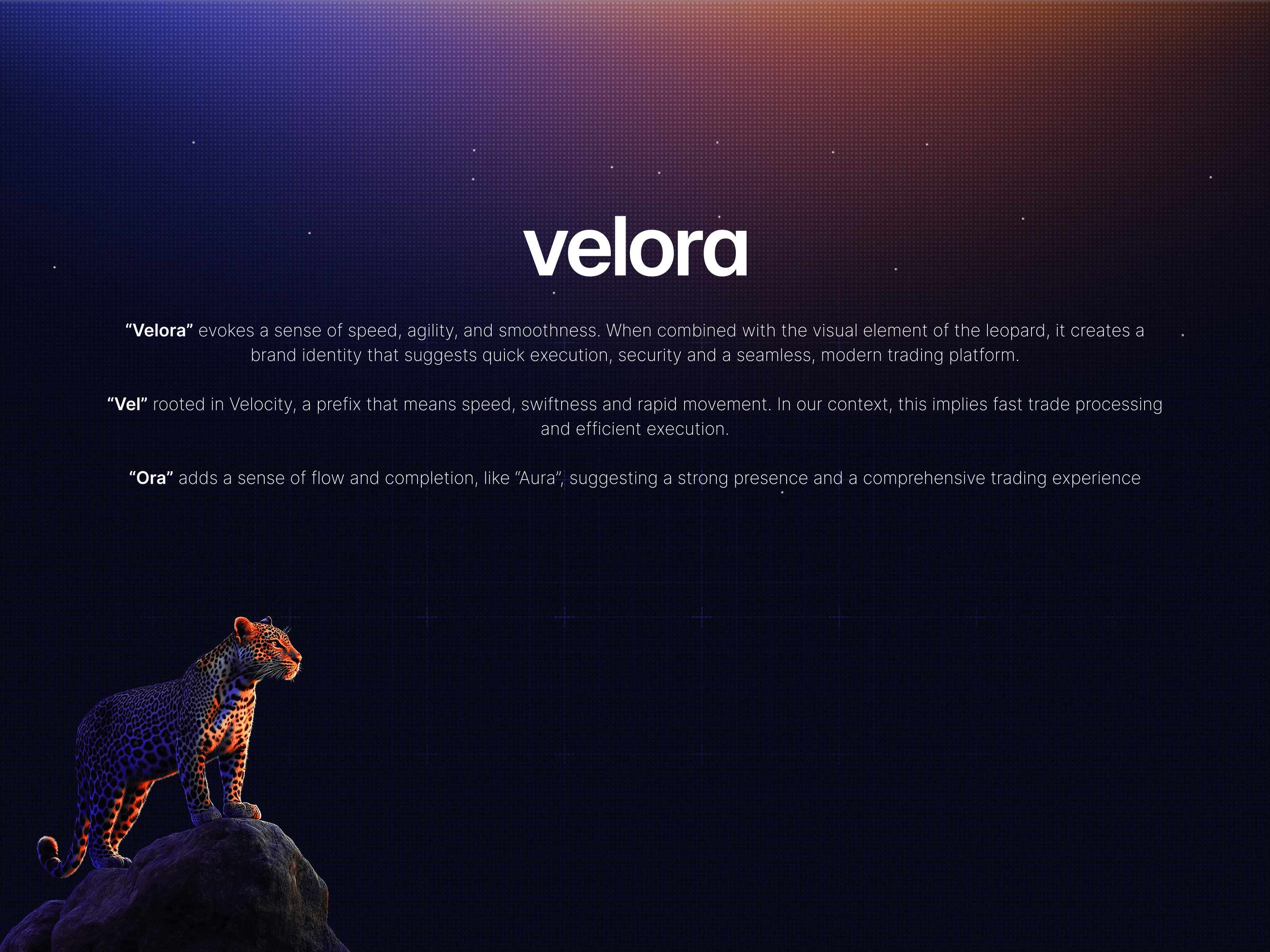
Semiotics behind the new brand name: Velocity + Aura
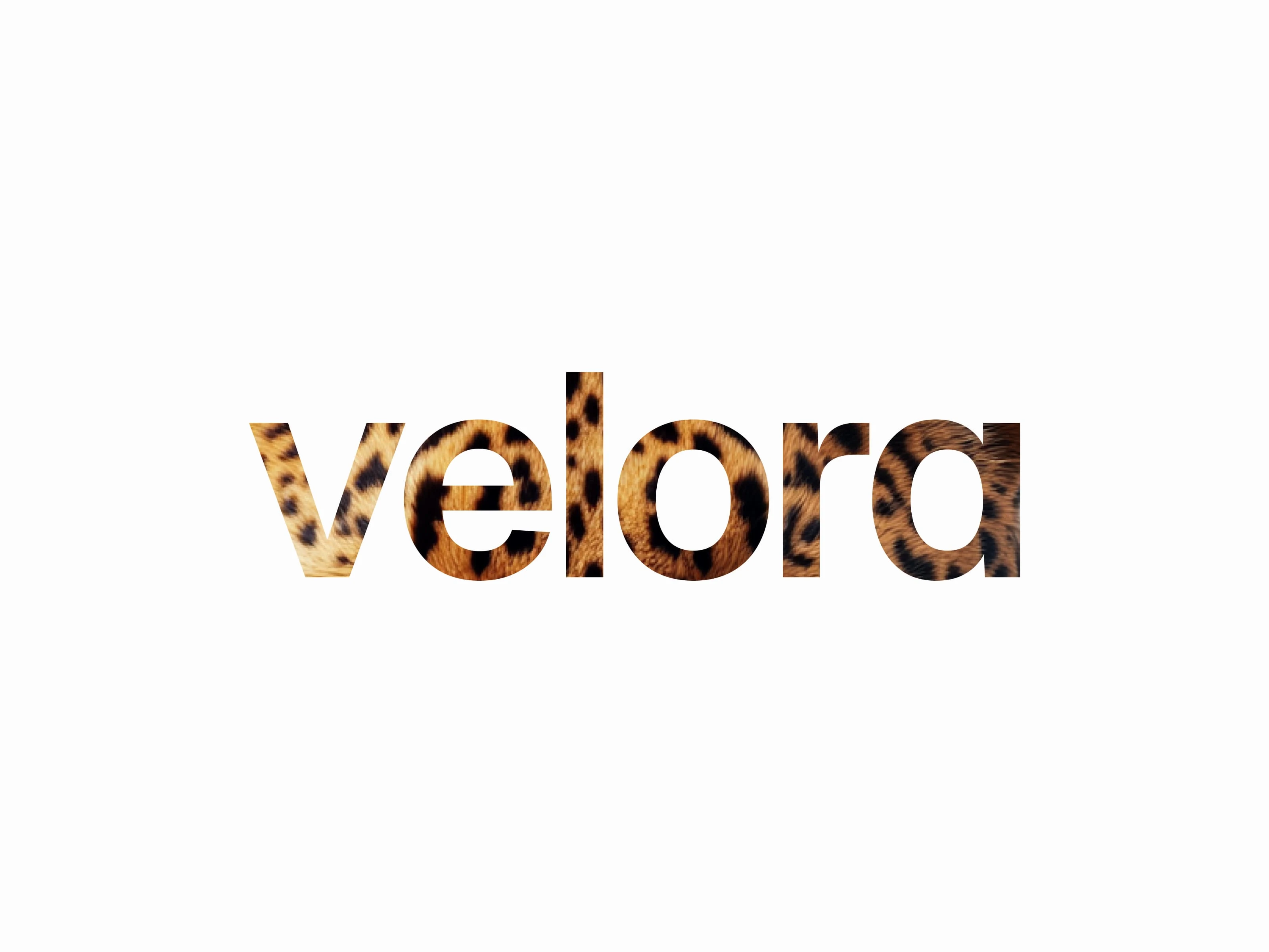
The Leopard as a reflection of brand personality
We chose the leopard to embody qualities such as precision, confidence, and a balance between wildness and control.
What feels bold and innovative to a DeFi audience might read completely differently to someone in luxury fashion, so we had to be intentional about every visual decision.
The Leopard as brand character, reflecting the fierce personality of Velora
Product-led Color Strategy
The color palette of the old brand was mainly monochromatic, consisting mainly of shades of deep-sea blue, which led to a “Space” theme. With one primary blue color and shades of dark, blueish grey, the UI was elegant but cold and “boring” (according to many power-user feedback). It lacked a scalable visual “vibe” and a real personality.
The rebrand was our chance to expand the palette. I built the new system around two brand colors: orange is the star, drawing attention to key actions, while indigo supports with depth and rhythm, so orange never feels overwhelming. The dark blue backgrounds are from the same family as indigo, just quieter, making the product feel unified instead of a mix of random colors. Feedback colors like error, warning, success, and info aren’t brand colors; they’re clarity colors. I tuned their hues to follow convention so users recognize them instantly, while ensuring they feel like part of the same family.
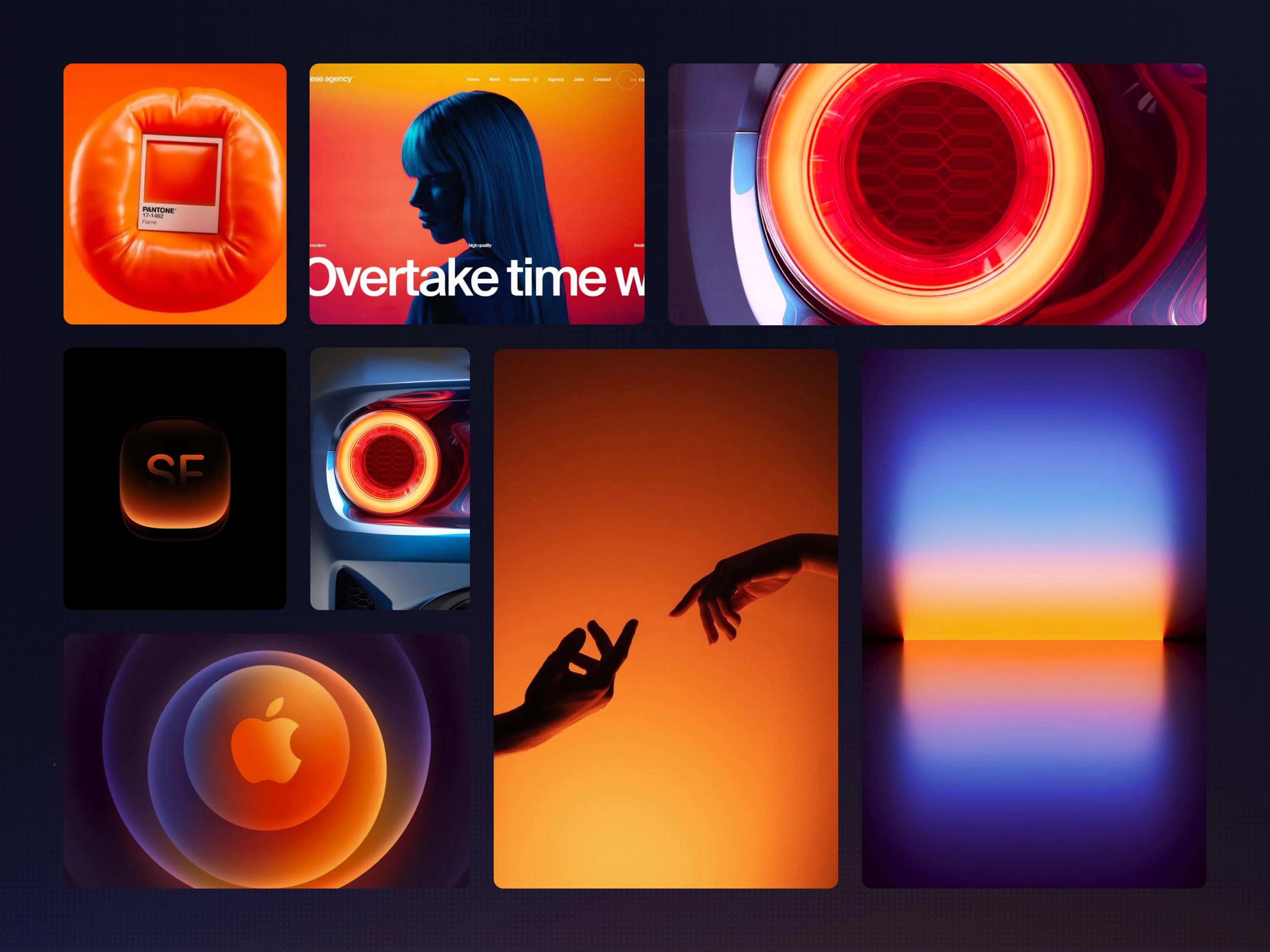
Brand colors exploration/references
Brand Identity System
We designed the new brand system to work seamlessly across all our products, from the trading interface and chain explorer to marketing pages and event materials.
Rolling out the new brand system had to feel like a natural evolution. With user adoption and $250 million in daily volume on the line, I made sure every element could scale without losing coherence.
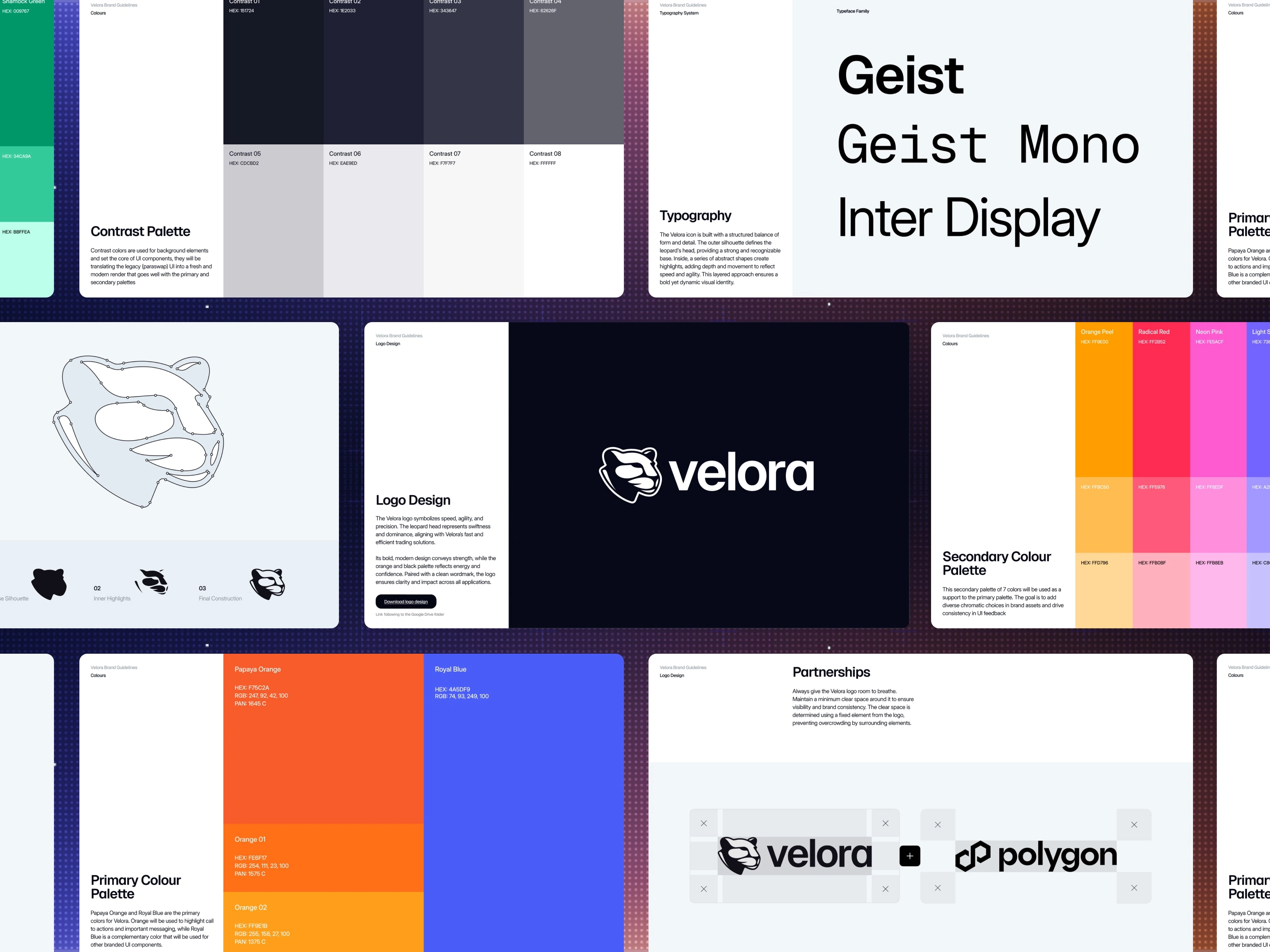
Brand identity guidelines
The Trading Experience, AKA The Hunt Party
The new trade experience on Velora is a dynamic, four-step process that happens right in the Trade Overview modal. Agents compete live, and every step is designed to maximize value for users. I see it as a coordinated hunt: the protocol is sharp, quick, and always working to get the best for the user.
For me, illustrations need to back up the brand story: the hunt, the exploration, the win. I wanted visuals that make DeFi feel alive, not just another abstract idea. Motion is a tool for telling the story, not just something to fill space.
"The Hunt Party" in motion
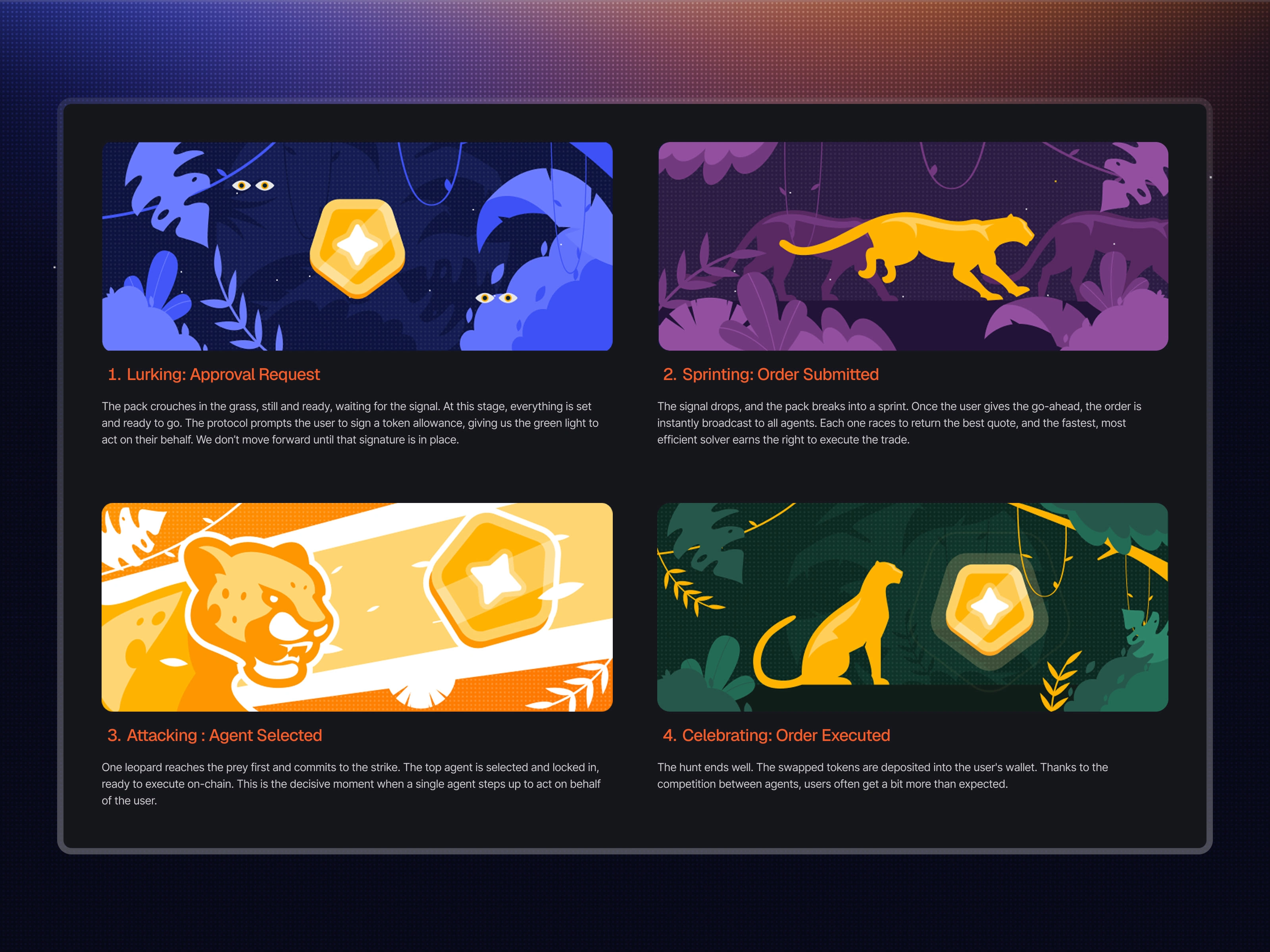
Storyboard for "The Hunt" trading experience
Engaging Touchpoints
Getting involved in events is a chance to share the brand’s vision and celebrate the energy of the DeFi community. We designed custom brand assets to make sure we left a lasting impression at every event.
Brand touchpoints like swag, social templates, and event materials are key to creating memorable experiences and bringing the Digital Jungle to life beyond just the product interface.
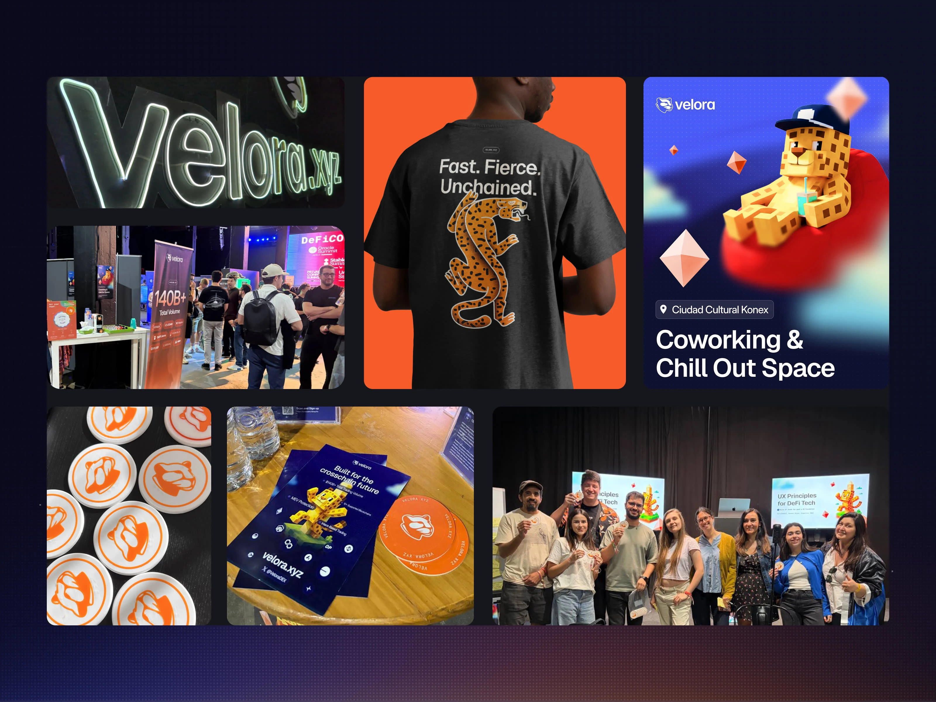
Merch design by Mihajlo Martinovic
The Impact: product-led branding strategy
I believe this project wouldn’t have been as successful if we’d handed it off to an external agency, even a specialized one. The rebrand worked because it was led by someone who built the product experience from the inside. All my branding decisions were driven by the product's needs rather than aesthetics for aesthetics' sake.
There were no handoff gaps, no translation layers between the brand and the product. For me, brand isn’t just a logo. It’s a functional framework that redefines the whole user experience. Velora gave the protocol a real foundation to grow into and showed users and partners that this was a leap in maturity, not just a new name.
Like this project
Posted Apr 16, 2026
Rebranding and developing a visual identity for the next generation of DeFi trading.
Likes
0
Views
11
Timeline
Apr 1, 2025 - Jul 1, 2026
Clients
ParaSwap


