iStorm website redesign on Behance
Brief
As the exclusive Apple Premium Reseller in Greece and Cyprus, iStorm takes pride in providing unparalleled access to the world of Apple products. With 14 physical stores and 2 online stores, iStorm strives to deliver exceptional experiences to customers. However, the current online stores are falling short in terms of both aesthetics and functionality, hindering the overall user experience. Moreover, the limited visibility of the extensive product range is a missed opportunity to showcase the breadth and depth of their offerings. I am committed to revamping their online presence, infusing it with modern design, enhanced functionality, and improved product visibility, ensuring that every customer enjoys a seamless and engaging digital journey with iStorm.
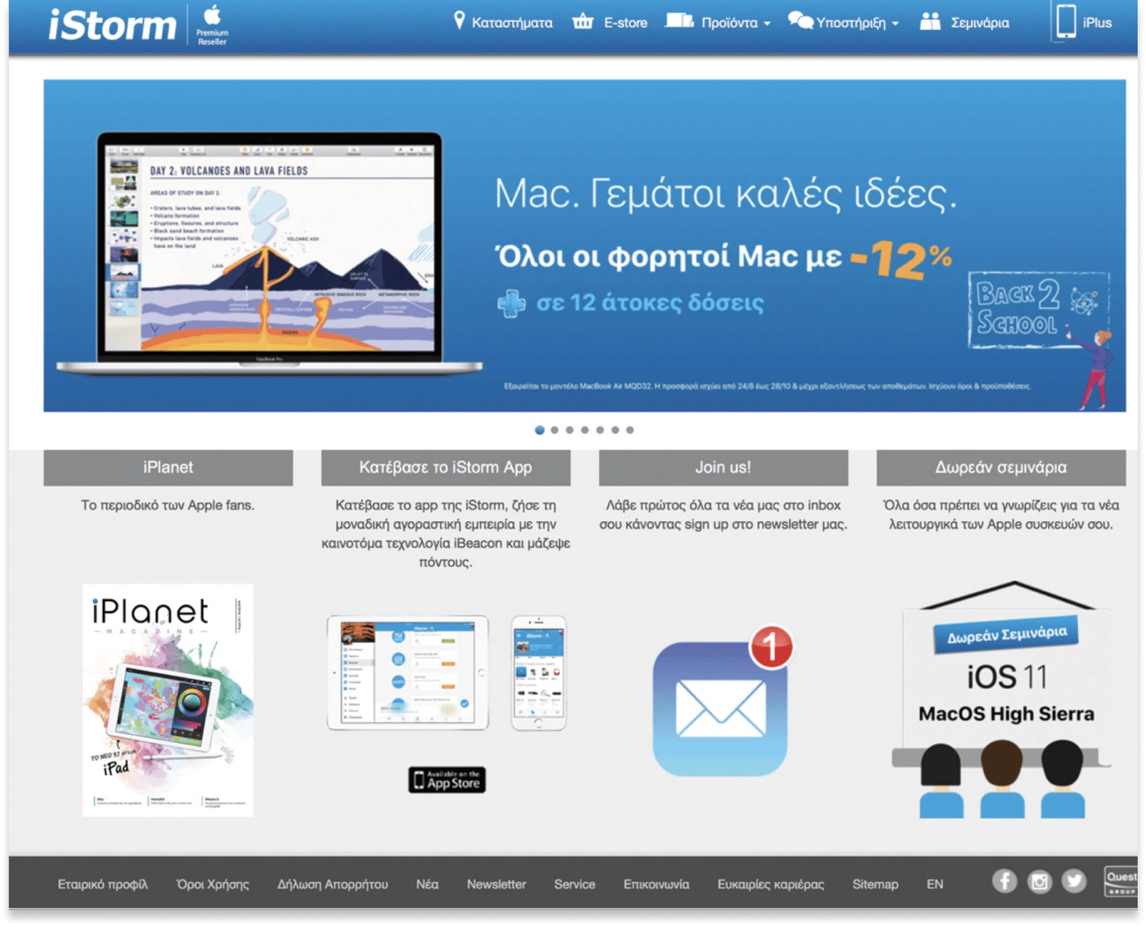
Old Site
In response to valuable feedback from stakeholders and the marketing team, there is need to enhance the homepage by creating more dedicated spaces for showcasing the wide range of products and services.
Competitive Analysis
In my analysis of competitor websites within the same market segment, I will examine the design, layout, features, and functionality of prominent players such as Apple's official website and other authorized Apple resellers. By comparing their strengths and weaknesses, I will gain valuable insights to inform iStorm's website redesign.
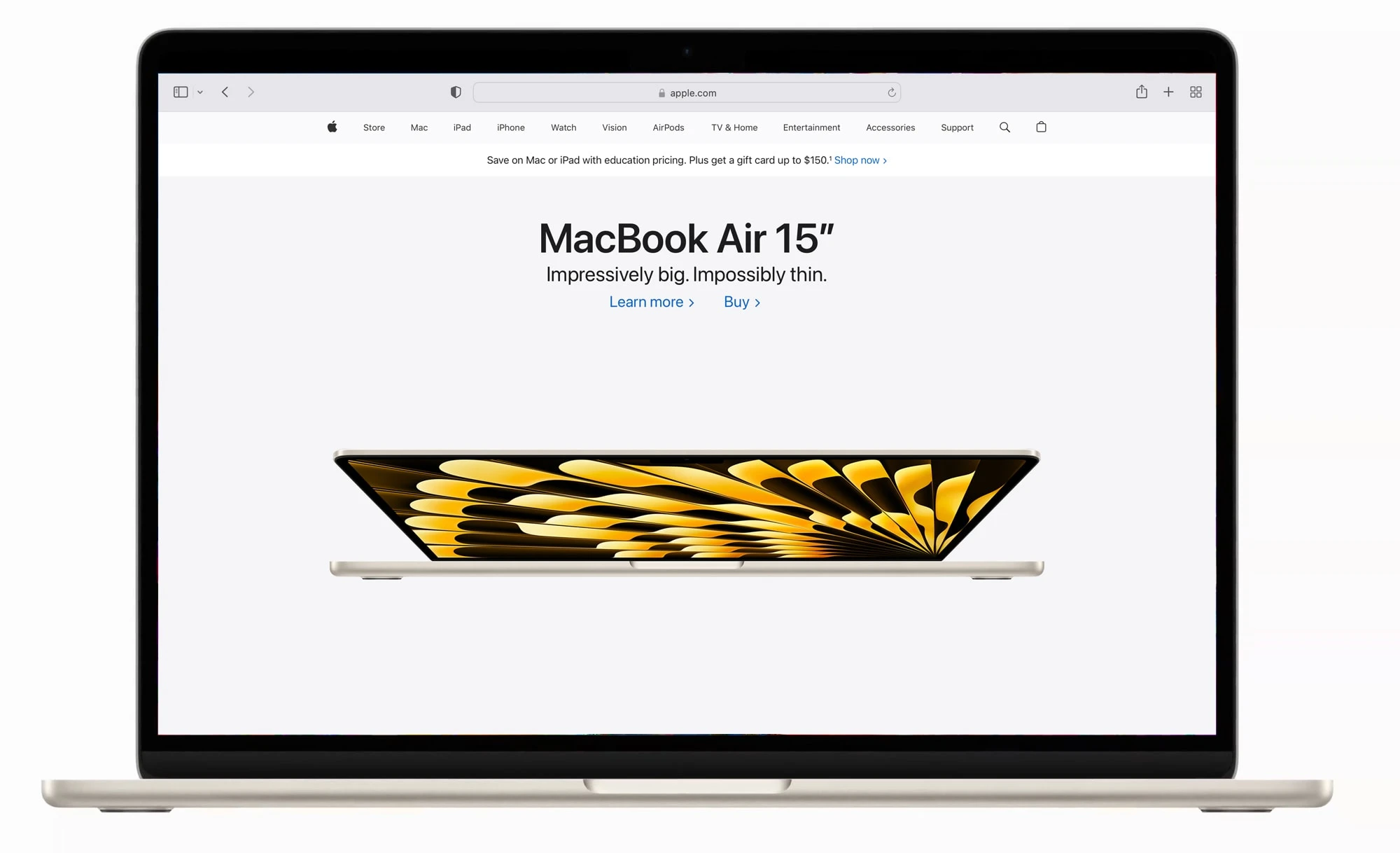
Apple's Website
Apple's official website sets the industry standards with its sleek and minimalist design, reflecting the brand's aesthetic appeal. The layout is intuitive, guiding users effortlessly through the product pages and highlighting key features. The website excels in functionality, offering seamless navigation, interactive product demonstrations, and a streamlined purchasing process. One of its notable strengths lies in effectively showcasing the entire range of Apple products, along with detailed specifications.
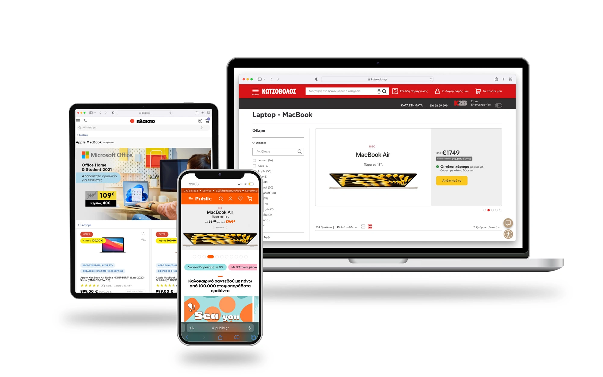
Other Websites
When assessing other authorized Apple resellers' websites, I see various design approaches. Some focus on creating visually engaging interfaces, utilizing vibrant colors and eye-catching imagery to capture attention. However, certain layouts may feel cluttered, potentially overwhelming users and hindering their browsing experience. It is essential to strike a balance between visual appeal and usability.
In terms of features and functionality, some resellers excel in personalized recommendations, interactive product comparisons, and comprehensive customer support. However, weaknesses arise in terms of website speed, responsiveness across devices, and the organization of product categories, which can affect the overall user experience and lead to frustration.
Personas
In order to cater to the diverse target groups seeking Apple products, I have identified three potential customer personas, each with distinct needs and preferences. Our goal is to provide them with a customer service experience that aligns with Apple's renowned standards of excellence. Let's meet our personas:

Personas
Sitemap
The main structure of the menu for an Apple Premium Reseller website aims to provide users with clear and intuitive navigation options to explore different sections and access relevant content. Here is a sample of it.
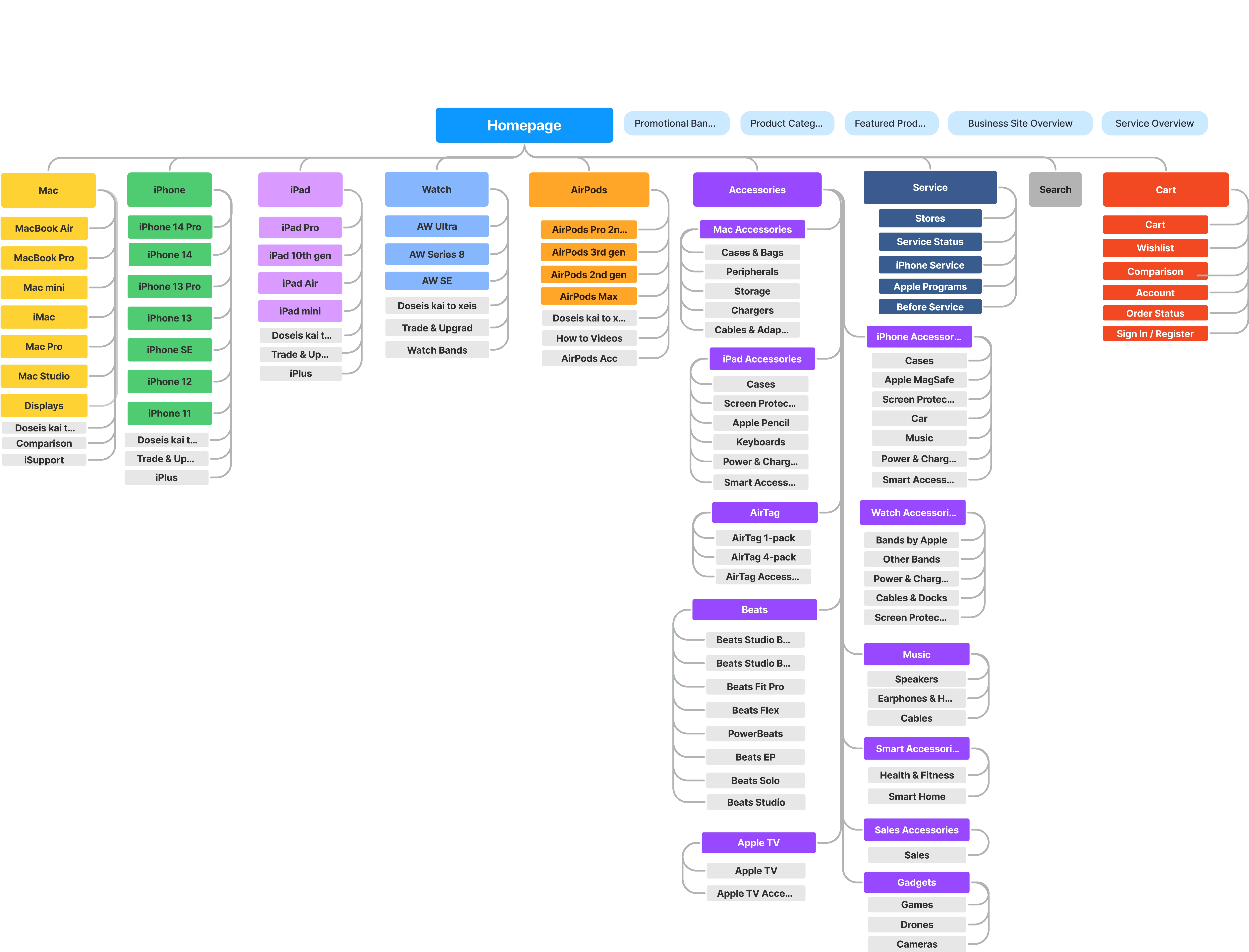
Main menu
Userflow

Wireframes
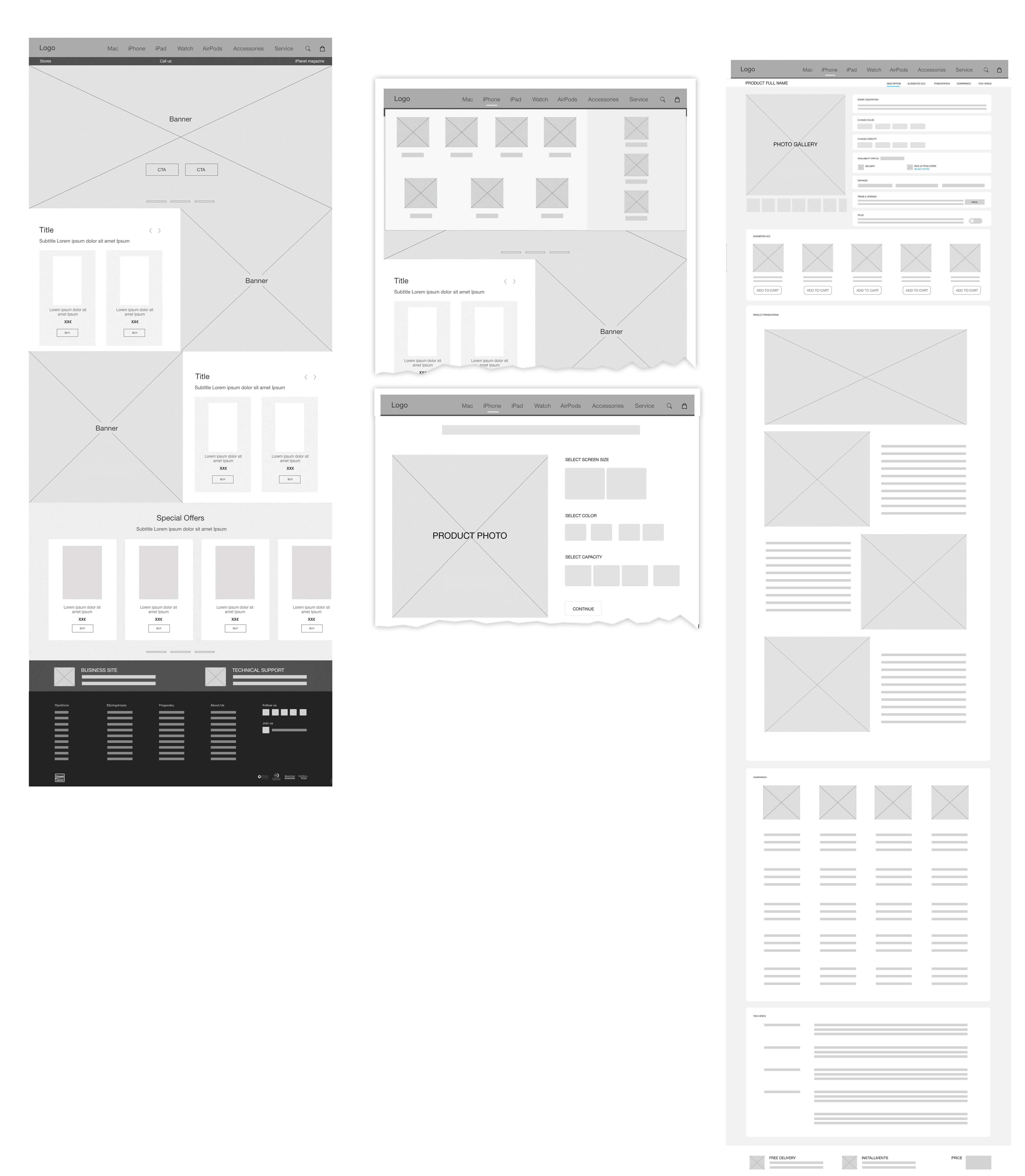
Wireframes (Homepage, Menu, Product Options Page, Product Presentation Page)
Prototypes
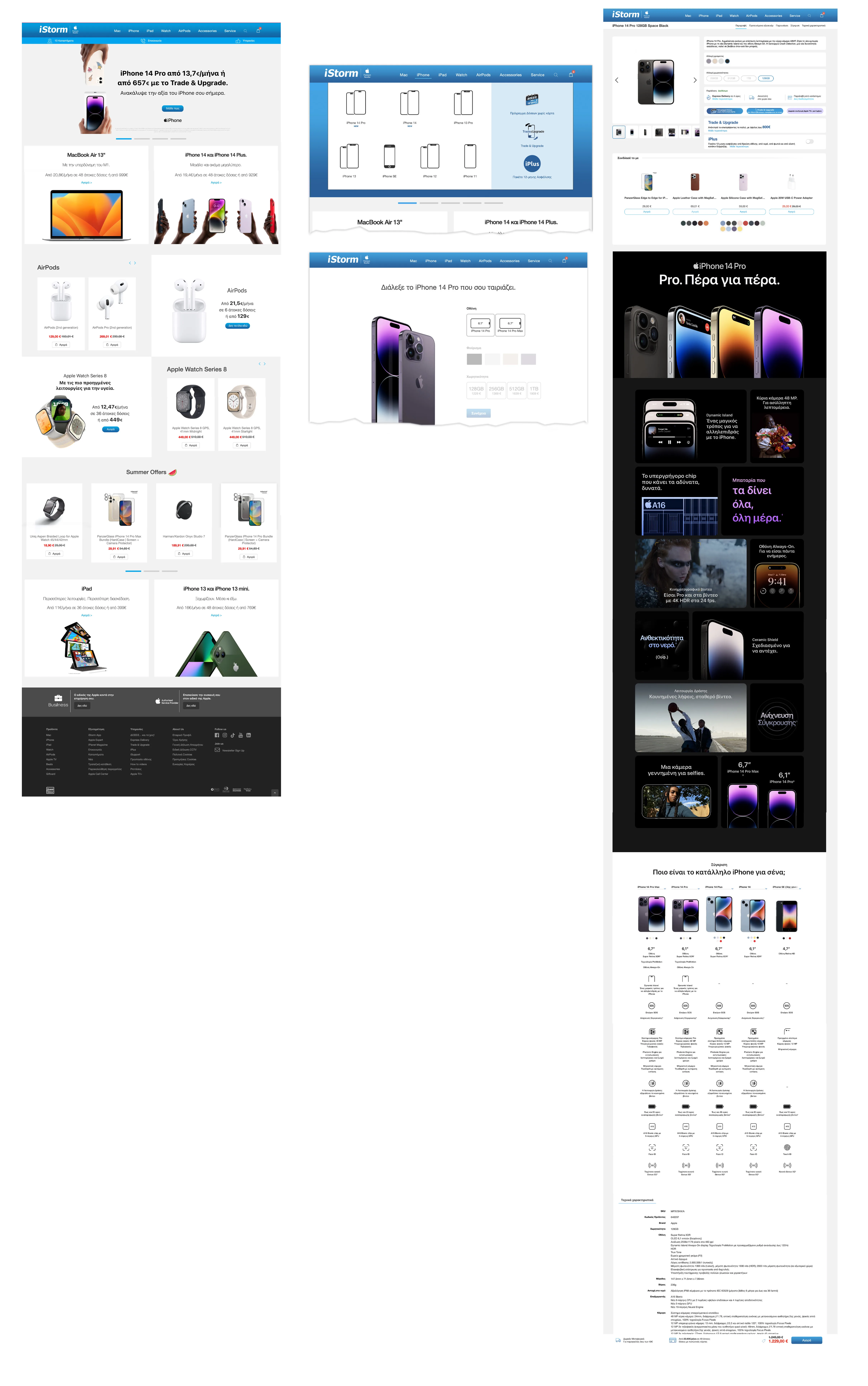
Like this project
Posted Aug 9, 2023
Branding,Web Design,UI/UX,Behance Mobile

