Modernizing coffee on the North Shore
Haleiwa Coffee Roasters
Brief
Brandon and Josh are two buddies with a passion for coffee. They started roasting their own out of frustration due to the lack of availability of quality coffee on the North Shore of Oahu. As many in the business began, they gave coffee to friends and family and saw an opportunity. They approached me to help find their voice and chart a direction for the mission: Bring excellent coffee to Hawaii.
Strategy
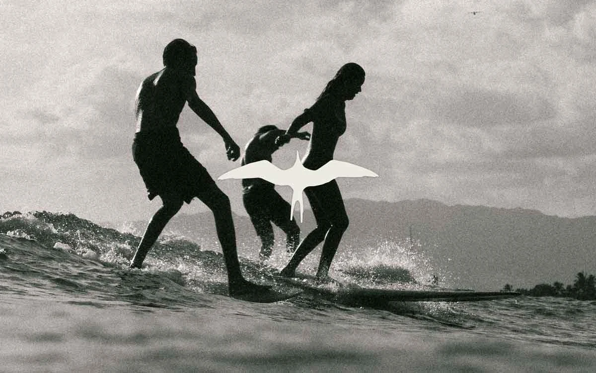
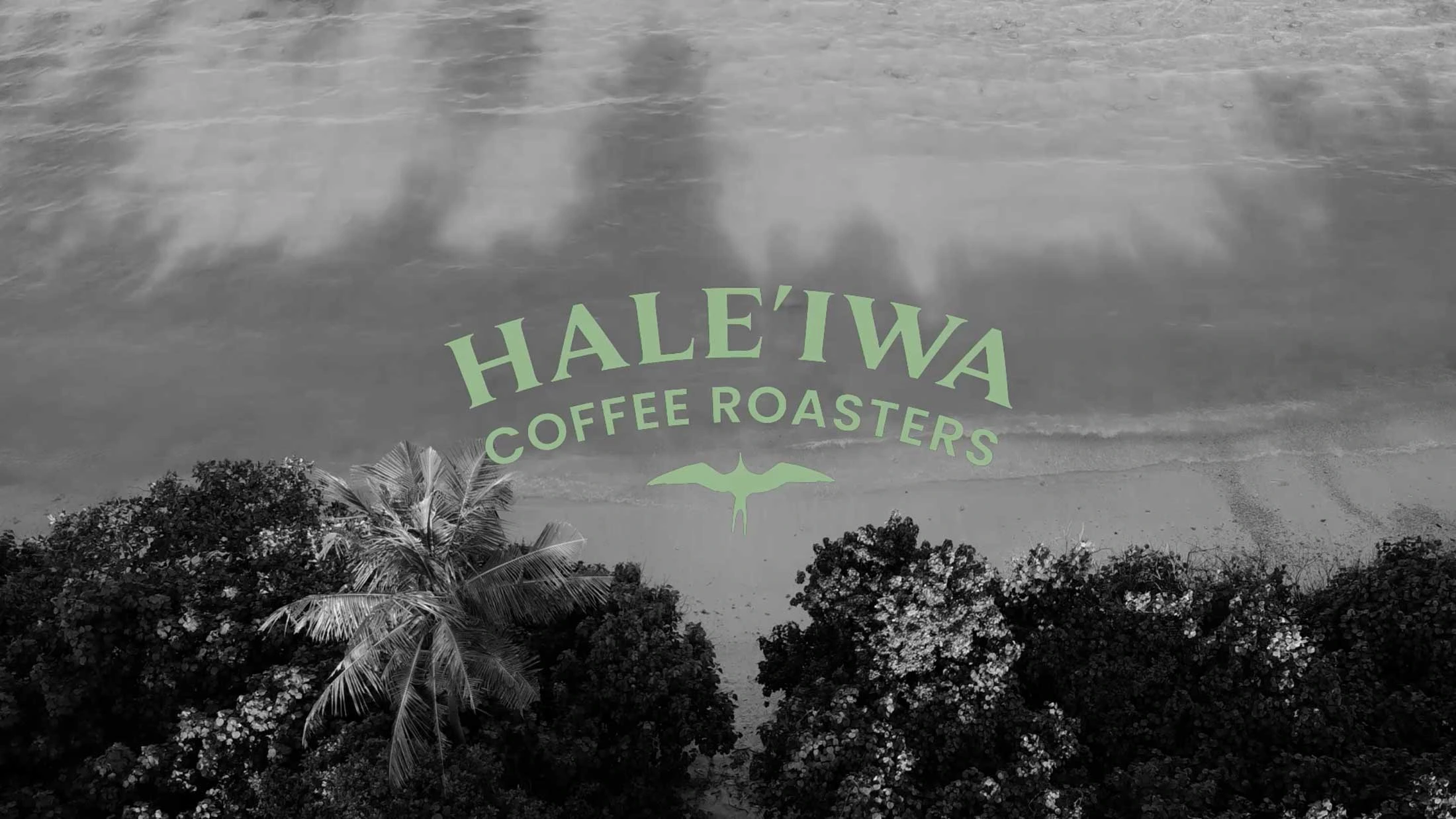
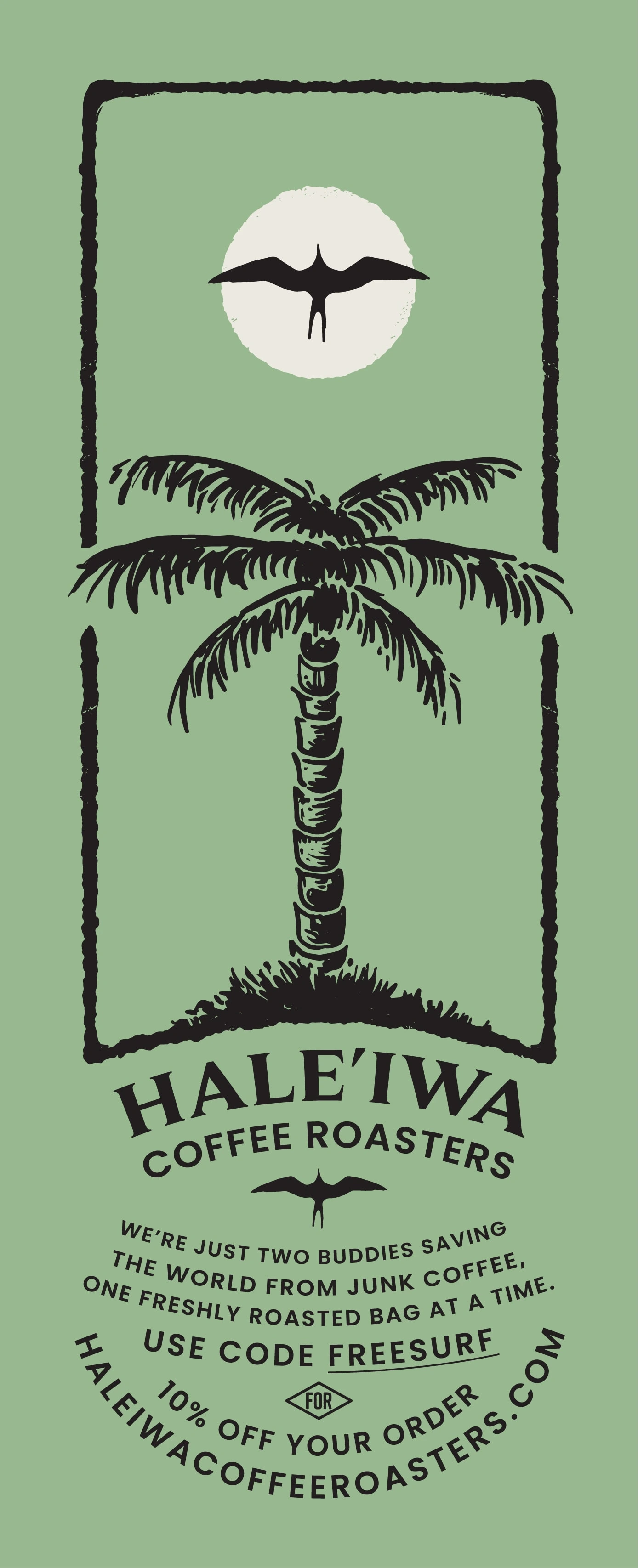
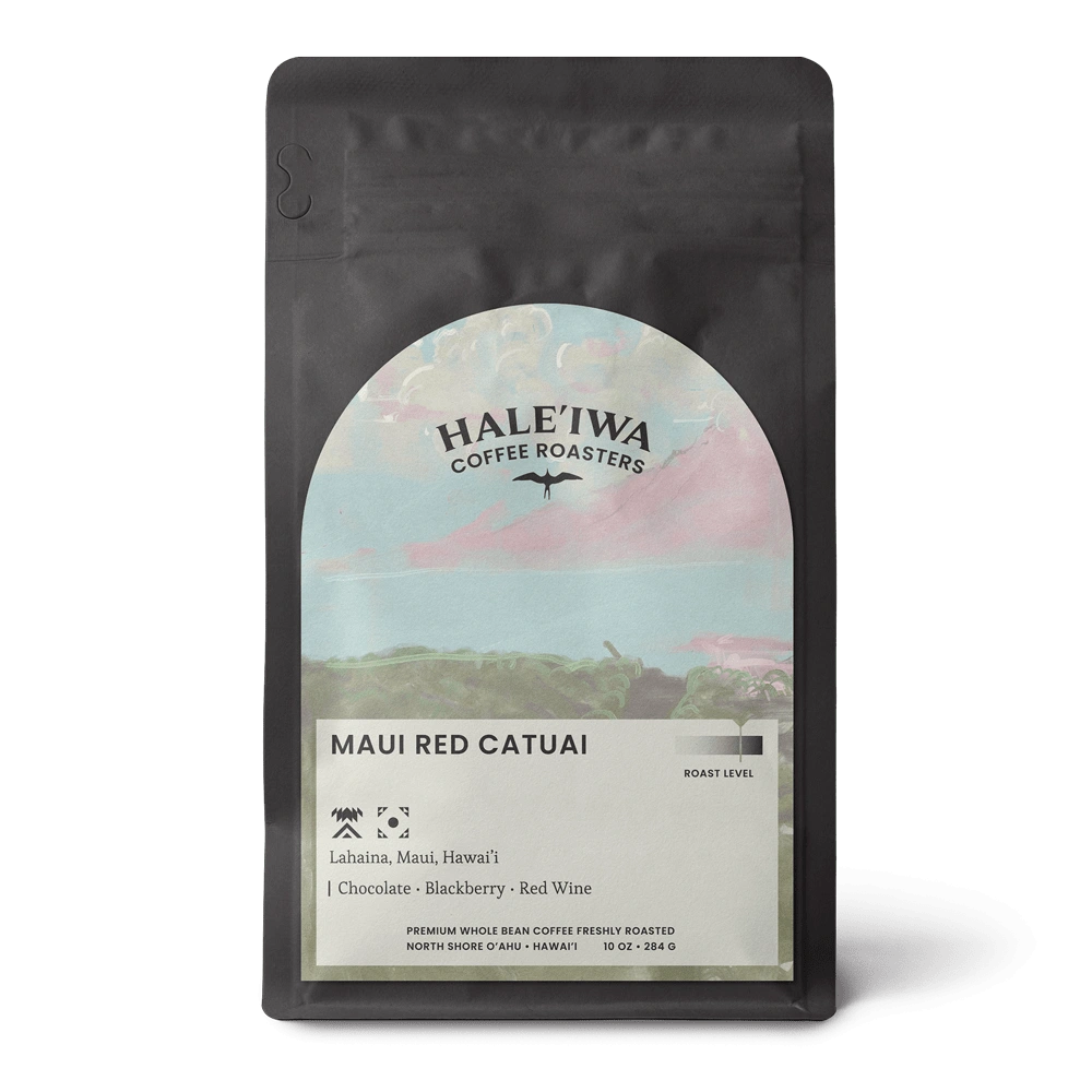
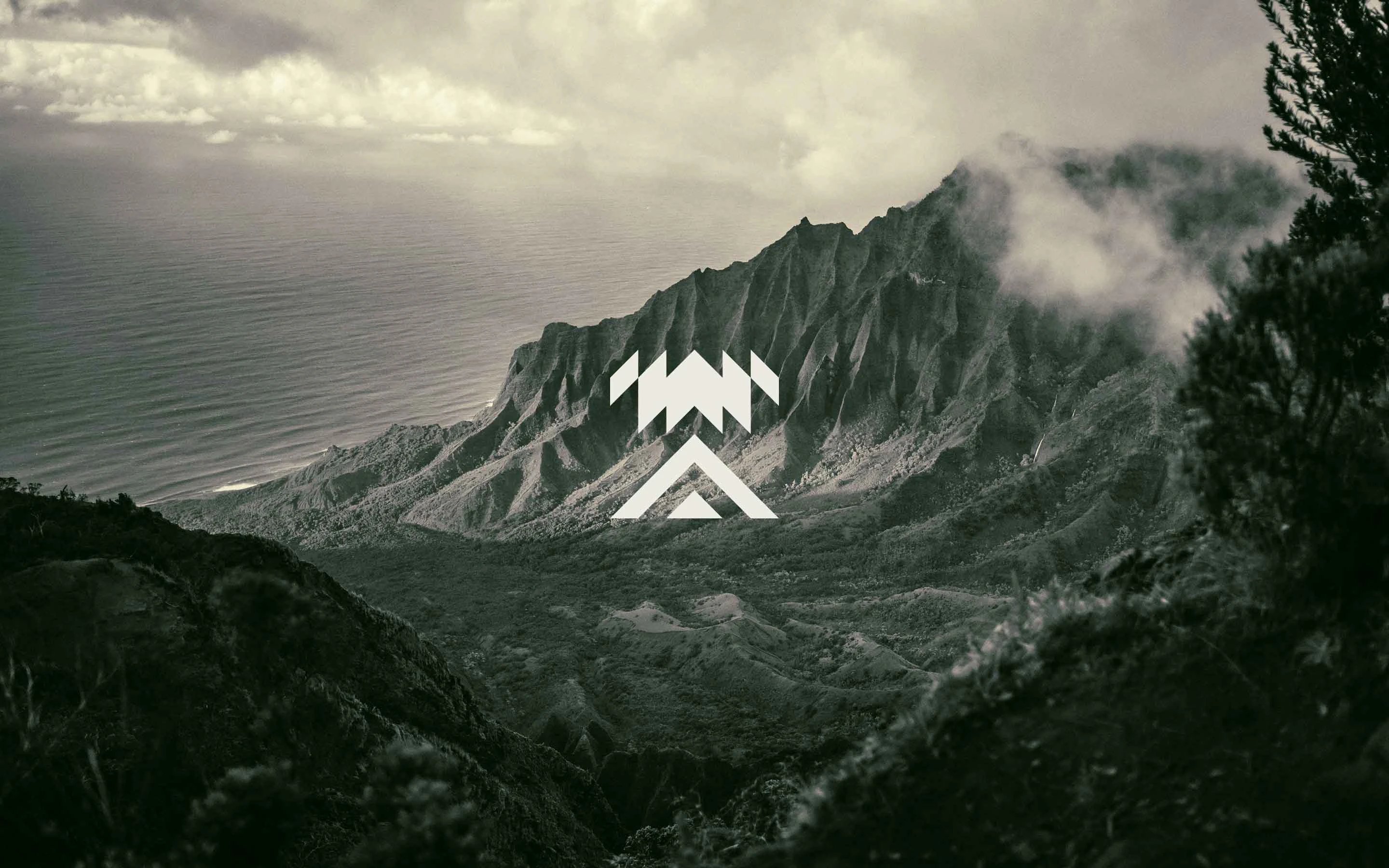
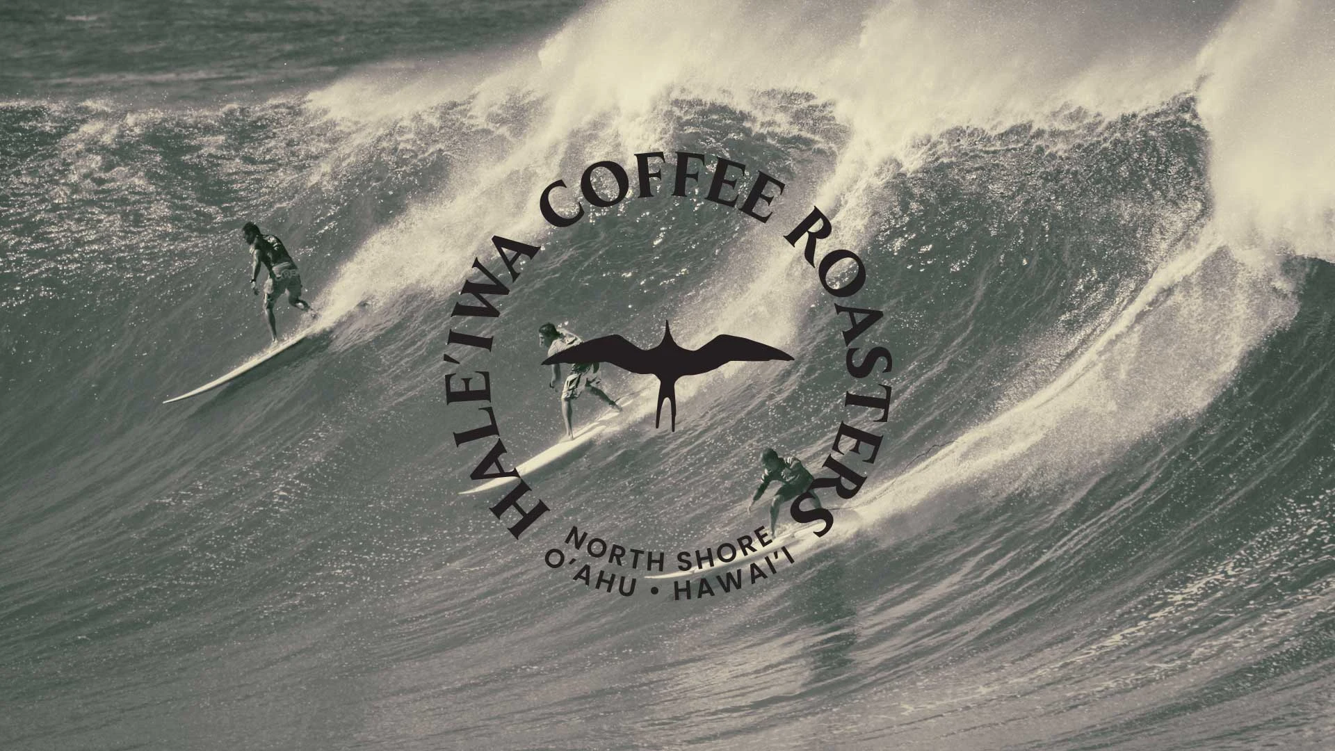
The brand needed to be fresh and modern to stand out in the crowded marketplace. However, it was critical that while the boys wanted to pull the North Shore into the future, they needed a nod to historic Hale'iwa. Working with the guys, I distilled the initial logo down to the 'Iwa bird icon paired with a clean contrasting wordmark. We chose playful and cinematic black and white photography to accompany colorful bespoke illustrations on the packaging. A limited color palette creates an air of modernity while reflecting the simple life of good coffee on the North Shore.
Business Consulting
Brand Strategy
Brand Identity Redesign
Packaging System
Shopify Website Design
Product Photography
Iwa Bird
Known to locals and visitors alike, the Iwa bird is an enduring symbol of the North Shore. The simple silhouette effortlessly roots the brand in the history of Hale'iwa, while the clean lines invoke a modern feel.
Like this project
0
Posted Sep 26, 2023
We developed a brand strategy, created a responsive visual brand identity, designed packaging, captured product photography, and set up a Shopify store.
Likes
0
Views
16


