Worknest- Job Board Website

David Oyerinde

WorkNest — Job Board Website Design
Project overview
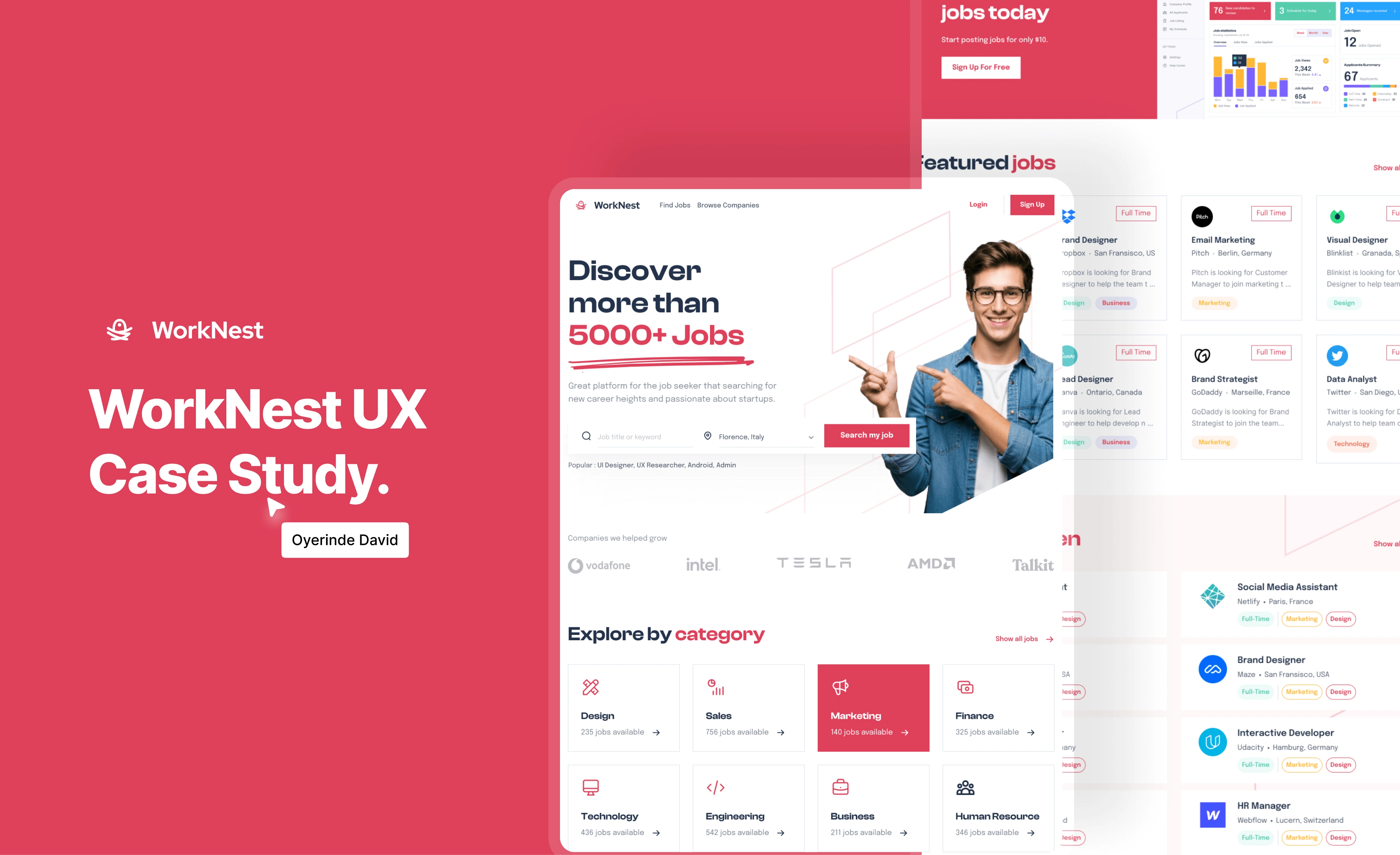
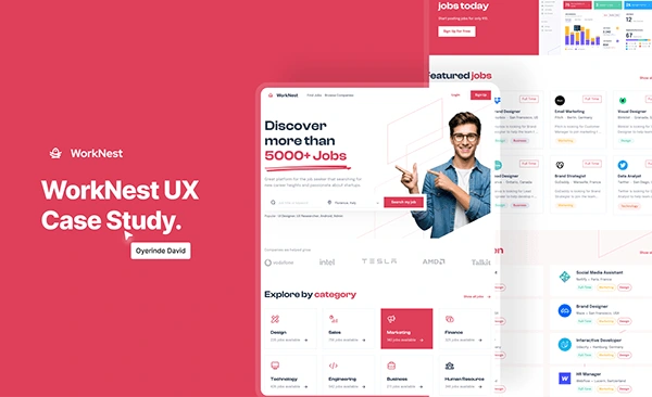
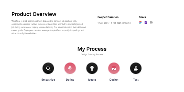
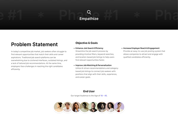
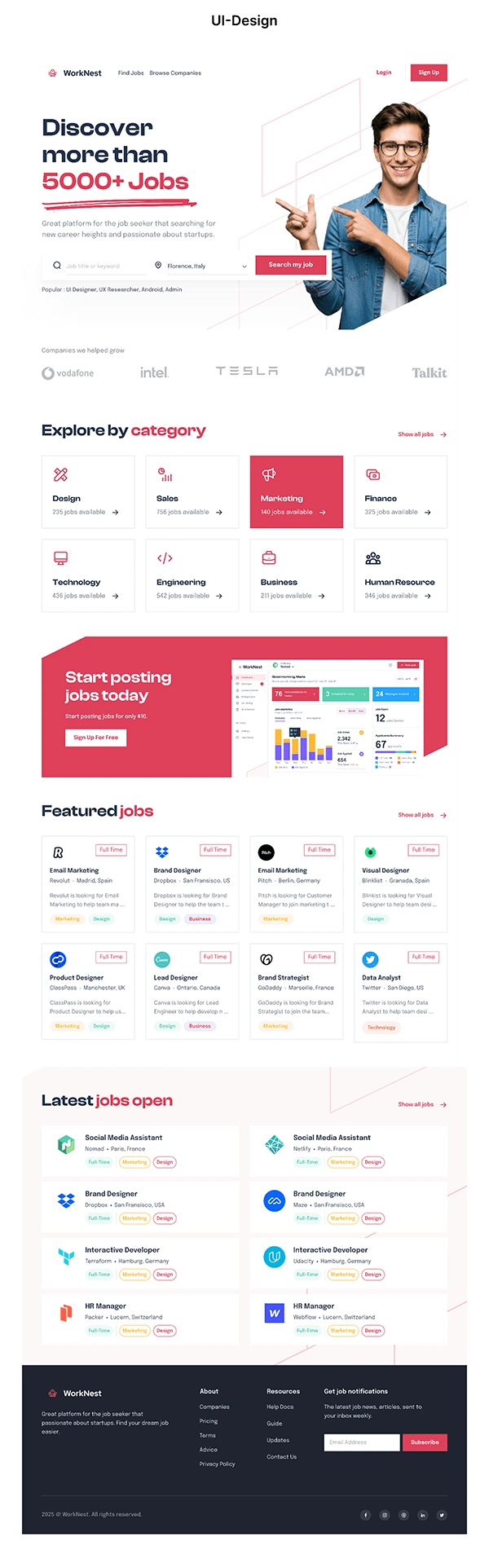
WorkNest is a UI/UX design case study for a recruitment website. The design brings job search, category browsing and featured opportunities into a clear desktop experience, giving job seekers several ways to explore available roles.
My role
I created the interface designs and case-study presentation in Figma. The scope shown here covers page composition, visual hierarchy, reusable job cards and the presentation of search and browsing features.
Design focus
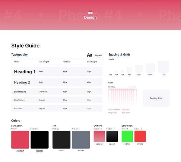
The homepage places the main search action near the opening message. Category cards provide another route into the listings, while featured-job cards surface role titles, company information and job types in a consistent format. A coral accent draws attention to key actions and works alongside a light background and dark text.
Interface decisions
The design balances a strong introductory section with practical browsing content. Repeated card layouts and consistent spacing make the page easier to scan. Navigation separates finding jobs from browsing companies, while account actions remain visible in the header.
Deliverables
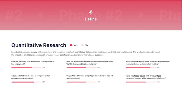
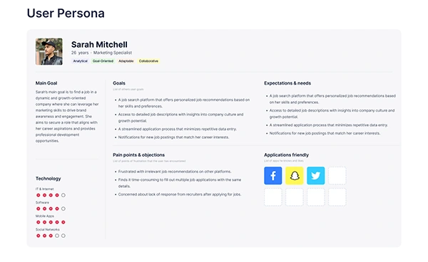
This portfolio presents the Figma website designs, visual layouts and supporting UX case-study artwork. It demonstrates how I organize a content-rich interface around the actions users need to take.
Work with me
I design websites and platforms that need clear navigation, structured content and a consistent visual system. Share your audience, key pages and business requirements, and I can help define a practical design scope.
Like this project
Posted Oct 22, 2026
UI/UX case study for WorkNest, a job-board website exploring job discovery, category browsing and a clear recruitment interface.
Likes
0
Views
0