The previous website (also designed by me) was done earlier,...

Aleesha Batool

Like this project
Posted Dec 23, 2025
The previous website (also designed by me) was done earlier, but he didn’t actively work on the business at that time. This redesign happened when he was re...
Likes
0
Views
0


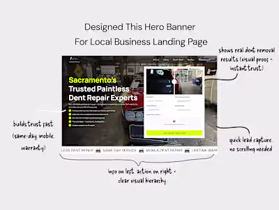
The previous website (also designed by me) was done earlier, but he didn’t actively work on the business at that time. This redesign happened when he was ready to take it seriously.
The biggest challenge: no photos.
Since it’s still a client-side hustle, communication was sometimes slow and requirements weren’t always very clear....
That said he’s very Gen-Z coded, so somehow things still worked out between us 😄
From a design perspective:
The core brand color was green, and the client wanted to stick strictly to it
I experimented with orange to add energy and contrast, but he didn’t like it
Being limited to one color reduced visual flexibility, especially without product photography
So I leaned heavily on bold, large typography to carry the hero message
I explored around four hero banner directions.