Bellsant - UX Audit/Redesign
Dylan Dinh
Bellsant is a health app, looking to pioneer a new era of personalized health and wellness solutions. Admittedly knowing they had some issues when it came to their user flows, I was brought on to highlight those issues and provide some possible solutions. I presented them in the form of a presentation deck.
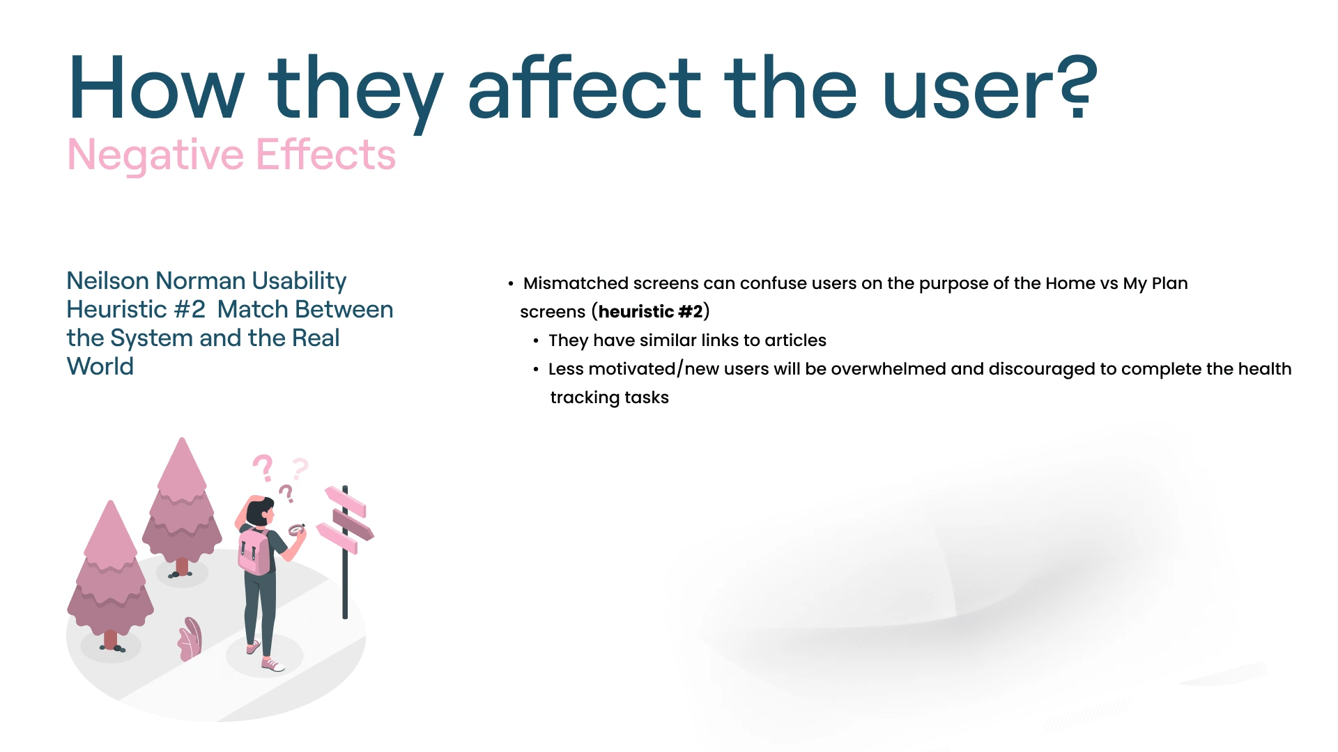
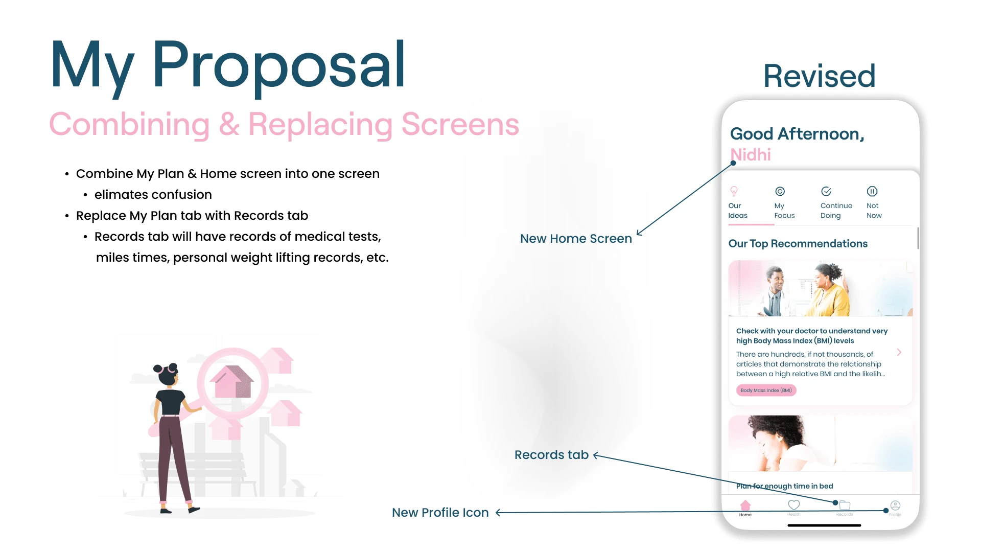
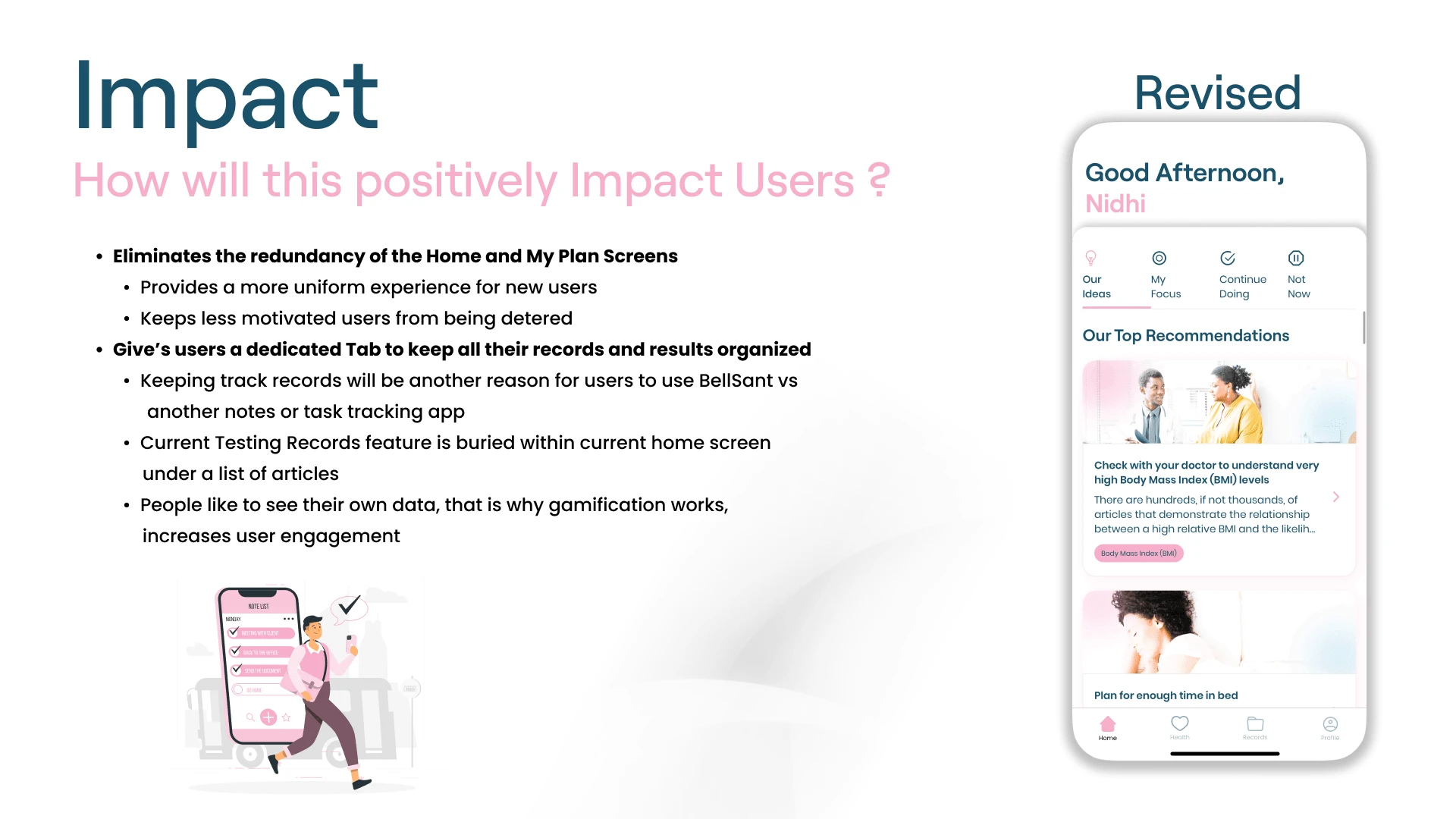
🏠 Issue #1 - Home Screen Redundancy
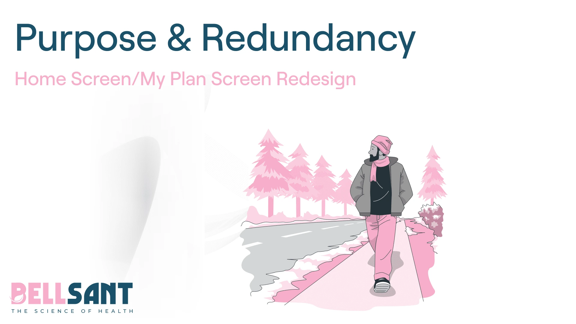
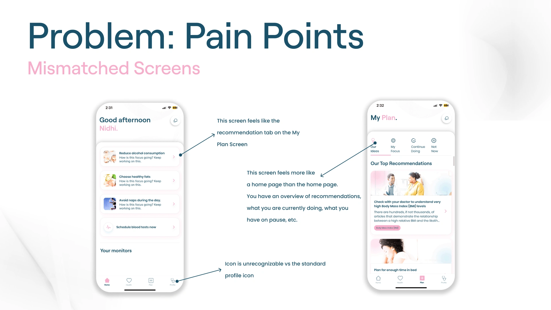
Home Screen & My Plan screens serve similar functions, having such similar pages is redundant
Miscellaneous critique, but the profile icon should use a more familiar icon to avoid confusing users
🧭 Issue #2 - Navigation
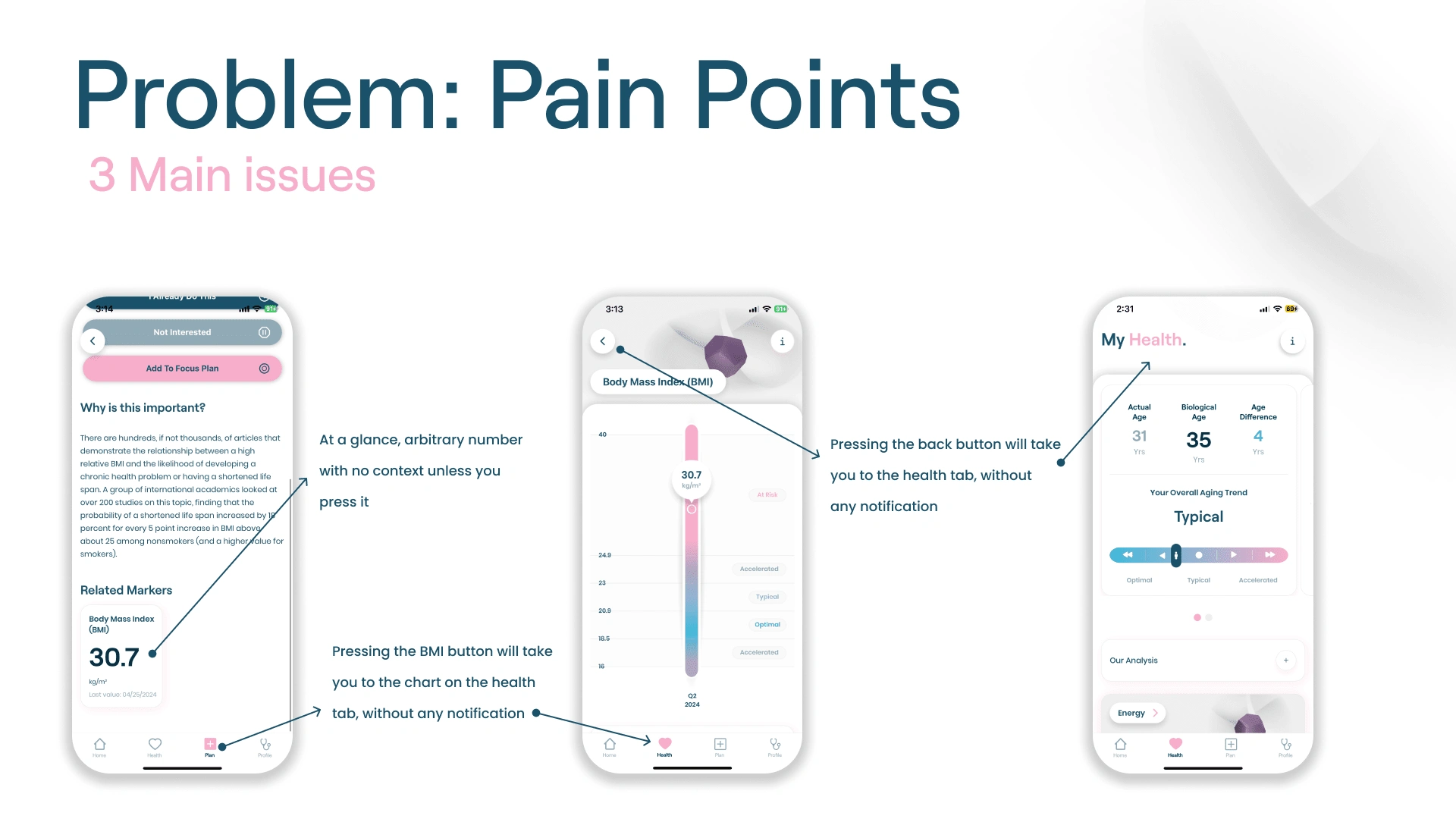
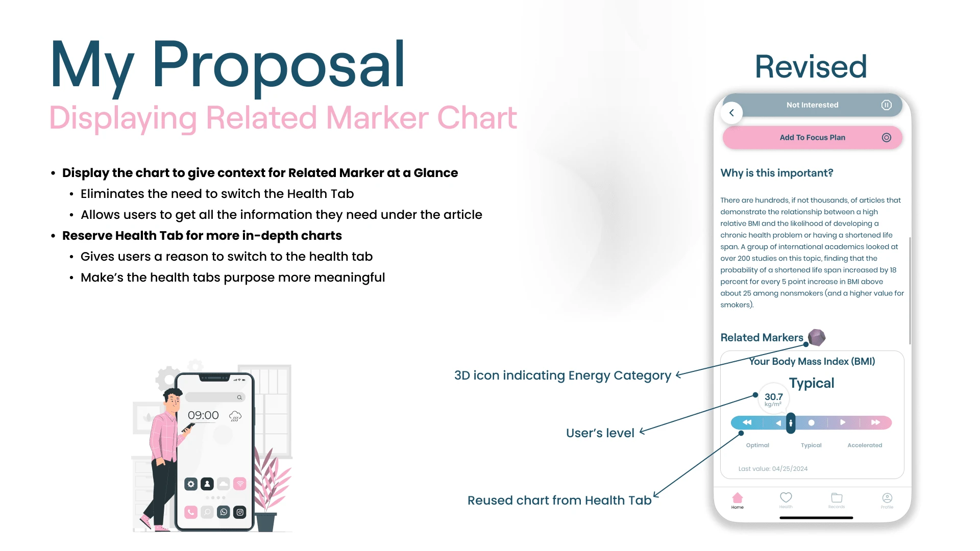
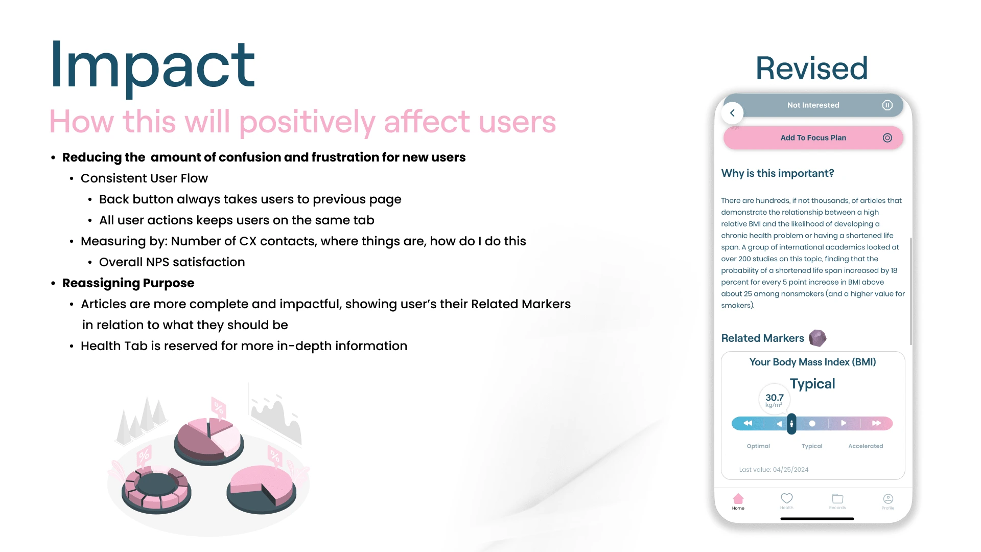
Related Markers feature is just an arbitrary number to the user at a glance
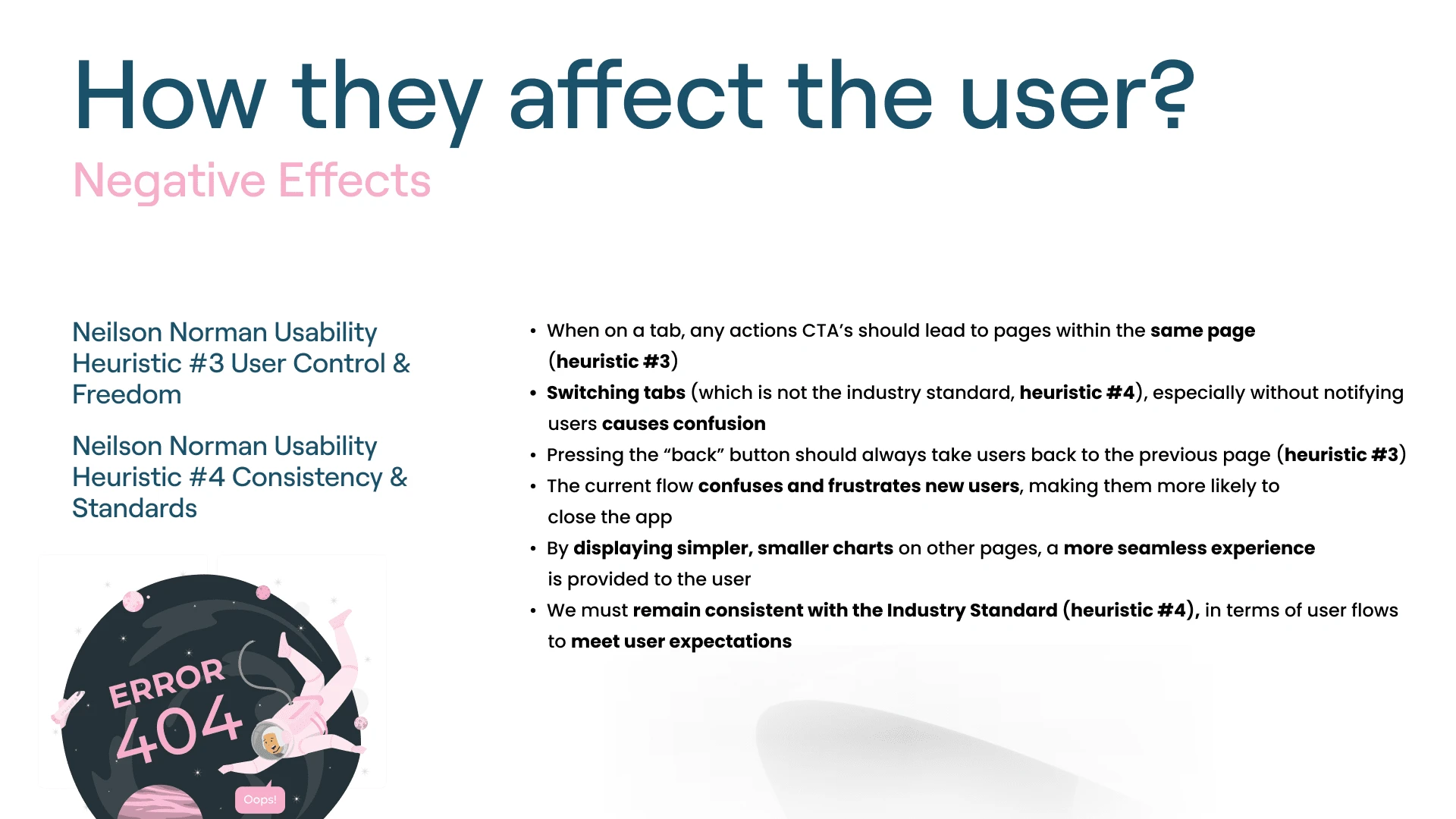
When pressing the Realted Marker feature, the user is taken to a Chart Page on the Health Tab without any notification
When pressing the back button from the Chart Page, the user is taken to the default page for the Health Tab
Like this project
Posted May 26, 2024
Audit + Suggestions for more functional and efficient user flows & features.
Likes
0
Views
28