'The Marinay' A restaurant with adaptability
‘The Marinay’ branding has been an interesting and fun project to delve into. A restaurant that primarily caters seafood is an interesting take on the industry, where many restaurants are trying to keep and give it all, Marinay goes down the hole in more ways than one.
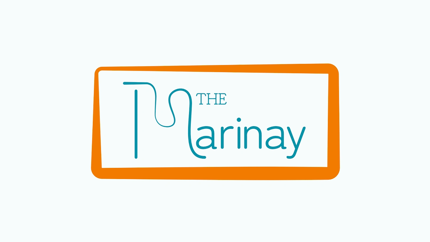
Full logomark
‘The Marinay’ not only serves seafood majorly with only going lean on the dessert side but also changes and adapts their menu to a specific country and cuisine every 6-8 weeks. Changing to a completely different cuisine every other month to focus on lesser known dishes of that country and bring them to a bigger audience.
‘The Marinay’ oughts to be a fun, modern, forward thinking and food loving brand. In this branding, wanted to bring their approach towards adaptation and change forward, for which at the centre of the brand sits a rather simple wordmark with a stylised letter ‘M’, that keeps the theme of adaptation in itself. It incorporates a flow and distinct width variations in its stroke to go with the idea. Also the flow goes with the themes of marine and waves, without being too on the nose. The wordmark is surrounded by a frame type form that balances and encompasses the mark. The frame also goes also the theme with its stroke width variation. The thinning out of the frame at the corner on the upper left also balances the mark, which it needed with its heavier right side.

The frame

Lettermark
For the typography, I wanted to use some friendly curvy typeface but without going absolutely obtuse. We settled on a couple of curved edged typefaces, that keep the friendliness and fit the modern aesthetic too. Both the fonts are not that much different despite one being a serif and a other a sans-serif but they work really well in the logo and throughout the identity too.

Typography

Typography
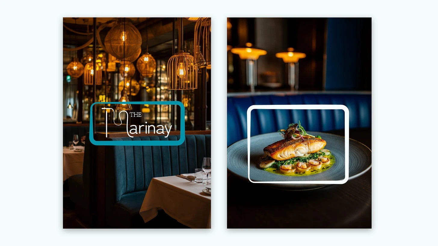
The frame is a form of incredible versatility, with its uses spanning the whole branding and really bringing it together. It also helps in giving out the idea of focus and bringing a particular taste to limelight.
The colours that bring the identity together are chosen with a lot of deliberation. Going with a slightly toned down blue(saturation wise) that acts as a primary colour of the brand giving out the marine theme, with a not so quite pastel green that does represent the sea plants too that are used in the food and while bringing out a wholesome and friendly vibe of the restaurant, with this also being the primary colour alongside the blue.
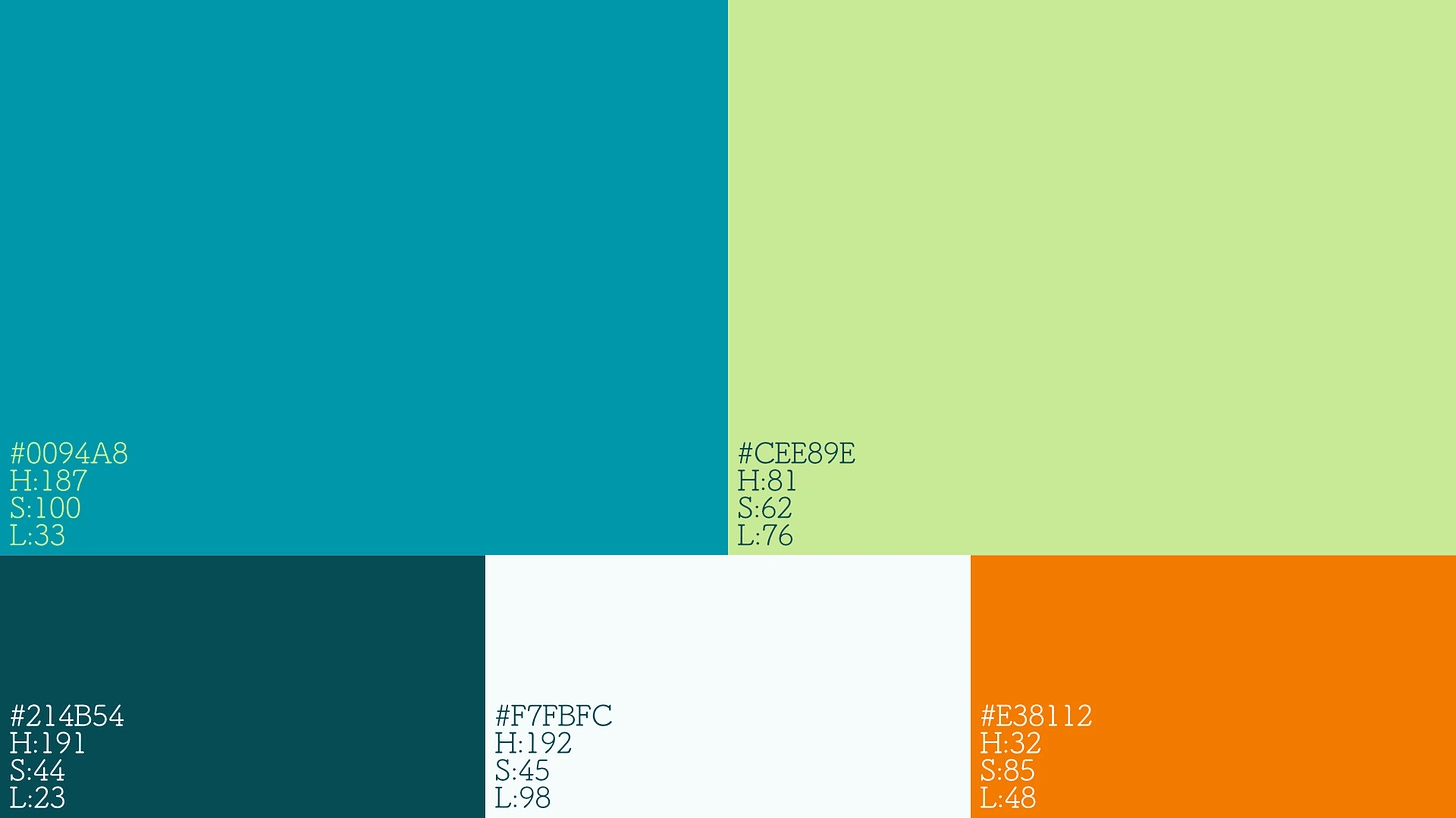
Colour Palette
The secondary colours are a darker blue with a hint of a green tint, while a white that is moments away from pure white with a blue tint that brings the colours together really well. The secondary colours complement the above colours with their versatility in all conditions, making amazing combinations. Finally as an accent colour choosing a colour that is truly accent to all, a bright orange that is visible in almost all backgrounds and environment. The orange is mostly used in the frame as an hook point to attract eyes.
‘The Marinay’s branding felt like it needed some fun, and to bring out some, I used illustrations. The illustrations are used at various different cases from marketing assets to functional utility like in the menu giving a visual descriptor of the type of sea organism used in the particular dish. The illustrations are a very simplified counterpart of their real sense, while featuring absolutely no facial features. I feel that eyes really personify any object and putting it on a living being and then telling people to eat the being is an off-putting thing. Personifying things has a real perspective shifting effect on people, including myself.
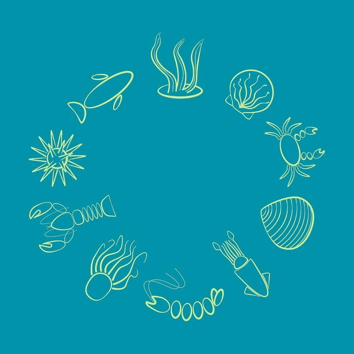
Illustrations
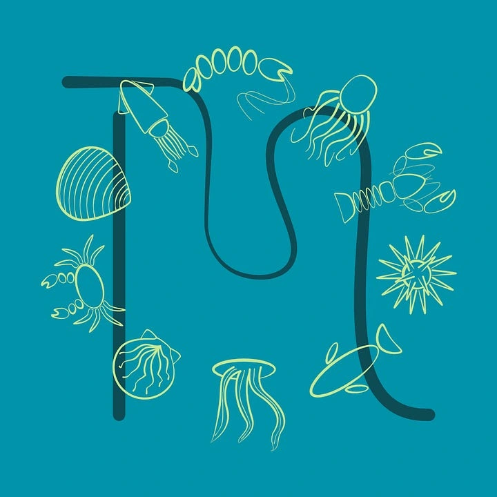
Illustrations
Keeping the fun vibes alive, the washroom signage is designed with keeping the brand in mind. With using the variable stroke and a clamshell seat, it keeps the fun around.

Washroom signage

Washroom signage
Using the Flow-y curve of the ‘M’, I created some patterns duplicating and rotating it, that fit well in the overall agenda, with one flowing endless one that came out just so good.
One of the most important part of any restaurant is its menu and the menu here is no different. The menu is designed in the shape and size of a slightly big business card, that features name of the dishes and what major ingredients are used in it. It sits on a small wooden card stand hosting multiple cards. Marinay operates on a singular entry fees system and does not charge extra for the food, so the prices of the dishes are not given individually. The name of the dish is accompanied by a symbol of what type of marine organism is used in the dish and the course of food it is(main, appetizer, dessert). The frame also in negative space the country that the food is serving of.
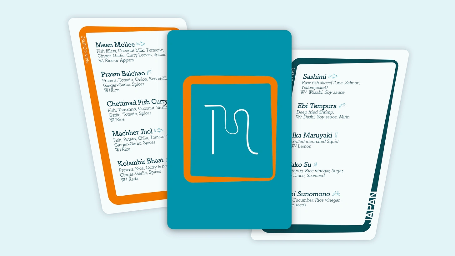
Menu cards
Finally to fit the modern vibes, the marketing assets were used. With icons filled posters to primarily typographical ones. They hit right at the mark with the aesthetic and motive they are aimed at. The social media assets too go right to the modern theme utilising the type and pattern in a meaningful way.
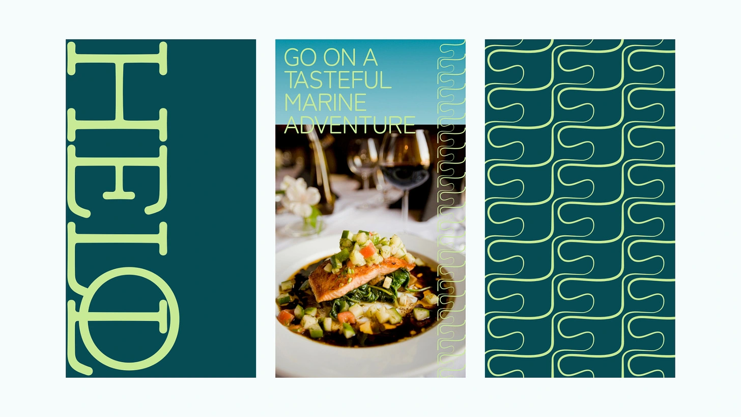
Social media assets
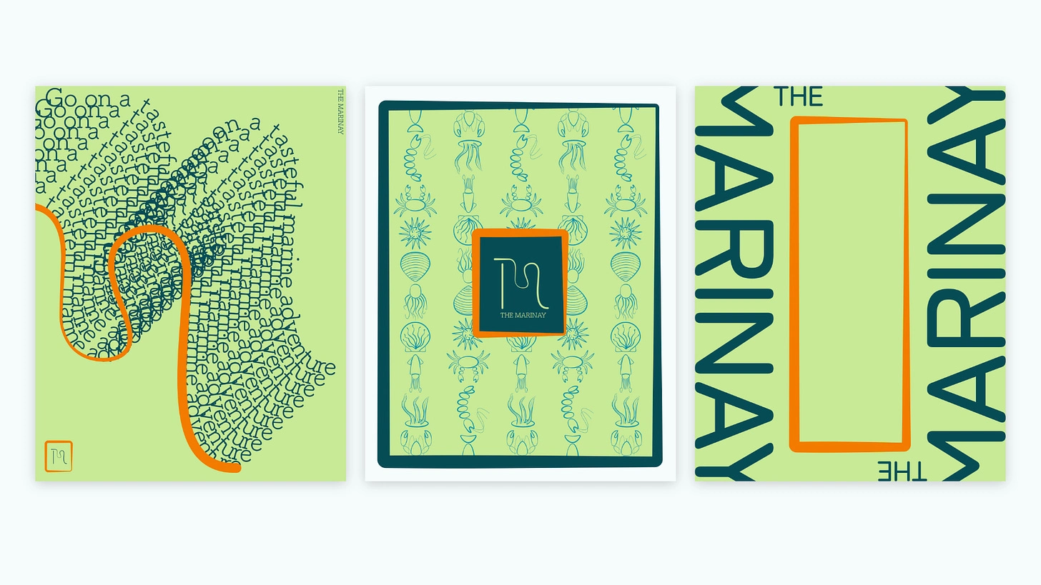
Posters- The first one is my favourite
One final thing that was made was the return gift that would be given to the diner. It is an A4 sized sort of certificate with a world map highlighting the specific countries food that the diner ate, along with their name and date of dining. This little gift really makes the whole experience special and gives the person a little push to collect them all.
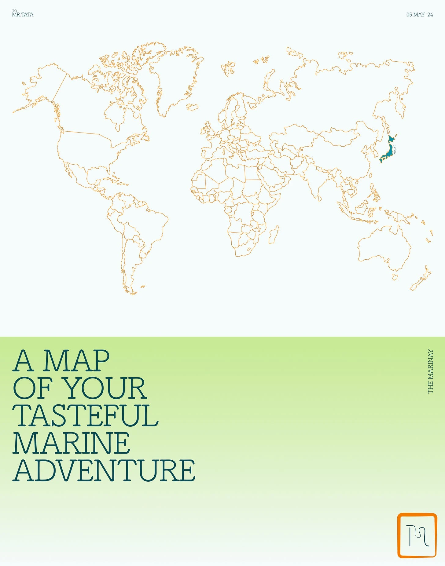
Return gift
This was an amazingly fun project that gave out some incredibly craftful designs and a fulfilling experience. Looking forward to more work like this.
Like this project
Posted Nov 27, 2024
The identity case study

