Redesigning WHOOP's Marketing Email for Better Engagement
Zeeshan Khan
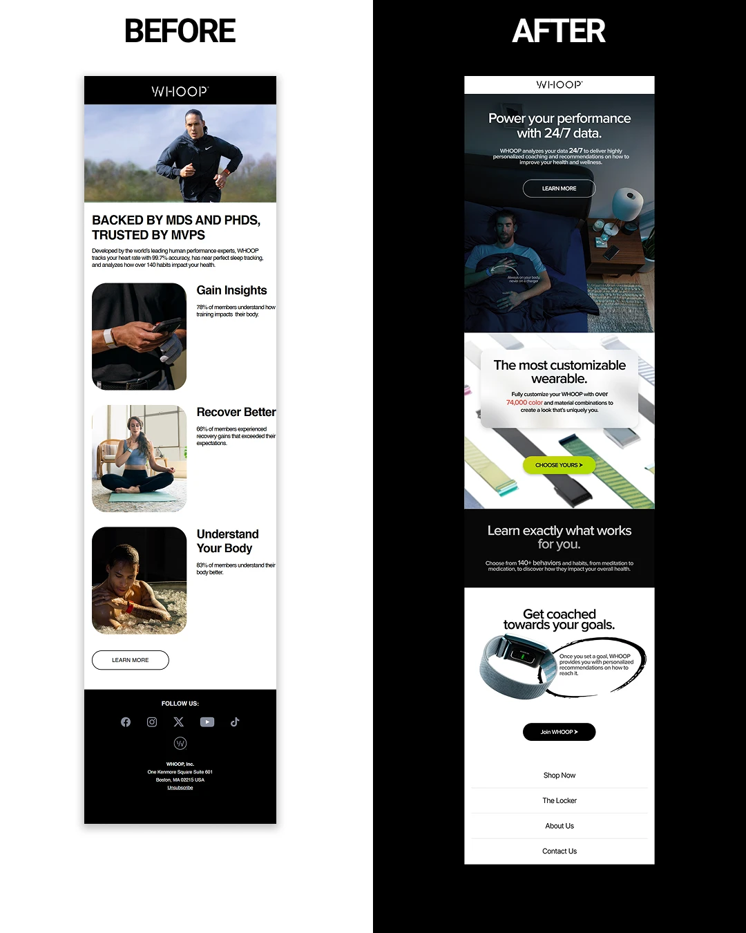
Redesigning WHOOP's Marketing Email.
This one lacked story, flow, and a reason to click.
My approach:
Grab attention instantly → Rewrote headline to focus on the user’s outcome (“Power your performance with 24/7 data”).
Guide action early → Placed a bold CTA at the top so readers know what to do right away.
Make features pop → Used subtle colour shifts to highlight unique selling points.
Improve flow → Added whitespace, hierarchy, and clean typography for a premium, easy-to-read experience.
Sell the differentiator → Framed WHOOP as a personalised coaching system, not just a wearable.
Engage to the end → Added a footer nav so readers keep exploring instead of bouncing.
The result: A more visual, intentional email that holds attention, guides the eye, and drives clicks — designed in Figma with a conversion-first mindset.
Like this project
Posted Aug 8, 2025
Redesigned WHOOP's marketing email for better engagement and conversion.