MEGU | Branding and Packaging
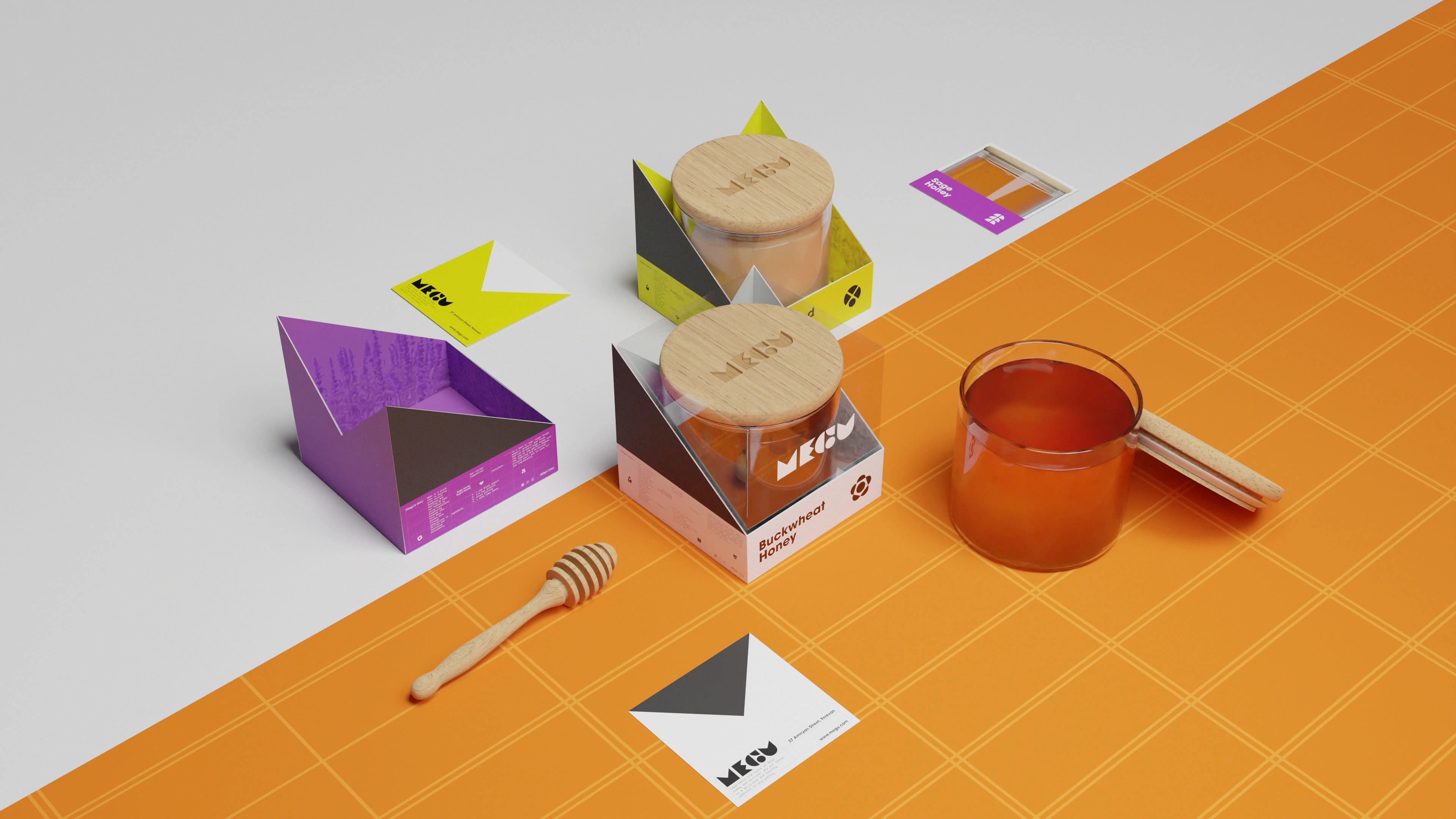
MEGU is an Armenian honey brand that is buzzing with natural goodness. Their commitment to quality is evident in every jar of honey they produce. The honeys are carefully handcrafted and minimally processed to preserve their natural flavor and nutritional value.
The brand name MEGU draws its inspiration from two sources. The first is the Armenian word "meghu," which translates to "bee" in English. The second is the Japanese word "megu," which translates to "love" or "affection", reflecting the brand's commitment to creating products that inspire profound sentiments of goodwill and endearment.
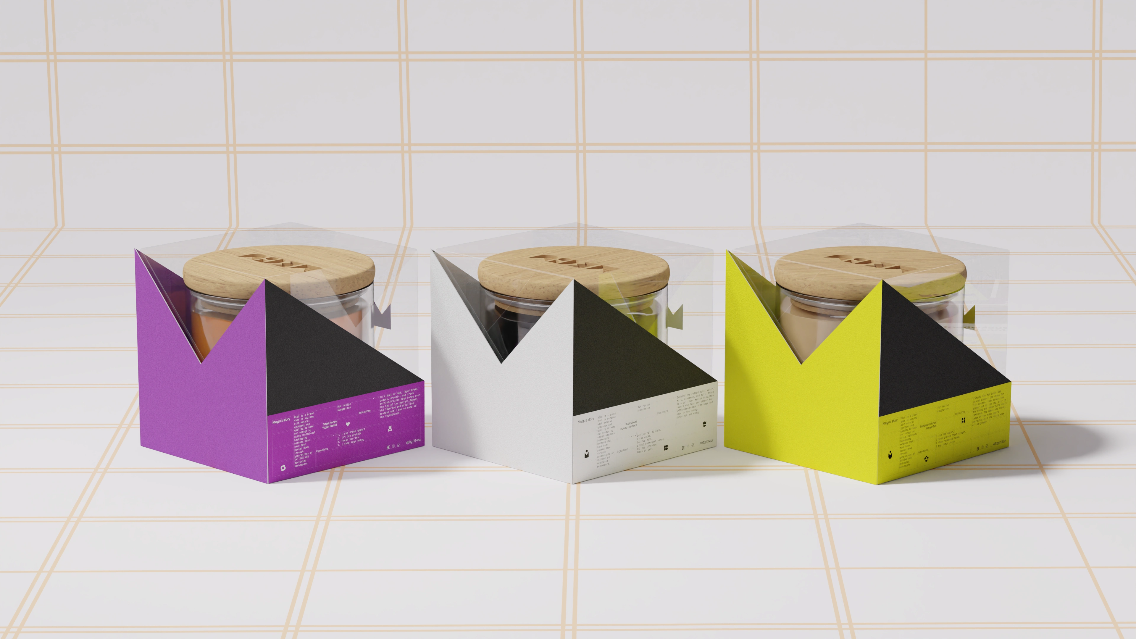
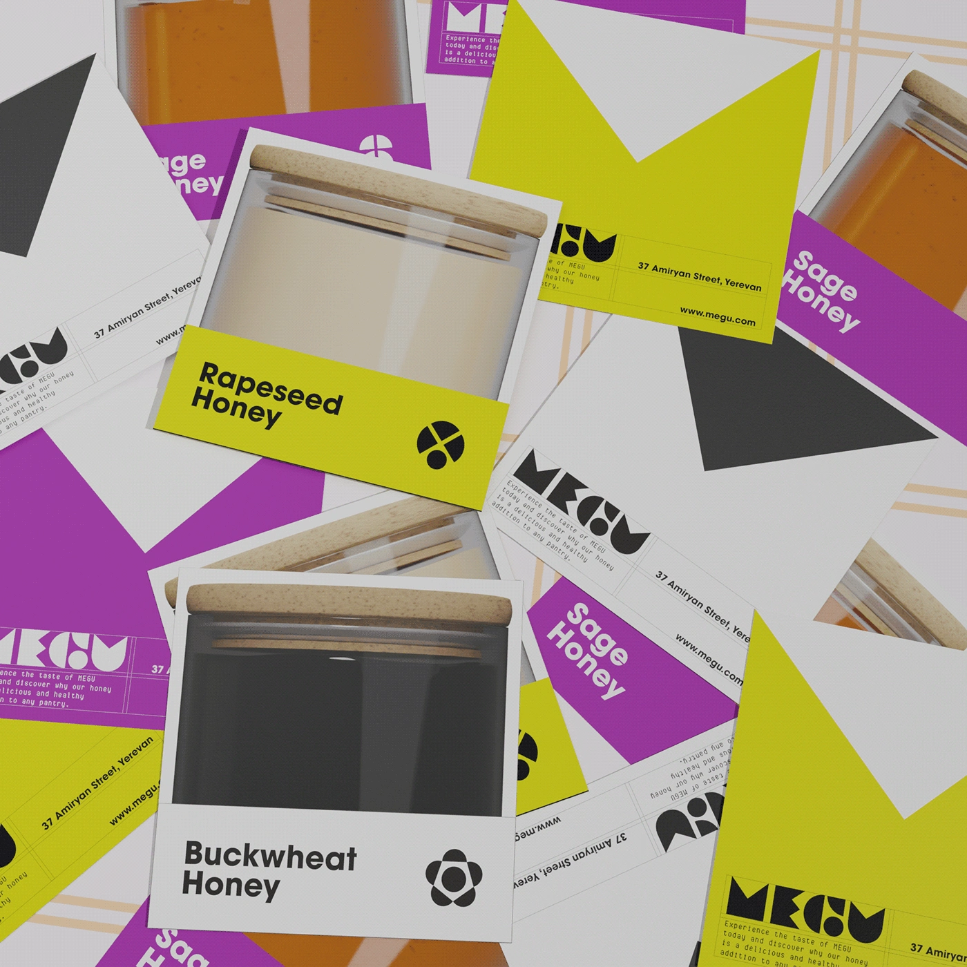
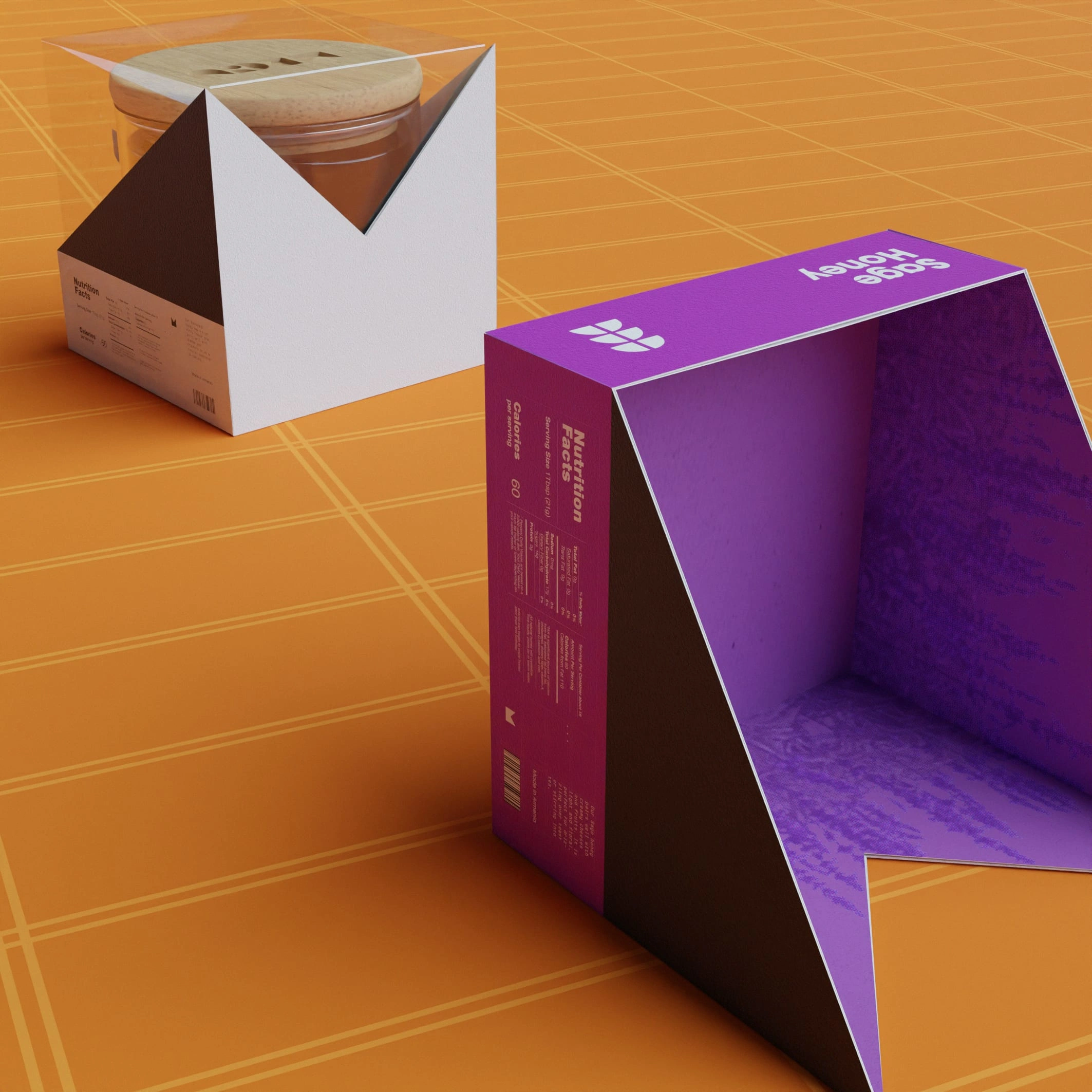
To further enhance the brand's identity and messaging, a complete branding package was necessary to effectively communicate the brand story and values to consumers. This included developing of an identity system, logo, packaging and so on.
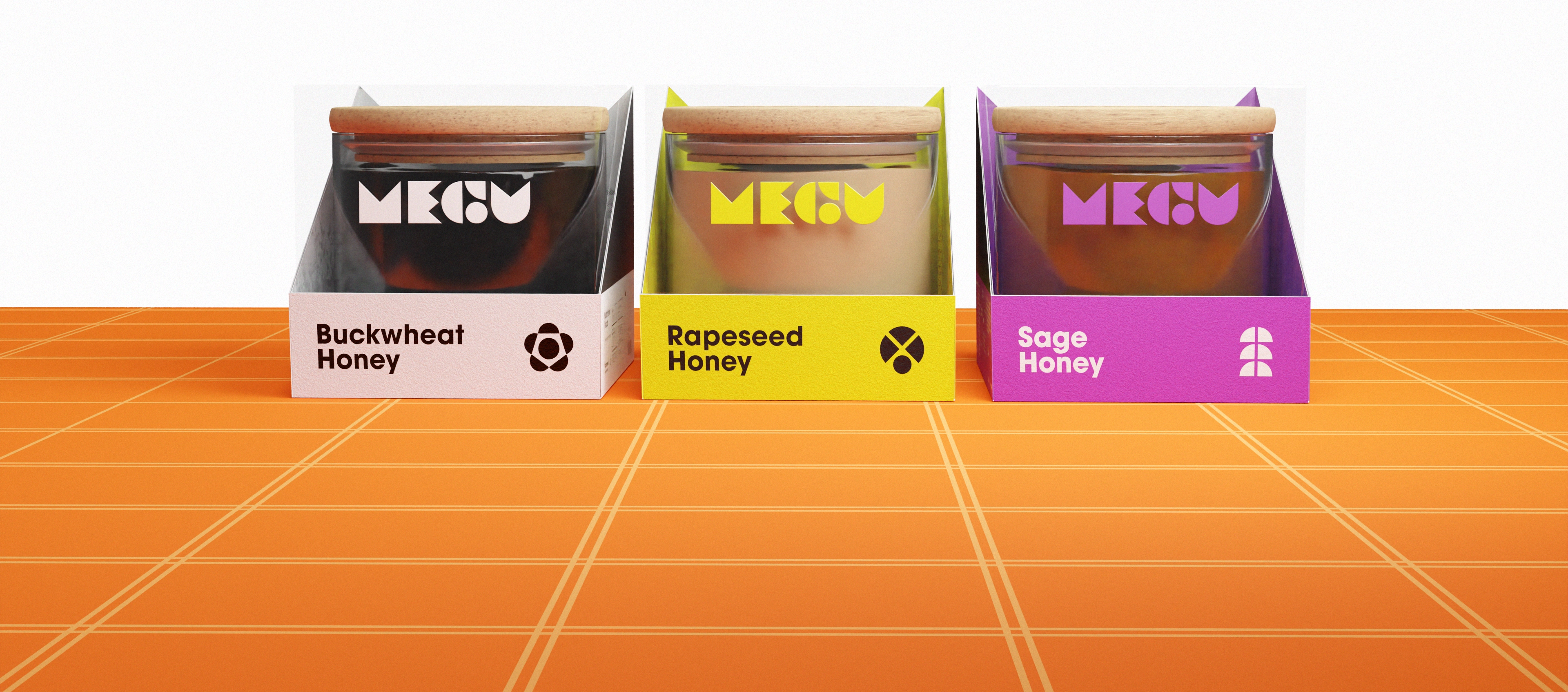
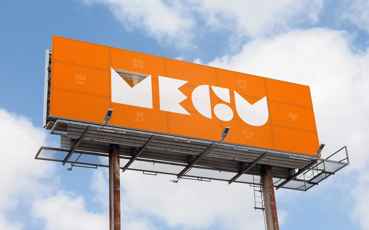
The utilization of a grid in the visual identity is aimed at conveying a sense of structure, simplicity, consistency, which is similar to the modular structure of honeycomb.

The reason behind using color halftone in the identity is based on the visual and tactile similarity of the halftone texture to that of natural honey. It evokes a sense of naturalness and organic appeal in the design.




Concept design / Motion design / 3D : Dina Yeghiazaryan
Brand identity design / Creative strategy : Artyom Aghinyan
Like this project
Posted May 28, 2023
MEGU is a honey brand. To enhance its identity, a complete branding package was necessary, including the identity system, logo, packaging, advertising, social m


