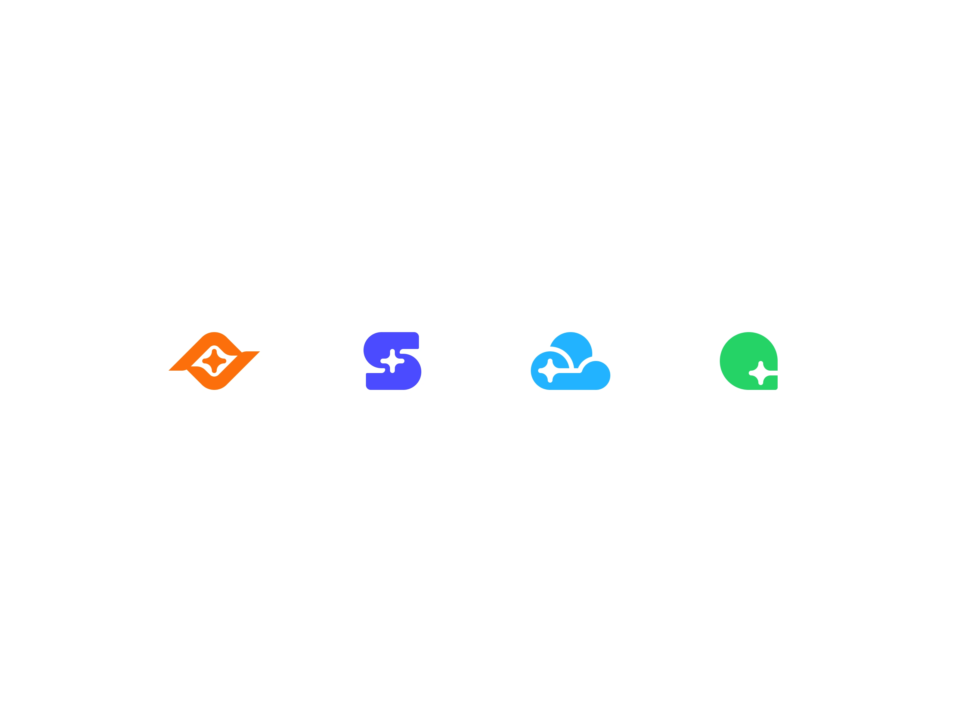
Sawang Logo Family

Amirul Hakim
1 collaborator


Sawang Cover
Sawang Section 2
The Problem
Sawang is an IT infrastructure platform with a growing product family: cloud services, AI tools, and business analytics. But none of these products had a visual identity. Each product existed in isolation, with no shared design language connecting them to each other or to the Sawang parent brand.
For a platform targeting technical users and enterprise buyers, this was a credibility problem. Competitors like Atlassian, Google, and Firefox have brand families where every sub-product is instantly recognizable as part of the same ecosystem. Sawang needed the same: a unified brand identity system where each product logo is connected to the family while strong enough to stand on its own.
Sawang Section 3
Sawang Section 4
The Users
Sawang's brand identity needed to resonate with three core audiences:
Tech users who interact with Sawang's infrastructure tools daily. They expect a brand that signals technical competence and reliability.
Business analysts evaluating Sawang's platform for organizational adoption. They need to see a cohesive product ecosystem, not a collection of disconnected tools.
AI and cloud subscribers choosing between competing platforms. For this audience, brand perception directly influences trust and willingness to commit.
All three groups share one expectation: a technology brand should look like it was built with the same rigor as the technology itself.
Sawang Section 5

Sawang Section 6

Sawang Section 7
The Process
Step 1: I studied how the strongest tech brand families work. Atlassian's system gives each product a distinct shape within a shared color and geometry language. Google uses consistent proportions and color coding. Firefox ties sub-brands through a shared flame motif. I mapped the structural principles behind each approach to identify what Sawang's system needed.
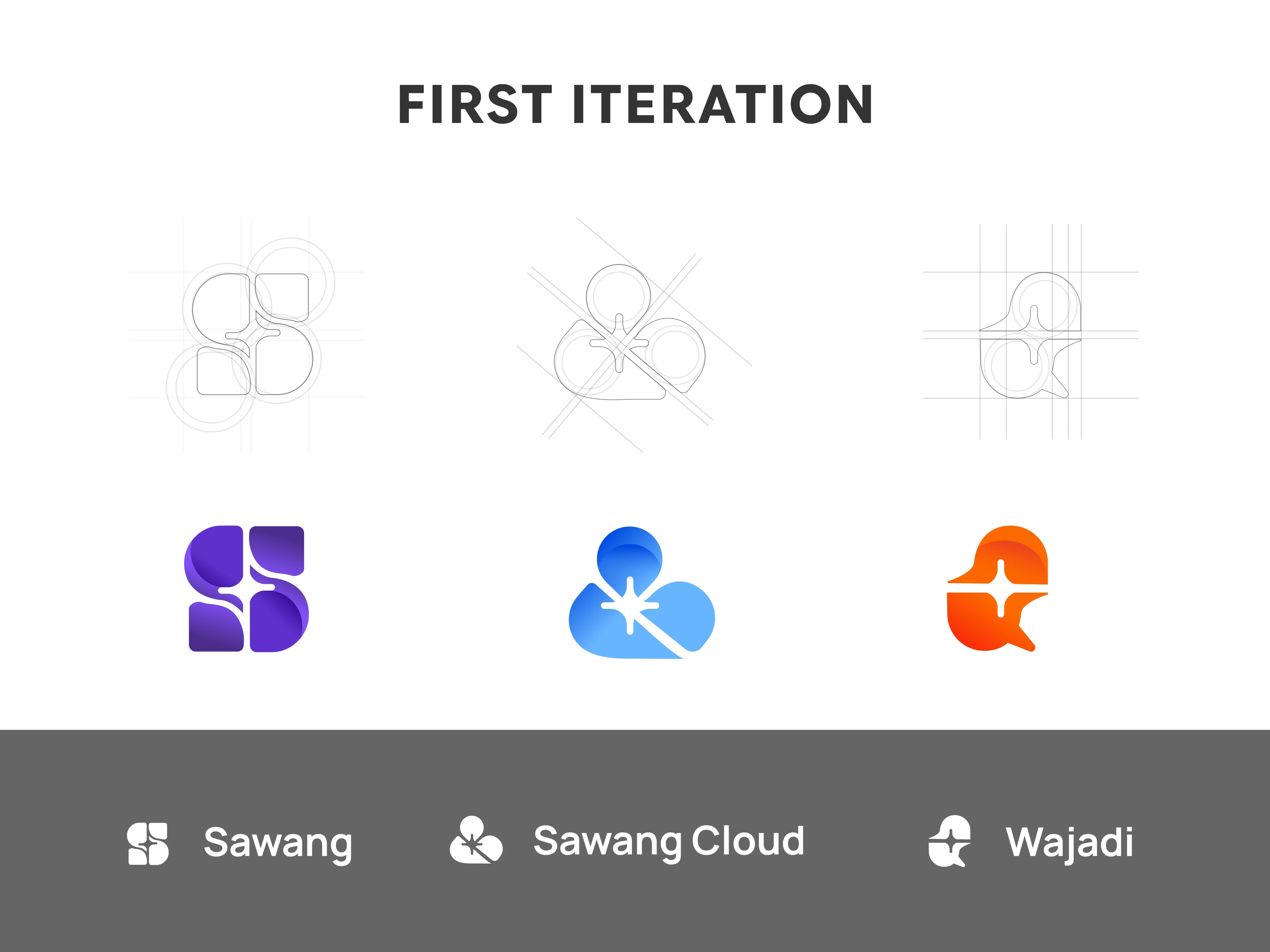
Step 2: I developed the core visual concept (detailed below) and built the primary Sawang logomark first, establishing the geometric rules, proportions, and color relationships that every sub-brand logo would inherit.
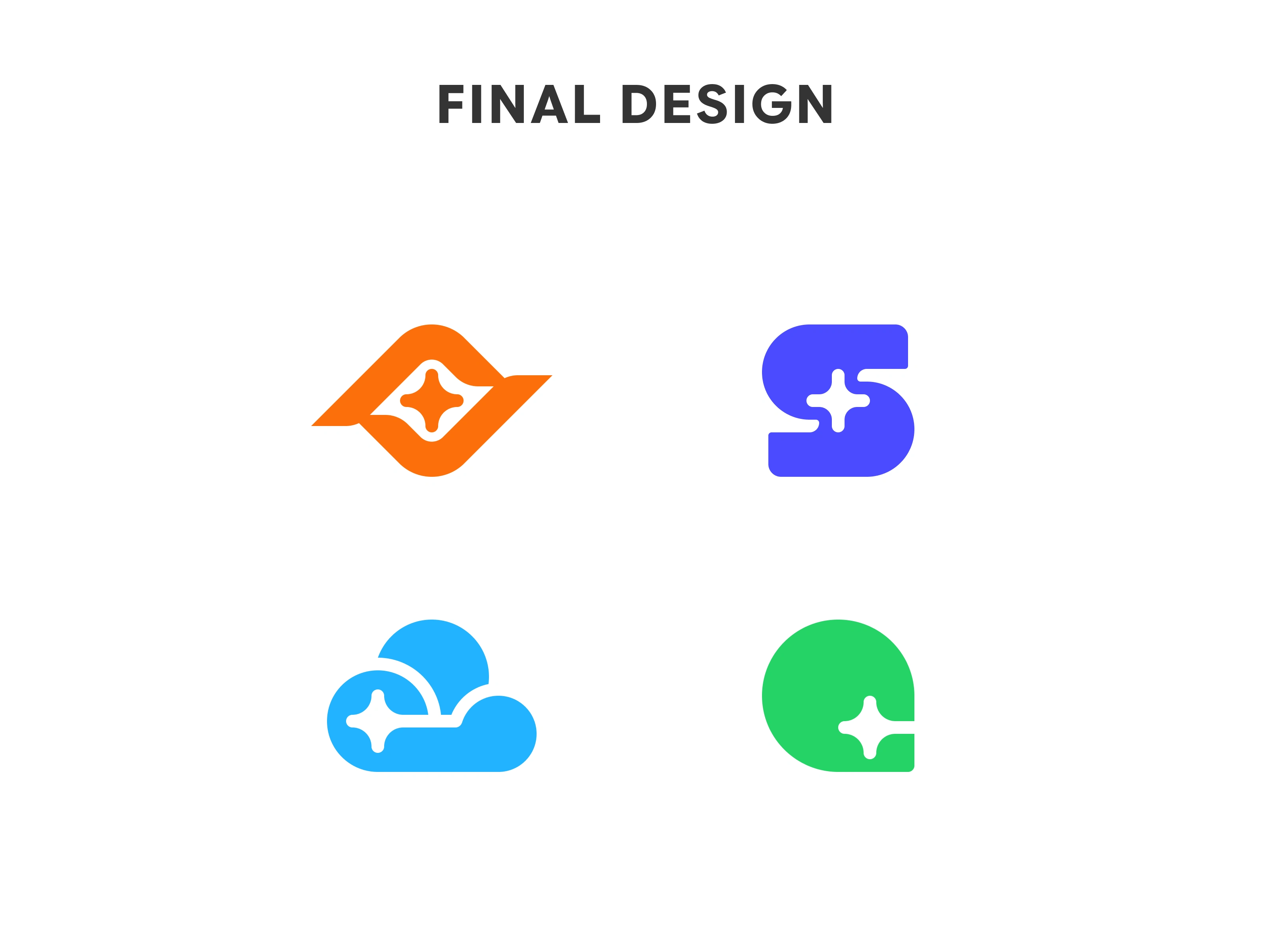
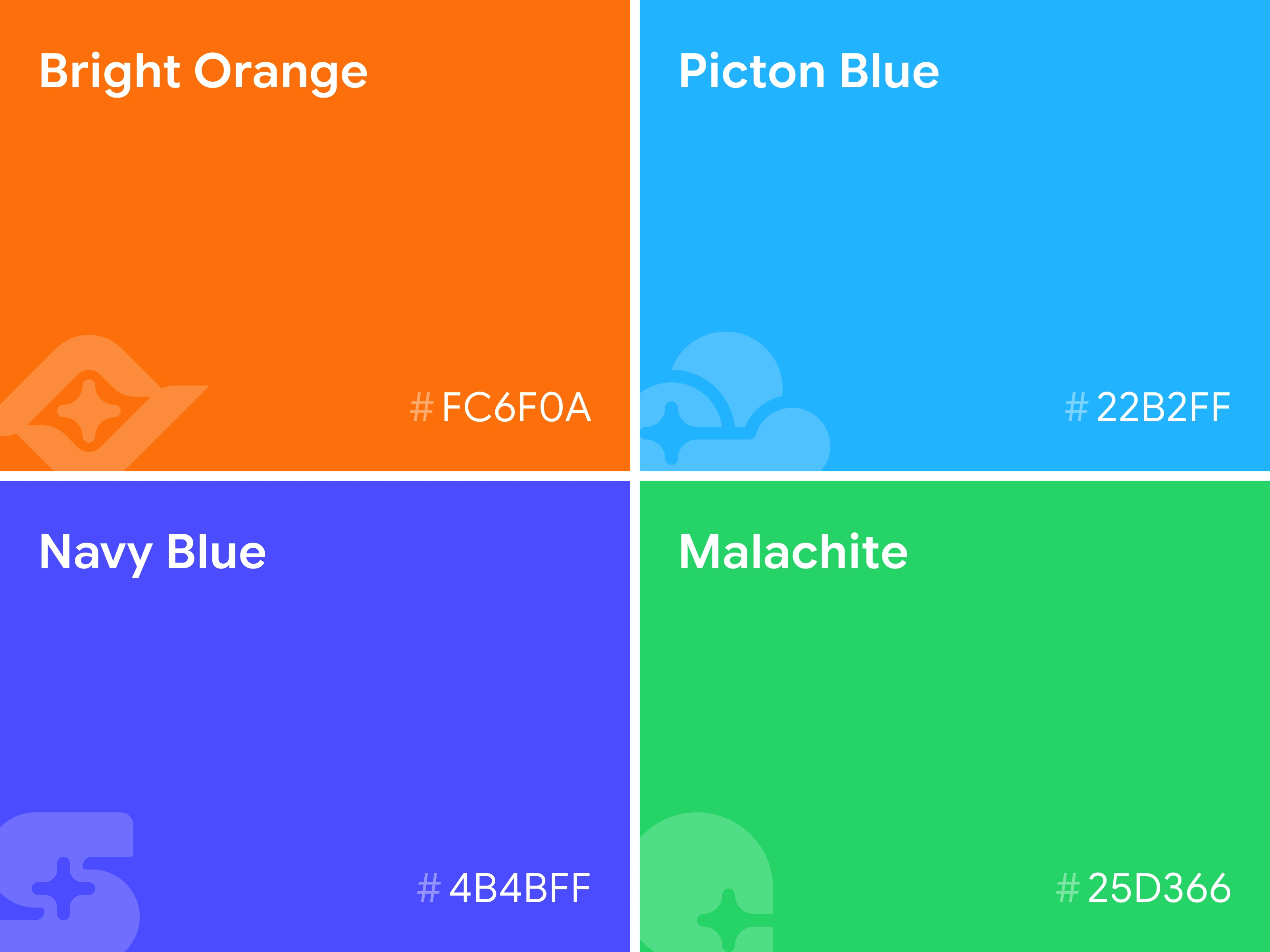
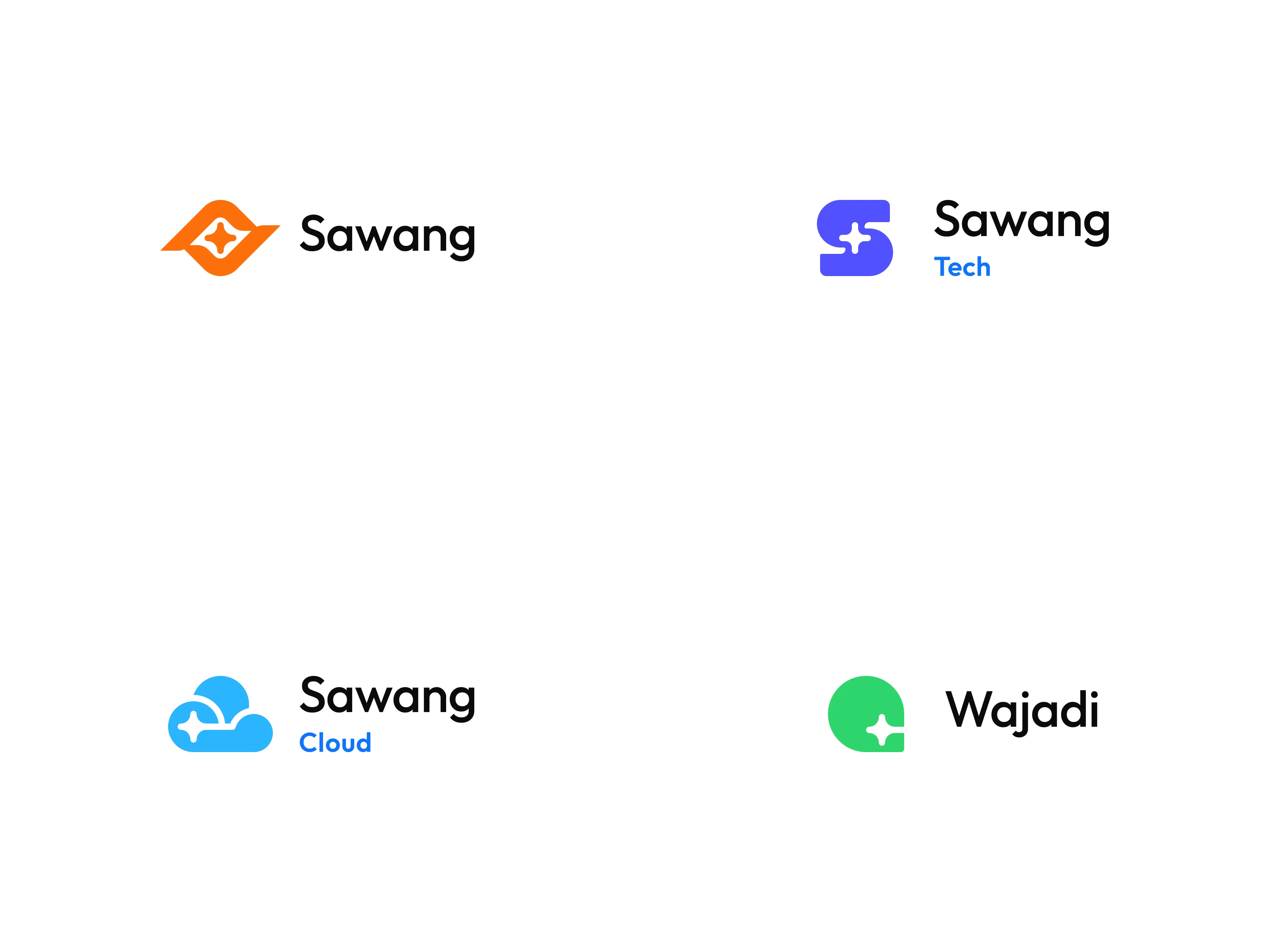
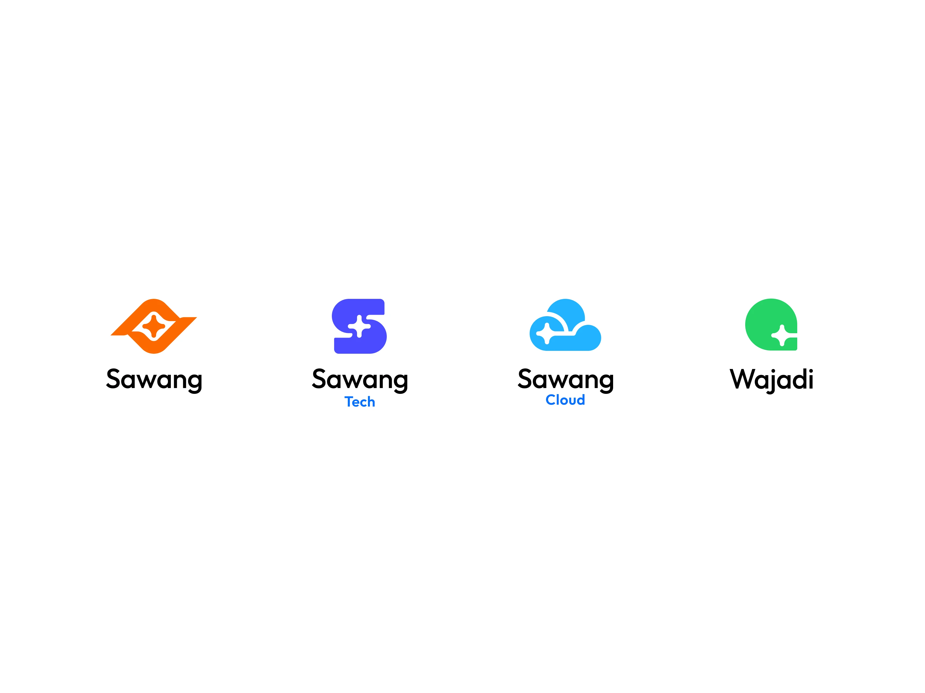
Step 3: I extended the system across the full product family, designing each sub-brand logo to be visually connected to the parent while carrying its own distinct identity. I also produced animated logo reveals using Jitter, giving each logo a motion signature for digital applications.
Sawang Section 8

Sawang Section 9
The Key Design Decision
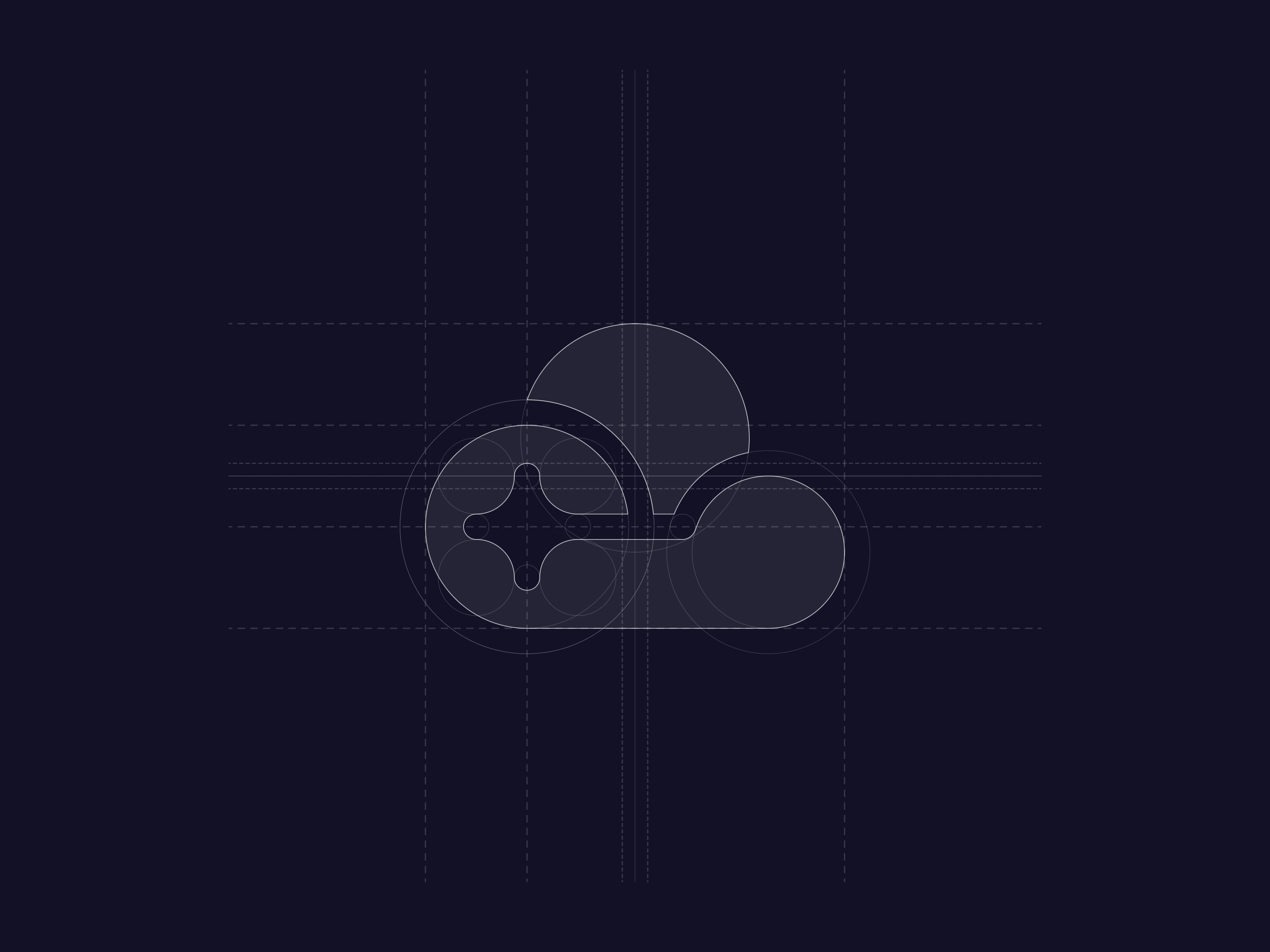
The entire brand family is built from galaxy-inspired geometry. Every logo in the system uses geometric forms derived from stars and supernovae.
The metaphor is structural, not decorative. A galaxy is a vast system composed of individual stars, each with its own identity, held together by gravitational pull. Sawang's product family works the same way: each product is a distinct entity, but they're all bound to the same system, orbiting the same core.
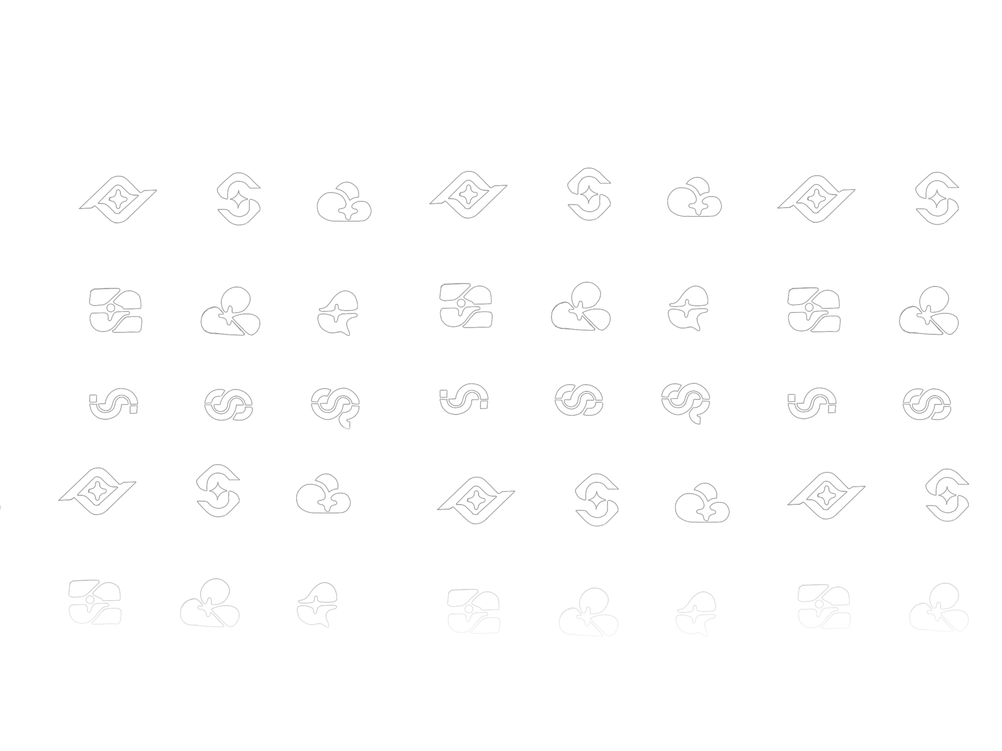
This concept gave me a generative framework. Instead of designing each sub-brand logo from scratch, I could derive every mark from the same set of geometric primitives (star points, radial symmetry, orbital curves) while varying the composition to give each product its own character. The result is a family that feels cohesive at a glance but rewards closer inspection with individual personality.
Sawang Section 11
Sawang Section 12
Sawang Section 13
Sawang Section 14
Sawang Section 15
The Outcome
Within 2 weeks of launching the new brand family, Sawang's user acquisition increased by 15.6%. For an IT infrastructure platform where trust and perceived professionalism directly influence conversion, a unified visual identity made a measurable difference.
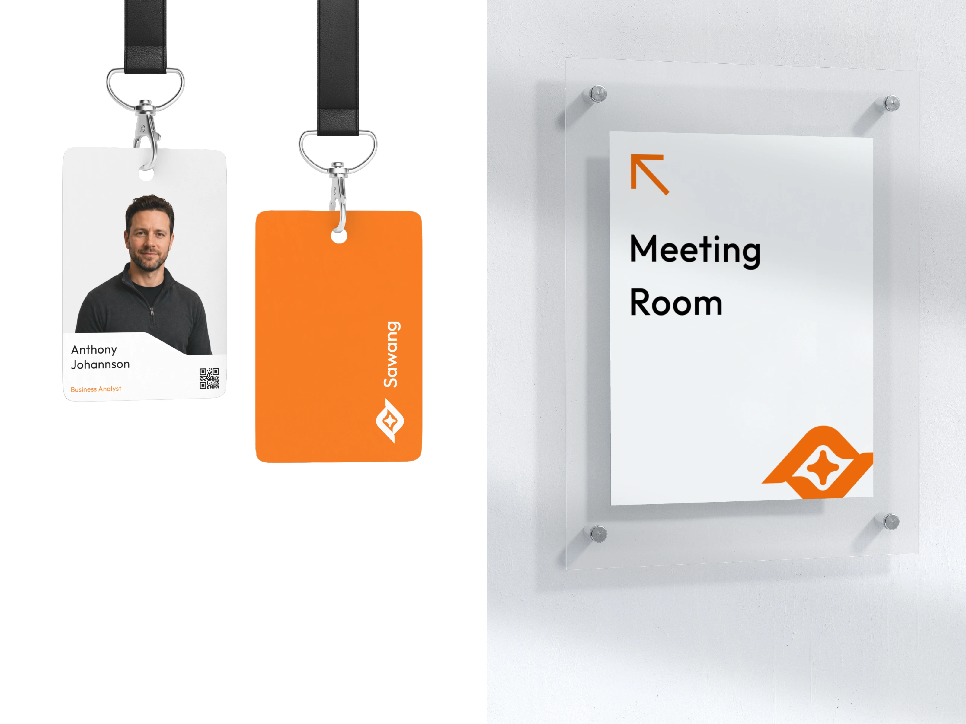
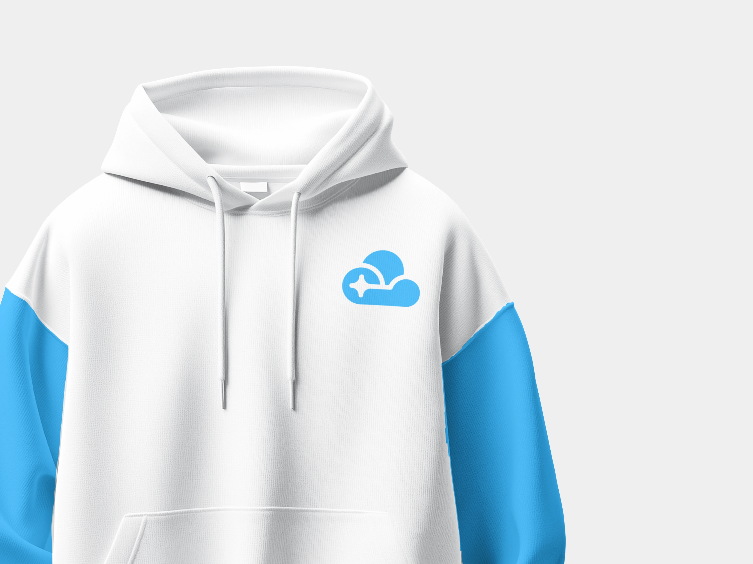
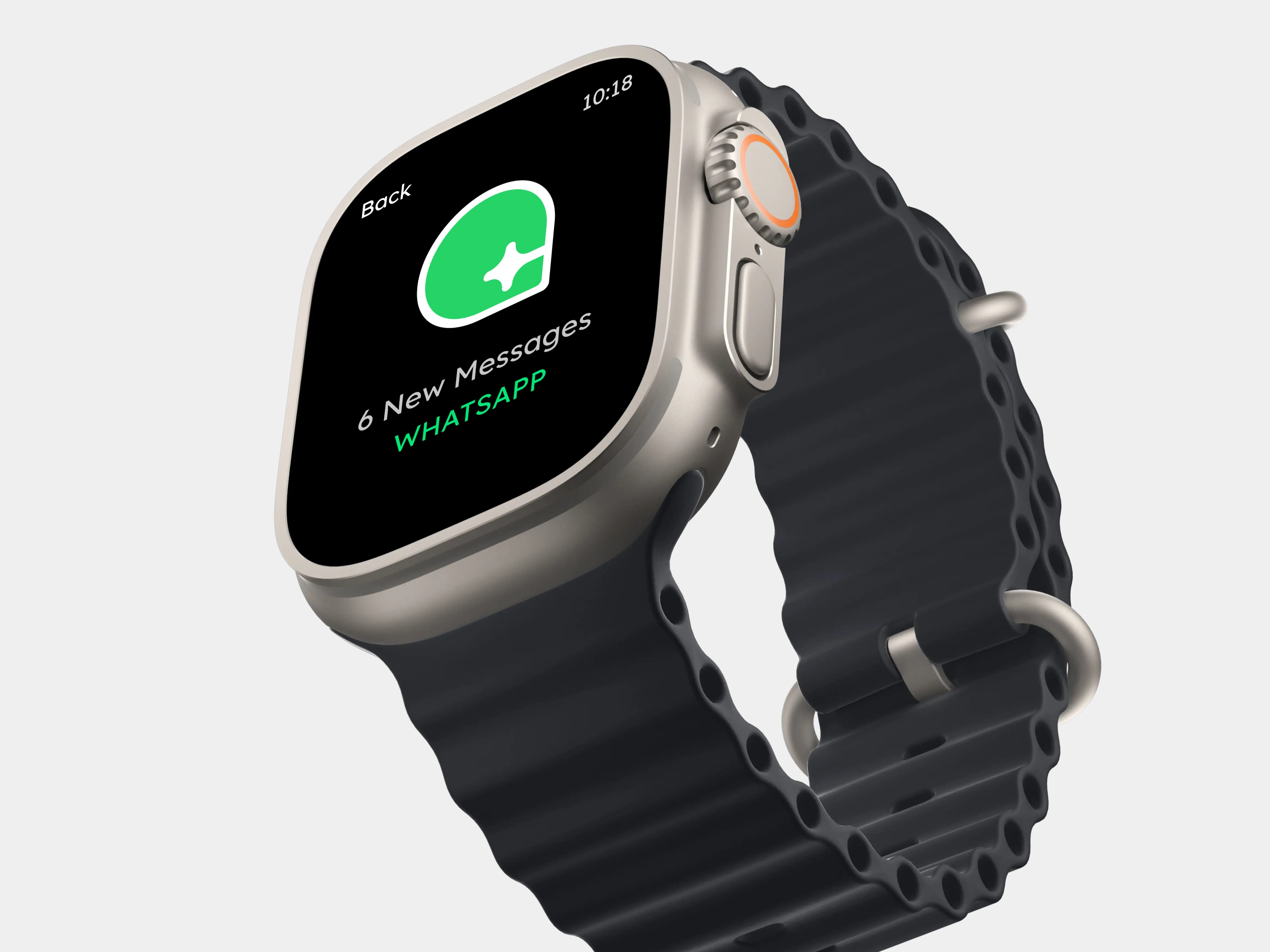
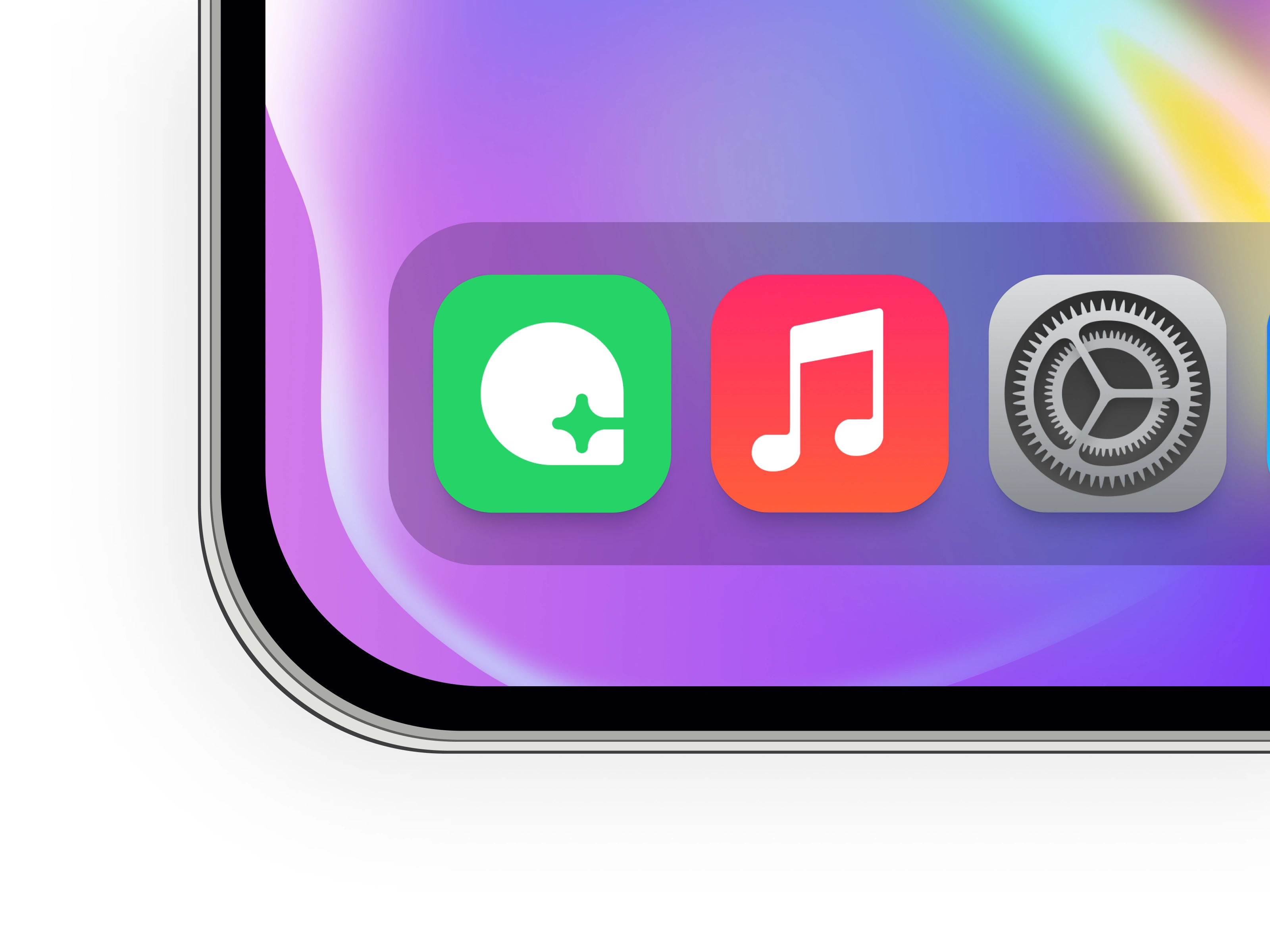
The brand system now serves as the foundation across Sawang's website, product interfaces, and marketing materials, giving every touchpoint a consistent, recognizable presence.
Sawang Section 16
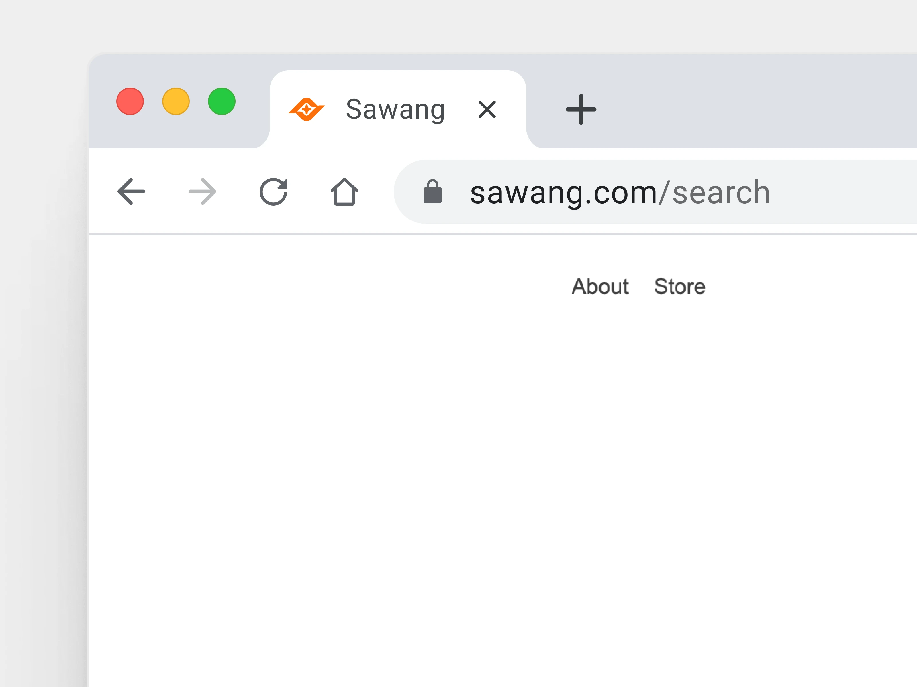
Sawang Section 17
Like this project
Posted Jul 19, 2026
Designed the complete logo family and brand identity system for Sawang, an IT infrastructure platform.
Likes
2
Views
19
Clients
Sawang
Collaborators