Fricko Fry – Street Chicken Hub Visual Identity

Avro Abir


Case Study: Fricko Fry – Street Chicken Hub Visual Identity & Brand Experience
Project Overview
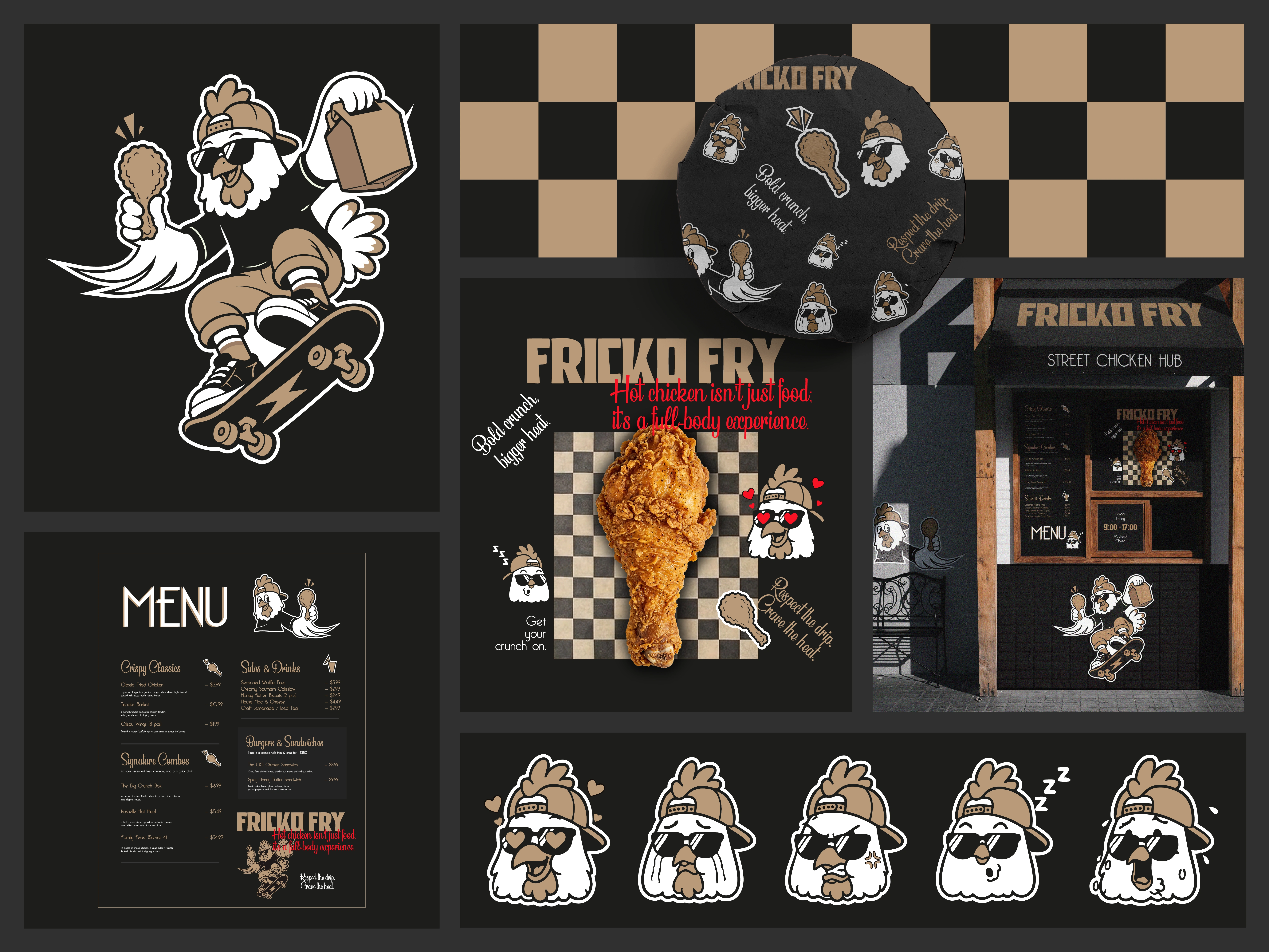
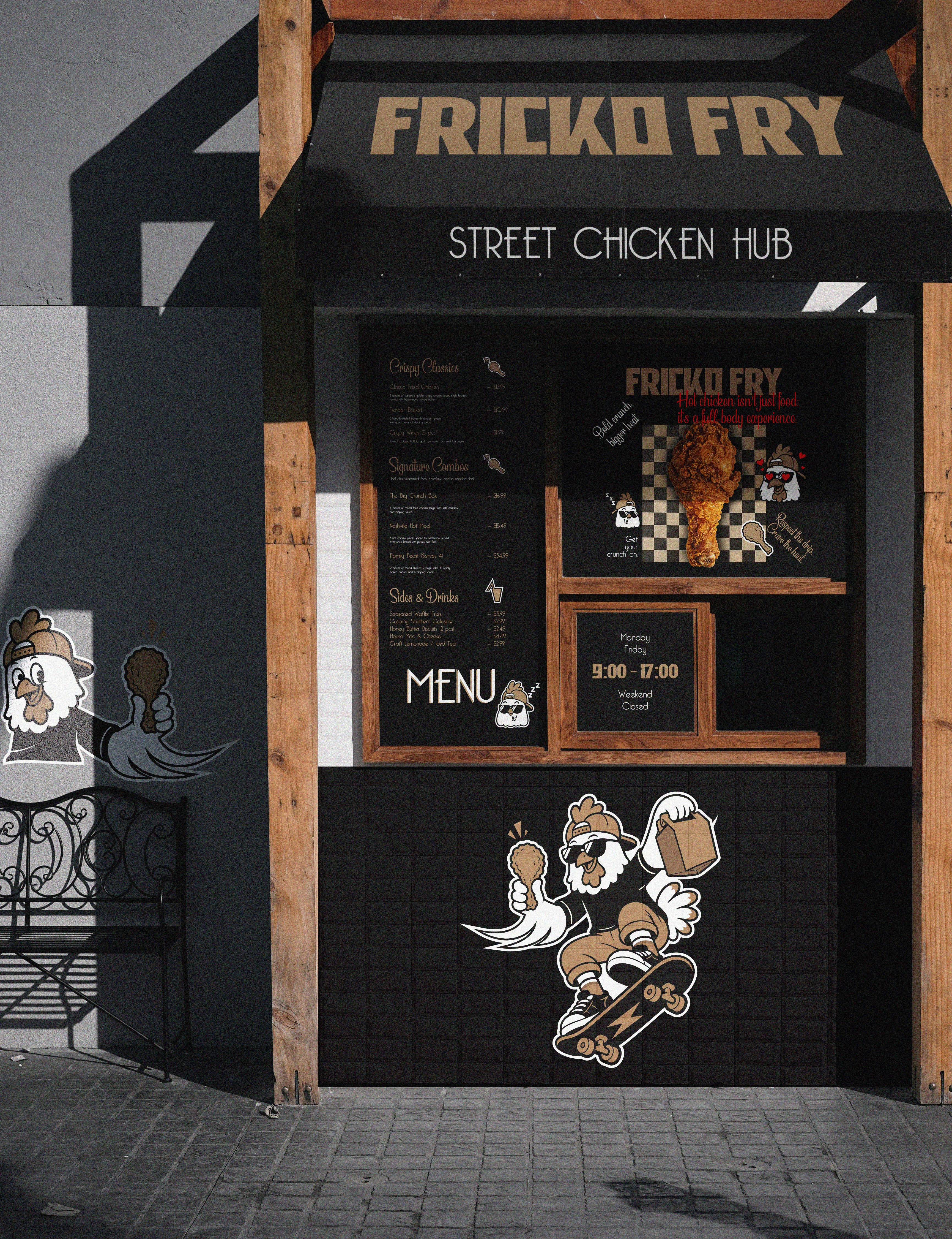
Fricko Fry is a street-style hot chicken joint built on bold flavors, urban energy, and high-crunch attitude. The objective was to craft a distinct, high-energy brand identity that merges skate/street culture with modern fast-casual dining, positioning Fricko Fry as an iconic, flavor-forward "Street Chicken Hub".
Brand Strategy & Concept
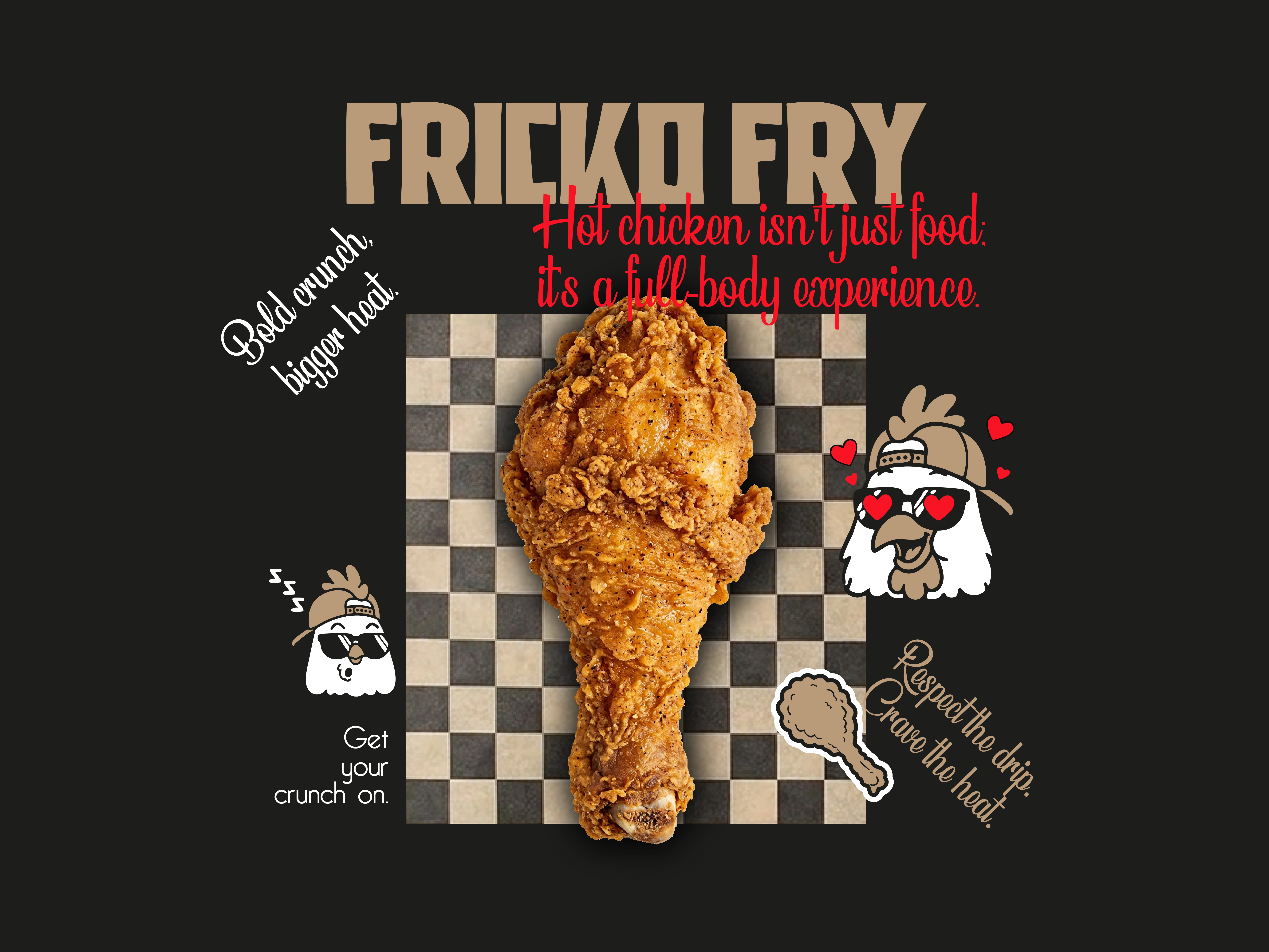
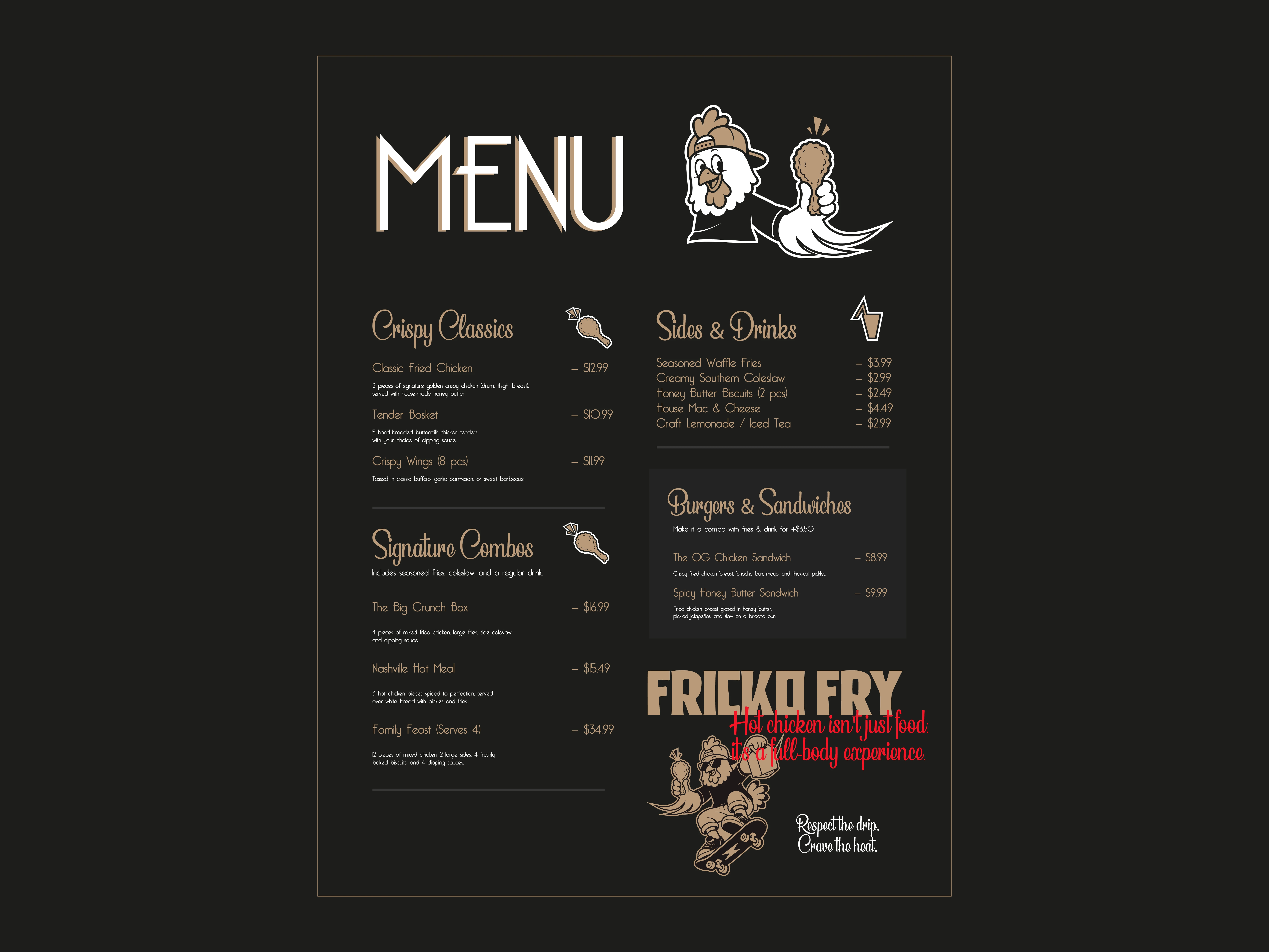
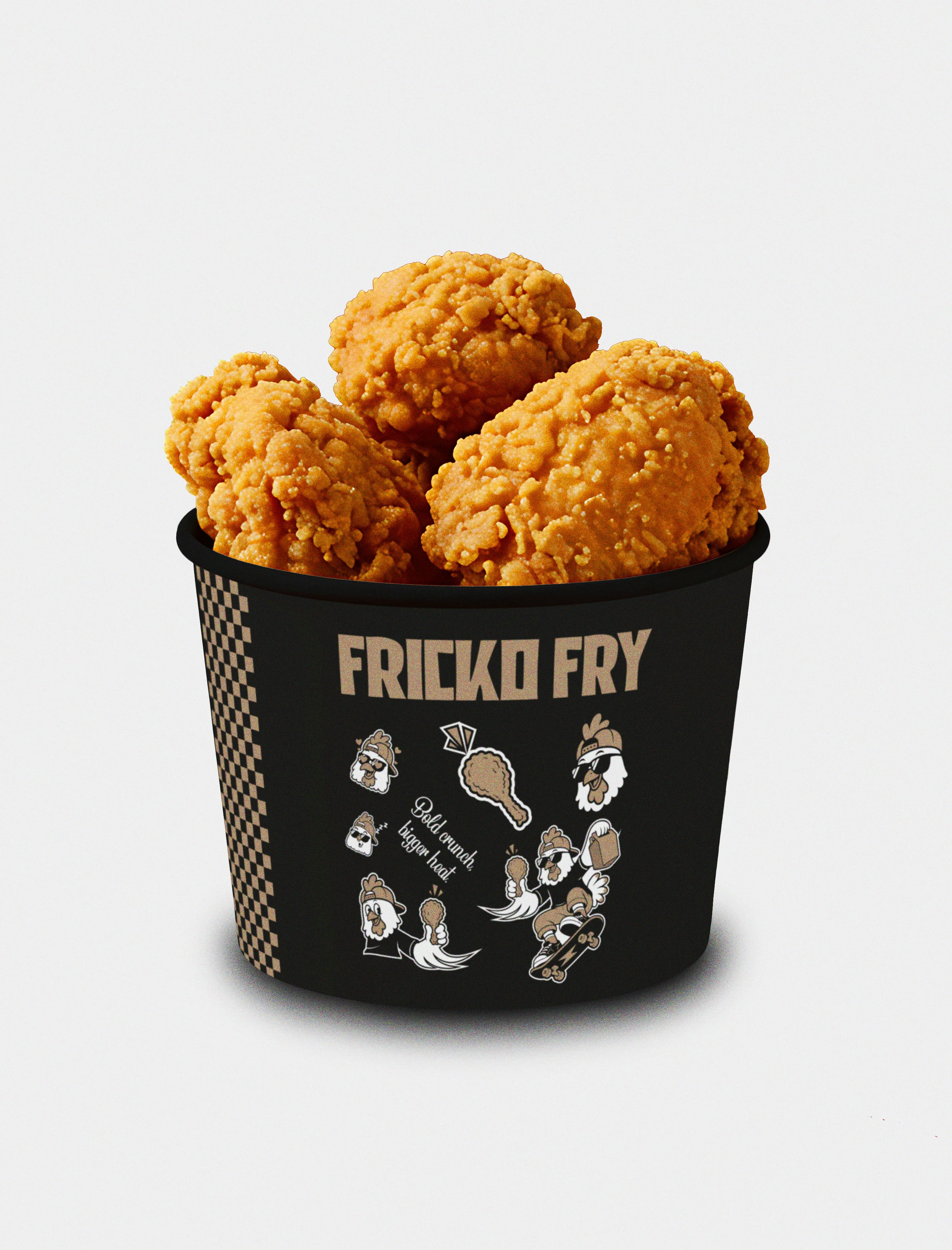
Brand Tagline: “Bold crunch, bigger heat.” / “Respect the drip. Crave the heat.”
Brand Personality: Rebellious, energetic, playful, urban, and authentic.
Core Idea: Treat fried chicken not just as quick food, but as a lifestyle experience. The design leans into classic street-art aesthetics, retro skate vibes, and dynamic character illustrations.
Visual Elements & Mascot Design
1. The Character Mascot
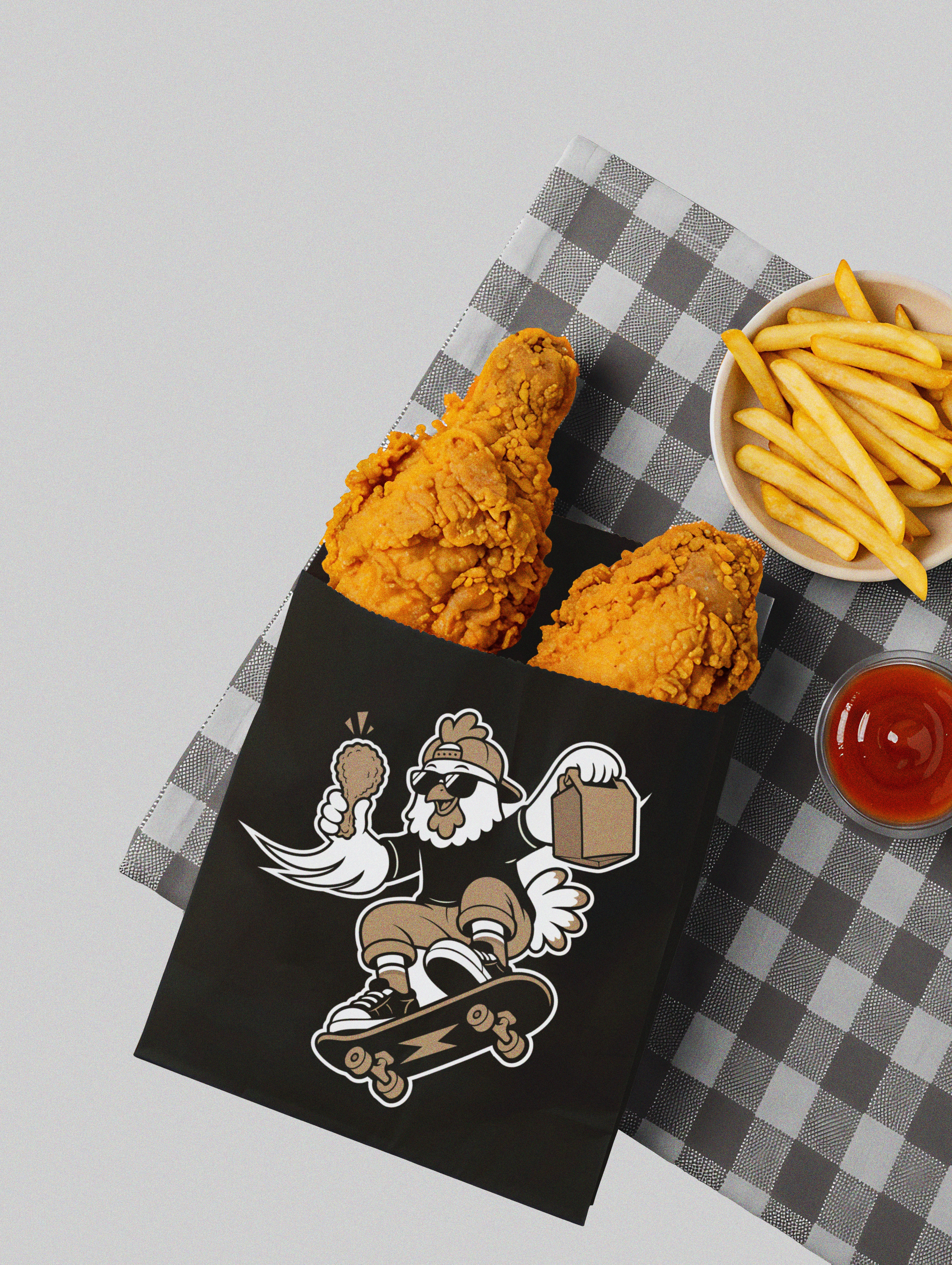
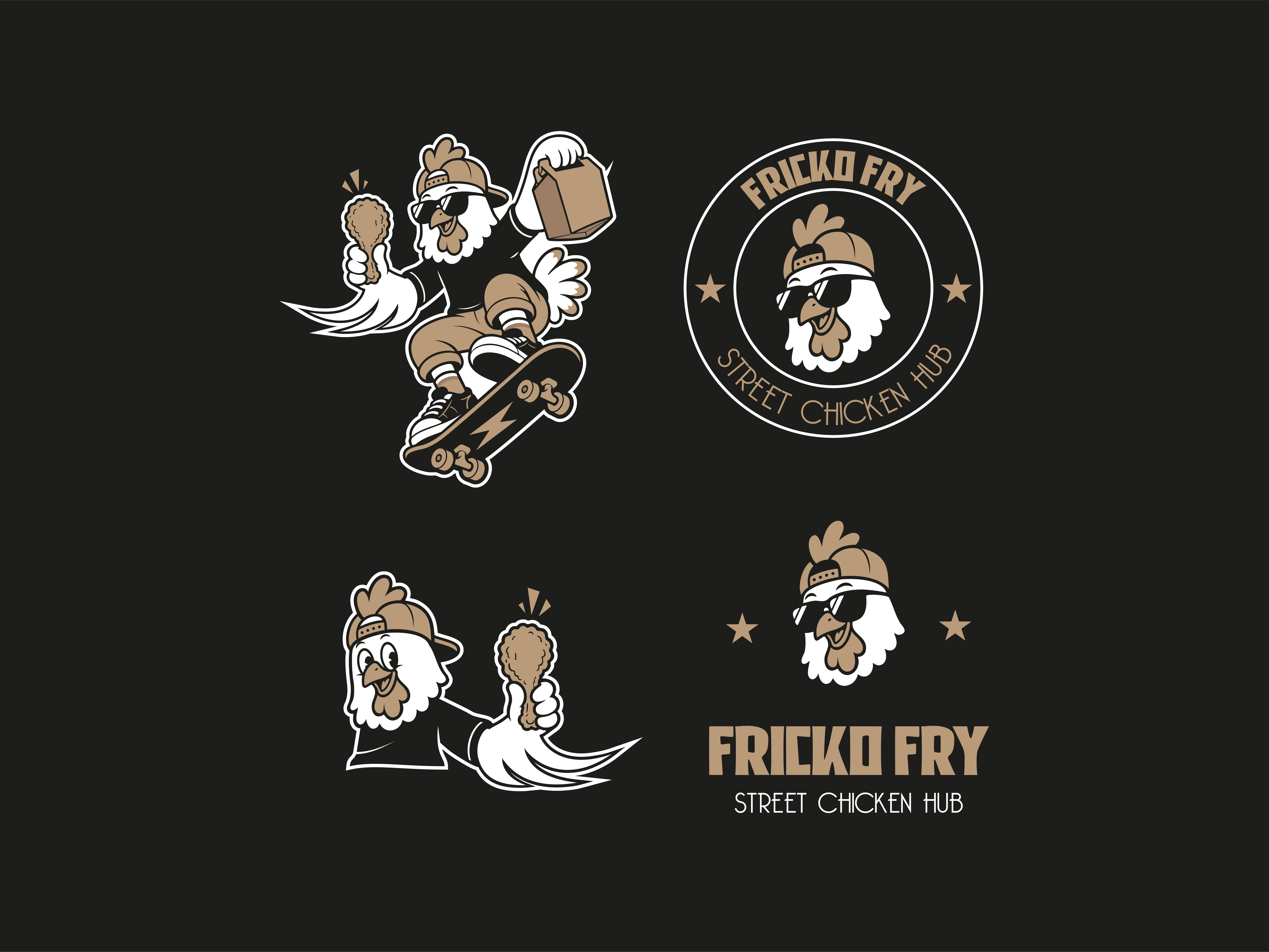
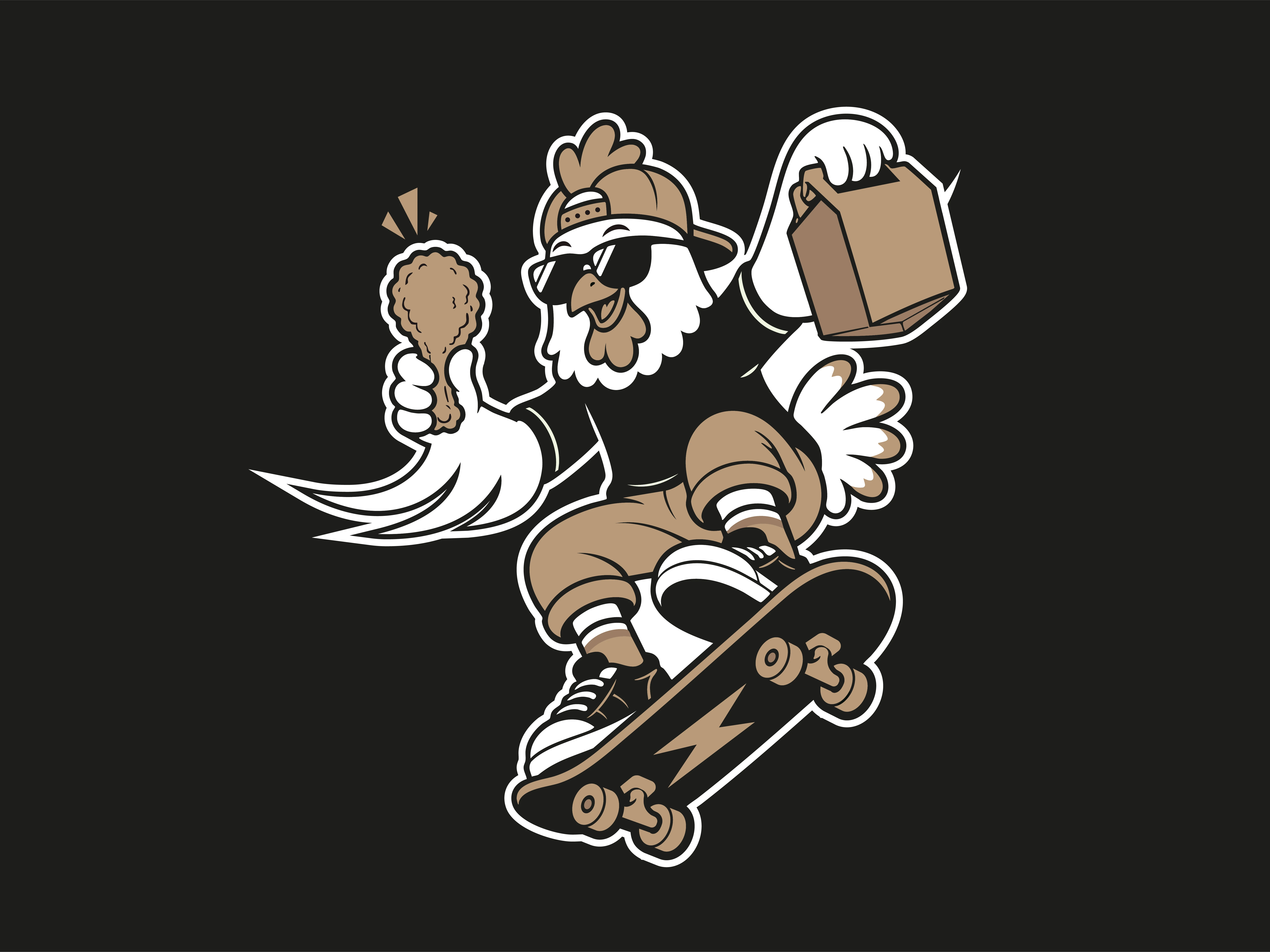
At the heart of the visual identity is the Skater Chicken Mascot—a cool, attitude-filled character wearing a backwards cap, sunglasses, sneakers, and riding a skateboard while holding fried chicken and a takeout bag.
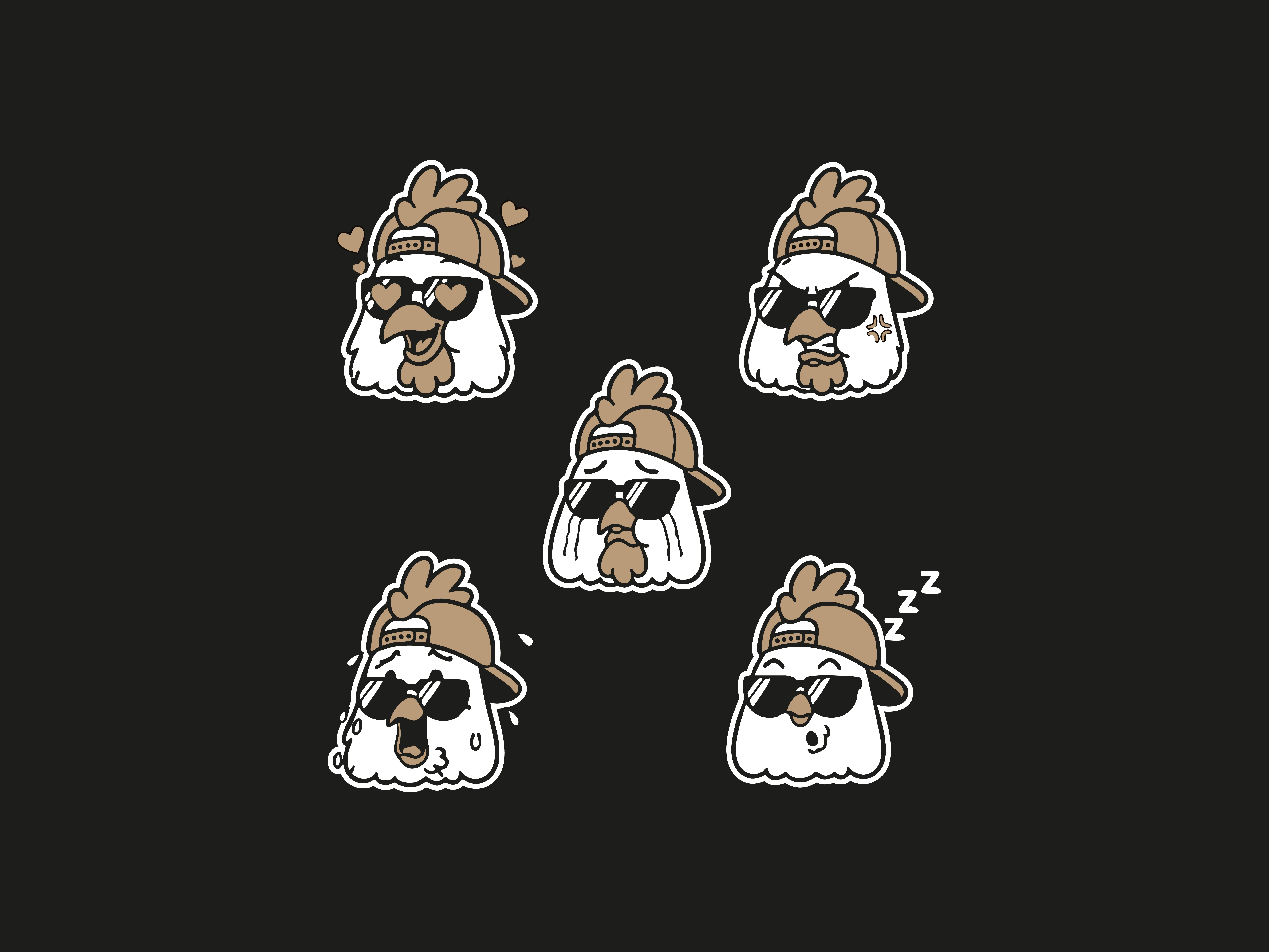
Mascot Expressiveness: A full sheet of custom emoji-style head icons was created to express diverse brand moods (in love, angry, sleeping, sweating, laughing), giving the brand versatility across social media, stickers, and digital menus.
2. Typography & Color Palette
Primary Logo Font: Blocky, industrial, bold display typography (
FRICKO FRY) designed for maximum impact on signage and packaging.Secondary Typography: Script and geometric sans-serif fonts used for menu headers and accent taglines, adding texture and readability.
Color Palette:
Deep Charcoal/Black: Provides a sleek, modern, street-style contrast.
Toasted Warm Tan & Gold: Reflects the golden-brown crispiness of the fried chicken.
Crisp White: Accents the character illustrations for clarity.
Fiery Red (Accent): Highlights spicy menu copy and energetic taglines.
Project Impact
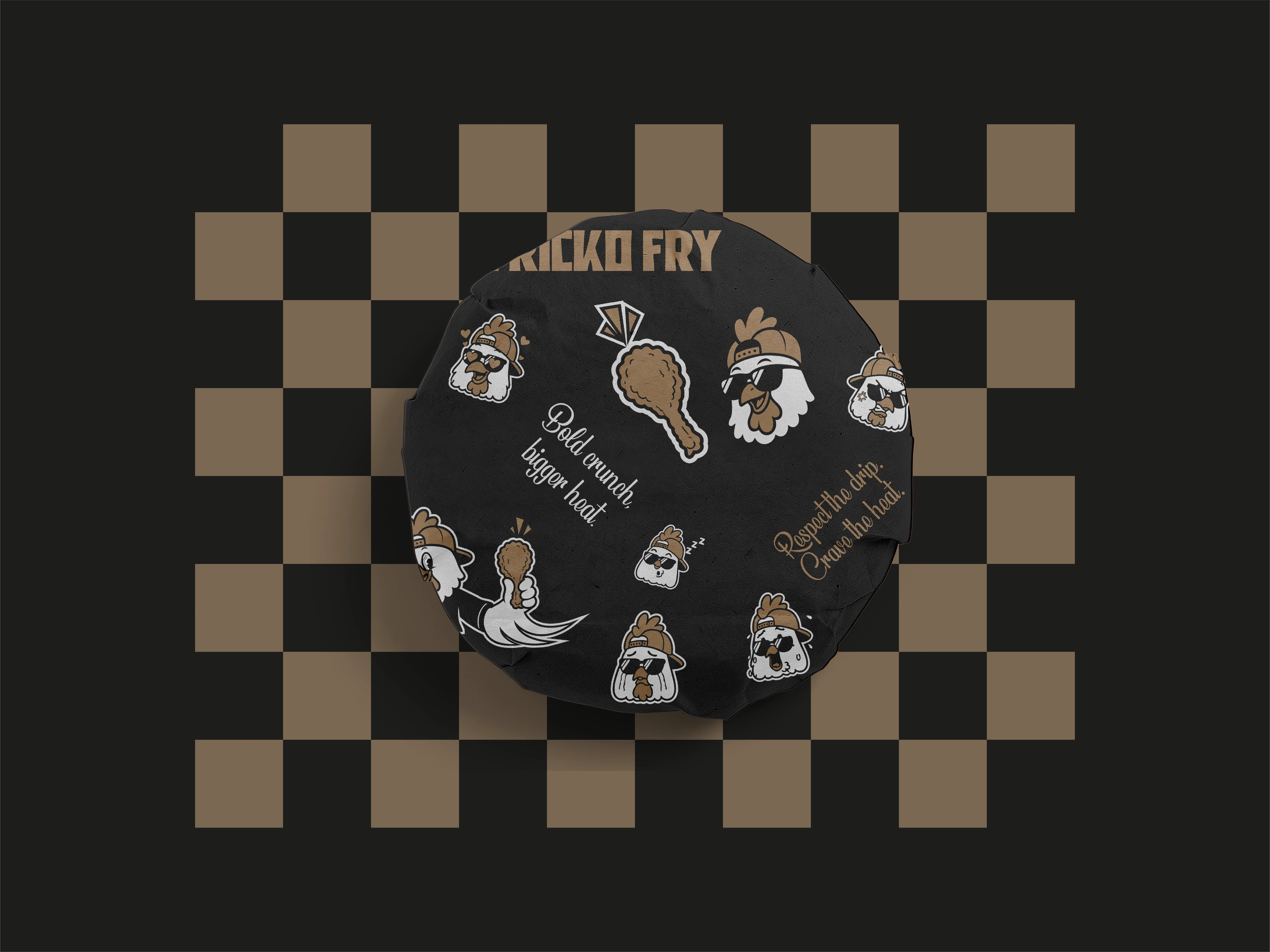
The resulting brand system provides Fricko Fry with a cohesive, instantly recognizable identity that seamlessly spans physical store environments, packaging, and digital media. The blend of skate culture, illustrative character branding, and strong typography establishes a memorable aesthetic designed to attract a young, flavor-seeking audience.
Like this project
Posted Sep 27, 2026
Developed a distinctive brand identity for Fricko Fry, blending street culture with dining.