Vista Auction App Icon Design
Jere Diberto

Overview
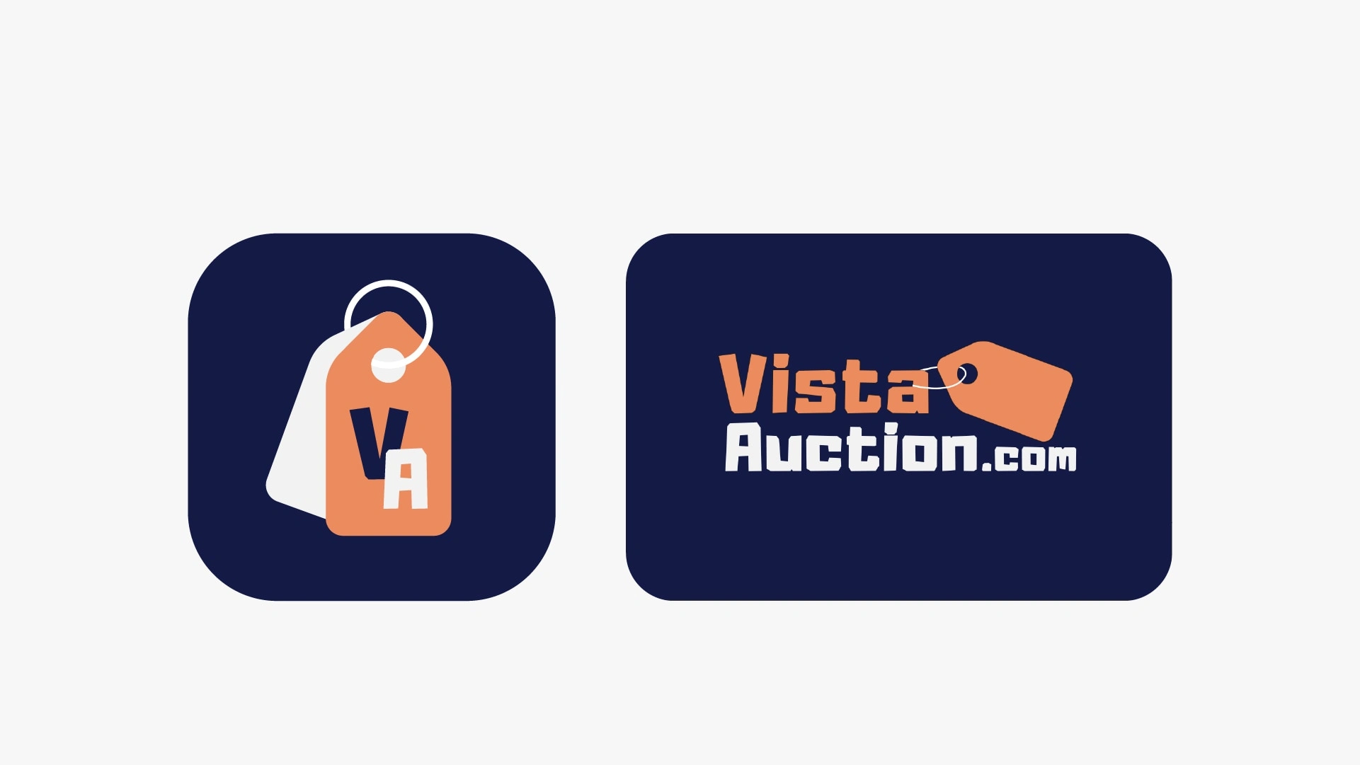
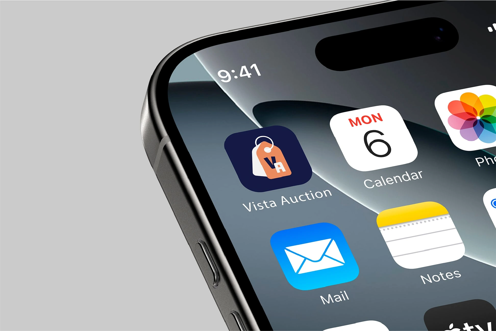
I was tasked with designing a new app icon for Vista Auction, a platform aiming to translate its established brand identity into a functional, high-impact mobile presence. The goal was to create a visual mark that felt familiar to existing users while ensuring visibility in a crowded app store environment.

The Challenge
This was more complex than merely "copying and pasting" the logo:
Scalability: The original logo contained fine details, which would become indistinguishable at smaller sizes.
Brand Recognition: It was essential to retain the essence of "Vista" without using the full wordmark.
Modernization: The design needed to convey a "tech-forward" feel to align with the app launch.
The Process
I structured my process into clear phases, showcasing my methodology:
Phase 1: Exploration & Gridding
I began by analyzing the existing Vista Auction brand elements. Utilizing mathematical construction grids, I ensured that every curve and line was optically balanced for high-resolution displays.
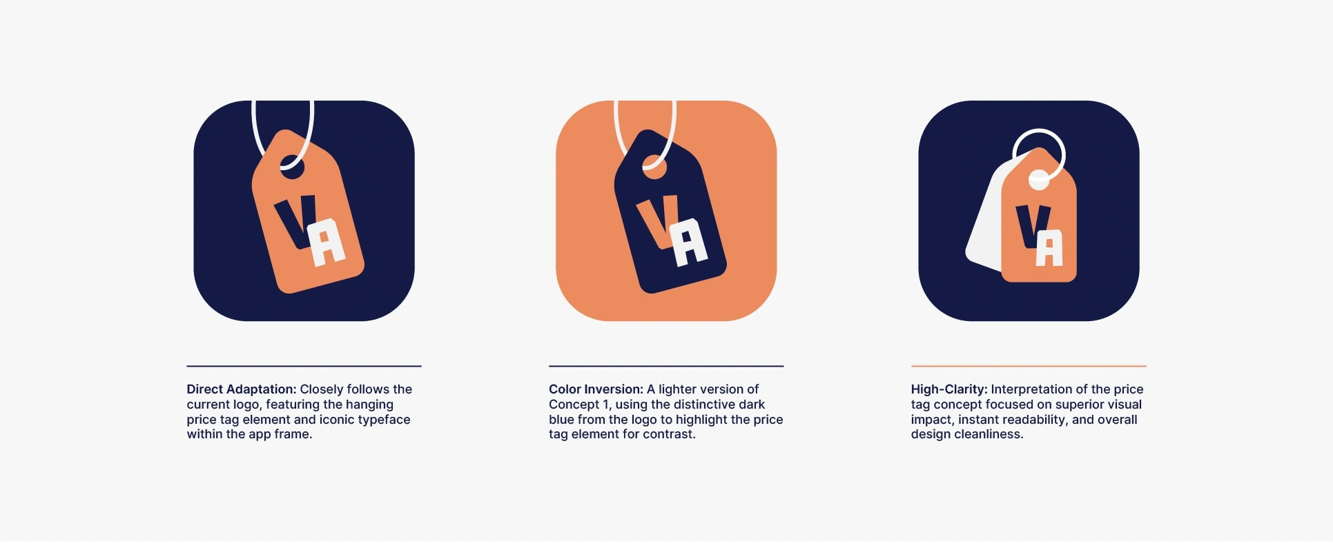
Phase 2: Concept Development
I developed three distinct design directions:
Direct Adaptation: A faithful rendition of the primary logo, preserving key elements.
Color Inversion: A lighter version of Concept 1, utilizing the distinctive dark blue from the logo to highlight the price tag element for contrast.
Minimalist Modern: Simplifying elements for maximum legibility while maintaining brand integrity.
The Deliverables
Here’s what I included to demonstrate my organizational skills:
Vector Source Files: (.AI format)
Web-Ready Formats: (.SVG files)
Mobile Exports: Multiple PNG sizes (ranging from 1024px to 512px).
Presentation Deck: Showcasing the icon within real-world mockups for context.
Closing Thought
This project was an exercise in precision. I focused on delivering a design that honored the brand's history while addressing the technical requirements of modern UI design. This balance between tradition and innovation is crucial for creating impactful visual identities
Like this project
Posted Dec 16, 2025
Created a distinctive app icon for Vista Auction, blending brand familiarity with modern design for maximum visibility in a competitive app store.
Likes
4
Views
18
Clients
Vista Auction