Modernizing GetQR's QR Frame Design
Jere Diberto
GetQR
Revitalizing QR Frame Design for Modern Users
Project Overview
GetQR, an online platform for generating and customizing QR codes, approached me to redesign their outdated library of QR frames. The existing designs felt rigid and reminiscent of early-2000s UI styles. They needed a modern, clean, and minimal system that appeals to both small business owners and individual users. My role was to create a scalable and visually timeless library of QR frames ready for integration into their platform.
The Challenge
The world of QR frame design is surprisingly outdated, with most references showcasing heavy, ornamental styles that clash with contemporary design standards. This project required addressing both visual and technical challenges:
Tone: Clean, modern, minimal, and semi-professional—avoiding playful or overly stylized elements.
Scalability: The system must allow for indefinite addition of new frames.
Technical Constraints:
Exactly 4 colors per template: White background, black QR code, and two accent colors.
Fully editable in SVG format for user customization.
Universality: Designs must cater to businesses, creators, and personal projects.
Scope & Deliverables
Final Deliverables
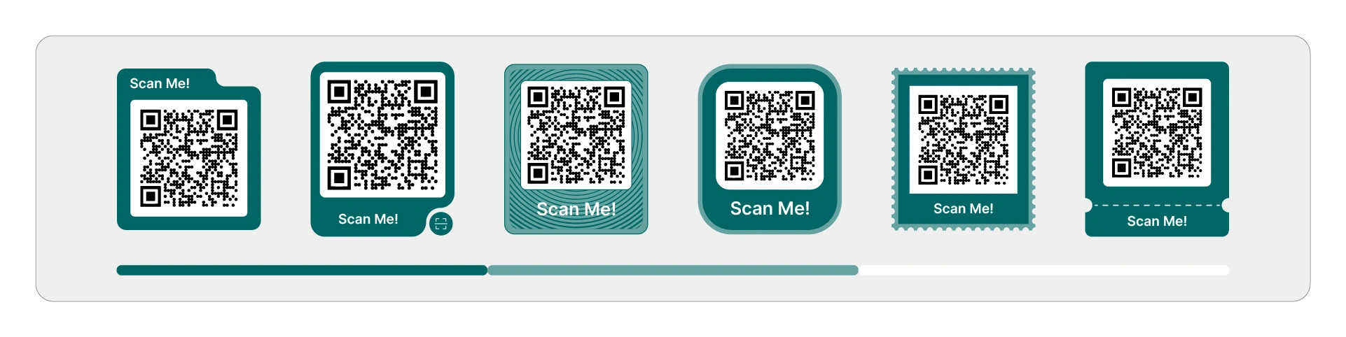
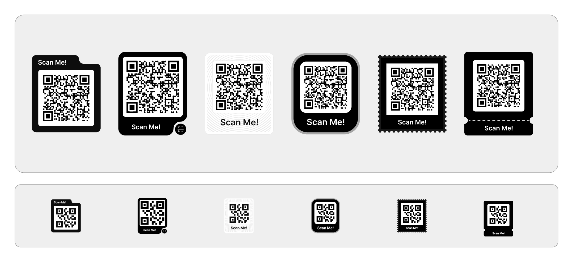
6 Monochrome QR Frame Templates
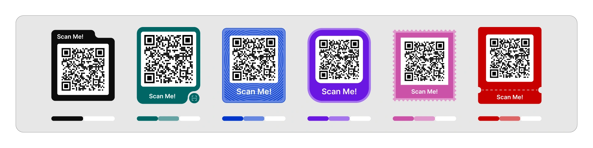
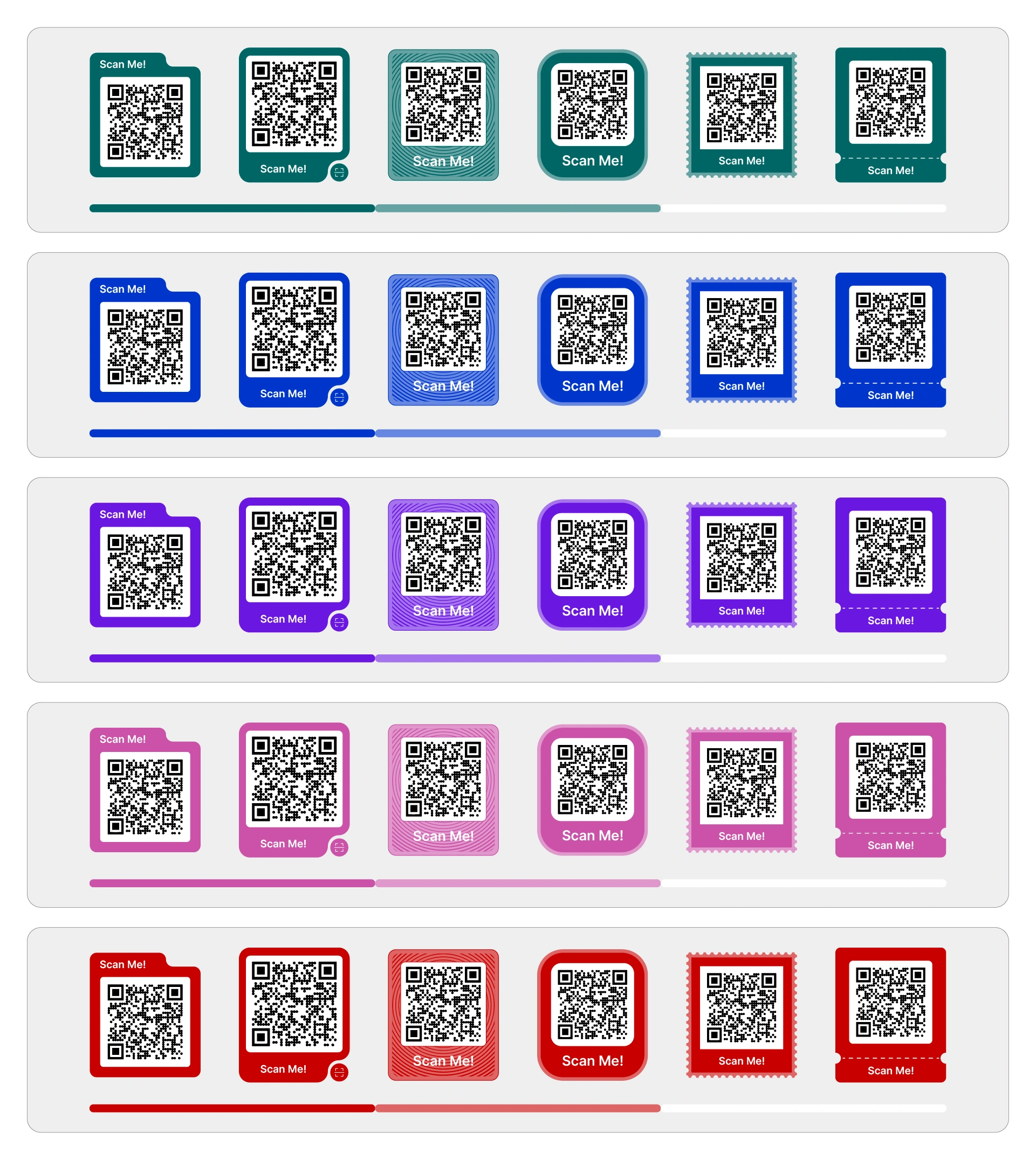
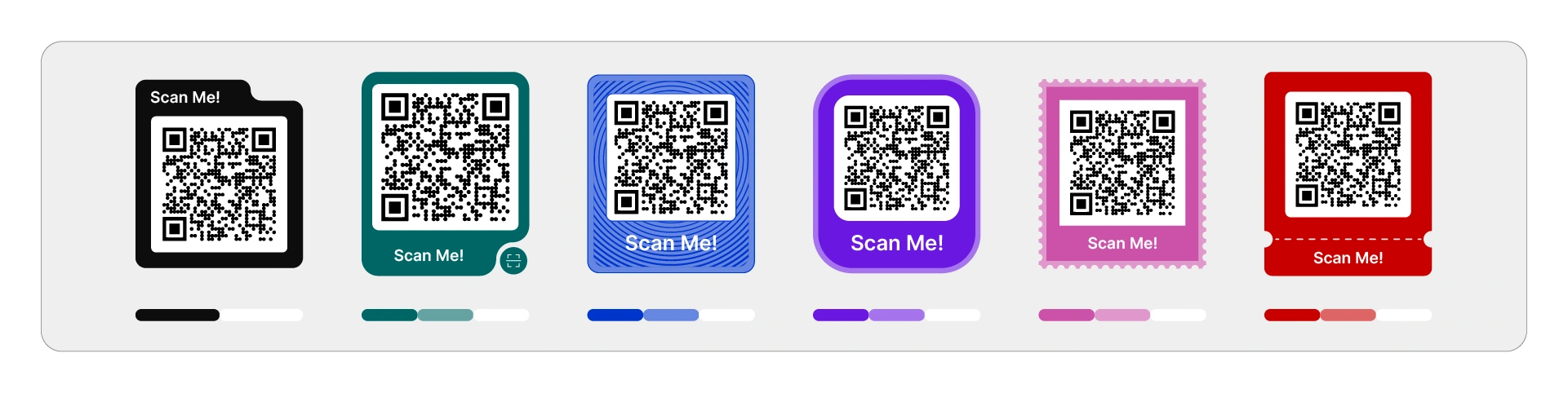
5 Complete Color Palettes: Brand Colors, Blue, Violet, Pink, Red
36 Final Colorized Templates (5 palettes × 6 templates + monochrome base)
Thumbnail System: Individual preview icons for each QR frame
Typography Update: From Arial to Inter
Complete SVG Package + AI + PDF
Technical specification document
This created a cohesive, expandable design system ready for long-term use.
Process
The design process was divided into three key phases to ensure alignment with the project goals and user needs.
A. Definition Phase: We established tone, technical constraints, color rules, and editing requirements, aiming to create a modern, neutral, yet visually distinctive system.
B. Monochrome Design Phase: The design began with an iterative monochrome exploration:
Initial round: 4 out of 6 frames approved.
Revision round: Strengthened identity and removed “Scan me” text from the remaining frames.
Final round: Explored 12 additional concepts, resulting in all 6 final frames being approved.
C. Color System Development: We explored 5 palette directions based on the brand’s tonal structure, adhering to strict rules to ensure consistency and web-editability.
Rejected Concepts (30 Total)
I explored 30 additional concepts to provide a wide range of stylistic possibilities. These were rejected for reasons such as:
Technical feasibility: Gradients or complex shapes not editable in the platform.
Visual similarity: Not adding new value compared to approved templates.
Complexity: Breaking the minimal and modern direction.
Tone: Leaning too playful, ornamental, or trendy.
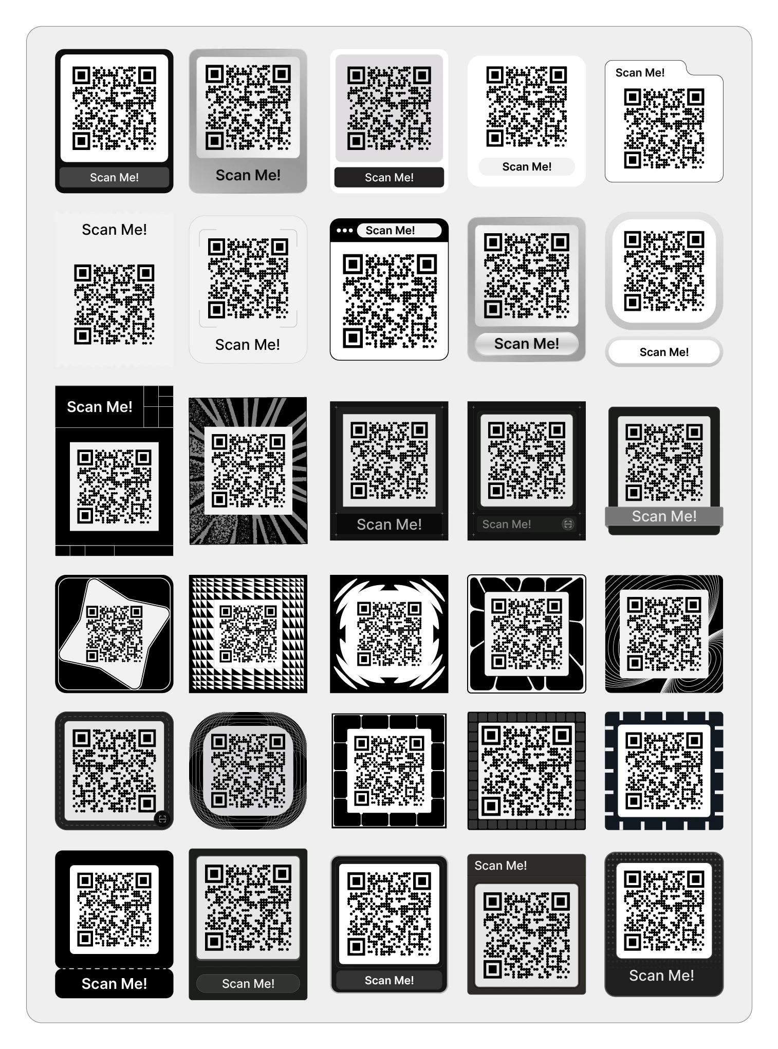
Showing these concepts demonstrates the breadth of exploration and the refinement process.
Technical Outcome
The final system is:
Fully scalable: New templates can be easily added.
Developer-ready: Clean and structured SVG files.
UI-optimized: Thumbnail previews enhance user experience.
Visually cohesive: Strict tonal rules ensure consistency.
Future-proof: Avoids outdated QR frame aesthetics, positioning GetQR as a leader in modern design.
The redesigned QR frame library not only modernizes GetQR’s visual identity but also enhances user experience, making it easier for businesses and individuals to create customized QR codes that resonate with contemporary design standards.
Like this project
Posted Nov 24, 2025
Transformed GetQR's outdated QR frame library into a modern, scalable design system, enhancing user experience for small businesses and individual users.
Likes
5
Views
19
Timeline
Nov 6, 2025 - Nov 20, 2025
Clients
Hint