Data Security Dashboard Design for Pinaca Technologies

Shakthi Thanigaivel

Building Brand Threat Monitoring Dashboard for Pinaca Technologies (Saptang Labs)
is a security platform that detects and mitigates online threats in real time. It helps brands monitor risks across social media, websites, and applications using ML-driven classification and alerts. Users can initiate takedown requests, track progress, and receive status updates—all in a single, intuitive dashboard.
Due to confidentiality agreements, I can only share select visual design work from this project. However, I'm sharing an overview of the multi-week design process I followed to help shape the product:
Objective: Design and develop a scalable, intuitive, and high-impact Data Security Dashboard from scratch that empowers users to monitor, analyze, and respond to data threats in real time.
The client's primary design requirement for the Data Security Dashboard is to create a user-centric interface that enables seamless access to critical, high-priority data, facilitating swift and informed decision-making. This involves presenting essential security metrics and threat alerts in a clear, intuitive layout that minimizes cognitive load and highlights actionable insights. Incorporating best practices such as logical grouping of information, consistent visual hierarchy, and appropriate use of color and typography will enhance the dashboard's clarity and efficiency. Ultimately, the goal is to empower users with a dashboard that supports real-time monitoring and rapid response to data threats.
Visual Components
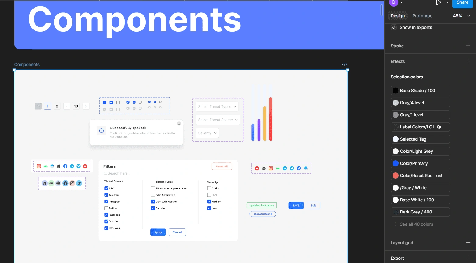
The component design focuses on clarity and quick interaction, with intuitive filters for threat source, type, and severity. Visually distinct icons and buttons streamline navigation and improve data accessibility. Together, these elements enable users to efficiently monitor and act on critical security threats.
Initial Iteration
The initial iteration was designed based on the client requirements to present a MVP which could be further tested and iterated to the final product
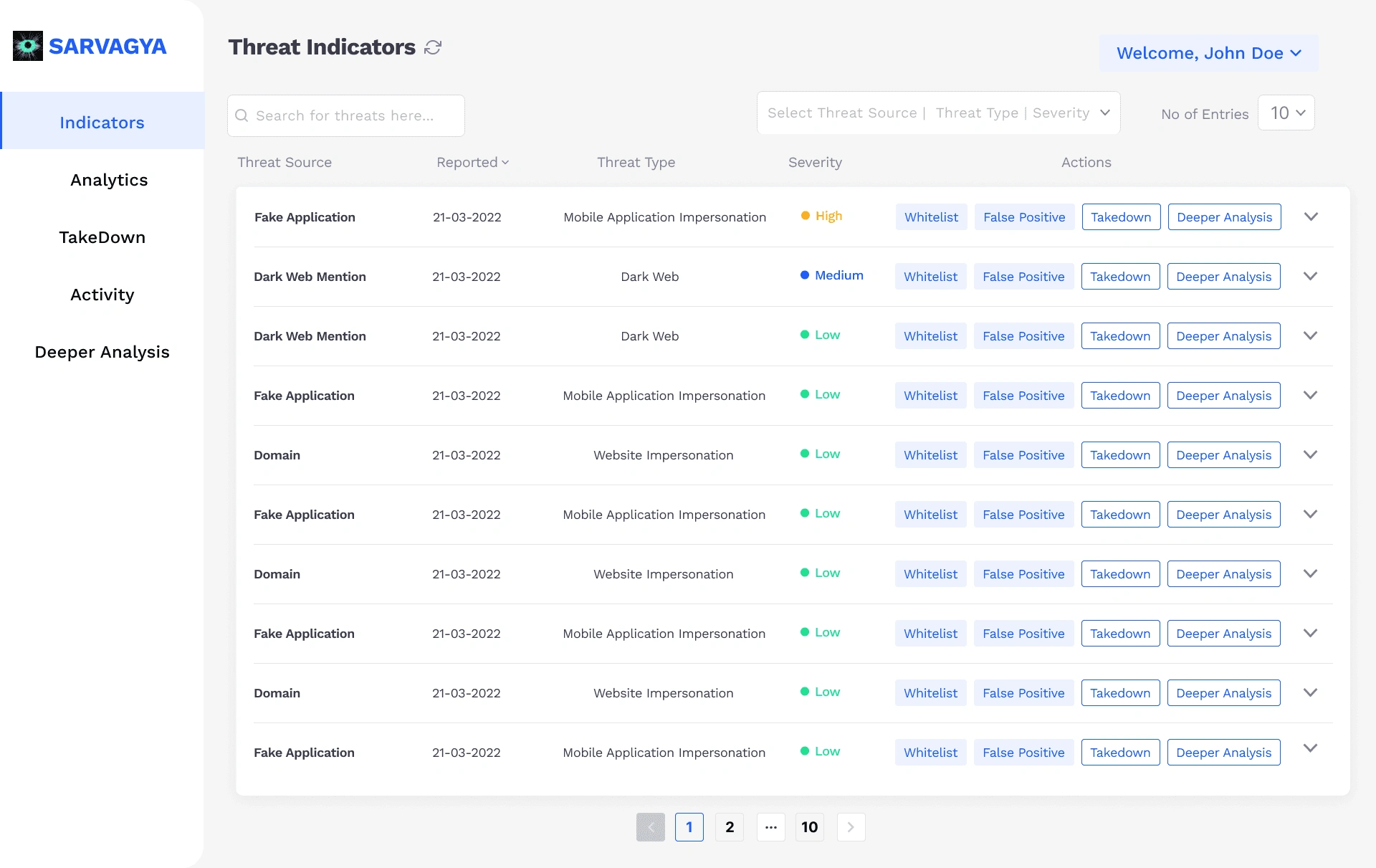
Home Page/Indicators Page - Shows the list of threats that the client has received via different sources and shows severity ranging from Critical to Low. The Client can take actions manually when required.
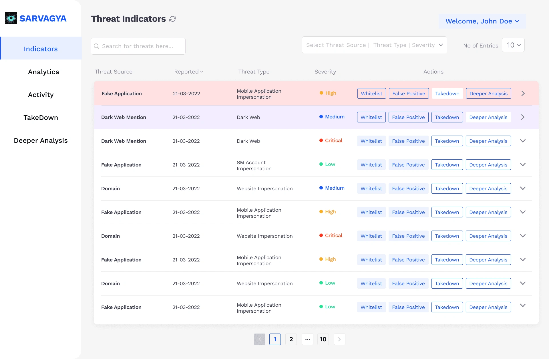
This wireframe shows how different action is being represented for the users in the dashboard. The takedown action highlights the 1st entry with red and the lilac is used for deeper analysis; referring to need for further analysis on the source.
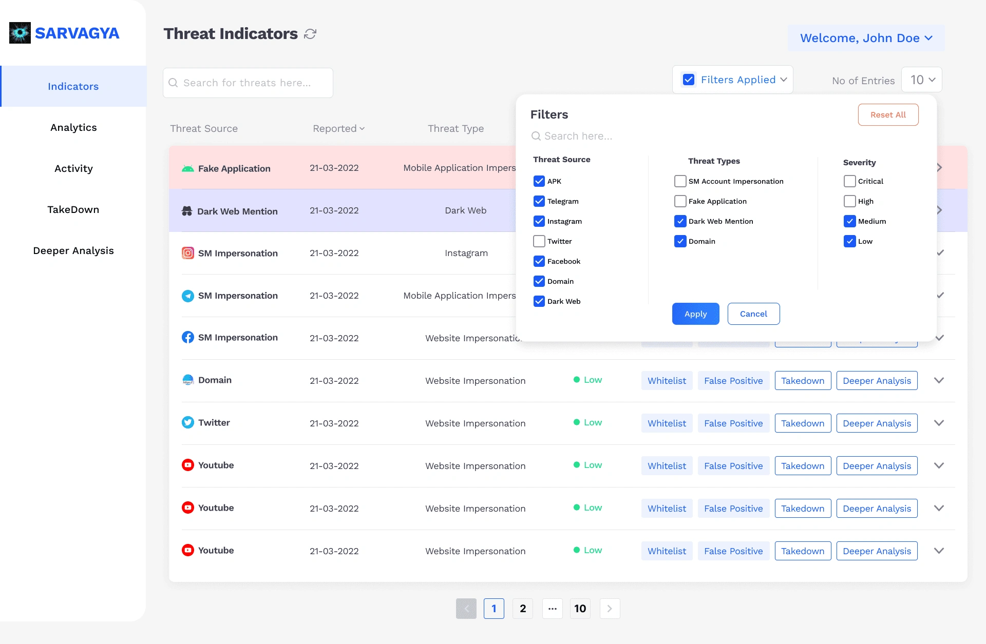
This wireframe represents how the filter action is done and how it reflects the entries after the action is being took.
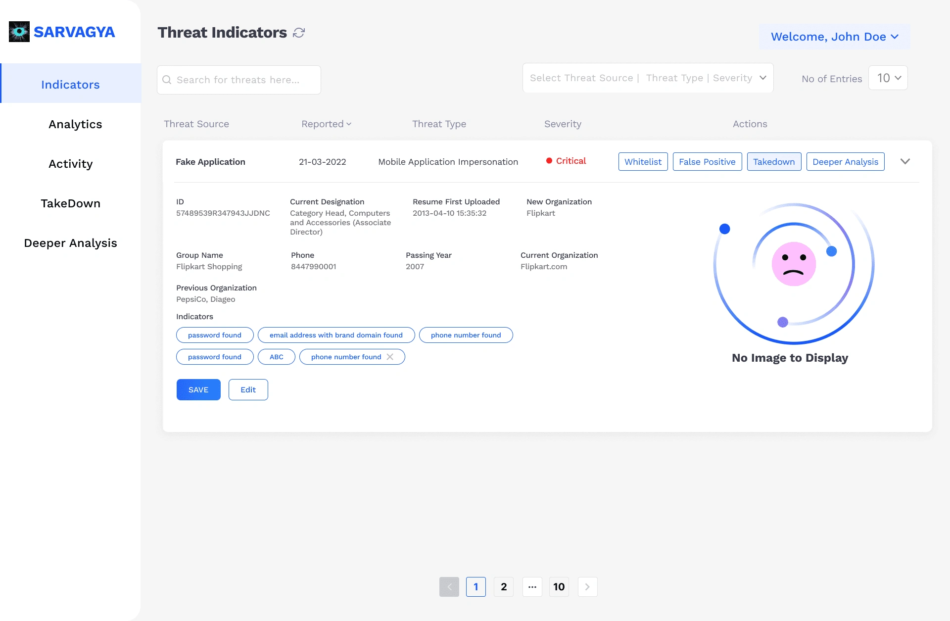
This wireframe showcases the opening of individual threats and check for necessary details.
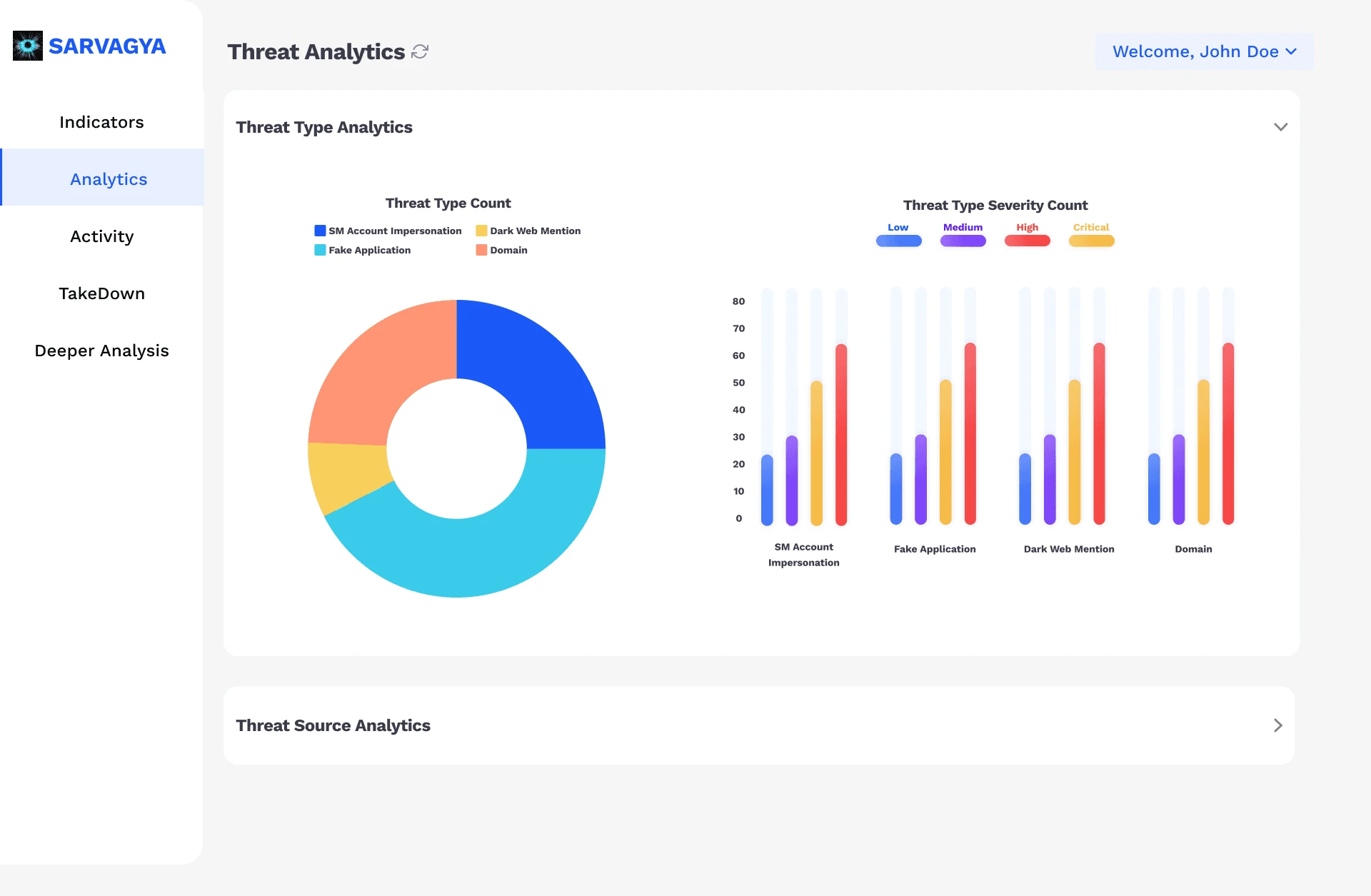
This wireframe represents a main panel showcasing two key visualizations: a donut chart highlighting the proportion of various threat types (e.g., SM Account Impersonation, Fake Application), and a bar graph depicting severity levels (Low to Critical) across each threat category.
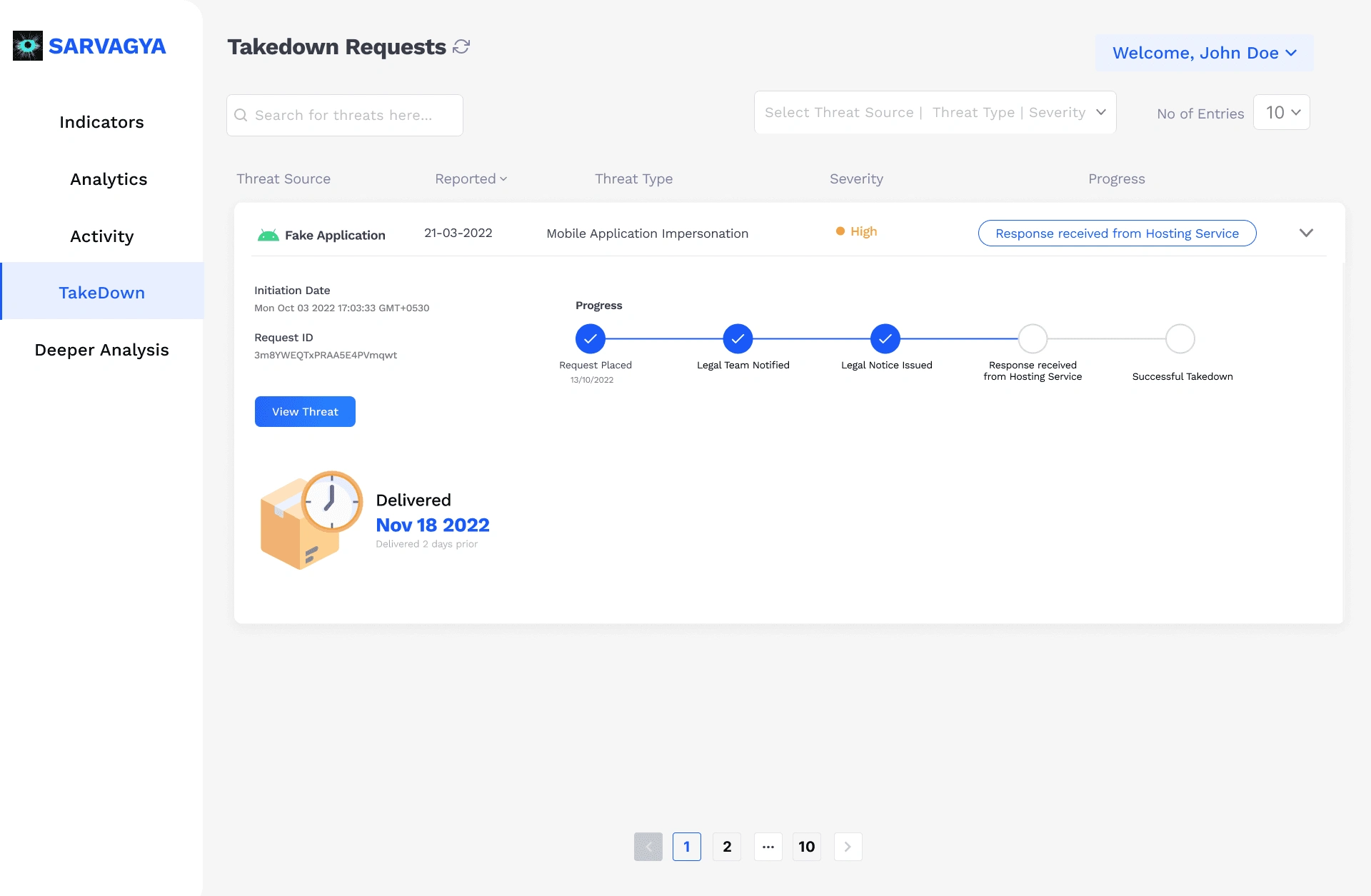
This wireframe shows the Takedown Requests screen for monitoring threat resolution. It highlights a Fake Application case marked as High severity, with a clear progress tracker from request placement to takedown. Key details like request date, ID, and delivery status are displayed, enabling quick and organized threat management.
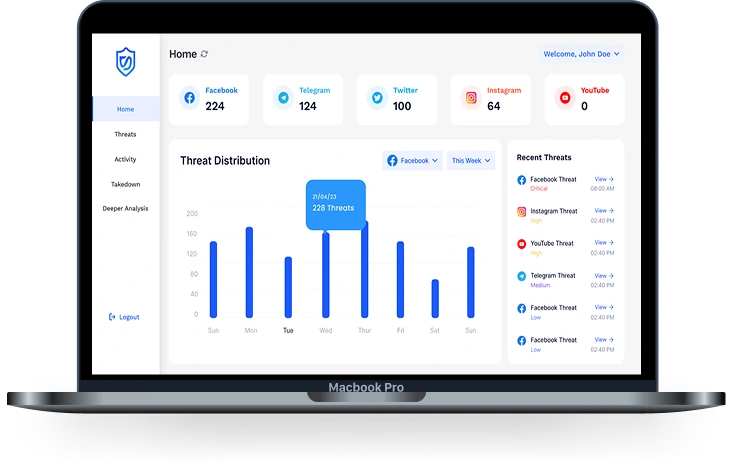
Once the MVP was tested amongst stakeholders, we gathered feedback that emphasized the need for a more visually engaging and intuitive homepage. Based on these insights, I redesigned the dashboard homepage to prioritize visual clarity and quick data comprehension. I introduced data visualizations such as charts, graphs, and status indicators to replace dense text blocks, enabling users to grasp key metrics at a glance. I also restructured the layout to create a clear visual hierarchy, ensuring that high-priority data like threat levels, system status, and recent activity were immediately visible. These enhancements significantly improved user engagement and made the dashboard more actionable for both technical and non-technical users.
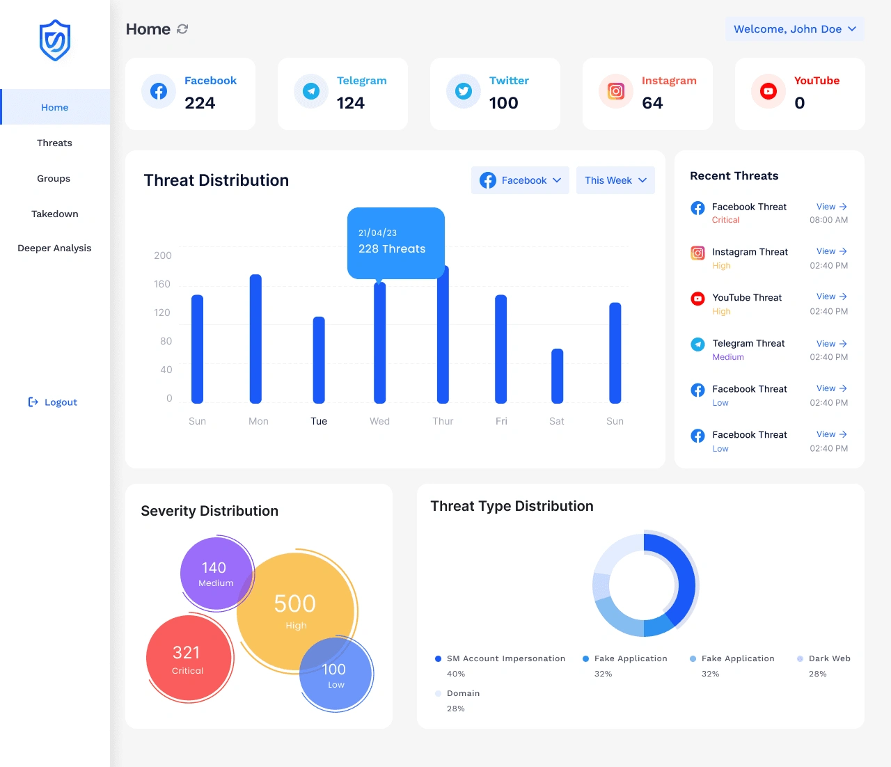
Based on stakeholder feedback from MVP testing, the dashboard homepage was restructured to prioritize visual clarity and actionable insights. Key metrics for each platform (e.g., Facebook, Twitter, Instagram) are now presented as prominent counters for instant status awareness. Interactive charts such as the Threat Distribution bar graph and the Severity and Threat Type pie charts were introduced to simplify complex data. Additionally, a dedicated Recent Threats panel enables quick access to the latest incidents by platform and severity. This redesign enhances situational awareness, supports faster decision-making, and offers a user-friendly overview for both analysts and executives.
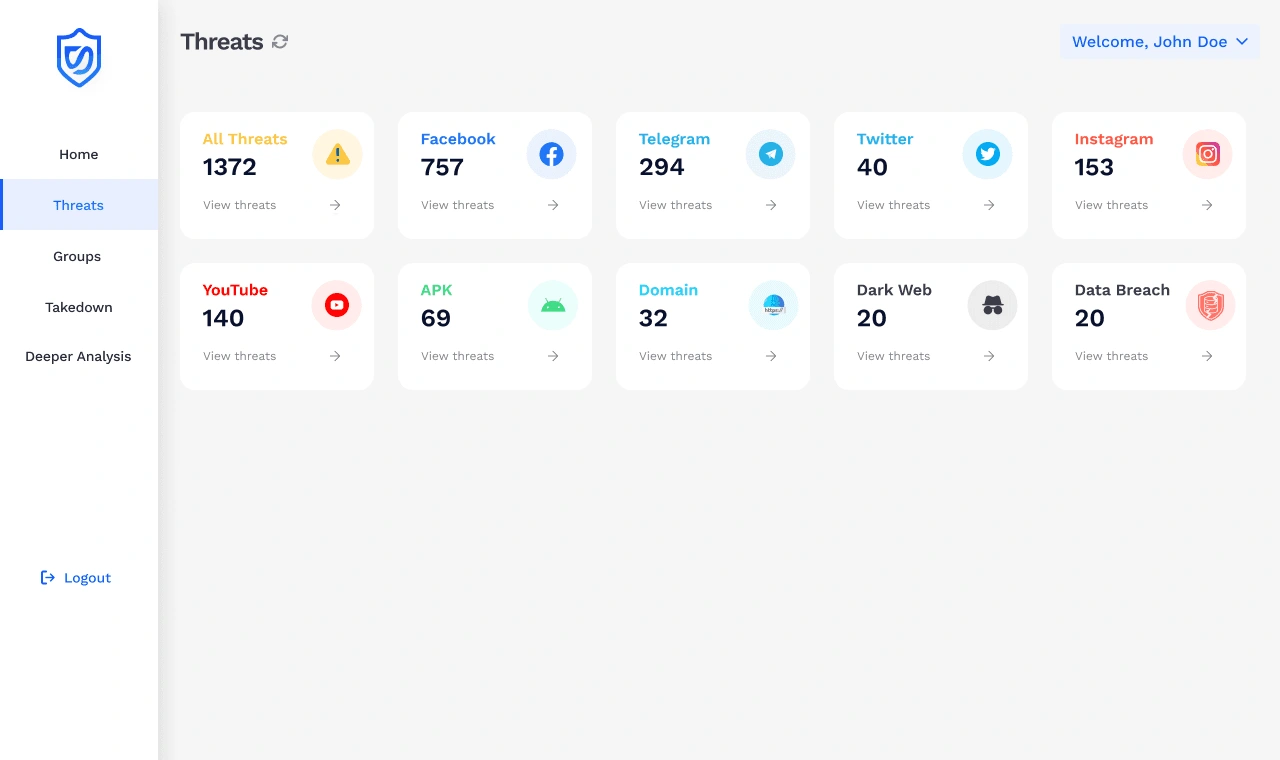
Stakeholder feedback revealed that using filters to access threats was time-consuming and unintuitive. In response, I revamped the Threats page into a segmented layout that categorizes threats by platform and type. Each threat category is now represented by a clear, clickable card with total counts and visual branding (e.g., logos for Facebook, Telegram, APK, Dark Web). This card-based overview allows users to instantly identify the scope and priority of threats and access specific datasets with a single click—improving navigation speed and overall user experience.
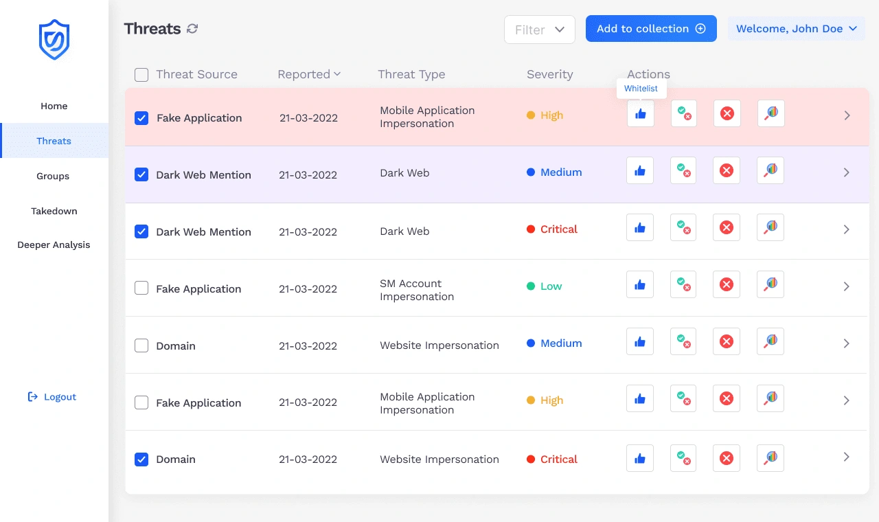
After identifying pain points in the previous Threat Indicators page, I redesigned the layout to improve clarity and user interaction. I replaced the text-heavy structure with a visually enriched table featuring color-coded severity tags, row highlights, and intuitive action icons. I also introduced checkboxes for bulk actions, allowing users to group multiple threats efficiently. This updated view seamlessly connects from the categorized Threats Overview page, preserving visual consistency and enabling a smooth transition from summary to detail. The redesign was guided by user feedback, which highlighted the need for quicker decision-making without relying heavily on filters.
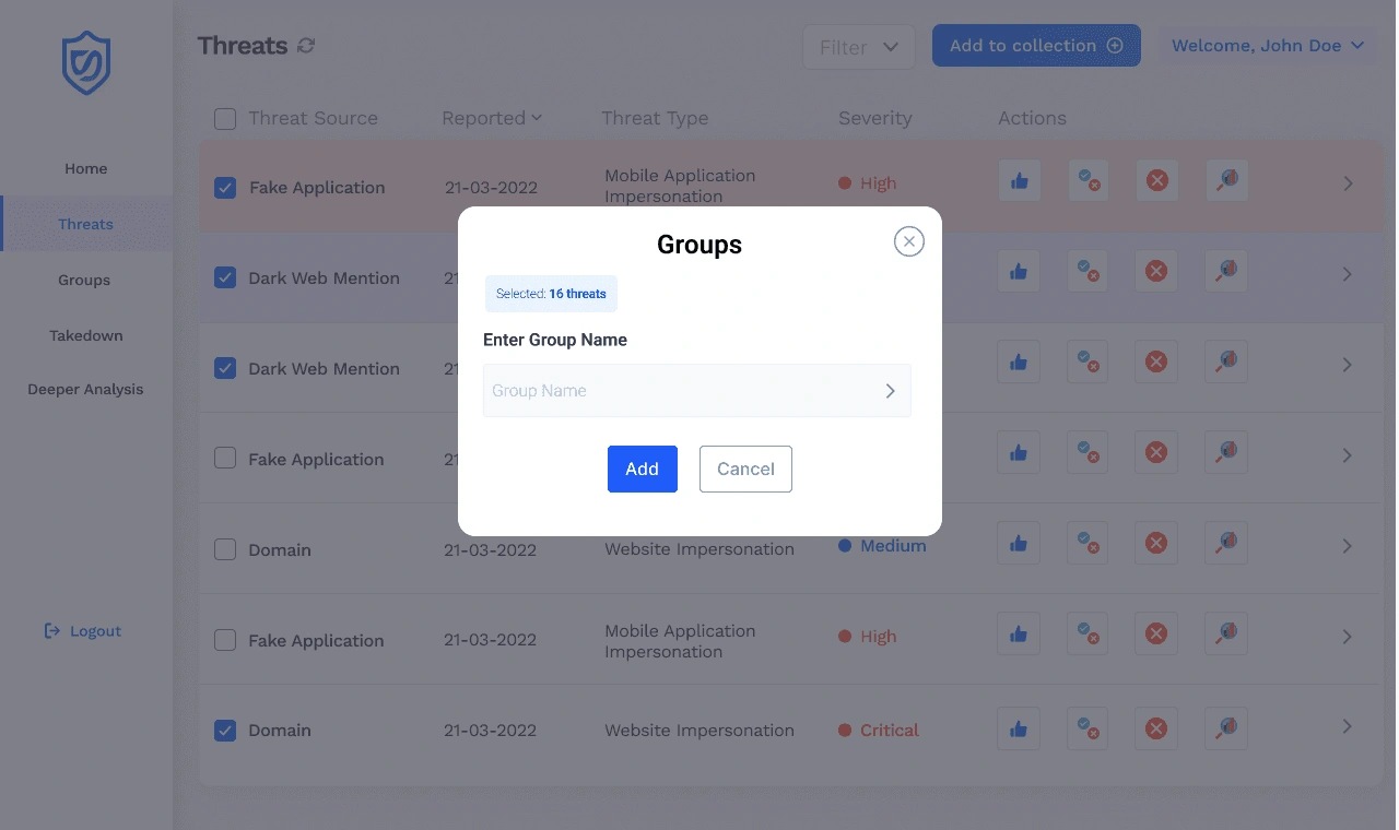
To streamline threat management, I introduced a modal based “Add to Collection” feature that allows users to group selected threats under a custom name. This enhancement supports bulk actions and helps analysts organize related threats for deeper analysis or reporting. By displaying the number of selected threats and allowing direct input, I ensured the flow remains intuitive and action oriented without leaving the main dashboard context.
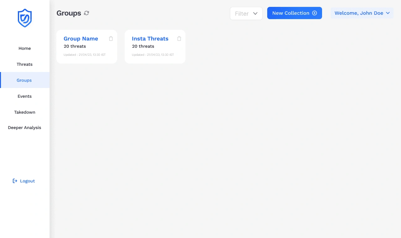
To support efficient threat organization, I designed the Groups page as a centralized space where users can view and manage their custom threat collections. Each card displays the group name, threat count, and last updated time, allowing users to quickly identify and access relevant clusters. This view builds directly on the "Add to Collection" feature, enabling seamless continuity from selection to storage. The clean layout and quick-delete option help maintain clarity and control over threat management workflows.
Through a series of strategic design decisions, I transformed a complex cybersecurity dashboard into a user-friendly, insight-driven platform. From visualizing threat metrics across over 1M+ data points to streamlining workflows with features like bulk actions and custom threat groupings, each enhancement was grounded in usability testing and stakeholder feedback. These iterations led to a 25% improvement in task completion rates and a 30% boost in client conversion. By developing scalable design systems, I also ensured visual consistency and reduced development time by 20%. This project reflects my ability to balance data density with intuitive interaction, delivering solutions that are both impactful and scalable for real-world cybersecurity applications.
Like this project
Posted Sep 5, 2025
Designed a scalable, intuitive Data Security Dashboard for Pinaca Technologies.


AskNestlé Website Redesign for Diverse Nutritional Needs
Urban Inferno: VR Experience for Urban Planning Awareness