Built with Framer
Profitable Painter CPA Website Redesign
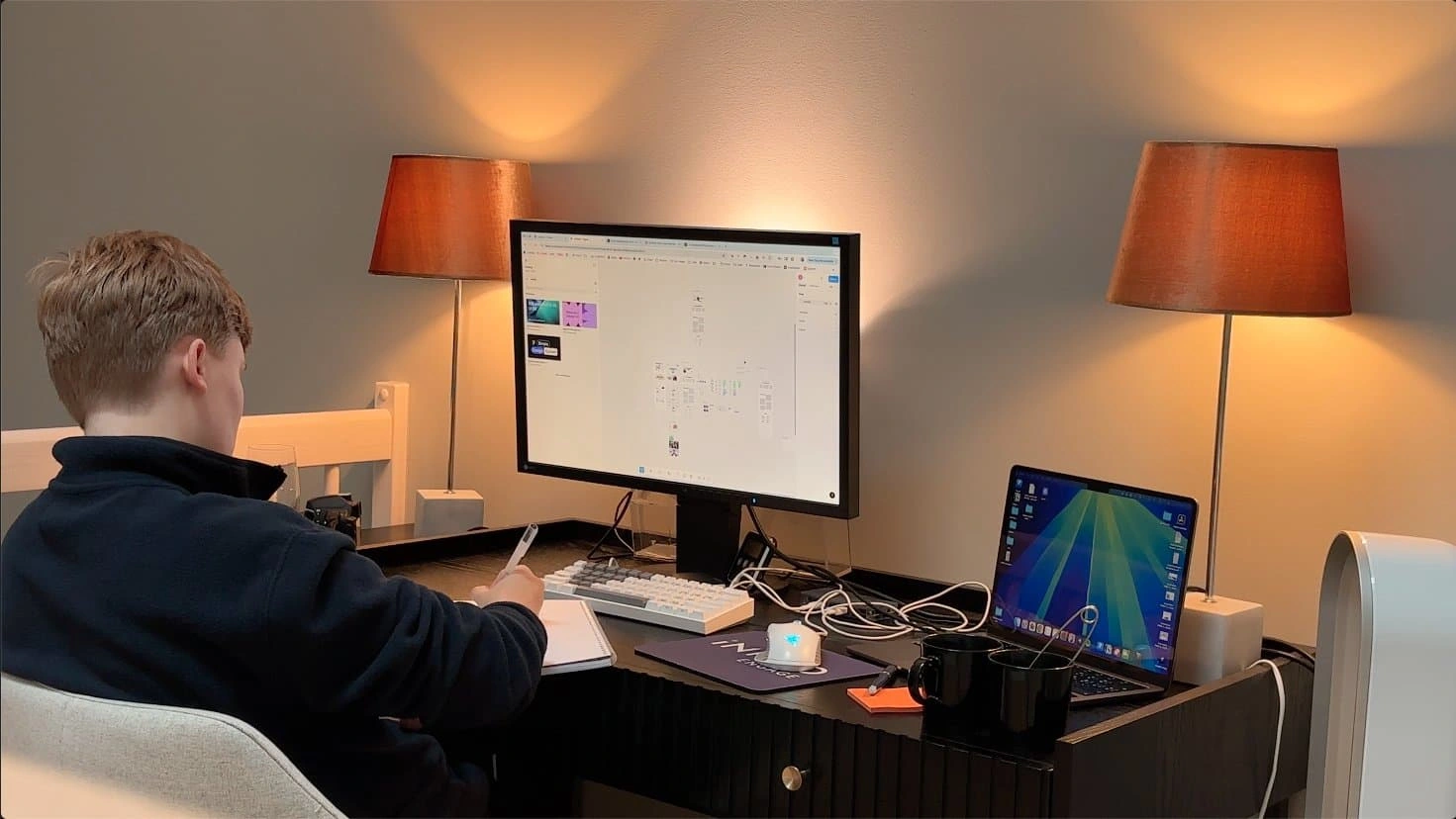
Noah Frummerin
Full Website Redesign & Migration to Framer
A complete transformation from an outdated, underperforming website into a clear, modern, conversion-focused platform built for growth.
The Starting Point
When Daniel first reached out, it was clear he had built something genuinely impressive.
Profitable Painter CPA is a specialised accounting firm helping painting contractors increase profitability, reduce taxes, and gain real financial clarity. The niche positioning was strong. The results were proven. The reviews were the kind most businesses only dream about, clients who are vocal, loyal, and enthusiastic.
The reputation was there. The substance was there.
The website just wasn't keeping up.
Brainstorming
The Audit
Before touching anything, I started with a full website audit. I went through every page with fresh eyes, mapping out what was working, what was broken, and what was quietly costing them trust before a visitor even made it past the fold.
What I found was a website that had grown without direction.
Different pages were running different navigation bars. Design elements were inconsistent across sections. The overall impression was unfinished, fragmented in a way that felt more like a work in progress than a firm you'd hand your financials to.
More importantly, the messaging wasn't doing its job. The site was functional, but structurally unclear, and visually outdated. For a new visitor landing for the first time, it didn't immediately answer the three things that matter most:
What does this company actually do?
Who is it for?
Why should I trust them?
The trust signals Daniel had worked hard to earn, the reviews, the credibility, the authority, the strong niche positioning, were buried. Visitors weren't getting the right picture of who Profitable Painter CPA actually was.
That was the real problem. Not just the design. The website wasn't representing the business accurately. And for a CPA firm, where trust is the entire foundation of the relationship, that gap matters enormously.
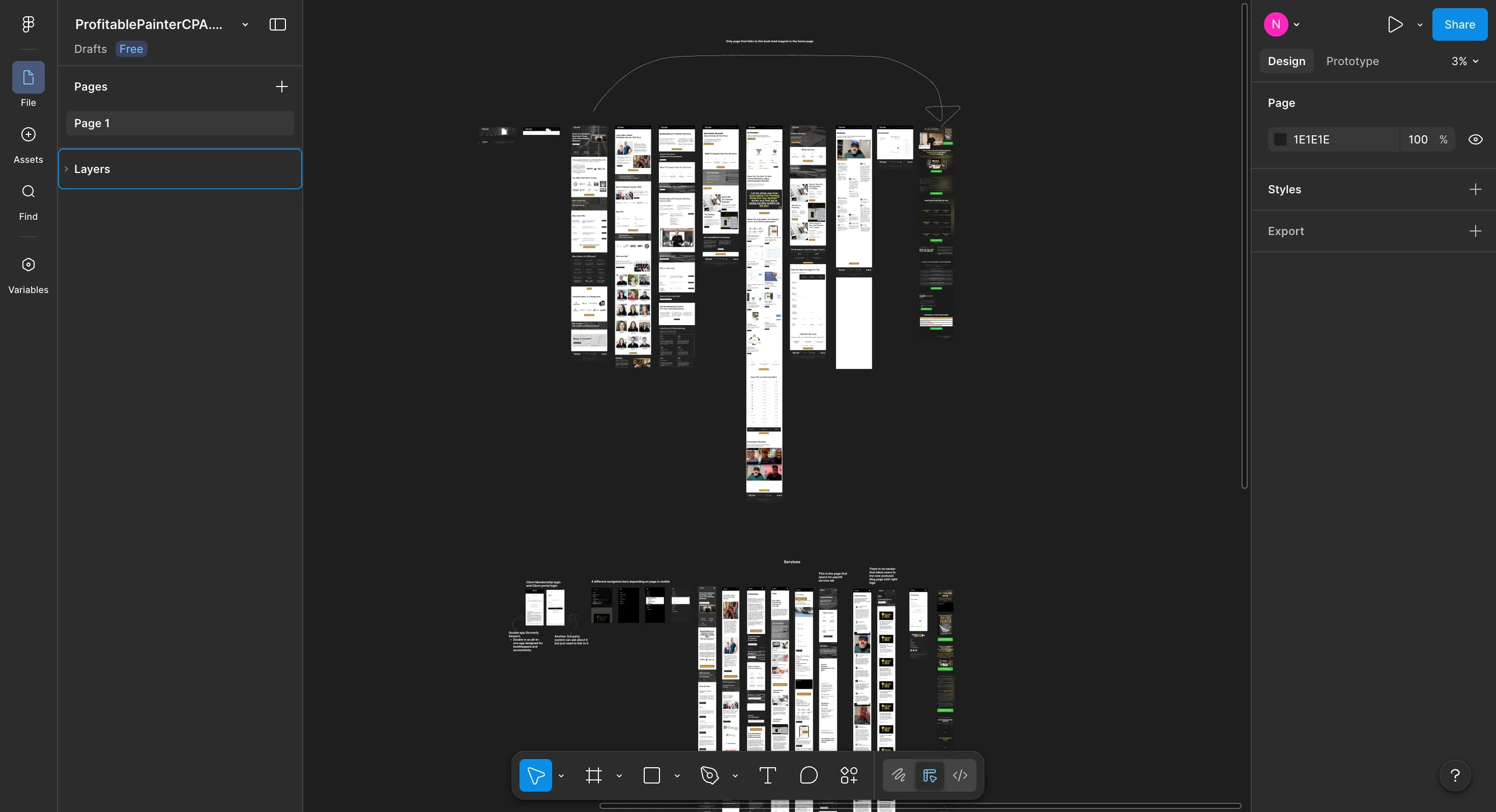
Visual audit for previous website
The Strategy
Once the audit was complete, I moved into strategy. This is the part most designers skip, and it's usually why websites fall short.
Before a single frame was opened in Framer, I mapped out the structure, the messaging hierarchy, and the user flow. The site was rebuilt around how visitors actually think, not how a business tends to describe itself.
That meant reordering content around intent, focusing the messaging on outcomes rather than services, and reducing cognitive load through cleaner navigation. Every page needed a clear purpose. Every section needed to earn its place.
The goal wasn't a prettier website. It was a website that finally matched the level of the business behind it.
Underneath the surface, Profitable Painter CPA already had everything needed to convert at a high level. The niche was clear, the results were proven, the founder's credibility was real. The opportunity wasn't to reinvent anything, it was to surface what was already there, clearly and intentionally.
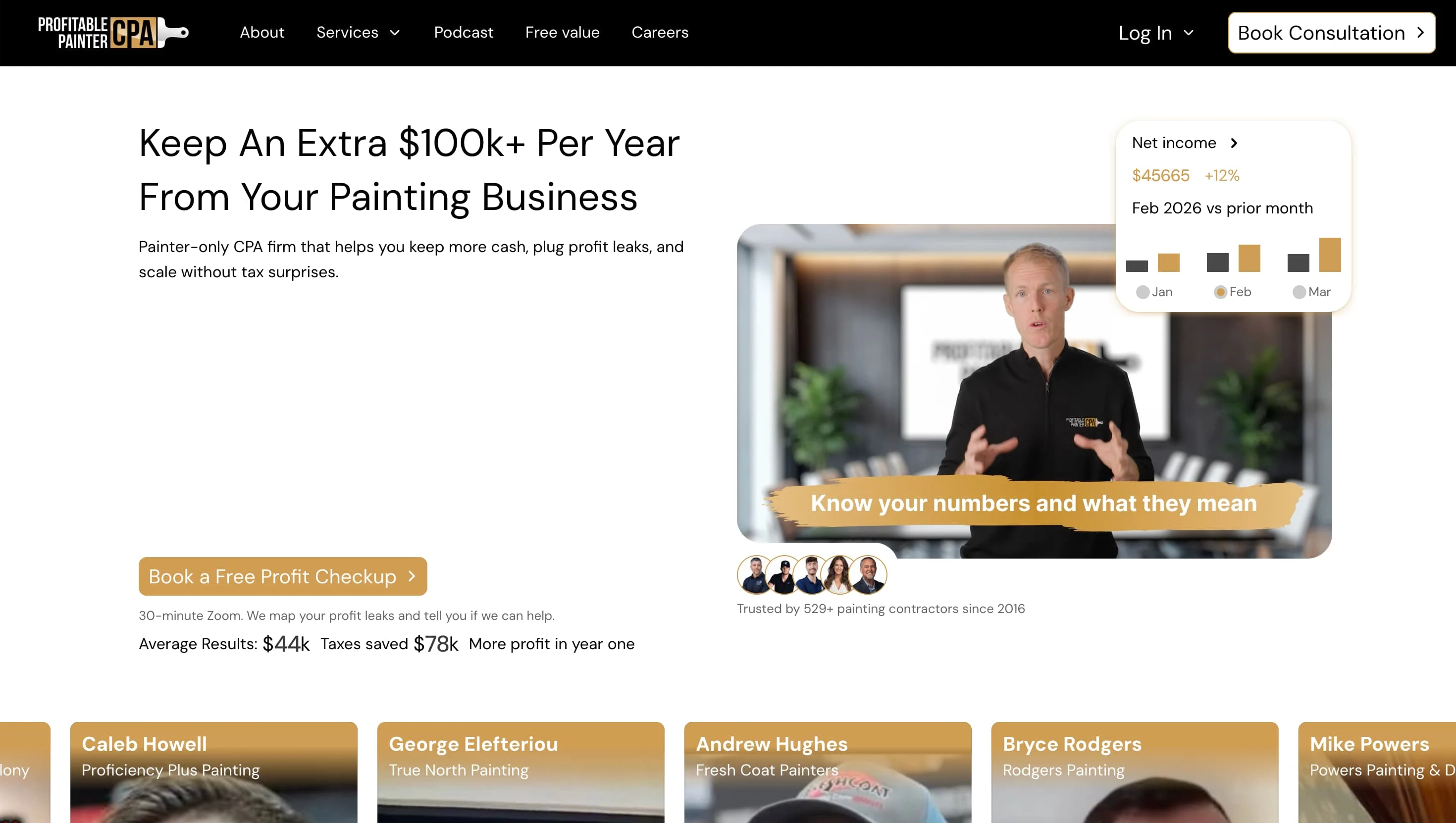
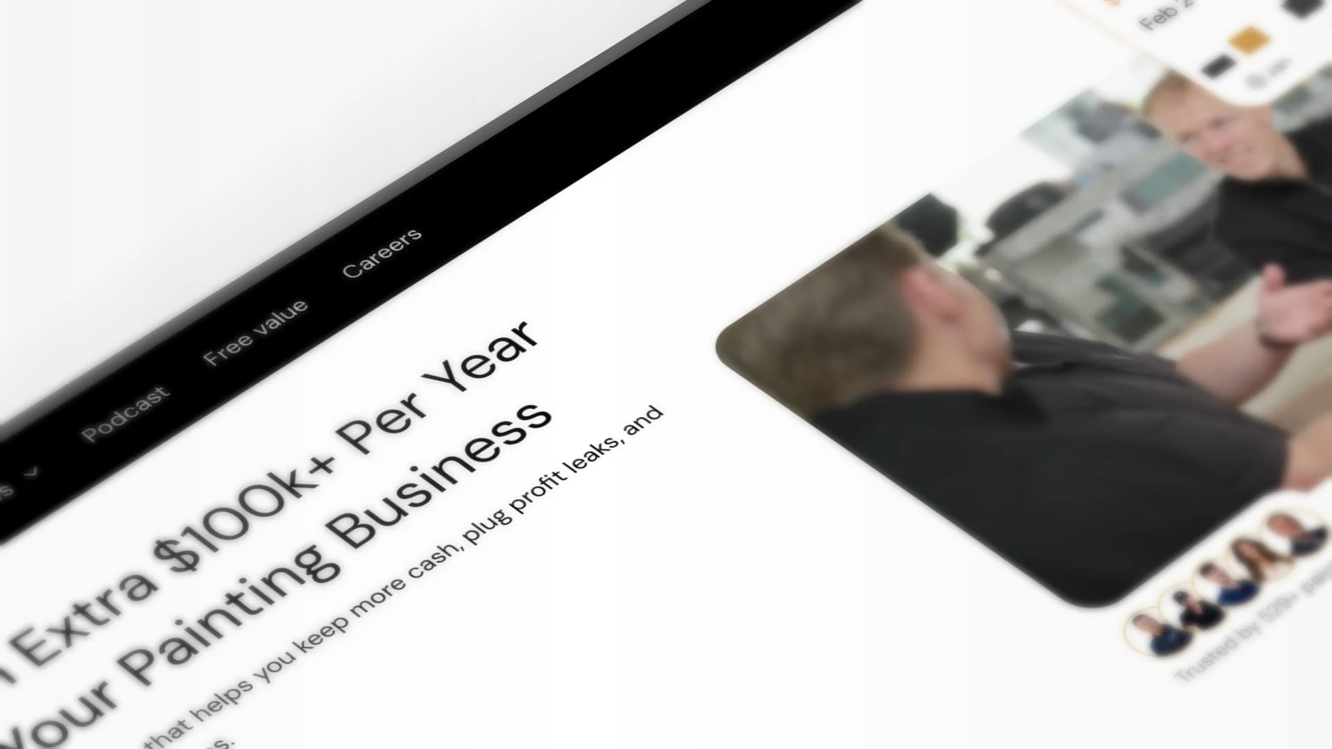
The new hero section
The Build
With the strategy locked in, I moved into Framer, and this one had an interesting layer to it.
Daniel wanted to keep his core systems running inside GoHighLevel. That was a constraint worth respecting, not fighting against. So rather than forcing everything onto one platform, we built the site across two: the main website in Framer, with two key funnel pages living inside GHL. The challenge was making the whole thing feel seamless. Through careful work on the navigation and footer, both platforms link together in a way that feels like one cohesive site. If you didn't know, you wouldn't know.
On the design side, the brief was clear: clean, modern, and built around strong hierarchy. Intentional spacing to remove the text-heavy feel that was weighing down the old site. Subtle animations to guide attention and flow. A layout that felt premium but approachable, the kind of credibility that works on a first impression.
Throughout the entire build, I kept Daniel in the loop the same way I do on every project, through regular Loom videos walking him through decisions, progress, and the reasoning behind choices. No guessing, no radio silence. Daniel always knew exactly where things stood and why.
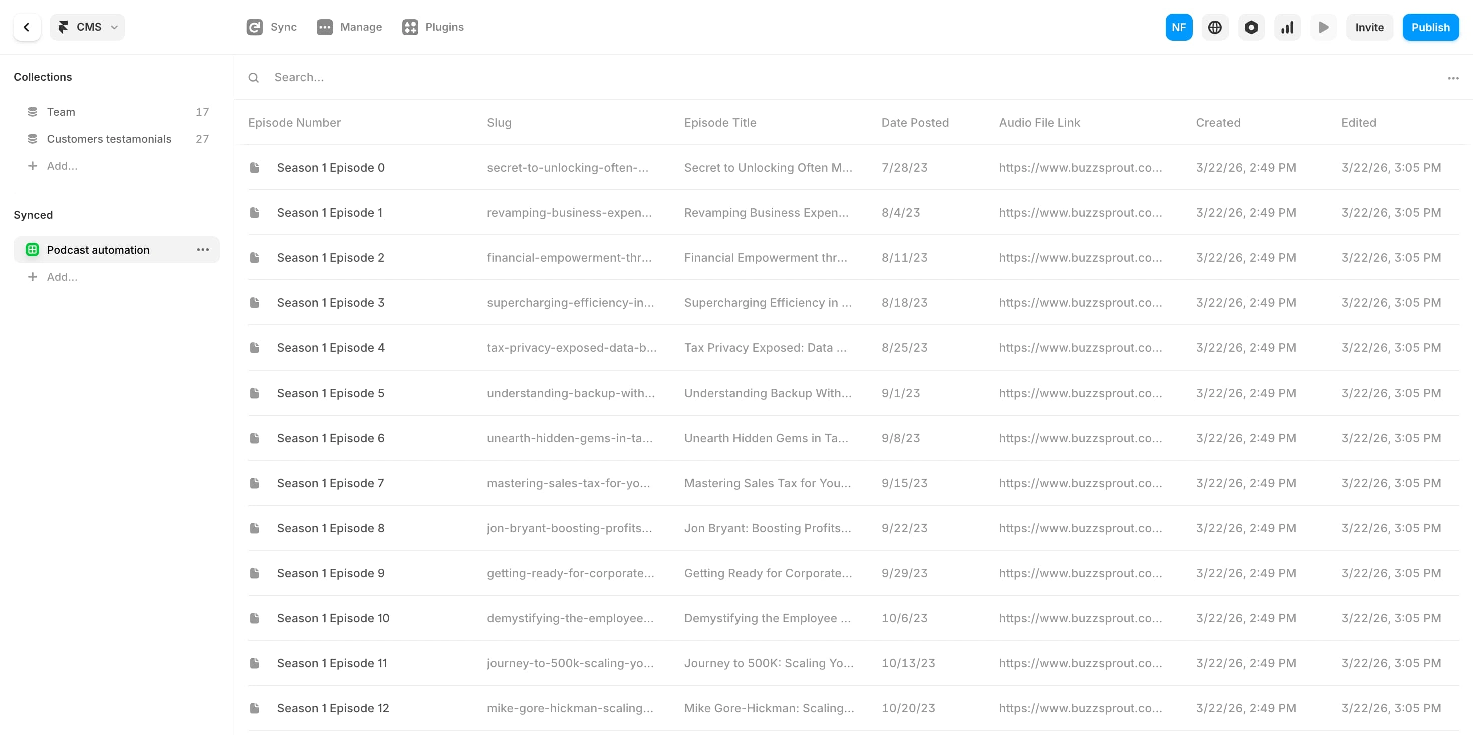
Screen shot of Podcast CMS inside of Framer.
The Podcast Solution
Midway through the migration, we hit a wall.
Daniel's podcast had episodes scattered across multiple places, none of them fully up to date. The old website only had some episodes listed. And when it came to migrating the CMS content out of GoHighLevel, GHL doesn't allow you to export CMS data as a CSV. So the standard migration path simply wasn't available.
Rather than building something manually or asking Daniel to do any heavy lifting, I built an automation using Manus AI connected to the podcast's RSS feed. The result: new episodes now publish directly to the website the moment they go live. No manual updates. No outdated episode lists. No ongoing maintenance. It just runs.
That's the kind of thing that doesn't show up in a screenshot, but makes a real difference to how the site operates long-term.
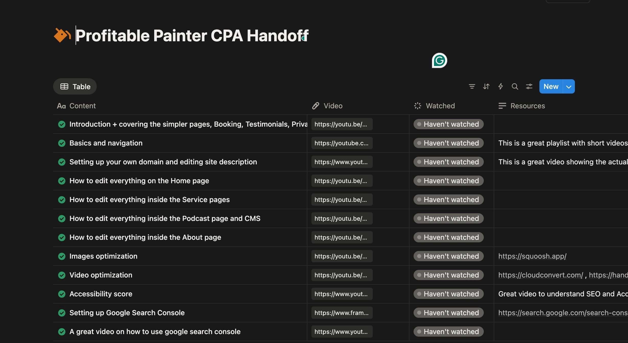
The Handoff Portal
The Handoff
Once the build was complete and everything was tested across both platforms, I put together a full handoff portal for Daniel, a structured library of recorded Loom videos covering everything he'd need to manage and grow the site confidently going forward. Every section documented, every process explained.
The kind of handoff that means he's never left staring at something, wondering what to do next.
Protecting What Was Already Working
Migrating a live website always carries a risk that's easy to overlook: losing the traffic and search equity the old site had already built up.
Before the new site went live, I made sure that wasn't going to happen. Every existing URL from the GoHighLevel site was mapped and 301 redirected to its corresponding page on the new Framer subdomain. That meant any traffic hitting the old pages, whether from Google search results, backlinks, or bookmarks, was cleanly passed through to the right place on the new site, without interruption. No broken links, no lost rankings, no dead ends for visitors. The authority the old site had accumulated carried over rather than starting from scratch.
It's a technical step that most people don't think about until something goes wrong. Getting it right before launch meant Daniel's site kept its footing from day one.
The Takeaway
Most websites don't fail because of bad design. They fail because there's no clear thinking behind them.
Profitable Painter CPA always had what it takes to earn trust. The reviews were there. The expertise was there. The niche was sharp. The business was already doing the work.
What changed was the website finally catching up to all of it, clear, structured, and built in a way that holds up the moment someone lands on it and decides whether or not to reach out.
That's what this project shows. When structure, messaging, and intent are clear, the design becomes straightforward. And more importantly, it performs.
Before and after
Like this project
Posted Mar 31, 2026
Redesigned website for Profitable Painter CPA, enhancing structure, messaging, and user flow.
Likes
1
Views
4