Built with Framer
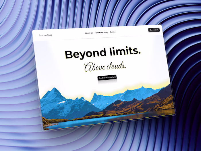
Alacrity Travel Website Template Design
Noah Frummerin
Alacrity - The template name
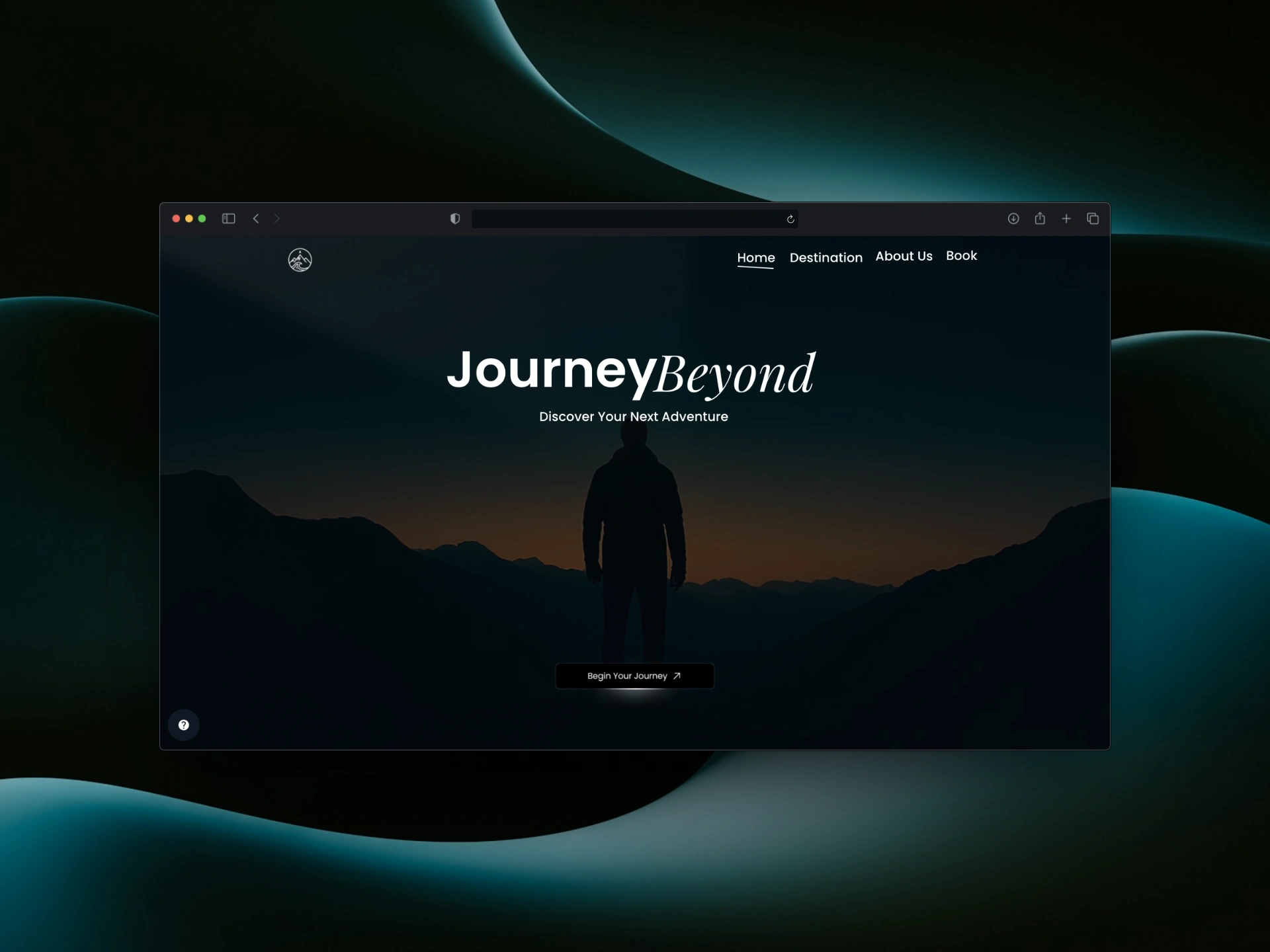
Discover Your Next Adventure
Overview
Alacrity is a travel website template I designed and built in Framer. It’s clean, cinematic, and built to help travel brands, photographers, or creators show off their work in a modern way.
The idea came from noticing that most travel sites either feel too loud or too corporate. I wanted something that captured the feeling of movement of curiosity and calm while keeping the experience simple and intentional.
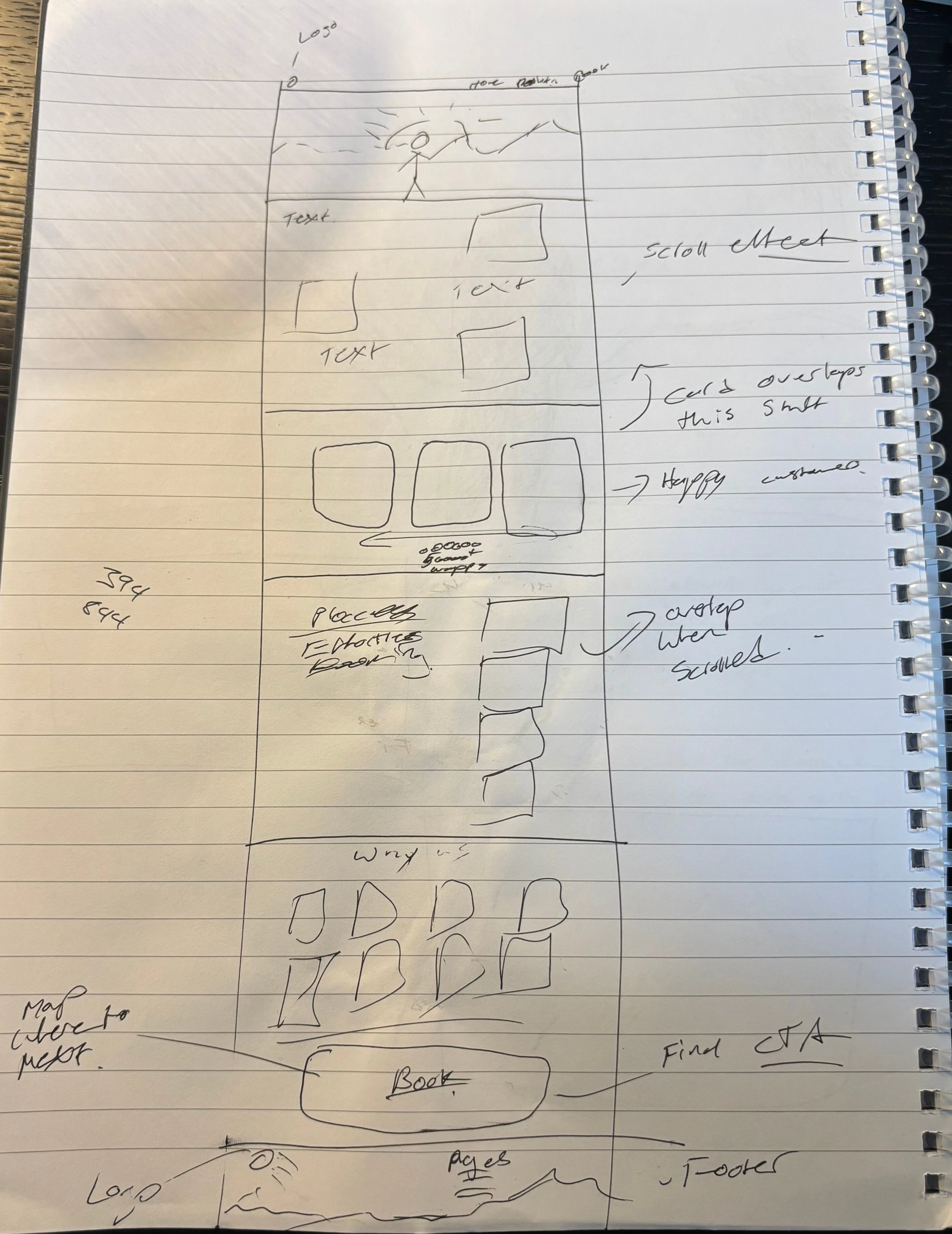
The Process
When I first started, the design was very different. I was leaning on effects and animations I had made before. But after starting the design I ended up trying completely new animations and interactive sections.
From the start I wanted the website to feel cinematic to have a lot of character which is why I love the lone traveler silhouette against a sunset that I generated for the hero and footer section.
Design Decisions
Fonts: I used Poppins for clarity and structure, and Playfair Display for elegance and emotion. Together they created a perfect balance between modern and classic bold headlines paired with softer, more expressive subheadings.
The animations are bold but intentional: smooth fades, gentle transitions, and a the ability to interact with most components making the website not just a source of information but of exploration which is what the company is truly about.
Reflection
What I learned from Alacrity is that simplicity is hard to get right. It’s easy to add things, but removing the unnecessary takes patience.
If I were to push it further, I’d experiment with more interactive destination previews, adding hoover effect revealing more information about each destination. But for now, I’m proud of how it turned out.
Alacrity is more than a travel template. It’s a calm, inspiring space that reminds people why they love to explore in the first place.
Like this project
Posted Nov 11, 2025
Designed and built a cinematic travel website template in Framer.
Likes
1
Views
5