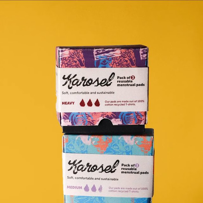
brand identity for Karosel ♻️👕🩸
brand identity for Karosel, a re-usable menstrual pads brand made out of recycled t-shirts ♻️👕🩸 (pt. 1) 1. wordmark with two of the main colours - i really wanted my wordmark to represent the messiness and pain that periods usually put people through, as opposed to the way they are usually portrayed in the media (feminine, girly and gentle)
2. wordmark with different colours used throughout the brand
3. main colour palette, tone of voice, and typography
4. moodboard - lots of texture!!!
5. some of my findings when doing research into old menstrual products & ads - shocking seeing these in the context of today. the book The Curse by Karen Houppert was a huge inspiration behind this research. the book talks about the physical and psychological impacts that the concealment and taboo of menstruation in the media has on women - such a great read!!! 6. some of the results of a survey I conducted on the topic - i mostly focused on the negative ones in order to assess what needs to change in the menstrual product industry
7. linocut printing of potential wordmarks i was going to go for! so fun seeing these after my project is all done 🥲
8. colour palettes i experimented with. i knew i wanted something bright and eye-catching from the start
9. some of my naming and symbol ideation (university project/concept) #design #branddesign #brandidentity #graphicdesign #adobe #adobeillustrator #adobeindesign #logo #logodesign #menstruation #feminism
Like this project
Posted Jul 26, 2024
brand identity for Karosel, a re-usable menstrual pads brand made out of recycled t-shirts ♻️👕🩸 (pt. 1)
Likes
0
Views
2


